
Shopify Category Grid: Add More Than 8 Tiles in Dawn
Shopify's collection grid seems capped at 8 tiles, and stacking two sections leaves a gap. Here is how to get a seamless 16-tile category grid on a free theme with one number change.
By AjayCodeWiz · July 25, 2026 · 9 min read
The problem
A merchant asked about this on the Shopify Community, and most stores hit it.
They wanted a category grid on their homepage. A block of collection tiles, so shoppers can jump straight to "Dresses", "Shoes", "Bags", and so on. They wanted 16 of them in one clean block.
The theme seemed to cap the grid at 8 tiles. Shopify's built-in AI suggested stacking two 8-tile sections on top of each other to reach 16.
That got them to 16 tiles. But it left a visible gap between the two blocks, so the grid did not look like one seamless grid. It looked like two grids with a seam down the middle.
Their exact words: "there's a noticeable gap so it doesn't look seamless."
They also said they do not know how to write CSS or edit code. So any fix has to be short and safe.
I reproduced this on a test store, found why the gap happens, and got a seamless 16-tile grid with a single number change. Here is the result on a free theme.
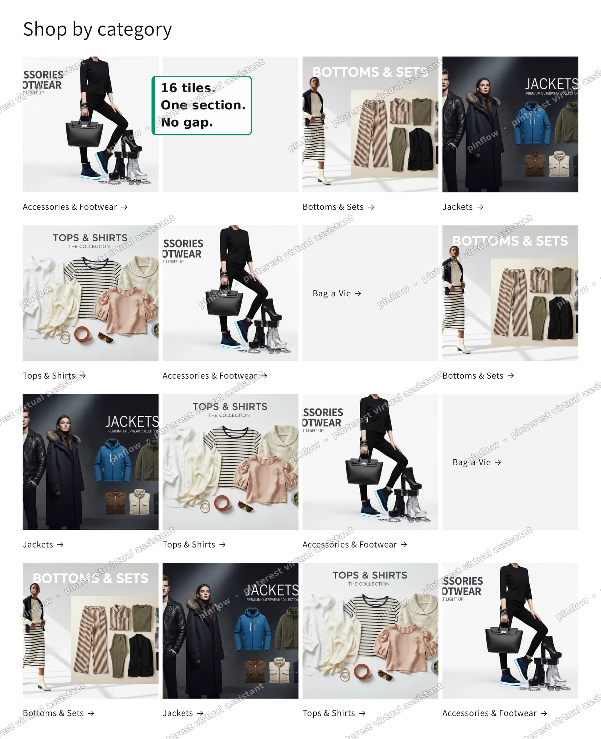 16 collection tiles in a single 4x4 grid on a Shopify store
One section. Sixteen tiles. No gap between the rows.
Why the gap happens
This is the part worth understanding, because it tells you why the whole "stack two sections" approach is doomed.
A section on your homepage is one self-contained block. When you drop a Collection list section, everything inside it lives in one CSS grid. The spacing between tiles in that grid is controlled and even.
When you stack a second Collection list section under the first, you now have two separate grids. Between them sits section padding, which is the empty margin every section adds above and below itself.
So the "gap" is not a grid gap. It is two lots of section padding meeting in the middle. You can shrink it, but you can never make it match the tight, even spacing inside a single grid. That is why the merchant's version never looked seamless no matter how much the AI trimmed the spacing.
The fix is not to make two sections touch. It is to use one section that holds all 16 tiles.
The 8-tile limit is not really 8
Here is the second surprise. The limit is not 8, and it is not fixed.
Each theme decides how many tiles its Collection list section allows. It sets that in the section's own code, as a value called max_blocks. Different themes ship different numbers. Some default low, which is where the "it maxes out at 8" impression comes from.
On Dawn, the free Shopify theme, the Collection list section allows 15 tiles out of the box. No code needed for the first 15.
The platform itself allows up to 50 blocks in a section. So the ceiling is not the platform. It is one number in your theme, and you can raise it.
To get the merchant's 16 tiles, we only need to nudge that one number from 15 to 16.
Which free theme to use
I recommend Dawn for this. It is free, Shopify made it, and its Collection list section is a single, clean grid with a desktop column control. That combination is exactly what a category grid needs.
The merchant had tried Horizon and Spotlight. Those can also show collections, but their section models differ and the tile counts and layout options are not the same. If you want the simplest path to a seamless multi-tile category grid with no app, Dawn is the one to reach for.
Everything below is done on Dawn.
Step 1: Raise the tile limit to 16
You only need this step if you want more than 15 tiles. For 15 or fewer, skip straight to Step 2, because no code is involved.
- In your admin, go to Online Store > Themes.
- Next to Dawn, click the ... button, then Edit code.
- In the left file list, open the sections folder, then collection-list.liquid.
- Scroll near the bottom and find the line
"max_blocks": 15. - Change the 15 to 16.
- Click Save.
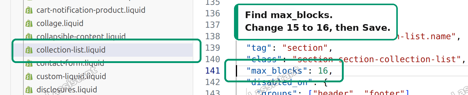 Editing collection-list.liquid to change max_blocks from 15 to 16
That is the entire code change. One number. You are not writing CSS and you are not adding a snippet. You are lifting a cap the theme set on itself.
If you ever want more than 16 later, set that same number to anything up to 50 and add that many tiles.
Step 2: Build the grid
Now build the section visually. No code here.
- Go to Online Store > Themes and click Customize on Dawn.
- Click Add section, then choose Collection list.
- In the section settings, set Columns to 4. This gives a clean 4 by 4 layout for 16 tiles.
- Add a tile for each collection you want, up to 16. Each tile points at one collection.
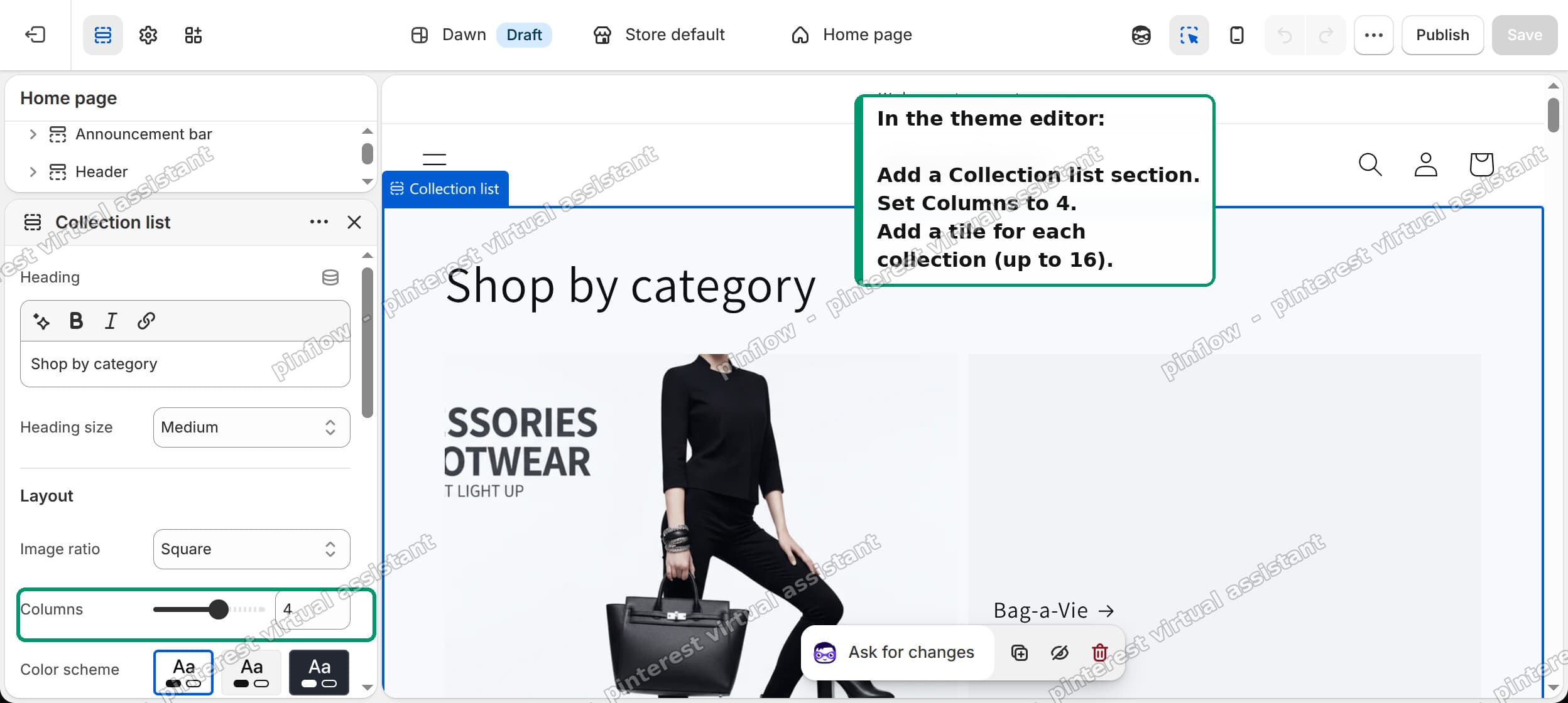 Adding a Collection list section and setting Columns to 4 in the Dawn theme editor
Save, and you are done. All 16 tiles sit in one grid with even spacing. No seam, because there is only one section.
Columns is adjustable. Four columns give a 4 by 4 block. Three columns give a different rhythm. Pick whatever suits your number of categories and your images.
Want more or fewer than 16?
The layout scales cleanly once you understand the two levers.
- Number of tiles is set by
max_blocksin the code plus how many tiles you actually add in the editor. Raisemax_blocksto any value up to 50 for more tiles. - Shape of the grid is set by the Columns control in the section settings. It decides how many tiles sit per row.
So 12 tiles in 4 columns is a 4 by 3 block. 20 tiles in 5 columns is a 5 by 4 block. You are mixing one code value with one editor control, nothing more.
Category grid vs product grid
People mix these two up, and it changes which section you use.
A category grid shows collections. Each tile is a category like "Shoes" or "Sale", and clicking it takes the shopper to that collection page. The section for this is Collection list, and it is what this whole guide covers.
A product grid shows individual products. Each tile is one product with its price. The section for this is Featured collection, which pulls products from a single collection.
If your tiles should be categories, use Collection list. If your tiles should be products, use Featured collection. The block-limit trick works the same way for both, but they are different sections.
What to check if it did not work
A few things trip people up after the change.
- Still capped at 15? The code edit did not save, or you edited the wrong theme. Make sure you edited the theme you are actually customizing, and that you saved
collection-list.liquid. - The 16th tile will not add? You raised
max_blocksbut on a different theme copy. Edit code and Customize must be on the same theme. - Tiles look uneven in height? That is usually the image ratio setting. In the section settings, set the image ratio to a fixed shape like Square so every tile matches.
- You updated Dawn and the limit reset to 15. A theme update can replace theme files, including your one-line change. If you update Dawn, redo that single edit. This is the one maintenance cost of the code change, and it is small.
Make it look right on mobile
A grid that looks great on a desktop can feel cramped on a phone, so check both.
Dawn's Collection list has a separate mobile column setting. On a small screen, four columns squeeze each tile and its label into a sliver. Two columns almost always reads better on mobile, so a 4 by 4 desktop grid becomes a 2-wide grid on phones.
Set the desktop columns and the mobile columns independently. Desktop 4, mobile 2 is a safe starting point for a 16-tile grid. Then open the store on your phone, or use the theme editor's mobile preview, and confirm the labels are readable and the tiles are not too small to tap.
Image ratio matters here too. A fixed Square ratio keeps every tile the same height, so the rows line up. Adaptive ratios let each image keep its own shape, which can leave the grid looking ragged when your category images are different sizes.
How many categories should a grid show?
Just because you can show 16, or 50, does not mean you should.
A category grid is a navigation shortcut. Its job is to get a shopper to the right section fast. Too many tiles turns it back into a wall of choices, which is the thing good navigation is meant to avoid.
For most stores, the sweet spot is the handful of categories that actually drive sales, shown clearly, with strong images. If you genuinely sell across 16 distinct categories, a 4 by 4 grid is a clean way to show them. If you are padding it out to fill space, fewer, larger tiles usually convert better.
Use the tile count that matches your real catalog, not the maximum the theme allows.
Do you even need to touch code?
If 15 tiles is enough, no. Dawn's Collection list holds 15 with zero code. Add the section, set your columns, add up to 15 tiles, done.
The code step exists only to cross from 15 to 16, or higher. For many stores, 15 categories is already more than enough, and you can ship the whole thing without opening the code editor at all.
The real fix here was never "learn CSS." It was understanding that the gap came from stacking sections, and that the tile cap is one editable number. Once you know that, a seamless 16-tile category grid on a free theme takes about five minutes.
I tested every step above on a Dawn store. Sixteen collection tiles rendered in a single 4 by 4 grid with even spacing and no gap between the rows.
Spending too long on manual Shopify busywork?
PinFlow turns your Shopify catalog into Pinterest pins and posts them on a schedule, automatically. Same idea as the rule above, let the system handle the repetitive part.
Get PinFlow on the Shopify App StoreMore Shopify fixes
More community-sourced Shopify guides, tested on a live store.
Collections & Products
Shopify Variants: The Complete Guide
Variants are one product sold in several forms. How they work, the 2,048 and 3-option limits, and where each variant fix lives - images, swatches, sorting, hiding and the theme-specific bugs.
Collections & Products
Shopify Collection Image Size: Why Cards Look Wrong
Collection images that look fine on desktop can turn huge on mobile, with the second card cut off the screen. The cause is not pixel dimensions, it is aspect ratio. Here is what to set, measured on a real phone viewport.
Collections & Products
How to Set Up Shopify Smart Collections With Metafields (Not Tags)
Building one tag per collection turns into hundreds of typo-prone tags fast. Here is how to run Shopify smart collections off product type and metafields instead, tested on a store.