
How to Change the Shopify Mobile View Only
There is no reliable "if mobile" in Liquid, and the reason matters. Here is the CSS media query that changes mobile without touching desktop, with four fixes tested on real stores.
By AjayCodeWiz · July 17, 2026 · 10 min read
The problem: the setting applies to both
Your store looks right on desktop and wrong on a phone. So you go into the theme editor, change the setting, and now desktop is wrong too.
This is the single most common shape of Shopify theme complaint. A position setting, an alignment, a layout direction: it applies to every screen size, and the theme gives you one control for both.
The instinct is to look for a Liquid conditional. Something like {% if mobile %}. It is a reasonable guess and it is why "shopify if mobile" is a search people actually make.
It does not exist, and the reason is worth understanding, because it tells you what the correct answer has to look like.
Why there is no "if mobile" in Liquid
Liquid runs on Shopify's servers, before the page is sent to the browser. At that moment the only hint about the visitor's device is the user agent string, which is unreliable, endlessly spoofed, and says nothing about the actual window size.
More importantly, Shopify caches rendered pages hard. If Liquid produced different HTML per device, that caching would break or you would serve the wrong version to someone. So the platform deliberately does not give you a device conditional.
Then there is the case that kills the idea outright: someone rotating their phone, or dragging a desktop window narrower. The screen changes size after the page has rendered. No server-side conditional can respond to that. CSS can.
So the answer is always the same:
@media screen and (max-width: 749px) {
  /* rules here apply only on phones */
}
The browser evaluates that continuously, on the actual viewport, and re-evaluates it when the window changes. It is the right tool, not a workaround for a missing one.
749px is Shopify's convention. Dawn, Horizon, Savor and most themes built on them treat 750px and up as tablet-and-desktop. Matching it means your rule flips at the same point the theme's own layout does, which is what you want.
Where to put it
Two options, and the choice matters more than the code.
Theme settings > Custom CSS is in the theme editor under Theme settings. It survives theme updates and it is easy to find again later. Use it when you can.
assets/base.css is reached through Online Store > Themes > ... > Edit code. Paste at the very bottom so your rules come last. Use this when you have a lot of CSS, or when a rule needs to be more specific than Custom CSS allows.
Either way, duplicate your theme first if you are editing code. Online Store > Themes > ... > Duplicate.
Below are four real fixes, each one a different flavour of the same problem.
Fix 1: product title and price on the same line
A merchant on Horizon wanted the title and price of each product card side by side rather than stacked. They had built a group section with a horizontal layout, selected horizontal for mobile as well, and it still stacked on phones.
They also wanted long titles truncated with an ellipsis rather than wrapping onto three lines.
@media screen and (max-width: 749px) {
.product-grid__card .group-block > .group-block-content.layout-panel-flex--row {
flex-direction: row;
flex-wrap: nowrap;
}
}
.product-card a[ref="productTitleLink"] .text-block {
min-width: 0;
flex: 1 1 auto;
}
.product-card product-price.text-block {
flex: 0 0 auto;
}
.product-card a[ref="productTitleLink"] .text-block > * {
overflow: hidden;
text-overflow: ellipsis;
white-space: nowrap;
}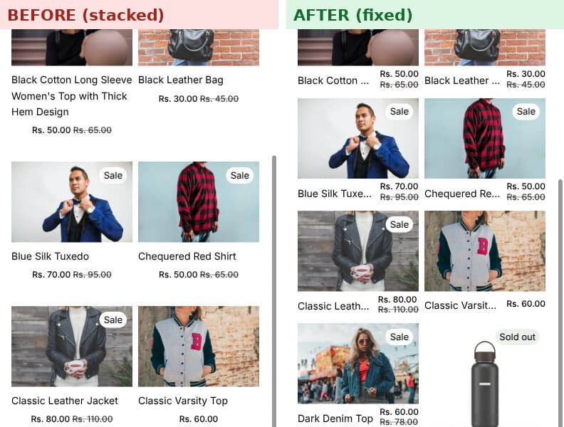 Product cards before, with title and price stacked, and after, with them on one line
Only the first rule is inside the media query. The rest apply everywhere, because the truncation behaviour is wanted on both.
The interesting line is min-width: 0. Flex items refuse to shrink below their content's intrinsic width by default, so a long title pushes the price off the card instead of truncating. min-width: 0 overrides that, and it is what makes text-overflow: ellipsis work at all here. Without it the other three rules do nothing, which is why this fix looks like it fails when you only copy part of it.
The price gets flex: 0 0 auto so it never shrinks. The title takes the remaining space and clips.
Desktop keeps working:
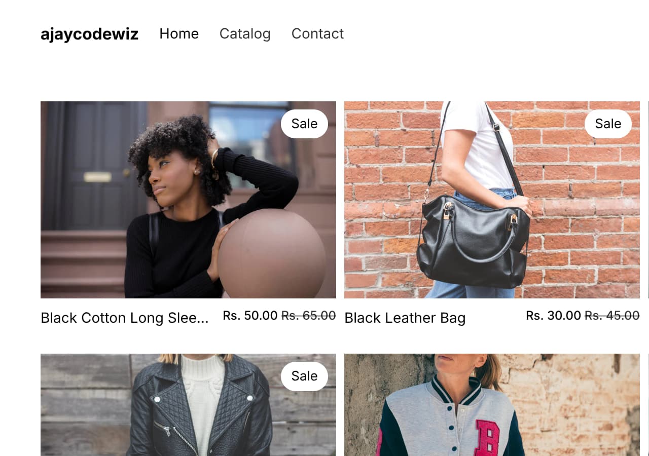 The same layout on desktop after the fix
Fix 2: make the product image full width on mobile
A merchant wanted their product photo to fill the screen on mobile instead of sitting inset with white space either side, and to remove the "peek" of the next gallery image.
Try the no-code route first. In the theme editor, open your Product page, click the product media or gallery block, and turn off Constrain media to viewport height. If there is a Media fit option, leave it on Contain. On many themes that alone makes the image fill the column, and a setting always beats CSS.
If the setting is not there or does not go far enough:
@media screen and (max-width: 749px) {
/* let the main product image use the full screen width */
.product-media-container.constrain-height.media-fit-contain {
width: 100% !important;
}
.product-media-container.constrain-height .media {
padding-top: var(--ratio-percent) !important;
}
/* remove the side "peek" so each gallery photo is edge to edge */
.product__media-list .product__media-item {
width: 100% !important;
}
}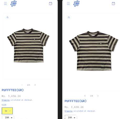 The product image before, inset with white space, and after, edge to edge
Tested at a 390px viewport, the main image went from 335px wide, centred, to a full 390px, edge to edge.
One honest note from that thread: some of the empty space above and below the product was baked into the photos themselves, not added by the theme. No CSS fixes that. If your images have generous built-in margins, crop them. It is worth checking before you spend an evening on selectors, because a theme cannot remove whitespace that is part of the JPEG.
Fix 3: move banner text up on mobile only
On the Savor theme, the Hero section's Position setting applies to desktop and mobile together. On a phone the centred text lands over the busiest part of the image and becomes unreadable.
@media screen and (max-width: 749px) {
.hero__content-wrapper.mobile-column {
justify-content: flex-start;
padding-top: 24px;
}
}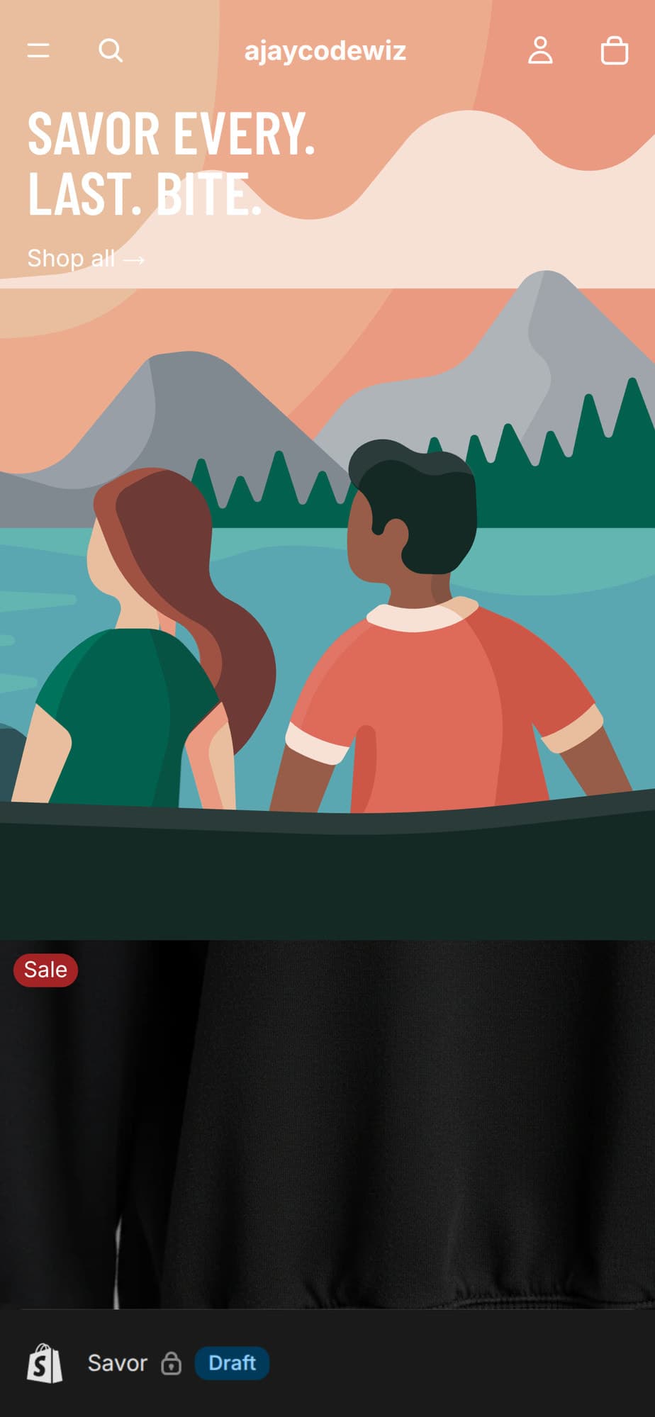 The Savor hero banner with the text moved to the top on mobile
Swap flex-start for center (the default) or flex-end (bottom) to reposition later. Same rule, one value.
Two things to know. It applies to the hero banner on every page, not just the home page, because the selector targets the section rather than one instance. And a hero that fits neatly on a phone can push its headline below the fold on a wide desktop window, so check both before concluding a layout problem is universal.
Fix 4: hide empty slideshow text boxes on mobile
A merchant on Crave had a slideshow where slides two onwards showed an empty text box beneath the image, but only on mobile. They had removed them on desktop and could not on mobile, and they wanted to keep the text box on the first slide.
That last requirement is what makes it interesting. You cannot just hide the text box, because one of them has to stay.
The CSS below was originally posted by tim_tairli in that thread. I reproduced the problem on a Crave/Dawn store and tested it, and it works:
@media screen and (max-width: 749px) {
.slideshow__slide .banner__content:has(.slideshow__text:empty) {
display: none;
}
.slideshow__slide:has(.slideshow__text:empty) .slideshow__media {
min-height: 100%;
}
} The Crave slideshow on mobile with no empty text box under slide two
Why this works without hardcoding slide numbers
The clever part is :has(), the CSS parent selector. Most selectors let you style an element based on its own attributes or its ancestors. :has() lets you style an element based on its descendants.
Read the first rule backwards: find a .slideshow__text that is :empty, then hide the .banner__content that contains it.
So the rule targets the content of the slide, not the slide's position. A slide with text keeps its box. A slide without text loses it. Add a sixth slide with no text next month and it is handled, and if you later add text to slide three, its box returns on its own.
Compare that with the obvious approach, :nth-child(n+2), which hides the box on every slide after the first. That works today and breaks the moment you reorder your slides or add text to one of them. Selecting on content rather than position is what makes this maintainable.
:empty matches an element with no children and no text at all. Note that whitespace counts as content, so a text block containing a single space will not match. If a slide stubbornly keeps its box, check the field is genuinely empty rather than holding a stray space.
The second rule stops the slide collapsing once the text box is gone, by letting the image take the full height the slide was reserving.
:has() is supported in all current browsers. On anything genuinely old it is simply ignored, which means you get the original layout back rather than a broken one.
This one goes in layout/theme.liquid, pasted just before </head> and wrapped in <style> tags, or into Custom CSS if your theme's settings expose it. Custom CSS is preferable for the same reason as always: it survives theme updates.
The four mobile-only jobs you will actually need
Beyond the four fixes above, almost every mobile request reduces to one of these.
Hide something on mobile.
@media screen and (max-width: 749px) {
  .announcement-bar__message { display: none; }
}
Useful for a decorative element that becomes clutter on a small screen. Do not use it to hide navigation or anything a customer needs, and remember the markup still downloads even when hidden, so this saves screen space rather than page weight.
Show something only on mobile. The inverse needs two rules, because the element has to be hidden by default:
.mobile-only { display: none; }

@media screen and (max-width: 749px) {
  .mobile-only { display: block; }
}
Shrink text that was sized for desktop. Large headings are the usual culprit, since a 60px hero headline on a 390px screen wraps into five lines:
@media screen and (max-width: 749px) {
  .banner__heading { font-size: 28px; }
}
Better still, use clamp() and skip the media query entirely: font-size: clamp(28px, 5vw, 60px) scales smoothly between the two rather than snapping at a breakpoint.
Reorder stacked sections. When a two-column layout stacks, the left column lands on top. If you want the image first:
@media screen and (max-width: 749px) {
  .some-section { display: flex; flex-direction: column; }
  .some-section__media { order: -1; }
}
order: -1 pulls an item ahead of its siblings without touching the markup. Note that it changes the visual order only. Screen readers and keyboard tab order follow the source, so do not use it to move anything interactive, or you create a layout where tabbing jumps around unpredictably.
Finding the right selector
The fixes above are theme-specific. Yours will differ. The method does not.
Open your store on desktop, right-click the element and choose Inspect. In Chrome DevTools, click the device toolbar icon (or press Ctrl+Shift+M) and pick a phone size. Now you are looking at the mobile layout with the real class names.
Click the element and read the classes in the Styles panel. Test a rule by editing it live in DevTools. When it works, copy it into Custom CSS.
This matters because themes change. .hero__content-wrapper is Savor's. Dawn calls things .banner__box. Horizon uses web components with ref attributes. Copying a selector from a tutorial written for a different theme is the main reason mobile CSS "does not work".
Testing it properly
Resizing your browser window is not enough. It gets the media query right, but not touch behaviour, not the real device pixel ratio, and not the mobile browser's own quirks.
Use Chrome DevTools device emulation for a quick check, then look at it on an actual phone before you call it done.
If you are previewing an unpublished theme, make sure the phone is on the same preview URL. A very common false alarm is editing a duplicate theme, previewing the live one on your phone, and concluding the CSS failed. Check the URL matches, and open it in a private window to rule out caching.
If it is not working
The rule applies on desktop too. It is outside the media query, or a second copy exists lower in the file. Later rules win.
Nothing changes anywhere. The selector is wrong for your theme. Inspect and read the real classes rather than trusting a tutorial.
It works in DevTools but not on your phone. Cache. Hard refresh, or open a private window.
The rule is right but loses. Something more specific is beating it. Add a parent class to raise specificity before reaching for !important, which wins the fight but makes the next change harder.
You see the change on desktop preview but not mobile. Usually two different themes, as above. Confirm both devices are on the same preview URL.
What this comes down to
There is no {% if mobile %} in Liquid because Liquid runs before the browser exists and the page it produces is cached and shared. Screen size is a browser-side fact, so it needs a browser-side answer.
@media screen and (max-width: 749px) is that answer. It matches the breakpoint your theme already uses, it responds when someone rotates their phone, and it leaves desktop untouched by construction rather than by luck.
Check for a theme setting first. When there is not one, this is the tool.
Most of your Pinterest traffic arrives on a phone
PinFlow turns your Shopify catalog into Pinterest pins and posts them on a schedule, so the mobile layout you just fixed is the one new visitors land on.
Get PinFlow on the Shopify App StoreMore Shopify fixes
More community-sourced Shopify guides, tested on a live store.
Themes & Storefront
Shopify Wishlist App: Add a Free Wishlist to Your Store
A free Shopify wishlist app: hearts on product cards, a Wishlist button on product pages and a wishlist page. Guest lists follow shoppers when they log in.
Themes & Storefront
Shopify Payment Icons: Fix a Footer That Shows None
The payment icons in a Shopify footer come from your payment provider, not from the theme. When the provider sends none, the row stays empty. Here is how to add the icons yourself on Refresh, Dawn and similar themes.
Themes & Storefront
Shopify Order Notes: Turn On the Cart Note Box
Let customers leave order notes and special instructions on your Shopify cart page. Turn on the built-in cart note in Theme settings, rename its label, and find each note on the order. Tested on Dawn, no code.