
How to Change Menu Font Size in Shopify: Bigger and Bold
Make your Shopify menu text bigger or bold with a few lines of Custom CSS. Works for normal themes and app-built mega menus like Meteor, including the selector mistake that stops most people.
By AjayCodeWiz · July 31, 2026 · 8 min read
The problem
You want your Shopify menu text to be bigger. Or bold. Or both.
You look through the theme settings and nothing changes the menu. The typography setting changes your headings and body text, but the navigation menu stays the same small size.
This is one of the most common small styling questions from store owners, and the answer is almost always the same: a few lines of Custom CSS. No app, no paid tool, no developer.
A store owner asked exactly this on the Shopify Community. They ran the Meteor Mega Menu app and wanted the top menu larger and bold. Their theme's font settings did not touch it. Someone gave them a snippet of CSS that looked right, and it did nothing. I reproduced their setup, found why it failed, and gave them the version that worked. They confirmed it "worked a treat."
This article covers both cases: a normal Shopify theme menu, and a menu that an app draws for you. The second one is where people get stuck, so I will go slow there.
The short answer
Shopify menu text is controlled by CSS, the language that decides how things look on a web page.
You do not need to touch your theme's real code files. Every Shopify theme has a Custom CSS box built for exactly this. You paste a few lines in, hit Save, and the change is live.
Here is the shape of what you are pasting. The details depend on your theme, and I will give you the exact version for both cases below.
your-menu-links {
  font-size: 18px;
  font-weight: 700;
}
font-size: 18px makes the text bigger. font-weight: 700 makes it bold. That is the whole idea. The only hard part is naming the menu links correctly, and there is one catch that trips most people up. First, where the CSS goes.
Where to paste it (2 steps)
The Custom CSS box is in the same place for every theme.
Step 1. Go to Online Store > Themes. On your live theme, click Customize. Newer stores show this button as Edit theme.
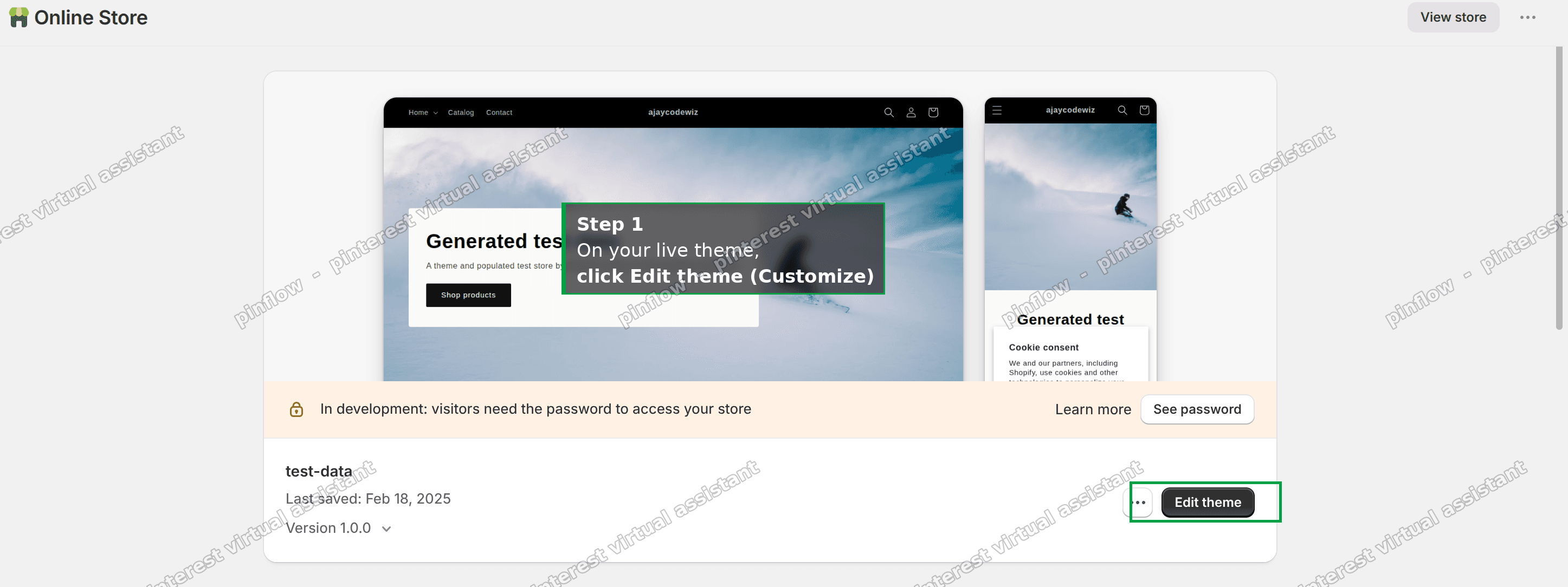 Shopify Themes page, the Edit theme button on your live theme
Step 2. In the editor, click the gear icon (Theme settings) on the left. Scroll down and open Custom CSS. Paste your code in the box, then click Save at the top right.
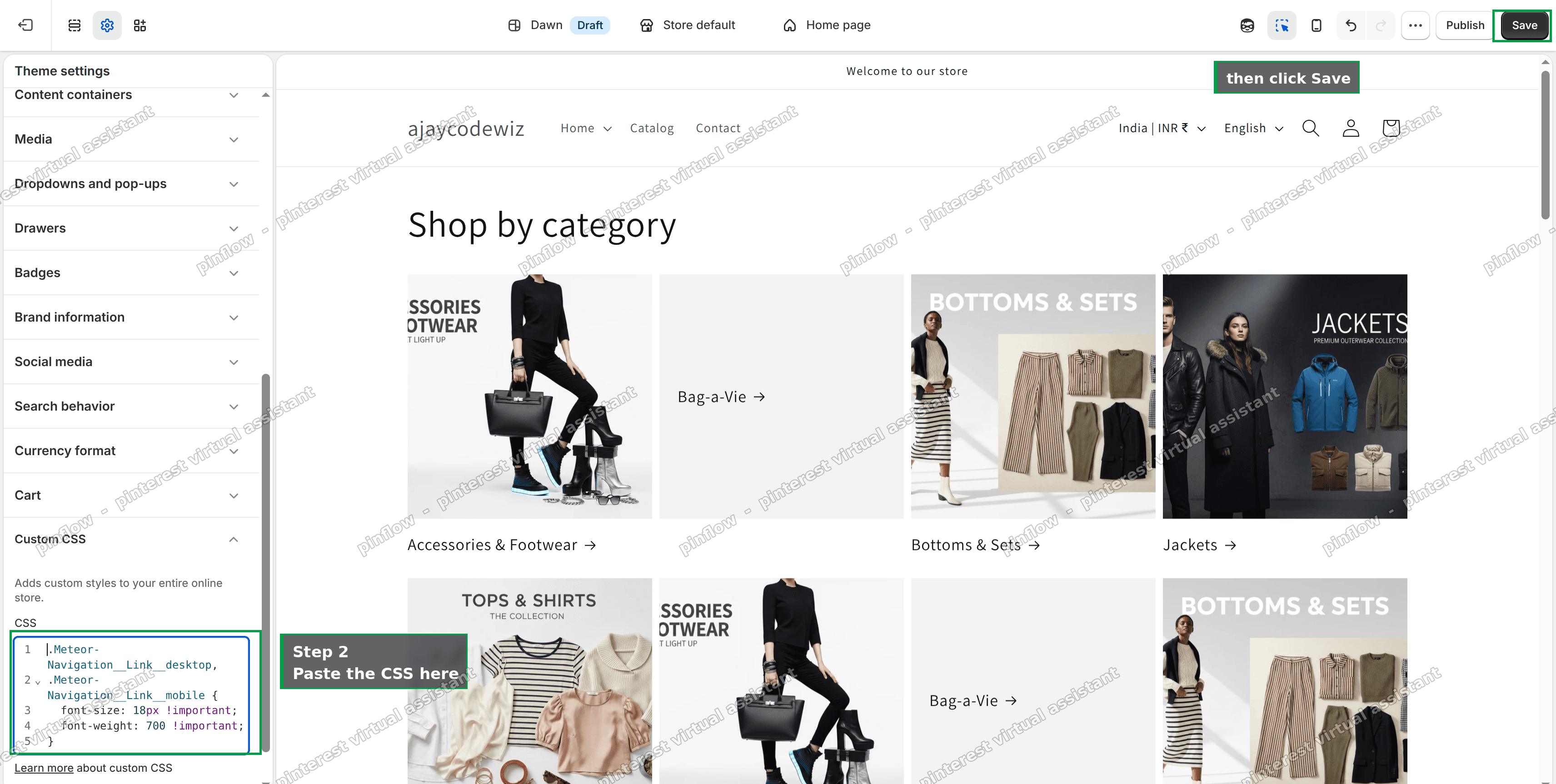 Theme settings panel open on Custom CSS, with code pasted and the Save button
That box adds your styles to the whole store, safely. You are editing a settings field, not the theme's code, so you cannot break anything. If you ever want to undo it, come back and delete the lines.
Case 1: a normal theme menu (Dawn and most free themes)
If your menu is the built-in theme menu, the theme draws it and you target the theme's own menu links.
On Dawn, the free theme most stores start with, the top menu links use the class name header__menu-item. So the CSS is:
.header__menu-item {
  font-size: 18px;
  font-weight: 700;
}
Paste that into Custom CSS and the menu gets bigger and bold.
Before you even do that, check one thing. Some themes have a menu size option built into the header. Open the theme editor, click the Header section, and look for a font size or menu style setting. If it is there, use it, and skip the code entirely. Custom CSS is the fallback for when the theme gives you no setting, which is most of the time.
Case 2: a menu built by an app (Meteor Mega Menu and similar)
This is the case the store owner had, and it is where the usual advice falls apart.
When a menu is built by an app, the app draws its own menu with its own HTML and its own class names. Your theme is not drawing that menu at all. So your theme's font settings never reach it, and neither do the normal theme selectors from Case 1. You have to target the app's own class names.
For Meteor Mega Menu, the class names are Meteor-Navigation__Link__desktop for the top bar and Meteor-Navigation__Link__mobile for the mobile drawer. The CSS that works is:
.Meteor-Navigation__Link__desktop,
.Meteor-Navigation__Link__mobile {
  font-size: 18px !important;
  font-weight: 700 !important;
}
Here is that store's menu before and after the change. The links go from small and light to bigger and bold, on the live storefront.
 Meteor menu before, text small and thin
 Meteor menu after, text bigger and bold
On the real store the desktop links went from 16px and normal weight to 18px and bold. The mobile menu changed too, because the CSS targets both classes.
Why the "clever" selector fails
The store owner was first given a catch-all selector, something like [class*='meteor'] a. The idea is to match any class name that contains the word meteor, then style the links inside it. It looks smart, and it saves you from finding the exact name.
On this store it changed nothing.
I tested both selectors on the live store to be certain. The catch-all did nothing at all. The exact-class version worked instantly. Two reasons, and both are worth knowing for any app menu:
- Class matching is case-sensitive. The app's class is
Meteorwith a capital M. A selector that writesmeteorin lowercase never matches it. A single wrong letter and the whole rule is ignored. - The top links were not inside a matching container. The "links inside it" part had nothing to find, so nothing got styled.
The lesson is simple. For an app menu, do not guess a wildcard. Use the exact class name. If you do not know it, right-click a menu item, choose Inspect, and read the real class name on the link. Then put that in your CSS.
Why the !important matters
You will notice the app version has !important after each value, and the Dawn version does not.
The app ships its own stylesheet that already sets a font size on those links. To make sure your rule wins over the app's rule, you add !important. Without it, your line and the app's line can carry equal weight, and the app can win depending on which stylesheet loads last. !important removes the guessing and makes your change stick.
For a plain theme menu you usually do not need it, but adding it does no harm if a stubborn menu refuses to change.
Make it bigger, smaller, or less heavy
Once the rule is in, tuning it is easy. You are only changing two numbers.
- Size: change
18px. Try anywhere from 16px to 22px. Go up slowly and check the menu does not wrap onto two lines on a laptop screen. - Weight:
700is bold.600is semi-bold, a softer look.500is just a touch heavier than normal.400is normal.
Want it bigger on desktop only, and left alone on phones? Wrap the desktop rule in a screen-size check:
@media (min-width: 990px) {
  .Meteor-Navigation__Link__desktop {
    font-size: 20px !important;
  }
}
That rule only applies on screens 990px wide and up, which is roughly laptops and desktops.
Change the font, color, or spacing too
The same rule holds more than size and weight. Add whatever you want to change:
.Meteor-Navigation__Link__desktop,
.Meteor-Navigation__Link__mobile {
  font-size: 18px !important;
  font-weight: 700 !important;
  letter-spacing: 0.5px !important;
  text-transform: uppercase !important;
}- Font family: add
font-family: 'Georgia', serif !important;to use a different font. Stick to fonts your theme already loads, or the browser falls back to a default. - Color: add
color: #ffffff !important;and use your own hex color. Handy when a bigger, bolder menu needs a different shade to stay readable over your header background. - Spacing:
letter-spacingspreads the letters out. Small values like 0.5px to 1px look intentional. Large values look broken.
Change one thing at a time and Save between each, so you can see what each line does.
Mobile and desktop are often separate
This surprises people. Many menus, Meteor included, build a separate set of links for mobile. That is why the working CSS above lists two class names, one for desktop and one for the drawer. If you only style the desktop class, your phone menu stays small.
On a normal theme menu the mobile version usually uses a different element as well. So after any menu change, open your store on your phone, or shrink the browser window narrow, and check the small-screen menu too.
What to check if nothing changes
If you pasted the CSS and the menu looks the same, run down this list. One of these is almost always the reason.
- You forgot
!importanton an app menu. App menus need it. Add it after each value. - Wrong class name. Inspect a real menu link and copy the exact class. Watch the capital letters.
- You edited a draft theme, not your live one. Make sure the theme you edited is the one that is published.
- Browser cache. Your change is live but your browser is showing an old copy. Do a hard refresh, or check in a private window.
- The size sits on a child element. Rare, but if the link wraps the text in another tag with its own size, target that inner element instead.
Do you need an app or a developer for this? No
For changing menu font size, you do not need either. The Custom CSS box and a few lines cover it completely, and you can undo it any time by deleting the lines.
It is worth being clear about what the menu app is actually for, though, because the answer is not "styling." A mega menu app handles the mobile drawer, the dropdown behavior, keyboard access, and staying intact when you update or switch your theme. That maintenance is the product. The look is a thin layer on top, and that layer is yours to adjust with CSS whenever you like.
So keep the app if you use its menu. Just remember that the font size, weight, color, and font are a five-line CSS change you own, not something you need to pay for or wait on.
Quick recap
- Menu font size is a Custom CSS change, found under Theme settings > Custom CSS.
- A normal theme menu: target the theme's link class, like
.header__menu-itemon Dawn. - An app menu (Meteor): target the app's exact class,
.Meteor-Navigation__Link__desktopand.Meteor-Navigation__Link__mobile, and add!important. - Avoid wildcard selectors like
[class*='meteor']. They are case-sensitive and miss. - Change
18pxfor size and700for weight, and always check the menu on a phone.
Spending too long on manual Shopify busywork?
PinFlow turns your Shopify catalog into Pinterest pins and posts them on a schedule, automatically. Same idea as the fix above, let the system handle the repetitive part.
Get PinFlow on the Shopify App StoreMore Shopify fixes
More community-sourced Shopify guides, tested on a live store.
Themes & Storefront
Shopify Horizon: Carousel Blank Until You Drag It
A Horizon carousel that shows an empty strip until you drag it, then fills in, is usually the theme skipping the painting of slides it thinks nobody is looking at. Here is how to tell that apart from a genuinely broken carousel, and the one line of CSS that covers it.
Themes & Storefront
Shopify Sold Out Overlay: Grey Out Products and Add a Sold Out Box
Shopify themes mark a sold out product with a small pill in the corner of the card. Here is how to turn that pill into a black Sold Out box across the middle of the photo, and fade the photo behind it, with no theme code and no app.
Themes & Storefront
How to Change the Price Font Size on a Shopify Collection Page
Shopify themes have no setting for the price size on a product card. Here is the one rule that shrinks it on collection pages only, where to paste it so it cannot reach your product pages, and how to keep the crossed out sale price in proportion.