
How to Add Custom CSS in Shopify (Beginner Guide)
Custom CSS lets you fix small design problems in Shopify without touching theme code. Here is where to paste it, how to target the right element, and a real example that aligns two image banner boxes. Beginner steps with screenshots.
By AjayCodeWiz · August 25, 2026 · 11 min read
The problem
A merchant asked this on the Shopify Community. Their homepage had two image boxes side by side, a cat box and a dog box. The left box sat lower than the right one, and they wanted the tops to line up. They were a beginner and asked for the CSS to fix it.
That is one of the most common reasons people reach for custom CSS. The theme is 95% right, one small thing is off, and you do not want to hire a developer or edit theme code for a single rule.
This guide shows how to add custom CSS in Shopify the safe way, using that exact alignment problem as the worked example. The store in the screenshots runs the Vitazen theme, but the steps are the same on Dawn, Horizon, and almost every modern theme.
 Two image boxes on a Shopify homepage, the left box sitting lower than the right
What custom CSS is, in plain words
CSS is the language that controls how your store looks. Spacing, colors, sizes, alignment, all of it.
Your theme already ships with thousands of lines of CSS. Custom CSS is a small block of your own that you add on top. It overrides the theme for one specific thing, without changing any theme files.
Two things make it safe for a beginner:
- It lives in its own box, separate from theme code. You cannot break a template by editing it.
- It is easy to undo. Delete the block, click Save, and you are back to normal.
That is the whole idea. You are not rewriting the theme. You are adding one polite instruction that says "for this element, use my value instead."
Where to add custom CSS in Shopify
Shopify gives you two places to paste custom CSS. Picking the right one matters, so here they are side by side.
Per section (the one you want most of the time). Every section in the theme editor has its own Custom CSS box at the bottom of its settings. CSS you paste there only affects that one section. This is the cleanest option, because it keeps your change scoped and easy to find later.
Whole theme. In the theme editor, open Theme settings, then find the Custom CSS box (some themes label it App embeds or Advanced). CSS here applies to every page of your store. Use this only when the change really is site-wide, like a font tweak that should appear everywhere.
For the image box problem, and for most small fixes, the per-section box is the right choice. That is what the steps below use.
How to add custom CSS to a Shopify section, step by step
Here is the exact process. It took under a minute on the test store.
1. Open the theme editor
From your admin, go to Online Store, then Themes, then Customize on your live theme.
2. Click the section you want to change
In the preview, click the section that holds the problem. In this example it is the Image banner with the cat and dog images. Clicking it opens that section's settings in the left panel.
3. Scroll to the Custom CSS box
Scroll to the bottom of the section's settings. You will see a box labelled Custom CSS. It even tells you "Adds custom styles to this section only," which is your confirmation that the change stays scoped.
4. Paste your CSS and Save
Paste your rule into the box and click Save. That is it. The change is live.
For the two misaligned boxes, the rule was:
.banner--image-space-true .grid__item:first-child {
margin-top: 0 !important;
} The Custom CSS box inside a section's settings in the Shopify theme editor
The theme was deliberately dropping the first box down with a top margin to create a staggered look. The rule sets that margin back to zero, so both boxes start on the same line.
 The same two boxes now aligned, both starting on the same line
How to find the right thing to target
The hardest part of custom CSS is not writing it. It is knowing which element to point at. Here is the beginner method.
- Open your storefront in Chrome.
- Right-click the element you want to change and choose Inspect.
- The panel that opens highlights the element and shows its
classnames. - Read the styles on the right. The value causing your problem is usually there, often with the file and line it came from.
In the image box example, inspecting the low box showed a margin-top of 8rem on the first .grid__item. That single value was the whole problem. Once you can see the value in Inspect, your custom CSS just needs to override it.
You do not have to memorise CSS. You need to find the one property that is wrong and set it to the value you want.
Section CSS vs theme CSS: which to use
This trips people up, so here it is plainly.
Section Custom CSS only affects the section you pasted it into. If you have three image banners and only want to fix one, this keeps the other two untouched. It is the safer default.
Theme Custom CSS affects the whole store. It is right for global changes, but risky for one-off fixes, because a broad selector can accidentally hit other pages.
A good rule: start with the section box. Move up to theme-wide only when you genuinely need the change everywhere.
Does custom CSS apply to products you add later?
Yes. This is the question that arrives once your rule is working: you have styled one product page, and next week you add ten more products. You do not have to open the theme editor ten more times, and the reason is where Shopify puts the code.
The Custom CSS box is not attached to the product you happened to have open in the preview. It is saved into the template that the page is built from. A template is the reusable layout a page type uses: one file that decides which sections appear, in what order, with which settings. Every theme ships with one called Default product, and unless you deliberately change it, every product in your catalogue is drawn by that same template.
Paste a rule into a product section's Custom CSS box and you have edited the template, not the product. Products you create afterwards are drawn by the same template, so they arrive with the styling already on them.
Here is a product created after the CSS was saved, with the theme editor never reopened in between. The size label and the value are already uppercase and the dropdown already has its blue focus ring.
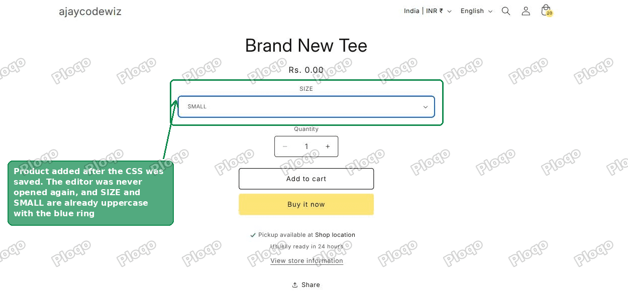 A newly created Shopify product page already showing the custom styling, with an uppercase size label and a blue ring on the dropdown
Deleting a product does not touch the code either. The rule lives in the template, so removing one of the pages that uses it leaves it exactly where it was.
The one case where it does not carry over
There is a single exception, and it is easy to check.
Shopify lets you build more than one product template. Shops do this when a few products need a different page shape, such as a bundle that needs extra sections or a made-to-order item with its own form. Each template is a separate file with its own settings, which means each one has its own Custom CSS box.
If you assign a product to one of those other templates, it is no longer drawn by the template holding your rule, so the styling will not appear on it.
To check which template a product uses, open the product in your admin and look at the right hand column, near the bottom. The card is labelled Theme template. On a normal product it reads Default product.
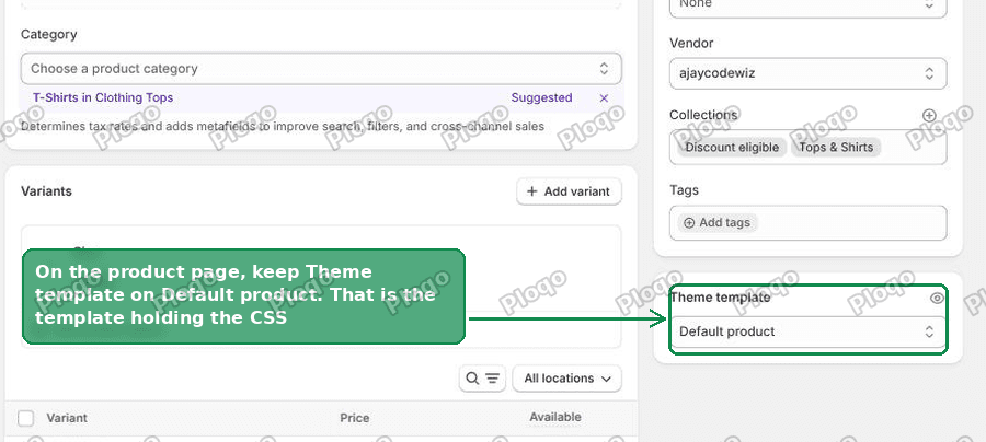 The Theme template card on a Shopify product page in the admin, set to Default product
Leave it on Default product and there is nothing more to do. If you do need a second template, open that template once in the theme editor and paste the same CSS into its own Custom CSS box. That is once per template, which is usually once or twice in the life of a shop, rather than once per product.
What does remove it
Two things, and neither happens by accident.
- You edit or clear the box yourself. The rule stays until you change it.
- You switch to a different theme. The code is stored inside the theme, not inside your store, so a brand new theme starts with an empty box. Duplicating your current theme is different: the copy carries every template across, Custom CSS included, which is why duplicating before a big change is the usual advice.
That is also the answer to "is custom CSS permanent?". It is as permanent as the theme it sits in. It survives new products, deleted products, product edits, and normal theme editor work. It does not survive being replaced by a different theme.
When to use !important
You will see !important in a lot of Shopify CSS answers, including the one above. Here is what it does and when to reach for it.
Your theme's own rule and your custom rule can have the same strength. When that happens, the theme can win and your change does nothing. Adding !important forces your value to take priority.
Use it when a plain rule has no effect even though the selector is correct. Do not sprinkle it everywhere by default, because once everything is !important, nothing is, and future overrides get harder. For a single scoped fix like the alignment one, it is fine and often needed.
What to check if your custom CSS is not working
If you pasted a rule and nothing changed, run through these in order. One of them is almost always the cause.
- Wrong selector. The class you targeted is not the one on the element. Re-check it in Inspect. Class names are case sensitive, so
Bannerandbannerare different. - The theme is winning. Your rule is being overridden. Add
!importantto the property, or make the selector more specific. - You edited the wrong section box. Section CSS only affects that section. If you pasted it into a different section, it will not reach the element.
- You did not Save. The theme editor needs an explicit Save. If the button stayed greyed out, click into the box, add a space, delete it, then Save.
- Browser cache. You saved, but your phone or browser is showing the old version. Reload, or check in a private window.
Common Shopify custom CSS snippets
Once you know where the box is, a lot of small requests become one-liners. Here are a few that come up constantly. Always confirm the class names on your own theme with Inspect first.
Hide an element on mobile only:
@media (max-width: 749px) {
  .your-element { display: none !important; }
}
Center a heading:
.your-heading { text-align: center; }Add space above a section:
.your-section { margin-top: 40px; }Make a button full width:
.your-button { width: 100%; }These are starting points, not copy-paste magic. Swap .your-element for the real class you find in Inspect, paste into the section box, and Save.
Custom CSS vs editing theme code
People often ask whether they should just edit the theme code instead. For small visual fixes, custom CSS is the better tool, and here is why.
Editing theme code means opening the code editor and changing .liquid or .css files. It is powerful, but a theme update can overwrite your change, and a typo can break a template. Custom CSS in the section box survives normal theme edits and cannot break a template, because it is additive.
Reach for theme code when you need new markup or logic that CSS cannot express. For spacing, alignment, colors, sizes, and visibility, custom CSS is faster and safer.
The no-code alternative
Before you write any CSS, it is worth checking the section's own settings. Many staggered or offset layouts, like the image box example, come from a toggle in the section itself.
In that example, the Image banner had an image-offset option turned on. Turning it off aligns the boxes with no code at all. So the order to work in is: check the section settings first, and only add custom CSS if there is no setting for what you want.
The short version
- Custom CSS is a small block of your own styles that overrides the theme without touching theme files.
- The best place for most fixes is the section's own Custom CSS box, at the bottom of its settings in the theme editor.
- Use Inspect in Chrome to find the exact class and the value that is wrong.
- Add
!importantonly when a correct rule is being overridden. - Check the section's built-in settings first, since a toggle often does the job with no code.
That is how to add custom CSS in Shopify safely. One scoped rule, pasted in the right box, fixed two misaligned image boxes in under a minute, and the same approach handles most of the small design problems a theme leaves behind.
Spending too long on manual Shopify busywork?
PinFlow turns your Shopify catalog into Pinterest pins and posts them on a schedule, automatically. Same idea as the rule above, let the system handle the repetitive part.
Get PinFlow on the Shopify App StoreMore Shopify fixes
More community-sourced Shopify guides, tested on a live store.
Themes & Storefront
Shopify AI Section: Fix a Price Badge Hidden Behind the Image
You built a section with Shopify's AI section generator, but the price badge on each card sits behind the photo. Here is the Custom Liquid fix that brings it to the front without regenerating anything. Tested on a Dawn store.
Themes & Storefront
Hide Shipping Calculated at Checkout on One Shopify Product
The line under Add to cart that says shipping is calculated at checkout shows on every product, gift cards included. Here is how to hide it on one product only, with the code, screenshots and the Eclipse theme steps.
Themes & Storefront
Shopify Dropdown Menu Behind Page Content (Z-Index Fix)
Your Shopify dropdown or mega menu opens, but the page title and products sit on top of its links and the menu closes before you can click. The fix is one Custom CSS rule in Theme settings. Tested on a Rebel store.