
Shopify Button Hover Color: Remove the Grey
Buttons turn grey on hover in Shopify Horizon, and it sticks after a tap on mobile. The CSS that keeps your button colour, scoped so checkout stays safe.
By AjayCodeWiz · July 31, 2026 · 10 min read
The problem, in the words a merchant would use
A merchant asked about this on the Shopify Community. Their buttons looked fine until someone clicked or tapped them. Then a grey wash appeared over the button. On a phone the grey stayed on the button until they tapped somewhere else on the page.
It looked worst on secondary buttons and custom buttons, but it showed up on the main buttons too.
Their store runs the Horizon theme. This is Shopify's newer free theme, and it behaves differently from Dawn, so the old Dawn fixes people paste in do not always work here.
I reproduced it on a Horizon test store. Here is the grey appearing on hover.
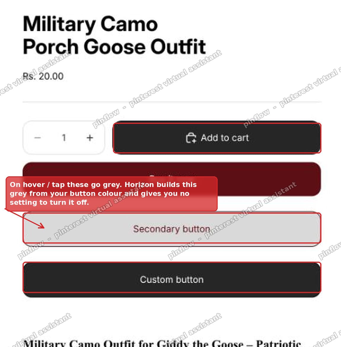 Horizon buttons turning grey on hover
If you searched for something like "shopify button hover color", "shopify button turns grey", or "remove hover effect on button Shopify", this is the same issue. The fix below keeps the button the same colour on hover, so nothing changes when a visitor points at it or taps it.
Why Horizon turns your button grey
This is the part the quick answers skip, and it is the reason the fix works.
Horizon has no colour picker for the hover state. You cannot go into the theme settings and set a hover colour. There is no such setting.
Instead, Horizon builds the hover colour for you. It takes your normal button colour and shifts it automatically to create a "hover" version. For a dark button, that automatic shift lightens the colour. A dark button becomes a lighter, washed out grey the moment you hover it.
So the grey is not a bug and it is not an overlay you can simply hide. It is the hover colour Horizon calculated from your button colour.
Horizon does this with CSS variables. A CSS variable is just a named value the theme reuses in many places, written like --button-background-color. On hover, Horizon points those button variables at its auto-derived hover colours. That is the whole mechanism.
Once you know that, the fix is obvious. You do not need to fight the grey with heavy overrides. You just tell the button to use its normal colours on hover as well. If the hover colour equals the normal colour, nothing changes on hover, and the grey never appears.
Why the grey "sticks" after a tap on mobile
The merchant described it as happening "on click", not on hover. That wording is a clue.
On a desktop with a mouse, hover is a real, live state. You point at the button, it goes grey, you move away, the grey clears. Annoying, but it comes and goes.
On a phone there is no mouse and no real hover. When you tap a button, the browser fakes a hover state for that tap. But nothing moves away afterwards, so the faked hover stays applied. The button holds the grey until you tap a different element and the browser moves the hover somewhere else.
So on mobile the grey looks like it triggers on click and then gets stuck. It is the same hover colour as on desktop. It just has no natural way to clear on a touch screen.
This is why the fix matters more on mobile. Removing the hover colour change removes the stuck grey at the same time.
The fix: keep the button colour on hover
Add a small piece of CSS to your theme. It sets the hover colours equal to the normal colours, so the button does not change when hovered or tapped.
The code
.button:hover,
.button-custom:hover,
button.shopify-payment-button__button--unbranded:hover:not([disabled]) {
  --button-background-color: var(--color-primary-button-background);
  --button-color: var(--color-primary-button-text);
  --button-border-color: var(--color-primary-button-border);
}
.button-secondary:hover {
  --button-background-color: var(--color-secondary-button-background);
  --button-color: var(--color-secondary-button-text);
  --button-border-color: var(--color-secondary-button-border);
}
Read that in plain terms. On hover, set the button background, text, and border back to your primary button colours. The secondary button block does the same with your secondary button colours. Because these are your real theme colours, the button looks identical before and after hover.
Notice it names the payment button on purpose. That is the checkout button. Naming it here, with its own primary colours, is what keeps the checkout button safe. More on that in the failure-mode section below, because it is exactly where the merchant first hit trouble.
Where to put it
- Go to Online Store > Themes.
- Click the ... menu next to Horizon, then Edit code.
- Open assets/base.css.
- Paste the code at the very bottom of the file, then click Save.
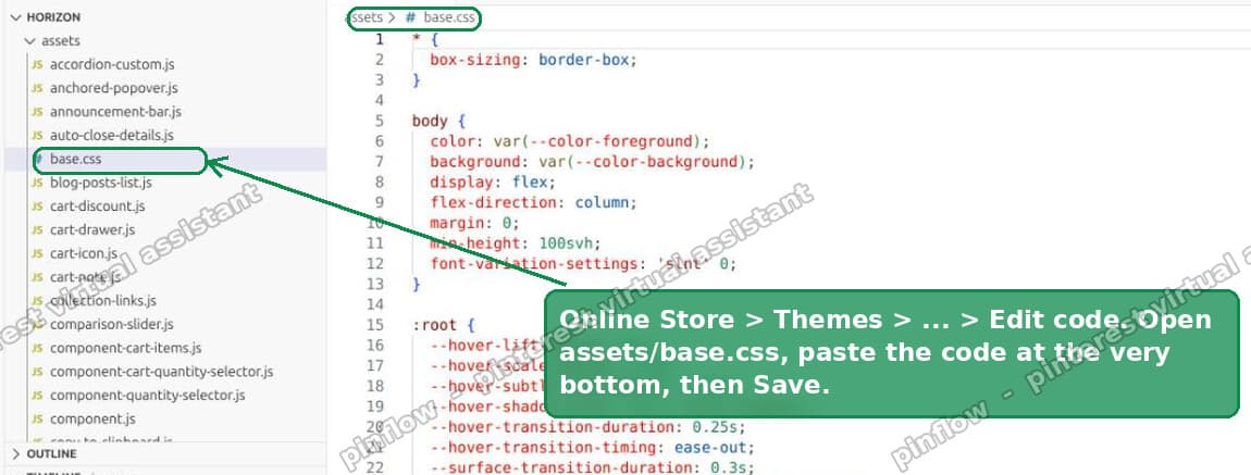 Edit code, then open assets base.css and paste at the bottom
That covers the Add to cart button, secondary buttons, and custom buttons. After you save, the grey is gone and nothing sticks after a tap.
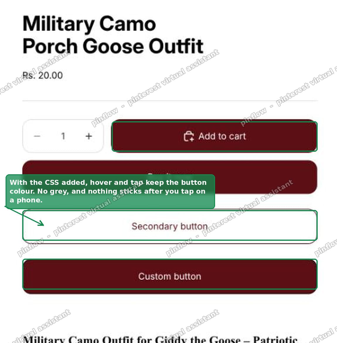 Buttons keep their colour after the fix, no grey on hover
I tested this on a Horizon store. The buttons hold their colour on hover on desktop, and on mobile the grey no longer sticks after a tap.
Want a hover colour instead of none?
Removing the change is one option. Some merchants do want a hover effect, just not the auto grey. You can pick your own.
Change the background line in the first block to any colour you like. For example:
--button-background-color: #5c0f14;Now the button turns that exact colour on hover instead of the grey Horizon would have chosen. You are in control of the hover colour, which is the setting Horizon does not give you in the editor.
Do the same in the secondary block if you want secondary buttons to have their own hover colour.
What to check if the checkout button looks off
This is the failure mode the merchant actually hit, so it is worth its own section.
A common first attempt is a broad rule like this:
.button:hover {
  background-color: transparent;
}
That looks tidy, but .button:hover matches every button on the store. The checkout button on the cart is also a button. So this broad rule strips the checkout button's background too, and the checkout button suddenly looks wrong. That is exactly what happened here. The grey went away, but the checkout button at the cart no longer looked right.
The lesson is to scope your CSS. Do not blanket every button. Target the buttons you mean, and give the payment button back its own colours rather than blanking it.
Two ways to stay safe:
- Use the code in the fix above. It names the payment button and restores its primary colours, so checkout stays correct.
- Or, if you only want to touch secondary and custom buttons, target just those and leave
.buttonalone entirely:
.button-secondary:hover,
.button-custom:hover {
  --button-background-color: var(--color-secondary-button-background);
  --button-color: var(--color-secondary-button-text);
  --button-border-color: var(--color-secondary-button-border);
}
If the grey is only bothering you on one specific button, scope to that button. Right-click it, choose Inspect, read the class on the button, and use that class instead of .button. A narrow selector never breaks checkout.
How do I change button color in Shopify Horizon?
Your base button colours do have a setting, even though the hover colour does not.
- Open the theme editor: Online Store > Themes > Customize.
- Open Theme settings, then Colors.
- Horizon uses colour schemes. Edit the scheme your buttons use, and set the button background, text, and border there.
That changes the normal button colour across the store. The hover colour is the one thing that setting does not expose, which is why the CSS above exists. Set your base colour in the editor, then use the CSS only to control what happens on hover.
Why does my Shopify button turn grey?
Almost always for one of these reasons:
- Horizon (or a similar newer theme) derived the hover colour from your button colour. A dark button lightens to grey on hover. This is the case in this article.
- A Dawn-style overlay. Dawn and many Dawn-based themes draw a semi-transparent layer over the button on hover using an
::afterpseudo-element. That reads as a grey sheen. The fix there is different: hide that overlay, not the variables. - The theme editor selection state. Inside the customizer, Shopify draws its own highlight over the section you are editing. That is not your live button style. Always confirm on the real storefront in a separate tab before you write any CSS.
To find out which one you have, right-click the button, choose Inspect, hover it, and watch which rule lights up in the Styles panel. On Horizon you will see the --button- variables change. That confirms you need the variable fix in this article.
Hover, active, and focus are not the same thing
These three states get mixed up, and they explain a lot of "grey button" confusion.
Hover is when a pointer is over the button. On a phone there is no true hover, so a tap fakes it and it can stick, as covered above.
Active is the split second while the button is actually being pressed. Some themes darken or shift the button during the press. That flash is normal and usually fine to leave alone.
Focus is when the button is selected by keyboard or after a tap, often shown as an outline. Do not remove the focus outline. It is what keyboard users and screen-reader users rely on to see where they are. It is an accessibility feature, not a style bug.
The grey in this thread is the hover colour. That is the one to change. Leave active and focus alone unless you have a specific reason.
What the Horizon button CSS variables mean
You do not need to memorise these, but knowing them helps you read the fix.
--button-background-coloris the fill colour of the button.--button-coloris the text colour inside the button.--button-border-coloris the button's border colour.--color-primary-button-background,--color-primary-button-text, and--color-primary-button-borderare your primary button colours from the colour scheme.- The
--color-secondary-button-*variables are the same three values for secondary buttons.
The fix simply says: on hover, set the first group equal to your saved primary or secondary colours. Same colour on hover as at rest, so no change and no grey.
A few last notes
- Test on the live storefront, not inside the customizer. The editor draws its own overlay that can look like a grey hover but is not.
- Re-add the CSS after a theme update. Editing
base.cssis a code change. If you update Horizon to a new version later, the change can be replaced, so keep a copy and paste it back if the grey returns. - Scope beats force. A single narrow selector aimed at the right button is safer and cleaner than a broad rule plus a pile of
!important. Broad rules are what break checkout.
The grey is not something you did wrong. It is Horizon choosing a hover colour for you. Once you set the hover colour to match your button colour, the grey is gone on desktop and it stops sticking on mobile.
Spending too long on manual Shopify busywork?
PinFlow turns your Shopify catalog into Pinterest pins and posts them on a schedule, automatically. Set your storefront up once, then let the system handle the repetitive part.
Get PinFlow on the Shopify App StoreMore Shopify fixes
More community-sourced Shopify guides, tested on a live store.
Themes & Storefront
Shopify Horizon: Carousel Blank Until You Drag It
A Horizon carousel that shows an empty strip until you drag it, then fills in, is usually the theme skipping the painting of slides it thinks nobody is looking at. Here is how to tell that apart from a genuinely broken carousel, and the one line of CSS that covers it.
Themes & Storefront
Shopify Sold Out Overlay: Grey Out Products and Add a Sold Out Box
Shopify themes mark a sold out product with a small pill in the corner of the card. Here is how to turn that pill into a black Sold Out box across the middle of the photo, and fade the photo behind it, with no theme code and no app.
Themes & Storefront
How to Change the Price Font Size on a Shopify Collection Page
Shopify themes have no setting for the price size on a product card. Here is the one rule that shrinks it on collection pages only, where to paste it so it cannot reach your product pages, and how to keep the crossed out sale price in proportion.