
Add an Account Dropdown Menu in Shopify Horizon
Fix the Shopify Horizon account menu that jumped to the far right edge. A small Custom Liquid CSS block reanchors the dropdown under the account icon.
By AjayCodeWiz · August 5, 2026 · 11 min read
The problem
A merchant asked about this on the Shopify Community.
The account icon in their header used to open a small menu right under the icon. Login, orders, and profile links all sat neatly below it.
Then, over two days, it changed on its own. The menu now opened stuck to the far right edge of the screen. It floated past the account icon, not under it.
The merchant had not touched the theme. All their apps were disabled. They ran the Ride theme, then published Horizon to check, and saw the exact same thing.
That is the tell. It is not a Ride bug and not a Horizon bug. It is a Shopify change to a shared login element.
I reproduced it on a test store on the Horizon theme. Same result. The account menu opened flush to the far right edge of the header.
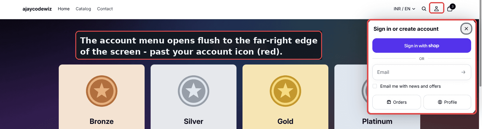 Shopify Horizon account menu opening at the far right edge of the header instead of under the account icon
In the shot above, the red box on the right is the account icon. The wide red box is the menu. It has slid all the way to the screen edge. The gap between the icon and the menu looks broken, even though every link inside still works.
If you searched for a way to fix your shopify account dropdown and landed here, this is the same issue. Below is the small fix I tested, plus a no-code path and answers to the questions that come up around it.
Why it happens
This is the part most forum answers skip, so let me explain it plainly.
The account icon in Horizon is not built by the theme. It is a Shopify web component called shopify-account. Think of a web component as a small, self-contained widget that Shopify drops into the page. The theme just places it in the header.
The menu that opens is a popover. A popover is a floating panel that sits on top of the page. Shopify renders it inside the component using a shadow part named dialog. A shadow part is a slice of the widget's internals that the theme is allowed to style from outside.
Here is the key point. Because the icon is Shopify's own element, and the same element ships on every Horizon-based theme, one Shopify update changes it everywhere at once. Ride, Horizon, and any theme in the Horizon family all move together.
Shopify updated how the popover positions itself on desktop. It now anchors to the right edge of the header. Before, it anchored under the icon. Nothing in your theme code changed. Nothing in your apps changed. That is why turning apps off did nothing, and why the theme developer could not fix it in their own code.
So the account menu is still there. It still works. It is just parked in the wrong spot.
Prerequisite check: are you on a Horizon-based theme?
This fix is for the new Horizon family of themes. That includes Horizon itself, Ride, and other themes built on the same engine.
To confirm, open your store, click the account icon, and watch where the menu appears. If it slides to the far right edge on desktop, you are in the right place.
If you run an older theme like Dawn or Debut, your account link behaves differently. It usually goes straight to a login page instead of opening a popover. That case is not what this article fixes.
The fix: pull the account menu back under the icon
The plan is simple. We add a tiny block of CSS that tells the popover to anchor under the account icon again. We do not touch any theme file. We do not edit the header code. We add one Custom Liquid section that loads on every page.
A Custom Liquid section is a theme block where you can paste your own HTML, CSS, or Liquid. It is safe, and you can remove it any time.
Step 1. Open the theme editor
- Go to Online Store.
- Go to Themes.
- Click Customize on your live theme.
Step 2. Add a Custom Liquid section in the footer
- In the left panel, scroll down to the Footer group.
- Click Add section.
- Choose Custom Liquid.
I put it in the footer on purpose. The footer shows on every page. So the fix applies site-wide, not just on the home page.
Step 3. Paste the code and save
- Click into the Liquid code box.
- Paste the snippet below.
- Click Save.
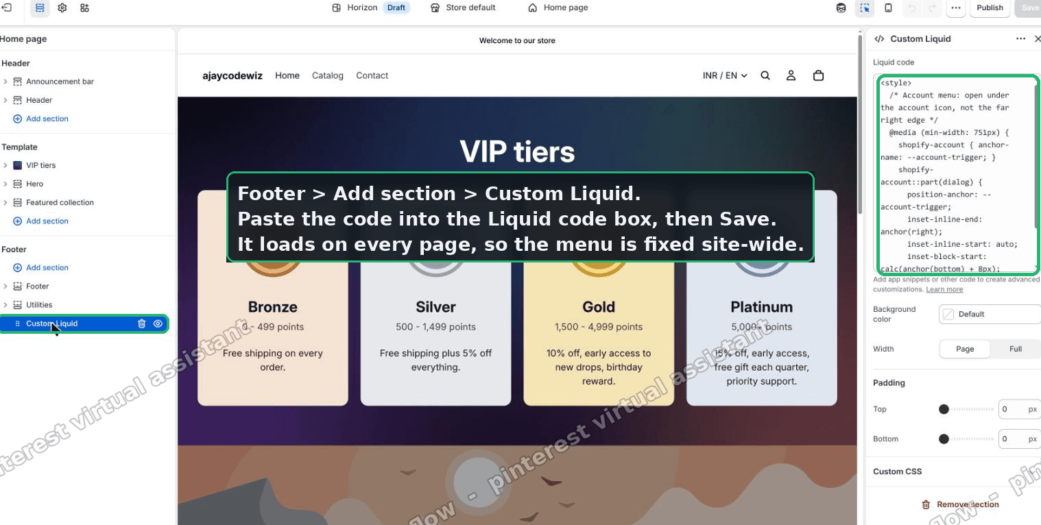 Adding a Custom Liquid section in the Shopify Horizon footer and pasting the account menu CSS
Here is the exact code I used:
<style>
  @media (min-width: 751px) {
    shopify-account { anchor-name: --account-trigger; }
    shopify-account::part(dialog) {
      position-anchor: --account-trigger;
      inset-inline-end: anchor(right);
      inset-inline-start: auto;
      inset-block-start: calc(anchor(bottom) + 8px);
    }
  }
</style>
Let me translate what each line does in plain words.
- The
@media (min-width: 751px)line means the rule only runs on desktop. On phones the menu already sits fine, so we leave it alone. anchor-name: --account-triggergives the account icon a name. Now other elements can pin themselves to it.shopify-account::part(dialog)reaches into the widget and grabs the popover panel.position-anchor: --account-triggertells the popover to pin itself to the named icon.inset-inline-end: anchor(right)lines up the popover's right edge with the icon's right edge.inset-inline-start: autolets the left side grow naturally.inset-block-start: calc(anchor(bottom) + 8px)drops the popover 8 pixels below the icon, so it sits just under it.
Step 4. Check the result
After saving, click the account icon on your desktop storefront. The menu should now open right under the icon. Its right edge lines up with the icon.
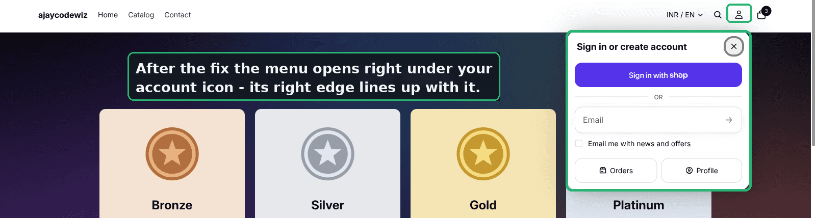 Shopify Horizon account menu fixed and opening as a dropdown right under the account icon
I tested this on a Horizon store. I added exactly this as a Custom Liquid section. The popover moved from the far edge to right under the account icon. That is the whole fix.
To nudge it left or right, change anchor(right). For example, calc(anchor(right) + 20px) shifts it 20 pixels to the right.
An alternative: a shorter no-code style tweak
If your theme has a Custom CSS field, you can skip the Custom Liquid section and use that instead.
Some Horizon-based themes expose a Custom CSS box under Theme settings. If yours does, paste the same rule there. The result is the same.
There is also a shorter version of the CSS. The merchant in the thread found it worked on their own store:
shopify-account::part(dialog) {
  right: 0 !important;
  left: auto !important;
  transform: none !important;
}
This pins the popover to the right side and cancels any offset that pushed it away.
A note on the two approaches. The anchor version ties the menu to the icon, so it stays lined up even if your header layout shifts. The short version pins to the container edge, which is simpler but less precise. Try the anchor version first. Fall back to the short one if your header is unusual.
Either way, you are not changing Shopify's element. You are only styling the panel it renders.
Will Shopify add a setting to move the account menu?
Right now there is no built-in setting to move it left, center, or right.
The merchant asked Shopify support about this. Support said the far right position is the new standard placement. They forwarded the request for a position setting to their team. So a real toggle may come later.
Until then, the CSS above is the way to control it. It is small and reversible, so there is no harm in using it now.
How do I add login, orders, and logout links to the Shopify header?
The good news is you do not build these from scratch on Horizon.
The shopify-account element already carries them. When a visitor clicks the icon, the menu shows Sign in, Orders, and Profile. Once they log in, it shows their account and a way to sign out.
So your job on a Horizon shopify header account menu is placement, not content. Shopify manages the links. You manage where the panel appears. The fix in this article handles that placement.
If you want extra links in that area, like a wishlist or a support page, that is a bigger customization. It usually needs a custom snippet or an app, since you cannot inject items into Shopify's own popover.
How do I make the account icon open a dropdown instead of a page?
On Horizon-based themes, the account icon already opens a dropdown popover, not a page. That is the default.
If clicking your icon sends you straight to a login page, you are likely on an older theme like Dawn. Older themes link the icon to /account. There is no popover to reposition, because there is no popover at all.
To get a true shopify account icon dropdown on an older theme, you would need to build a custom menu yourself. That is more work than the Horizon fix. On Horizon, the dropdown is free, and you only fix its position.
Why does the account menu look different on mobile and desktop?
The menu is responsive. It changes shape based on screen size.
On mobile, the popover usually opens as a wide sheet that fits the small screen. It looks fine there, which is why our fix skips phones with the min-width: 751px line.
On desktop, the popover floats near the icon. That is where the far right jump happened. So we only correct desktop. This keeps the mobile view untouched and safe.
Always check both after any header change. A rule that helps desktop can sometimes shift the mobile layout, so a quick look on a phone is worth it.
If it did not work
A few things can stop this fix from landing. Here is what to check.
- You saved it in the wrong theme. The Custom Liquid must be in the live theme, or in the theme you are previewing. If you edit a draft and view the live site, you see no change.
- Browser support. This works in Chrome, Edge, and Safari. In Firefox the menu may stay at the edge for now, because Firefox does not fully support CSS anchor positioning yet. The menu still works, so the rule does no harm. It just does not move there.
- A theme or app already forces a position. If another snippet sets the popover position with
!important, it can override this. Try the short!importantversion from the alternative section above. - Cache. Hard refresh the storefront after saving. Old CSS can linger for a minute.
- You are on mobile. The rule is desktop-only by design. On a phone the menu will not move, and that is expected.
The merchant hit this at first. It did not work until they spotted a leftover rule in their own CSS file that was fighting the fix. Once they removed it, the menu snapped into place. So if nothing moves, search your theme's Custom CSS for any existing shopify-account rule and clear it.
Definitions and distinctions people confuse
A few terms get mixed up in these threads. Here is a clean version of each.
- Account icon. The small person icon in the header. On Horizon it opens a menu.
- Account menu or popover. The floating panel that opens under the icon. Same thing, two names. This is your shopify customer account dropdown.
- shopify-account. Shopify's own web component that draws the icon and the menu. It is not part of your theme, so theme edits and app toggles do not change it.
- Shadow part. A named piece of a web component that outside CSS can style. Here it is the
dialogpart, the popover panel. We target it with::part(dialog). - Anchor positioning. A newer CSS feature that pins one element to another. We name the icon, then anchor the popover to it. That is what keeps them lined up.
- Custom Liquid section. A theme block where you paste your own code. We use it to load the CSS on every page without editing core files.
One last distinction, since it causes real confusion. Horizon is built by Shopify. Ride and other Horizon-family themes share Shopify's login element. So a change to that element shows up on all of them at once. That is not your theme breaking. It is one shared component moving. And a small, reversible CSS rule is all it takes to put the menu back where your customers expect it.
Spending too long on manual Shopify busywork?
PinFlow turns your Shopify catalog into Pinterest pins and posts them on a schedule, automatically. Same idea as the rule above, let the system handle the repetitive part.
Get PinFlow on the Shopify App StoreMore Shopify fixes
More community-sourced Shopify guides, tested on a live store.
Themes & Storefront
Shopify AI Section: Fix a Price Badge Hidden Behind the Image
You built a section with Shopify's AI section generator, but the price badge on each card sits behind the photo. Here is the Custom Liquid fix that brings it to the front without regenerating anything. Tested on a Dawn store.
Themes & Storefront
Hide Shipping Calculated at Checkout on One Shopify Product
The line under Add to cart that says shipping is calculated at checkout shows on every product, gift cards included. Here is how to hide it on one product only, with the code, screenshots and the Eclipse theme steps.
Themes & Storefront
Shopify Dropdown Menu Behind Page Content (Z-Index Fix)
Your Shopify dropdown or mega menu opens, but the page title and products sit on top of its links and the menu closes before you can click. The fix is one Custom CSS rule in Theme settings. Tested on a Rebel store.