
Add a Hover Animation to Shopify Buttons
Add a hover animation to Shopify buttons: a slide-fill, lift or scale effect via a small CSS block that works across themes.
By AjayCodeWiz · August 8, 2026 · 10 min read
The problem
A merchant asked about this on the Shopify Community. They wanted a hover animation on their Add to cart button. The idea was a black background that slides in when you move the mouse over the button. The text would turn white at the same time.
They already had CSS ready. They pasted it into their theme. Nothing happened. The button stayed plain.
Here is the CSS they tried:
.button-secondary.button-secondary-background-slide::before {
  content: '';
  position: absolute;
  background-color: var(--accent-color);
  transform: scaleX(0);
  transform-origin: left;
  transition: transform 300ms ease-in-out;
}
It looks correct. The animation logic is fine. But it targets classes and a colour variable that their theme does not use. So the browser matched nothing and drew nothing.
This is the most common reason a Shopify button hover animation fails. The code is right. The selector is wrong. A selector is the part of a CSS rule that says which element to style. If it names a class the button does not have, the rule is skipped.
I reproduced this on a test store running Horizon, one of Shopify's newer free themes. I confirmed the button uses a different class than the merchant's CSS expected. Then I wrote a version that targets the real one. Below is the whole fix, plus a few other hover styles you can swap in.
Why it happens
Every theme names its buttons its own way. There is no single button class shared across all Shopify themes.
The merchant's snippet used .button-secondary.button-secondary-background-slide. That class pair comes from a different theme. On Horizon the Add to cart button carries the class .add-to-cart-button instead. So the rule never applied.
Two other things stopped their code from working:
- The colour variable did not exist. Their code used
var(--accent-color). A CSS variable is a named value the theme defines once and reuses. Horizon has no variable called--accent-color, so that line produced no colour at all. - Curly quotes. Their
contentvalue used smart quotes (the slanted kind a word processor makes) instead of straight quotes. CSS only accepts straight quotes. Smart quotes make the whole rule invalid.
So the fix is not about the animation. The slide effect they wrote is good. The fix is about pointing it at the right button and using values the theme understands.
Find your button's real class first
Before you paste any code, check what your Add to cart button is actually called. This one step saves the most time.
- On your live store, open a product page.
- Right-click the Add to cart button and choose Inspect.
- A panel opens with the page code. The highlighted line is your button.
- Look for its
class="...". Note the class names.
On Horizon you will see add-to-cart-button. On Dawn you often see product-form__submit and button. On other themes it will be something else again. Whatever you see is the selector you target.
If you skip this and copy a snippet built for another theme, you will hit the exact wall the merchant hit. The animation is invisible because the selector matches nothing.
The fix
Here is the version that works on Horizon. Black slides in from the left on hover. The text turns white. When you move the mouse away, the black slides back out.
I add it through a Custom Liquid block. That is a small box in the theme editor where you can drop your own HTML and CSS. It keeps your change separate from the theme's own files, so a theme update will not wipe it.
Step 1. See the button at rest.
This is the plain Add to cart button before any change. Note the outline style with no fill.
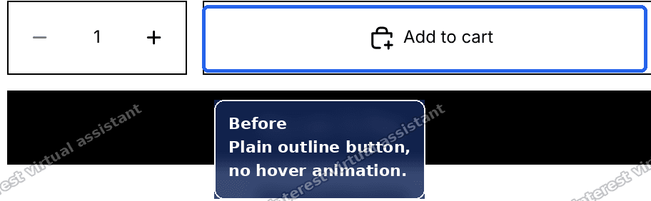 Plain Add to cart button before the hover animation is added
Step 2. Add a Custom Liquid section.
- Open your theme editor.
- Go to a product page inside the editor.
- Scroll the left sidebar and click Add section at the bottom.
- Type Custom Liquid in the search box.
- Click the Custom Liquid result.
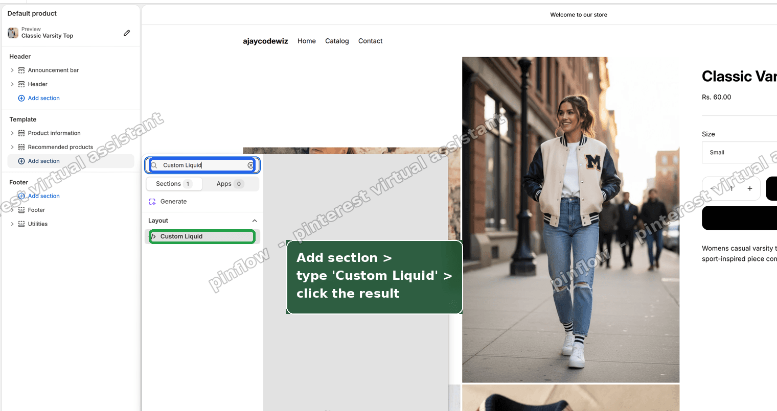 Add section, search Custom Liquid, and click the result
Step 3. Paste the code and save.
Paste this into the Liquid code box, then click Save.
<style>
.add-to-cart-button { position: relative; overflow: hidden; isolation: isolate; }
.add-to-cart-button::before {
content: "";
position: absolute;
inset: 0;
z-index: -1;
background-color: #000;
transform: scaleX(0);
transform-origin: left;
transition: transform 300ms ease-in-out;
}
.add-to-cart-button:hover::before,
.add-to-cart-button:focus-visible::before { transform: scaleX(1); }
.add-to-cart-button:hover,
.add-to-cart-button:focus-visible { color: #fff; --button-color: #fff; }
</style>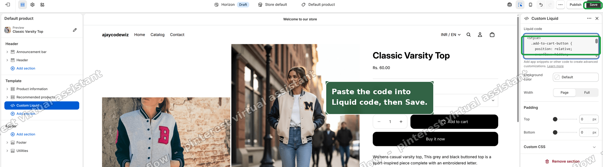 Paste the code into the Liquid code box and click Save
Step 4. Check the result.
Move your mouse over the button. The black fills in from the left. The text turns white. Move away and it slides back out.
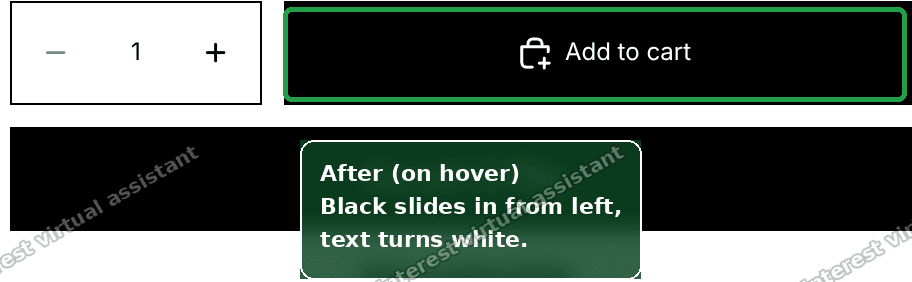 Add to cart button on hover with black sliding in and white text
I tested this on a Horizon store. The black fills in from the left on hover, the text turns white, then slides back out when you move away.
How each line does its job, in plain words:
position: relativeandoverflow: hiddenlet the coloured layer sit inside the button and stay clipped to its shape.::beforeis a hidden layer added behind the text. It holds the black colour.transform: scaleX(0)squashes that layer to zero width at rest, so you see nothing.- On hover,
scaleX(1)stretches it back to full width.transform-origin: leftmakes it grow from the left edge. transition: transform 300msmakes that growth take 300 milliseconds instead of snapping instantly.- The last rule flips the text to white while hovering, so it stays readable on the black.
Adjust it
The code has three knobs you can change with no CSS knowledge.
- Fill colour.
background-color: #000is black. Change#000to any hex colour. For example#c0392bfor red or#1a5c38for green. - Speed.
300msis the animation time. Lower is faster. Try200msfor snappy or500msfor slow and smooth. - Which button. This targets the Add to cart button only. To style every button on the page, change
.add-to-cart-buttonto your theme's general button class.
An alternative: a simple lift and shadow
The slide fill is bold. Some stores want something subtler. A gentle lift on hover reads as premium and works on any button.
Paste this instead of the slide code. It nudges the button up a few pixels and adds a soft shadow.
<style>
  .add-to-cart-button {
    transition: transform 200ms ease, box-shadow 200ms ease;
  }
  .add-to-cart-button:hover,
  .add-to-cart-button:focus-visible {
    transform: translateY(-3px);
    box-shadow: 0 8px 18px rgba(0, 0, 0, 0.18);
  }
</style>
translateY(-3px) moves the button up 3 pixels. box-shadow draws the soft shadow under it. Both animate over 200 milliseconds. There is no colour change, so it suits any theme palette.
If you want a scale effect instead, swap translateY(-3px) for scale(1.04). That grows the button by 4 percent on hover. Keep the number small. A big jump looks jarring.
Where do I put custom CSS in Shopify?
You have two good homes for this code.
- A Custom Liquid block or section. This is what I used above. It lives on the page and holds the
<style>tag. Good when you want the effect on one template only. - The theme's Custom CSS box. Many themes have a field under Theme settings > Custom CSS in the editor. Paste the CSS there without the
<style>tags. It then applies across the whole store. Not every theme has this field, so check yours first.
Both are safe. Both survive theme updates. Editing the theme's raw code files works too, but a Custom Liquid block is easier to find and remove later.
How do I add a hover effect to my Add to cart button only?
Target the Add to cart button's own class, not a general button class.
On Horizon that class is .add-to-cart-button. Every rule above already uses it, so the effect stays on the Add to cart button and leaves other buttons plain.
If you used a broad class like .button by mistake, the effect would spread to search buttons, filter buttons, and more. Inspect the button, copy its exact class, and use only that.
Does a button hover animation work on mobile?
Phones have no mouse, so there is no true hover on mobile. A tap acts like a quick hover, then the state clears.
This is fine. A hover animation is a desktop nicety. It should never hide information a mobile shopper needs. Since our effect only changes colour and motion, mobile shoppers still see a normal, working button. Nothing breaks.
Do not put anything important behind hover only. Keep the button label and colour readable at rest.
Why is my Shopify button CSS hover not working?
Nine times out of ten it is one of these.
- Wrong selector. The class in your CSS does not match your button. Inspect the button and use its real class.
- Missing variable. You used a colour variable your theme does not define, like
var(--accent-color). Use a plain hex value such as#000. - Curly quotes. Smart quotes in
content: ''break the rule. Retype the quotes as straight quotes. - No positioning. A
::beforefill needsposition: relativeandoverflow: hiddenon the button. Without them the layer floats free or spills out. - Another rule wins. The theme's own style may override yours. Add
:focus-visiblealongside:hoverand, as a last resort,!importanton the losing line.
If it did not work
Walk through this short list.
- Nothing changes on hover. Your selector is wrong. Re-inspect the button and confirm the class name matches your code exactly, including capital letters.
- The button turns fully black with no slide. The
::beforelayer has notransform: scaleX(0)at rest, or the button lacksoverflow: hidden. Re-check both lines. - The text vanishes on hover. The text colour and the fill colour are the same. Change the
coloron hover so it contrasts with the fill. - The fill spills past the button edges. Add
overflow: hiddento the button rule. - It works in the editor but not live. Make sure you clicked Save, then hard-refresh the live page to clear the old cached styles.
Definitions people confuse
A few terms get mixed up when people search for this.
- Hover animation vs hover effect. People use both for the same thing. An effect is any change on hover, like a colour swap. An animation is an effect that moves over time, like the slide. Our fix is both.
- Selector vs class. A class is a label on an element, like
add-to-cart-button. A selector is how you point CSS at it, written with a dot, like.add-to-cart-button. - Pseudo-element vs pseudo-class.
::beforeis a pseudo-element. It creates an extra layer to hold the colour.:hoveris a pseudo-class. It describes a state, the moment the mouse is over the button. - Custom Liquid vs Custom CSS. Custom Liquid is a block that can hold HTML, Liquid, and a
<style>tag on one page. Custom CSS is a plain box for site-wide styles with no tags. Either works for this hover effect.
A Shopify button hover animation is a small touch. But it makes a store feel finished. Point the CSS at the right button, use real colour values, and the effect that would not budge suddenly works.
Spending too long on manual Shopify busywork?
PinFlow turns your Shopify catalog into Pinterest pins and posts them on a schedule, automatically. Same idea as the rule above, let the system handle the repetitive part.
Get PinFlow on the Shopify App StoreMore Shopify fixes
More community-sourced Shopify guides, tested on a live store.
Themes & Storefront
Shopify AI Section: Fix a Price Badge Hidden Behind the Image
You built a section with Shopify's AI section generator, but the price badge on each card sits behind the photo. Here is the Custom Liquid fix that brings it to the front without regenerating anything. Tested on a Dawn store.
Themes & Storefront
Hide Shipping Calculated at Checkout on One Shopify Product
The line under Add to cart that says shipping is calculated at checkout shows on every product, gift cards included. Here is how to hide it on one product only, with the code, screenshots and the Eclipse theme steps.
Themes & Storefront
Shopify Dropdown Menu Behind Page Content (Z-Index Fix)
Your Shopify dropdown or mega menu opens, but the page title and products sit on top of its links and the menu closes before you can click. The fix is one Custom CSS rule in Theme settings. Tested on a Rebel store.