
Center-Align Text on Your Shopify Homepage
Center text on a Shopify Horizon homepage using the section Layout alignment control, plus Fit width for images and a CSS fallback.
By AjayCodeWiz · August 4, 2026 · 10 min read
The problem
A merchant asked about this on the Shopify Community. Their homepage looked fine on desktop but fell apart everywhere else.
The title, the tagline and a paragraph under it all sat off to one side. They would not line up. The footer logo did the same thing.
The merchant had a good hunch about why. To place things on desktop, they had typed extra spaces to push words around. On a phone, those spaces broke the layout.
I reproduced it on a test store on the Horizon theme. Horizon is Shopify's newer free theme, and it is the base for several free themes like Ritual. The merchant was on Ritual, which behaves the same way.
Here is the short version of what I found. Some of the pieces that would not center were not text at all. They were images. And an image does not center the way text does.
 Shopify Horizon homepage where the wordmark and tagline are images, not text, so they will not center
You can see the two red boxes. The big wordmark is one image. The tagline and paragraph under it are another image. They look like text, but they are pictures of text.
Why it happens
This is the part most forum answers skip. There are two separate reasons your homepage will not center. You need to know which one you have.
Reason one: alignment lives on the section, not the block. In Horizon, you do not center a single heading with a button on that heading. You center the whole section, and every block inside it follows. This trips people up. They click the text, hunt for a "center" button, and never find one. The control is one level up, on the section.
A "section" is a full-width band of your homepage, like a banner or a rich text area. A "block" is a single item inside it, like one heading or one image. The block inherits its position from the section.
Reason two: images do not flex like text. Text wraps and centers on its own. An image keeps its own fixed size and shape. If the picture itself has empty space baked into one side, no button can fix that. The words inside the picture will always look pushed over.
There is also a third thing the merchant hit. To fake a layout on desktop, they had typed long runs of spaces and invisible characters inside a text box. Those characters have real width. They still take up room on a phone. So the line can never truly sit in the middle, no matter what you press.
When I opened the live store, one text line had around 30 spaces and several invisible marks typed into it. You cannot see them. They still push the words sideways.
Check this first
Before you touch alignment, work out what each piece actually is. Click it in the theme editor.
- If the side panel says Text or Heading, it is real text. Alignment will work on it.
- If the side panel says Image, it is a picture. Alignment moves the picture, but not the words drawn inside it.
This one check saves a lot of frustration. The merchant was fighting alignment buttons on things that were images the whole time.
The fix
I tested this on a Horizon store and it lines everything up, on desktop and on mobile. Here are the steps.
Step 1: Center the whole section.
Click the section itself, not a block inside it. Click an empty part of the banner where there is no text or image. The right panel should show the section name at the top, not "Text" or "Image".
Open Layout and set Alignment to Center.
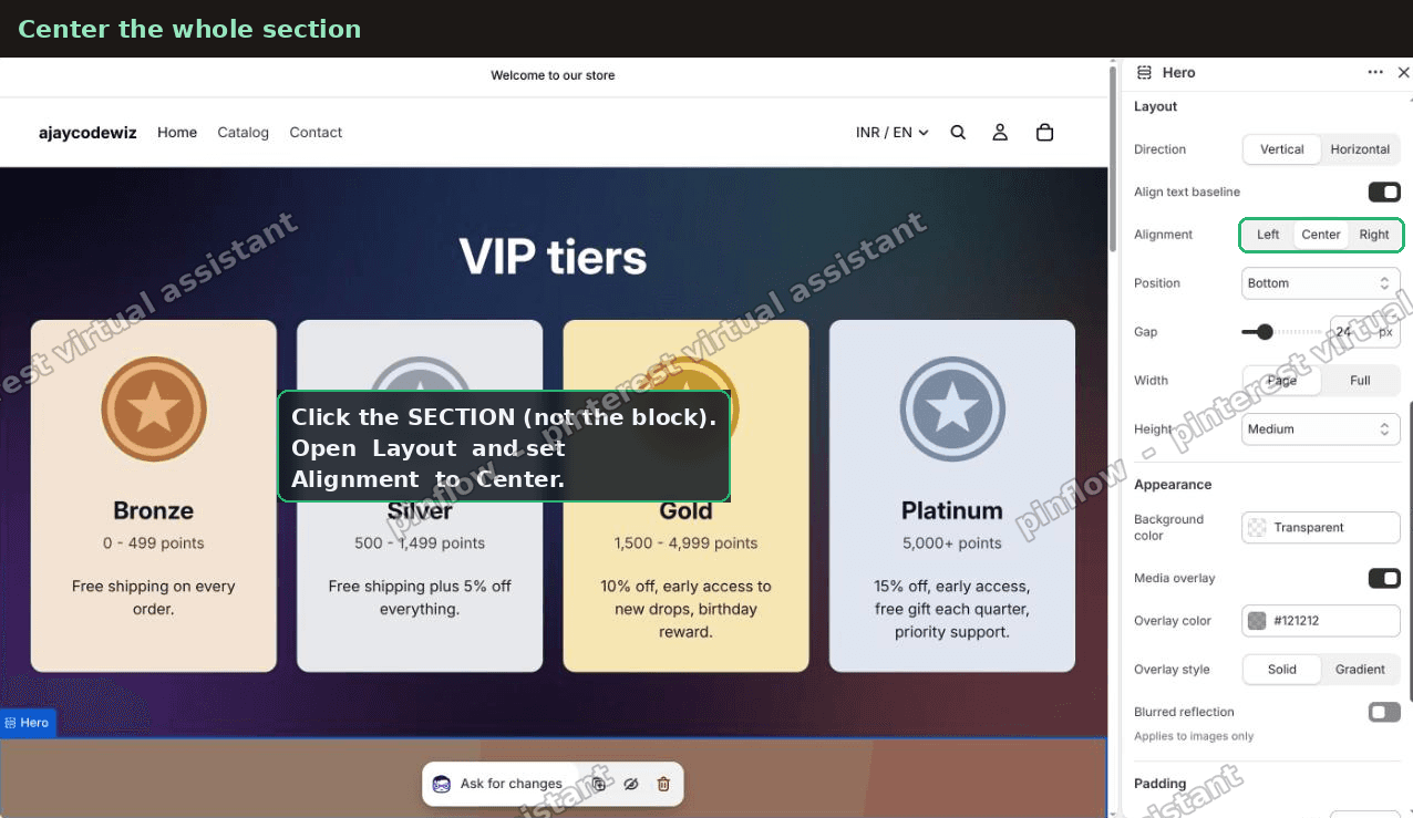 Horizon section Layout panel with Alignment set to Center
Every block in that section now centers together. This is the single most important step. On Horizon, this is how you center text on a Shopify homepage.
Step 2: Set each image block to Fit width.
If some pieces are images, they need one more setting. Click each image block, one at a time. Under Size, set Desktop width to Fit.
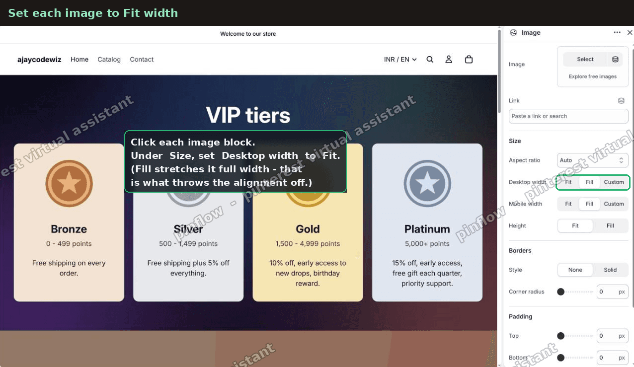 Horizon image block Size panel with Desktop width set to Fit
Here is the difference. Fill stretches the image edge to edge. That is what throws your alignment off. Fit keeps the image at its real size, so it sits in the middle with the rest.
Do this for the wordmark, the title image and the paragraph image. Any block set to Fill will refuse to line up with the others until you switch it to Fit.
Step 3: Fix the footer.
The footer is its own thing. Scroll down to it in the same editor.
Click the logo in the footer. It may select the logo, or it may select the column it sits in. In Horizon that column is called a Group.
Select the Group, open Layout, and set Alignment to Center.
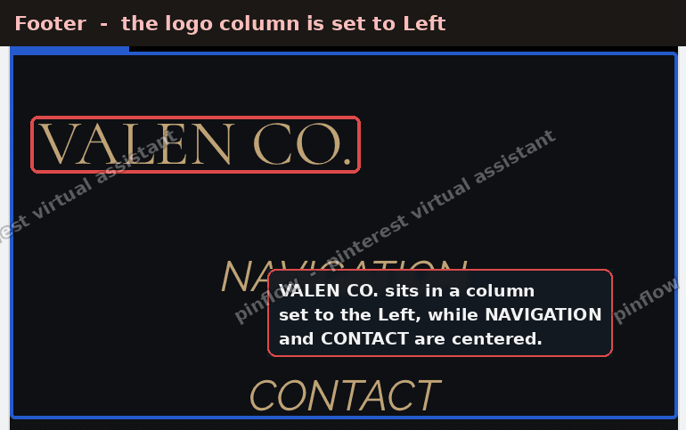 Shopify footer with the logo column set to Left, out of line with the other columns
The logo column was set to the left while the other columns were centered. That is the whole reason it looked out of line.
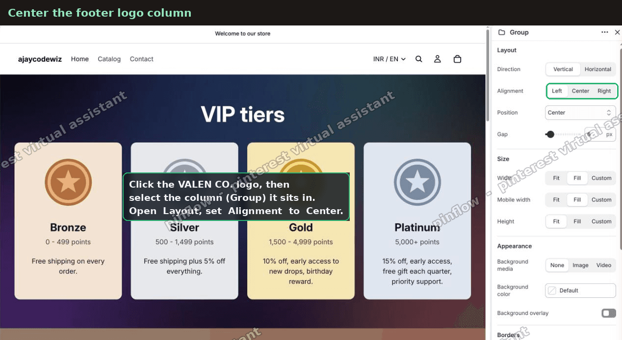 Horizon footer Group Layout panel with Alignment set to Center
Now the logo lines up with the navigation and contact columns beside it.
Step 4: Clear any invisible spacing.
If a real text line still will not center, it has junk typed into it. Click the line. Select everything in the box and delete it all. Then type the words fresh.
Do not just backspace the spaces you can see. The invisible marks stay behind. Clear the whole box and retype it clean.
An alternative: use real text, not pictures of text
This is the better long-term fix, and I recommend it to anyone in this spot.
Text centers on its own. It edits in seconds. It reads sharp on every screen. A picture of text does none of that. It blurs when it scales, it cannot be edited without a design tool, and it will not reflow on a phone.
To swap a picture for text: delete the image block, then Add block and pick Heading for a title or Text for a paragraph. Type the words in.
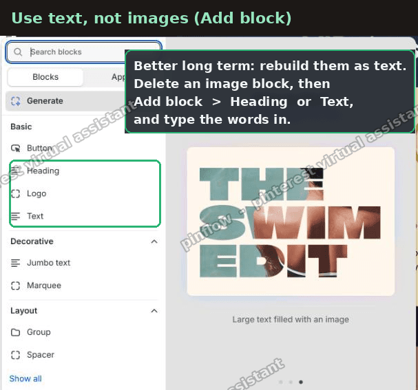 Horizon Add block menu with Heading and Text block options highlighted
For a big brand wordmark you can use a Heading block with a large font, or the Logo block if you want to keep the exact logo art.
Once the words are real text, Step 1 centers them perfectly, and the mobile problem disappears for good.
What if the image itself is off-center
This is worth its own note, because it fooled the merchant. One of their images had a wide empty strip on the left and nothing on the right. The words inside sat off to one side.
Even with the block centered, the words looked pushed over. That is not an alignment bug. The picture is lopsided.
Two ways out:
- Re-crop or re-export the image so the words sit in the middle with equal space on both sides, then re-upload it.
- Or replace it with real text using the step above. Text is always balanced.
No alignment button can fix a lopsided picture. You have to fix the picture or drop it for text.
How do I center only the desktop or only the mobile view
Horizon's alignment control sets both at once. Often that is what you want. Centered reads well on every screen.
But sometimes a merchant wants desktop left and mobile centered, or the reverse. Horizon has no separate mobile alignment toggle for this.
If you truly need one screen different from the other, the clean route is a small piece of CSS inside a Custom Liquid block. A media query targets one screen size only and leaves the other alone. Add a Custom Liquid section, then a style rule that centers the blocks under a max-width: 749px media query for mobile, or a min-width: 750px query for desktop.
Reach for this only when the built-in section alignment cannot do the job. For most homepages, the section alignment control is all you need, and it is safer than custom code.
Can I drag each block anywhere I want
No. This comes up a lot. Horizon does not let you drag a block to any spot on the screen.
You choose left, center or right on the section. Blocks stack and follow that choice. There is no free-drag canvas.
That is by design. It keeps the layout responsive so it holds together on a phone. If you want an item nudged by a specific amount, that needs a line of custom CSS in a Custom Liquid block, moving that one item left or right.
Why does my text center on desktop but not on mobile
Almost always, this is the invisible-character problem.
You typed spaces to position text on desktop. The spaces have width. On desktop the wide screen hides the effect. On mobile the narrow screen exposes it, and the text drifts.
The fix is the same as Step 4. Clear the whole text box and retype the words with no manual spacing. Then let the section alignment do the centering.
If it did not work
A few things to check when centering still will not stick.
- You centered a block, not the section. Click empty space in the banner so the panel shows the section name, then set its Layout Alignment.
- An image is still on Fill. Any image set to Fill stretches full width and will not line up. Switch it to Fit.
- The footer column was missed. The footer aligns per column. Center the Group that holds the logo, not just the logo.
- Invisible characters remain. Select all text in the box, delete, and retype. Backspacing visible spaces is not enough.
- The image is lopsided. Re-crop it so the content is centered, or replace it with a Heading and Text block.
Work through these in order. One of them is the cause every time.
Definitions people confuse
Section vs block. A section is a full-width band. A block is one item inside it. Alignment lives on the section. Blocks follow it.
Fit vs Fill. Fit keeps an image at its natural size. Fill stretches it to the full width of its column. Fill is what breaks alignment on a homepage.
Text block vs Image block. A Text or Heading block holds real, editable words that center and reflow. An Image block holds a picture, even a picture of text, which keeps its own fixed shape.
Horizon vs Ritual. Horizon is Shopify's newer free theme. Ritual is a free theme built on Horizon, so the same alignment steps apply. If your theme is based on Horizon, look for the section Layout and Alignment controls in the same place.
That is the full picture. To center text on a Shopify Horizon homepage, set the section alignment to center, put image blocks on Fit width, clear any manual spacing, and swap pictures of text for real text where you can. Everything then lines up on desktop and holds on mobile.
Spending too long on manual Shopify busywork?
PinFlow turns your Shopify catalog into Pinterest pins and posts them on a schedule, automatically. Same idea as the rule above, let the system handle the repetitive part.
Get PinFlow on the Shopify App StoreMore Shopify fixes
More community-sourced Shopify guides, tested on a live store.
Themes & Storefront
Shopify AI Section: Fix a Price Badge Hidden Behind the Image
You built a section with Shopify's AI section generator, but the price badge on each card sits behind the photo. Here is the Custom Liquid fix that brings it to the front without regenerating anything. Tested on a Dawn store.
Themes & Storefront
Hide Shipping Calculated at Checkout on One Shopify Product
The line under Add to cart that says shipping is calculated at checkout shows on every product, gift cards included. Here is how to hide it on one product only, with the code, screenshots and the Eclipse theme steps.
Themes & Storefront
Shopify Dropdown Menu Behind Page Content (Z-Index Fix)
Your Shopify dropdown or mega menu opens, but the page title and products sit on top of its links and the menu closes before you can click. The fix is one Custom CSS rule in Theme settings. Tested on a Rebel store.