
Shopify Chat Widget Scrolling With the Page? Here Is the Fix
If your Shopify Inbox chat bubble scrolls away instead of staying in the corner, your theme's CSS reset is stripping the widget's own positioning. Here is how to confirm it in ten seconds and the Custom CSS that pins it back.
By AjayCodeWiz · September 4, 2026 · 8 min read
The problem
Your chat bubble is supposed to sit in the bottom corner of the screen and stay there while the page moves behind it. That is what "floating" means.
Instead it sits still on the page and slides upward as you scroll, until it disappears off the top. Scroll back up and it comes back.
A merchant asked about this on the Shopify Community. Their bubble did it on desktop and on mobile, in both orientations. Hiding sections of the page made no difference. Clicking the bubble seemed to do nothing at all.
I loaded their live store and measured it. Here is what the bubble's position on screen did as the page scrolled:
| at the top | scrolled 600px | scrolled 1500px | |
|---|---|---|---|
| Desktop 1440 x 900 | 834 | 250 | -601 |
| Mobile 390 x 844 | 778 | 92 | -781 |
A pinned element does not move. This one moved by exactly the amount the page scrolled, then went off the top of the screen.
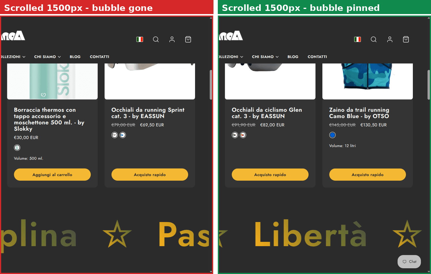 The chat bubble is gone after scrolling down, and pinned in the corner after the fix
Why it happens
This is not a Shopify Inbox bug and it is not an app conflict. It is your theme.
The chat launcher is not a plain image on your page. It is a web component, an element called shopify-chat that Shopify drops in near the bottom of your page. The component carries its own styling, including the instruction that keeps it pinned:
:host {
  position: fixed;
  inset: 0;
  display: grid;
  pointer-events: none;
}
Read plainly: pin me to the viewport, stretch me across it, and let clicks pass through me so I do not block the page.
Now here is the collision. Many modern themes start with a CSS reset, a rule that strips the browser's default styling off every element so the theme can start from a clean slate. The theme in this case, Taiga 8.1.0, uses one that looks like this:
*:where(:not(iframe, canvas, img, svg, video, audio, dialog, use)) {
  all: unset;
  display: revert;
}
all: unset means "remove every style from this element". The exception list covers images, video, canvas and a few others. It does not cover web components, because there is no way to write "any custom element" in CSS.
So the reset hits shopify-chat too. And a rule in your theme's stylesheet outranks a component's own :host styling, no matter how weakly the theme rule is written.
I checked the live values on the merchant's page. The component had been flattened to:
position: staticinstead of fixedinset: autoinstead of 0pointer-events: autoinstead of noneheight: 0
With no fixed position, the bubble falls back to being positioned against the page rather than the screen. So it scrolls with the page. That is the whole bug.
The second problem: the chat window is broken too
The merchant said clicking the bubble seemed to misbehave, and the thread focused on the scrolling.
I tested the open state. The chat does open. The panel renders at the correct size. It just renders at viewport y of -6115, roughly six thousand pixels above the top of the screen.
So from the shopper's side, clicking the bubble does nothing at all. It is the same bug and the same fix, but if you only test scrolling you will think the widget is half fixed.
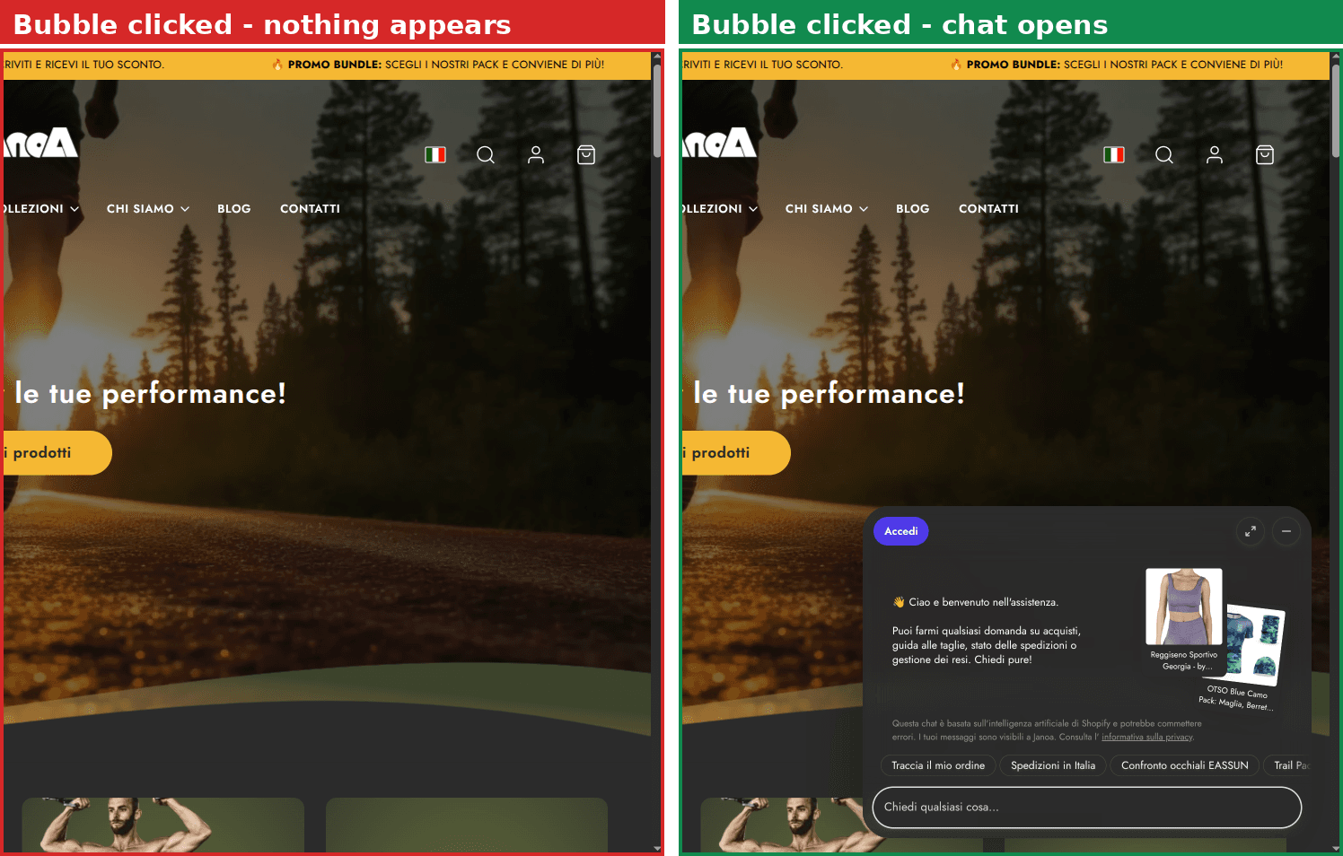 Clicking the bubble before the fix shows nothing, and after the fix opens the chat window
Ten-second check: is this your problem?
Before you paste any CSS, confirm the cause. You do not need developer skills for this.
- Open your storefront in Chrome.
- Right-click the chat bubble and choose Inspect.
- In the panel that opens, look for an element called
shopify-chat. - Click it, then look at the Computed styles list on the right and find position.
If it says fixed, this article is not your problem. If it says static, it is.
If you cannot find shopify-chat at all, the widget on your site is from a different chat app and the fix below will not apply to it.
The fix
This goes in Online Store, Themes, Customize, Theme settings, Custom CSS. Not in a theme file. If you have never used that box, see How to Add Custom CSS in Shopify.
shopify-chat {
  position: fixed !important;
  inset: 0 !important;
  display: grid !important;
  height: auto !important;
  width: auto !important;
  pointer-events: none !important;
  contain: layout !important;
  z-index: 2147483000 !important;
}
Save, then reload your storefront and scroll. The bubble should stay put.
That is all it does: it puts back the four properties the reset removed, on the one element that needs them. Nothing else in the theme changes.
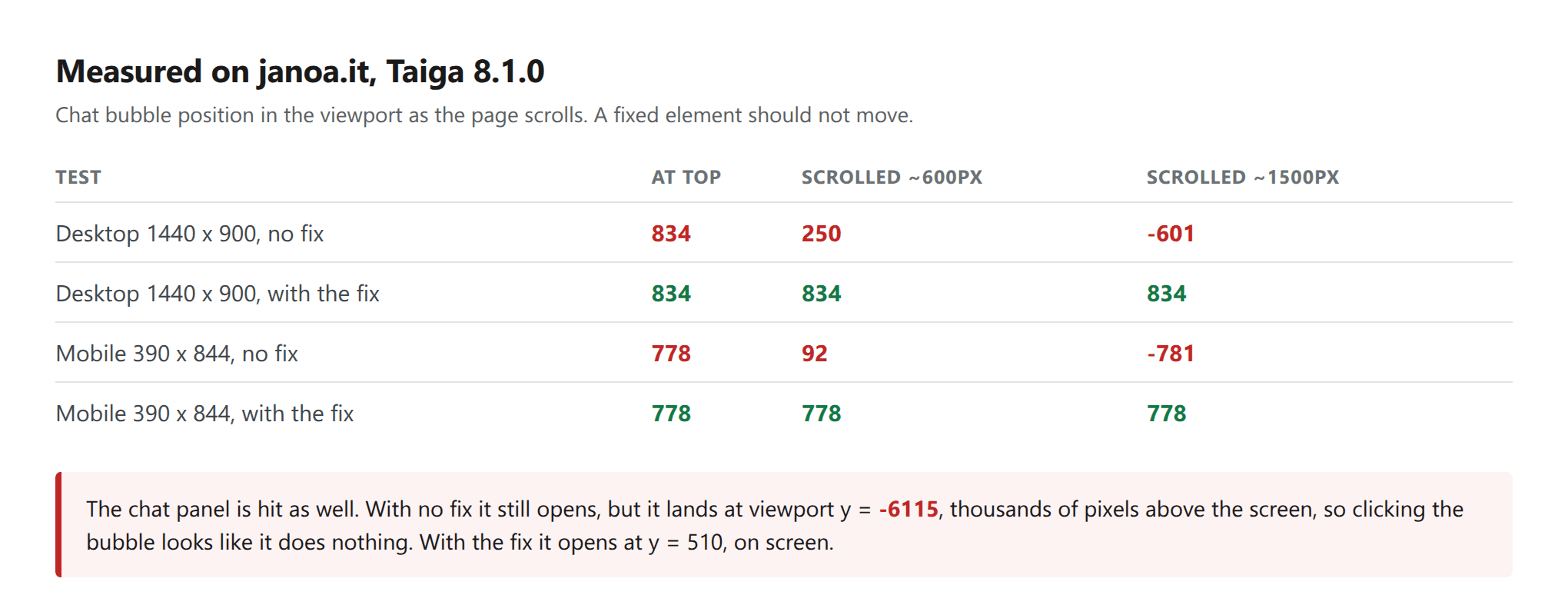 Bubble position measured at three scroll positions, before and after
Do not put it in reset.css
Someone will suggest pasting the rule at the bottom of your theme's reset.css or base.css file. It does work.
It also disappears the next time you update your theme, because those are theme files and an update replaces them. The bug comes back weeks later with no obvious cause, and by then the fix has been forgotten.
Theme settings, Custom CSS survives updates. Use that.
Do not drop pointer-events: none
If you trim the rule down, this is the line to keep.
I tested the short version, position: fixed and inset: 0 with nothing else. It pins the bubble correctly. It also makes the chat component a full-screen invisible sheet over your storefront, and because the reset set pointer-events back to auto, that sheet catches every click.
I confirmed it: with those two lines only, the element under the middle of the page was shopify-chat, not the product the shopper was trying to click. Adding pointer-events: none back put the page underneath in charge again.
An invisible layer that swallows every click is a much worse bug than a scrolling bubble, and it is the kind that costs sales without anyone reporting it. Keep the full block.
Why themes keep breaking web components
This is worth understanding because it will happen again with the next component Shopify ships.
A web component packages its own styling inside itself. That styling is deliberately weak, so a store can restyle the component without a fight. :host rules sit near the bottom of the pecking order on purpose.
A blanket reset in a theme sits above them. Not because it is written strongly, but because rules in your page always outrank a component's internal rules for the component's own element.
So any theme with a global all: unset will flatten any web component it does not explicitly exclude. It is a design collision, not a mistake by either side, and it is why the fix has to name the element.
The practical consequence: if you later add another Shopify feature that ships as a component, check it. If it is misplaced, the same shape of rule will fix it, with a slightly lower z-index so it sits under the chat bubble rather than over it.
Shopify Forms is usually fine, and here is why
The obvious worry is that every Shopify component on the store is broken the same way.
I checked Shopify Forms on the same store. It is fine, and the reason is instructive.
Forms does not rely on :host styling for its position. It writes position: fixed as an inline style on a div inside the component. Inline styles beat stylesheet rules, so the theme's reset never reaches it. Their welcome popup was placed correctly with no override at all.
So do not add a rule for it. That would be one more line to maintain, and it would do nothing.
What to check if the bubble is still wrong
It is pinned but in the wrong corner. That is a setting, not a bug. Shopify Inbox has a position option in the app, and the theme's Custom CSS is not involved.
It is pinned but sitting behind something, or on top of your menu. That is a stacking problem rather than a positioning one. Raise or lower the z-index in the rule to suit. I covered that case separately in Stop a Chat Widget Covering Your Shopify Menu.
It moved back after a theme update. Then the rule was pasted in a theme file, not in Theme settings, Custom CSS. Move it.
It is fine on desktop and wrong on mobile. Check whether you have a second override somewhere, for example an app that adds mobile-only CSS. The rule above is not screen size specific and tested identically at 390 by 844.
Nothing changed at all. Confirm the app embed for Shopify Inbox is actually turned on, in Theme settings, App embeds. A disabled embed means there is no shopify-chat element on the page to style.
Fixed, sticky and absolute: the difference that causes this
Three words get used interchangeably and they are not the same.
Fixed positions an element against the browser window. It stays in place while the page scrolls. This is what a chat bubble needs.
Sticky positions an element normally until it reaches a certain point, then it holds. This is what most sticky headers use.
Absolute positions an element against its nearest positioned ancestor, or against the page if there is not one. It scrolls with the page.
When a reset strips position: fixed off the chat component, the launcher inside it falls back to absolute against the page. That is why the bubble tracks the page perfectly instead of staying still, and why the numbers in the table above move by exactly the scroll amount.
Knowing that distinction is also the fastest way to diagnose any floating element that will not float. Look at position on the element, then on its parents, and the first thing that is not fixed when it should be is your answer.
Spending too long on manual Shopify busywork?
PinFlow turns your Shopify catalog into Pinterest pins and posts them on a schedule, automatically. One less thing to remember to switch on.
Get PinFlow on the Shopify App StoreMore Shopify fixes
More community-sourced Shopify guides, tested on a live store.
Themes & Storefront
Shopify Wishlist App: Add a Free Wishlist to Your Store
A free Shopify wishlist app: hearts on product cards, a Wishlist button on product pages and a wishlist page. Guest lists follow shoppers when they log in.
Themes & Storefront
Shopify Payment Icons: Fix a Footer That Shows None
The payment icons in a Shopify footer come from your payment provider, not from the theme. When the provider sends none, the row stays empty. Here is how to add the icons yourself on Refresh, Dawn and similar themes.
Themes & Storefront
Shopify Order Notes: Turn On the Cart Note Box
Let customers leave order notes and special instructions on your Shopify cart page. Turn on the built-in cart note in Theme settings, rename its label, and find each note on the order. Tested on Dawn, no code.