
Shopify Collection Image Size: Why Cards Look Wrong
Collection images that look fine on desktop can turn huge on mobile, with the second card cut off the screen. The cause is not pixel dimensions, it is aspect ratio. Here is what to set, measured on a real phone viewport.
By AjayCodeWiz · September 8, 2026 · 9 min read
The problem
Most advice about Shopify collection image size gives you a number. Upload 1024 by 1024, or 2048 by 2048, and you are done.
That advice is not wrong, but it does not fix the thing people actually complain about.
A merchant asked about this on the Shopify Community. Their homepage looked correct on desktop. On a phone, the collection tiles were enormous, and the second tile in each row ran off the right edge of the screen. Tapping through to the collection looked perfect. Only the homepage cards were broken.
Their words: massively oversized, and it reverts to fit the screen perfectly once you select it.
That is not a resolution problem. Uploading bigger or smaller files changes nothing. The cause is the shape of the images, not their size in pixels.
What is actually going wrong
I loaded the store on a real 390 pixel wide iPhone viewport and measured the layout rather than eyeballing it.
The section was already configured correctly. Its own settings said two equal columns on mobile, written into the page as repeat(2, 1fr). Two equal columns inside a 358 pixel content area should give two 175 pixel cards.
The columns came out 259 pixels and 190 pixels.
That is 449 pixels of cards, plus the gap, inside a 358 pixel box. Around 99 pixels of the second card sits past the edge of the phone. And because it is a grid rather than a carousel, there is nothing to swipe. The content is simply cut off and unreachable.
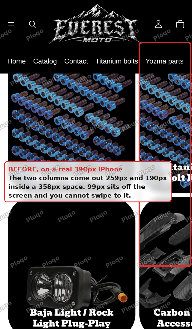 Shopify collection cards at a 390px phone width, with the right column cut off the screen
So the merchant's two complaints, oversized tiles and a tile hanging off the edge, are one bug.
Why the aspect ratio decides the width
Here is the mechanism, because once you see it the fix is obvious.
Many modern Shopify themes set the collection card's aspect ratio from the image itself. The theme writes each image's own proportions onto the card as a variable, then applies it:
aspect-ratio: var(--ratio);On this store there were 24 collection cards and 22 different values of that variable, ranging from 0.735 to 1.256. Twenty-two different card shapes on one page.
Now the important part. In a CSS grid, a 1fr track will not shrink below the minimum width its content needs. When a card has a fixed aspect ratio and the row forces a shared height, the card's minimum width becomes height multiplied by ratio. A tall card in a tall row demands a wide track.
So the images are not just different heights. They are actively inflating the columns they sit in, past what the screen can show.
That is why it only breaks on mobile. On a wide desktop there is enough room to absorb the extra width. On a 390 pixel phone there is not.
And it is why the collection page looks fine. That page uses a different grid, one that is not driven by each image's own shape.
The fix: give every card the same aspect ratio
You do not need code, and you should not paste any.
- Open your theme editor and go to the page with the collection cards, usually the home page.
- In the left sidebar, expand the collection section.
- Expand Collection card, then select the Image block inside it.
- Find the Aspect ratio setting on the right. It will most likely be on Auto.
- Change it to a fixed shape.
The moment every card shares one ratio, the columns resolve properly. I tested this on the live page and the tracks went from 259 pixels and 190 pixels to 175 pixels and 175 pixels, with zero overflow.
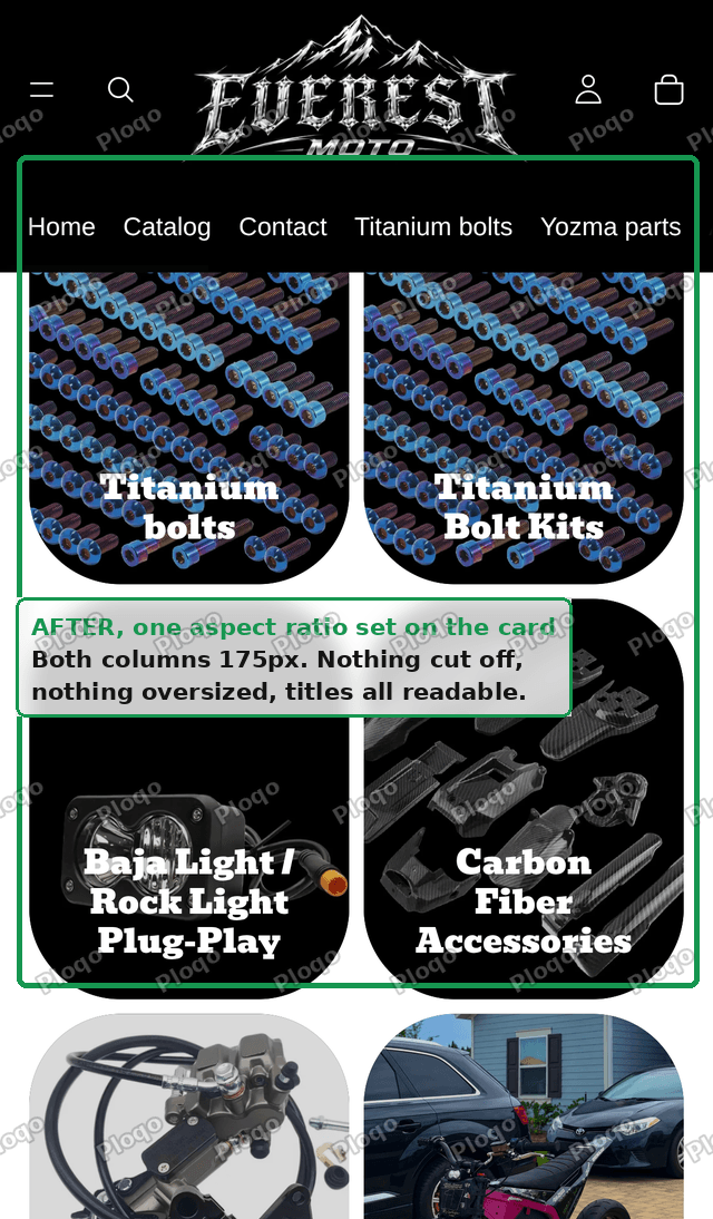 Shopify collection cards with one aspect ratio set, showing two even columns and nothing clipped
Auto is the setting causing the problem. Anything else is better. But which one you pick matters for a different reason.
Which aspect ratio should you choose?
This is where the generic advice fails, and where you should spend two minutes rather than guessing.
Whatever ratio you pick, Shopify crops your images to fit it. Pick the wrong one and every image loses its edges.
So pick the one closest to what you have already uploaded.
On the store above, I measured all 24 collection images. Twenty-one of the 24 were portrait, and the median ratio was 0.85, which is close to 4:5. Only one image was landscape.
For that store, Square is the worst available choice. It would crop the top and bottom off almost every image in the collection list. Portrait is the right answer, and it is not what most tutorials suggest.
Your library may be the opposite. The point is to check rather than default to square.
How to check your own images
You do not need to open each one. Look at the collection list in your admin and judge the thumbnails as a group.
- Mostly taller than wide, so people or products shot upright: choose Portrait.
- Mostly wider than tall, so flat lays, landscapes or wide banners: choose Landscape.
- Genuinely mixed, or you are not sure: choose Square, and accept that some images lose their edges.
If the important part of an image sits near an edge, a logo in a corner or text along the bottom, that part is what gets cut. Which brings us to the durable fix.
The better long term answer: crop the sources
Setting one aspect ratio makes the layout correct. It does not make the images look good.
Cropping to a shape they were never designed for can cut heads off, slice through product names, or lose a logo. The card is now the right size but the picture inside it is wrong.
If your collection images matter to how the store looks, re-crop them yourself to one consistent shape before uploading. Then set the theme's aspect ratio to match.
That way you decide what stays in frame, not an automatic centre crop. It is the difference between a page that stops being broken and a page that looks designed.
What size should a Shopify collection image be?
Now the pixel question, since it does matter, just less than shape.
Shopify recommends collection images at around 1024 by 1024 pixels, and accepts up to 4472 by 4472 or 20 megabytes.
In practice:
- Go bigger than the space it will fill, so it stays sharp on high resolution phones. Something around 1200 to 2048 pixels on the long edge is plenty.
- Keep every collection image the same dimensions. Consistency here is what prevents the whole problem above.
- Use JPEG for photographs and PNG only when you need transparency.
- Do not upload a 6000 pixel wide original. Shopify will serve resized copies, but you are slowing your own uploads and your admin for nothing.
The one number that actually matters is the ratio, and that you should choose deliberately.
Set it on every section, not just the first
A detail worth knowing before you declare victory.
The aspect ratio setting applies to the section you are editing, not to the whole store.
If your home page has more than one section showing collection cards, each one needs setting separately. The same is true of any other page using them.
After changing it, scroll the whole home page on an actual phone. It is common to fix the first row and leave an identical problem further down.
If you already pasted CSS
A lot of forum answers for this problem hand you a snippet to paste into theme.liquid, usually something forcing a square ratio below 767 pixels.
If you have done that, take it back out before using the theme setting.
Two reasons. Running both means a future you, or a future developer, has to work out why the card behaves oddly and which of two fixes is winning. And the pasted version disappears the next time you update your theme, so the bug returns with no obvious cause.
The theme setting survives updates and lives where somebody would think to look.
There is also a correctness problem with most of those snippets. They are wrapped in a mobile only media query, so they stop at 767 pixels. The uneven shapes are still there on desktop, just with enough room to hide them.
How to check you actually fixed it
Do not rely on the theme editor's mobile preview alone. It can look right while a real phone still overflows.
The fastest real check, on a desktop browser:
- Open your live home page.
- Open developer tools and switch on device emulation.
- Set the viewport to 390 by 844, an iPhone width.
- Try to scroll the page sideways.
If the page will not move sideways and both cards in every row are fully visible, it is fixed. If you can drag the page left, or a card is sliced by the screen edge, something is still forcing a width.
Check at 375 pixels too, which covers older and smaller iPhones.
Related reading
If your collection cards are showing the wrong product photos rather than the wrong shape, that is a separate issue with its own cause. See Why Shopify Collection Cards Show Different Images.
The short version
Collection image size is a ratio question before it is a pixel question.
If your cards look oversized on mobile, or one runs off the edge, the aspect ratio is set to Auto and each image is inflating its own column. Set one fixed ratio on the Image block inside the Collection card, in every section that uses them.
Choose the ratio that matches most of your existing images rather than defaulting to square, and re-crop the sources if the images matter. Then test at 390 pixels and confirm the page will not scroll sideways.
Spending too long on manual Shopify busywork?
PinFlow turns your Shopify catalog into Pinterest pins and posts them on a schedule, automatically. Same idea as the rule above, let the system handle the repetitive part.
Get PinFlow on the Shopify App StoreMore Shopify fixes
More community-sourced Shopify guides, tested on a live store.
Collections & Products
Shopify Variants: The Complete Guide
Variants are one product sold in several forms. How they work, the 2,048 and 3-option limits, and where each variant fix lives - images, swatches, sorting, hiding and the theme-specific bugs.
Collections & Products
How to Set Up Shopify Smart Collections With Metafields (Not Tags)
Building one tag per collection turns into hundreds of typo-prone tags fast. Here is how to run Shopify smart collections off product type and metafields instead, tested on a store.
Collections & Products
How to Show Metafields on a Shopify Product Page
How to turn Shopify product metafields into a clean specifications table on the product page, with each value linked to a filtered list. No app required. Tested on a Dawn store.