
Make a Shopify Section Responsive With Container Queries
A custom Shopify section that reflows on zoom while the theme grid stays clean is using viewport media queries. Here is the container query fix.
By AjayCodeWiz · July 31, 2026 · 11 min read
The problem
A merchant asked about this on the Shopify Community, and it is a problem I see a lot once a store starts adding custom sections.
They run the Shopify Savor theme. They built a custom Video Review section for the product page. It shows customer videos in a grid, a bit like a wall of reviews.
The grid looked fine at first. Then they noticed something odd.
When they zoomed the browser in or out, the video grid changed its layout. It jumped to a different number of columns. Sometimes the videos went narrow and cramped. The theme's own Recommended Products section, sitting right below it, never did that. It stayed clean at every zoom level and every screen size.
Their goal was simple. They wanted the video grid to behave exactly like Recommended Products across desktop, tablet, mobile, and every zoom level. Same clean reflow, no surprises.
I reproduced it on a Savor test store. Here is the video grid at a middling width, around 780 pixels. It has been forced into four cramped columns even though there is not enough room for four.
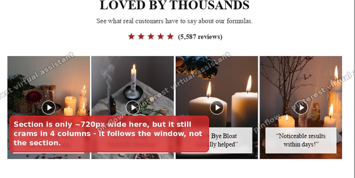 A Shopify video review grid squeezed into four cramped columns at a narrow width
This is not a random glitch. The section is doing exactly what its CSS tells it to. The CSS is just measuring the wrong thing.
Why the video grid reflows but Recommended Products does not
Both sections are grids. Both change their column count as space changes. The difference is what each one is watching when it decides how many columns to show.
The custom video section switches columns based on the viewport. The viewport is the whole browser window. Its rules look like this:
@media screen and (min-width: 750px) { ... }
@media screen and (min-width: 990px) { ... }
Read that in plain words. "When the whole browser window is at least 750 pixels wide, use the tablet column count. When it is at least 990 pixels, use the desktop count."
Savor's Recommended Products section does not watch the window. It watches its own box. It uses container queries, which look like this:
@container (min-width: 750px) { ... }That reads as "when this section's own width is at least 750 pixels, use more columns."
Most of the time the window and the section are close enough in width that you never notice the difference. The gap shows up when the section is narrower than the window, or when zoom changes them at different rates.
Here is exactly what the merchant hit. Their product page puts the video section inside a content column, so the section is narrower than the full window. At a window width around 990 pixels, the viewport rule fires and demands the full desktop column count. But the section itself is only about 780 pixels wide. It does not have room for that many columns. So it crams them in, and the videos go thin and ugly.
Recommended Products never hits this because it counts its own width. When its box is 780 pixels, it asks for the layout that fits 780 pixels. It cannot over-commit, because it is measuring the thing that actually holds the content.
That is the whole bug in one line. Viewport rules measure the window. Container rules measure the box. The fix is to make the video grid measure its box, exactly like the native section does.
The fix: two changes in the section's style block
The fix lives in the custom section's own code, inside the {% style %} block where the grid columns are set. There are only two changes.
- Add one new rule that turns the grid wrapper into a container to measure.
- Change the two
@media screen and (min-width: ...)lines to@container (min-width: ...).
Here is a map of where those two changes go in the grid CSS.
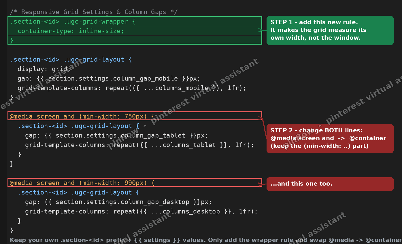 Annotated Shopify section CSS showing where to add the container rule and swap media for container queries
Where to find it
In your admin, go to Online Store, then Themes. On your Savor theme click the three dots and choose Edit code. In the left sidebar open the Sections folder and click the file for your video review section. Scroll to the {% style %} block near the top and find the part that sets .ugc-grid-layout and the two @media queries under it.
The drop-in block
Find your grid block and replace it with this. It keeps all of your own settings. It only adds the wrapper rule and swaps @media for @container.
.section-{{ section.id }} .ugc-grid-wrapper {
  container-type: inline-size;
}

.section-{{ section.id }} .ugc-grid-layout {
  display: grid;
  gap: {{ section.settings.column_gap_mobile }}px;
  grid-template-columns: repeat({{ section.settings.columns_mobile }}, minmax(0, 1fr));
}

@container (min-width: 750px) {
  .section-{{ section.id }} .ugc-grid-layout {
    gap: {{ section.settings.column_gap_tablet }}px;
    grid-template-columns: repeat({{ section.settings.columns_tablet }}, minmax(0, 1fr));
  }
}

@container (min-width: 990px) {
  .section-{{ section.id }} .ugc-grid-layout {
    gap: {{ section.settings.column_gap_desktop }}px;
    grid-template-columns: repeat({{ section.settings.columns_desktop }}, minmax(0, 1fr));
  }
}
Keep your own .section-{{ section.id }} prefix. Keep your own settings values. The only real changes are the new .ugc-grid-wrapper rule at the top and the word @media screen and becoming @container on the two lines below.
The new wrapper rule is the key. container-type: inline-size tells the browser to treat that element as a measuring box. After that, every @container rule inside it reads that box's width instead of the window's.
Save the file. Then open your product page and try the same zoom test.
Here is the same grid after the change, at that same narrow width. It now drops to two clean columns that actually fit. Wider screens still get three or four, because the rules still fire, they just fire off the section width now.
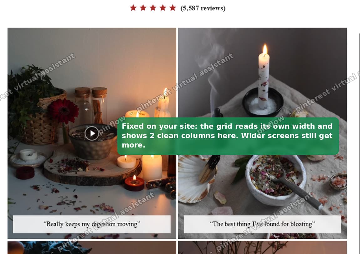 The Shopify video review grid showing two clean columns after switching to container queries
On my test store, at roughly 780 pixels of section width, the old viewport version forced four cramped columns. The container query version dropped to two columns that fit the space, and full width still gave the desktop count. That is the exact behavior Recommended Products already had.
Align the heading breakpoints too
There is one more small mismatch worth fixing while you are in there.
The grid switched at 750 and 990 pixels. But the heading font size in the same section switched at 768 and 1024 pixels. Different numbers.
That means the heading and the grid changed size at slightly different moments as the page resized. It looks a little off, like two parts of the same section disagreeing.
If you want them in step, change the heading breakpoints to match. Use the same 750 and 990 the grid uses. It is a tiny change and it makes the whole section feel like one piece.
What are CSS container queries?
A container query is a rule that responds to the size of an element on the page, not the size of the browser window.
For years, responsive design had one tool for this job: the media query. A media query asks about the window. "Is the window at least 990 pixels wide? Then do this." That works when your component always fills the window, but it falls apart when the component sits in a narrow column or a sidebar.
Container queries fixed that. You mark one element as a container. Then any rule you write with @container asks about that element's width instead of the window's. The component becomes self aware. It lays itself out based on the room it actually has.
This is why modern Shopify themes like Savor, Horizon, and their relatives use container queries for their grids. A product grid might sit full width on one page and inside a two column layout on another. With container queries it just works in both places, because it always measures itself.
Why is my Shopify section not responsive?
If a custom section reflows badly while your theme's built in sections stay clean, the cause is almost always one of these.
- It uses viewport media queries in a narrow container. This is the case in this article. The section counts the window, not its own box, so it asks for a layout that does not fit.
- It has fixed pixel widths. A card set to
width: 300pxcannot shrink. On a small screen it overflows and pushes the layout sideways. - It is missing
minmax(0, 1fr)on the grid. Without the0, grid columns refuse to shrink below their content, so a wide video or long word can blow the columns out. - It copies a breakpoint number that does not match the theme. Themes pick specific switch points. If your section uses different ones, it changes at the wrong moment and looks out of sync.
The fix is usually to stop measuring the window and start measuring the section, which is exactly what the container query change does.
How do I make a custom Shopify section match the theme grid?
The goal is not to copy the theme's code. It is to copy the theme's method. Do these three things and a custom grid will behave like a native one.
Measure the section, not the window. Add container-type: inline-size to the grid's wrapper, then write your column rules with @container, not @media. This is the single most important step.
Use minmax(0, 1fr) for the columns. This lets every column shrink evenly and share the row, so nothing overflows. More on this below.
Match the theme's breakpoints. Savor switches at 750 and 990 pixels. Use the same numbers so your section changes at the same moments the rest of the page does.
Do all three and the section will track the theme's own layout at any width and any zoom, because it is following the same logic the theme follows.
Viewport media query vs container query
These two look almost identical in code, so it is worth being clear on the difference, because it is the whole point.
A viewport media query starts with @media and asks about the browser window. It is the right tool when a section always spans the full width of the page, like a header or a hero banner.
A container query starts with @container and asks about a specific element's width. It is the right tool when a component can appear in different sized slots, like a product card grid that might be full width on one template and half width on another.
For a grid of items inside a content column, the container query is almost always what you want. The grid should respond to the space it has, not to a window it does not fill.
What inline-size means
When you write container-type: inline-size, the word inline-size just means width, for a normal left to right, top to bottom page.
There is also a size value, which tracks both width and height. You rarely want that for a vertical grid, because the grid's height depends on its content, and letting height feed back into the layout can cause loops. For a column grid, inline-size is the safe and standard choice. It watches width only, which is all a column count needs.
What minmax(0, 1fr) does, and why columns should grow with width
The column rule uses repeat(4, minmax(0, 1fr)). That means "four columns, each one able to shrink to nothing and otherwise share the space equally."
The 1fr part means equal shares of the leftover space. The minmax(0, ...) part is the important half. Without the 0, a grid column will not shrink below the natural size of its content. A wide video or a long unbroken caption can then force the column wider than its share, and the whole grid overflows. The 0 gives the browser permission to shrink the column all the way down, so the columns always fit.
There is one more habit worth keeping. Your column count should go up as width increases, never down. Mobile gets the fewest columns, tablet more, desktop the most. That matches how people read. A phone has room for one or two videos across. A desktop has room for four. If you ever find yourself giving mobile more columns than desktop, the numbers are backwards, and that alone can make a section look broken on small screens.
What to check if it did not work
The grid still jumps on zoom. Confirm the container-type: inline-size rule is on the element that actually wraps the grid, and that the grid sits inside it. If the container rule is on the wrong element, the @container queries have nothing to measure and fall back to acting like the layout has no breakpoints.
Nothing changed at all. Check that you swapped both @media lines, the 750 one and the 990 one. Missing one leaves the section half fixed.
The columns overflow the section. Make sure each column uses minmax(0, 1fr) and not just 1fr. The 0 is what lets the columns shrink to fit.
The heading and grid still feel out of step. That is the breakpoint mismatch. Change the heading's 768 and 1024 media queries to 750 and 990 so they line up with the grid.
Once the section measures its own width, it behaves like the theme's native grid at every size and zoom level, which is what the merchant wanted from the start.
Spending too long on manual Shopify busywork?
PinFlow turns your Shopify catalog into Pinterest pins and posts them on a schedule, automatically. Let the system handle the repetitive part so you can spend your time on the store.
Get PinFlow on the Shopify App StoreMore Shopify fixes
More community-sourced Shopify guides, tested on a live store.
Themes & Storefront
Shopify Horizon: Carousel Blank Until You Drag It
A Horizon carousel that shows an empty strip until you drag it, then fills in, is usually the theme skipping the painting of slides it thinks nobody is looking at. Here is how to tell that apart from a genuinely broken carousel, and the one line of CSS that covers it.
Themes & Storefront
Shopify Sold Out Overlay: Grey Out Products and Add a Sold Out Box
Shopify themes mark a sold out product with a small pill in the corner of the card. Here is how to turn that pill into a black Sold Out box across the middle of the photo, and fade the photo behind it, with no theme code and no app.
Themes & Storefront
How to Change the Price Font Size on a Shopify Collection Page
Shopify themes have no setting for the price size on a product card. Here is the one rule that shrinks it on collection pages only, where to paste it so it cannot reach your product pages, and how to keep the crossed out sale price in proportion.