
Shopify Different Image for Mobile and Desktop (No Code)
Sense crops one hero image differently on desktop and mobile. Here is the no-code way to show a landscape banner on desktop and a portrait banner on phones, with nothing cut off.
By AjayCodeWiz · August 1, 2026 · 9 min read
The problem
A merchant asked about this on the Shopify Community. They run the Sense theme, and they wanted a landscape hero banner on desktop and a portrait hero banner on mobile.
That sounds simple. It is not, with one image.
They designed two images. A wide one for desktop. A tall one for phones. When they loaded the same image into the banner, Shopify cropped it to fit each screen. The desktop version looked fine. The phone version had the important part cut off, or the other way around.
They tried Shopify Sidekick. It gave them code snippets they did not want to paste. So the banner still looked wrong on half their traffic.
I reproduced this on a Sense test store. Here is the fix, and it needs no theme file editing at all.
Why Sense crops your image on one screen
This is the part every quick answer skips, so let me explain it plainly.
The Image banner section in Sense has one image slot. One image. That single image has to cover every screen size, from a wide desktop monitor to a narrow phone held upright.
To fill the space, the theme scales the image and then crops whatever does not fit. On a wide desktop the banner area is short and wide, so a landscape photo sits in it nicely. On a phone the banner area is tall and narrow, so that same landscape photo gets zoomed in and the sides get chopped off.
There is no "mobile image" field in the Sense Image banner. So you cannot just upload a second picture for phones. One slot, one image, cropped to taste.
That is the whole issue. You are not missing a setting. The setting does not exist in this section.
Once you see it that way, the answer is obvious. You do not need one image that survives both shapes. You need two images, and a way to show the right one on the right screen.
The fix: two banners, one shown per screen
The trick is to build the hero twice.
You add two Image banner sections. You put the landscape image in one and the portrait image in the other. Then you add one line of Custom CSS to each, so the desktop banner hides on phones and the mobile banner hides on desktop.
Every visitor sees exactly one banner, the one made for their screen, and neither one is cropped.
No theme files. No developer. It is all in the theme editor, which is why I like this route for a merchant who does not want to touch code.
Here is each step.
Step 1. Add two Image banner sections
Open the theme editor. On the page where you want the hero, click Add section and choose Image banner. Do it twice, so you end up with two Image banner sections stacked on top of each other.
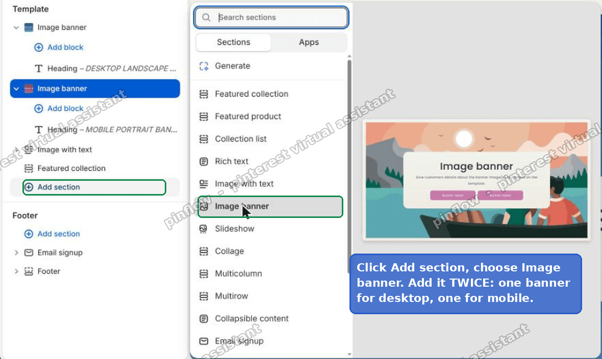 Add section, choose Image banner, and add it twice in the Shopify theme editor
In the editor sidebar you will now see two Image banner sections. I renamed the headings while testing so I could tell them apart, one for the desktop banner and one for the mobile banner. You do not have to, but it helps.
Step 2. Put one image in each
Click the first Image banner and set its image to your desktop landscape image.
Click the second Image banner and set its image to your mobile portrait image.
That is it for the images. Right now both banners show on every screen, stacked. That is expected. The next step hides the wrong one on each device.
Step 3. Add one line of Custom CSS to each banner
Each Sense section has a Custom CSS box in its settings. That box only styles that one section, which is exactly what we want.
Open the desktop banner's settings, scroll to Custom CSS, and paste this. It hides the desktop banner on phones.
@media screen and (max-width: 749px) { .banner { display: none; } }Open the mobile banner's settings, scroll to Custom CSS, and paste this. It hides the mobile banner on desktop.
@media screen and (min-width: 750px) { .banner { display: none; } }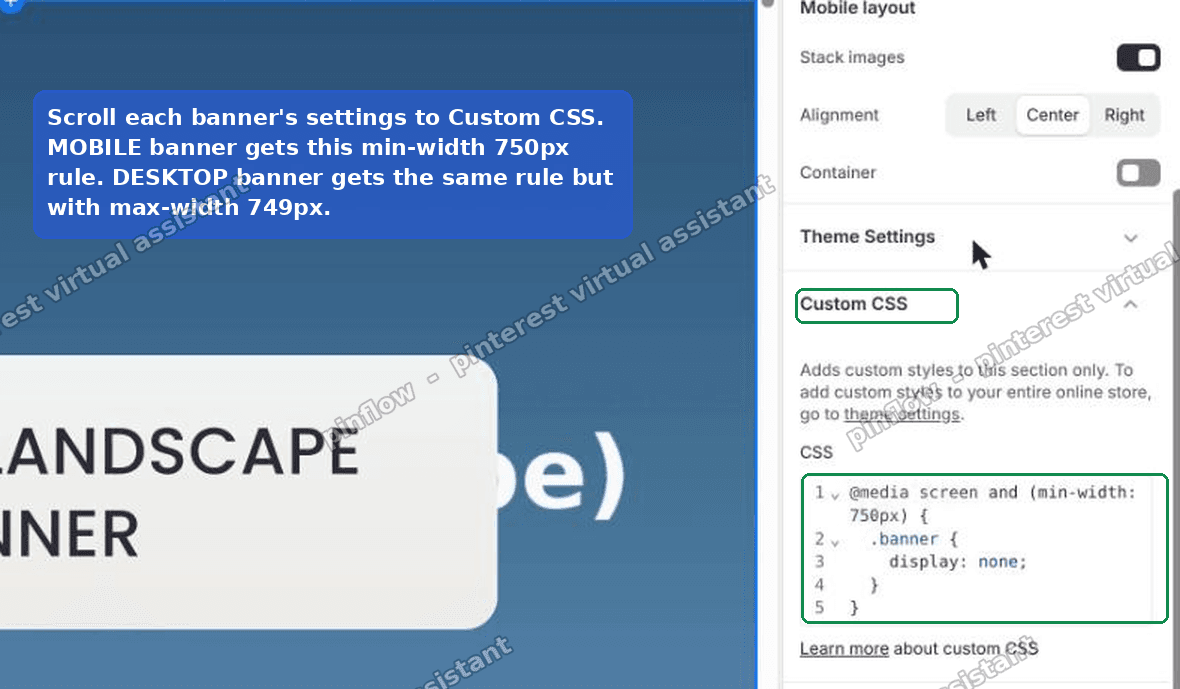 The Custom CSS box on a Sense Image banner with the media query hide rule pasted in
Then click Save.
If Save stays greyed out after you paste, click into the box, press Space, then Backspace. That nudges the editor into noticing the change.
The result
On desktop, visitors get the landscape image, full width, nothing cropped.
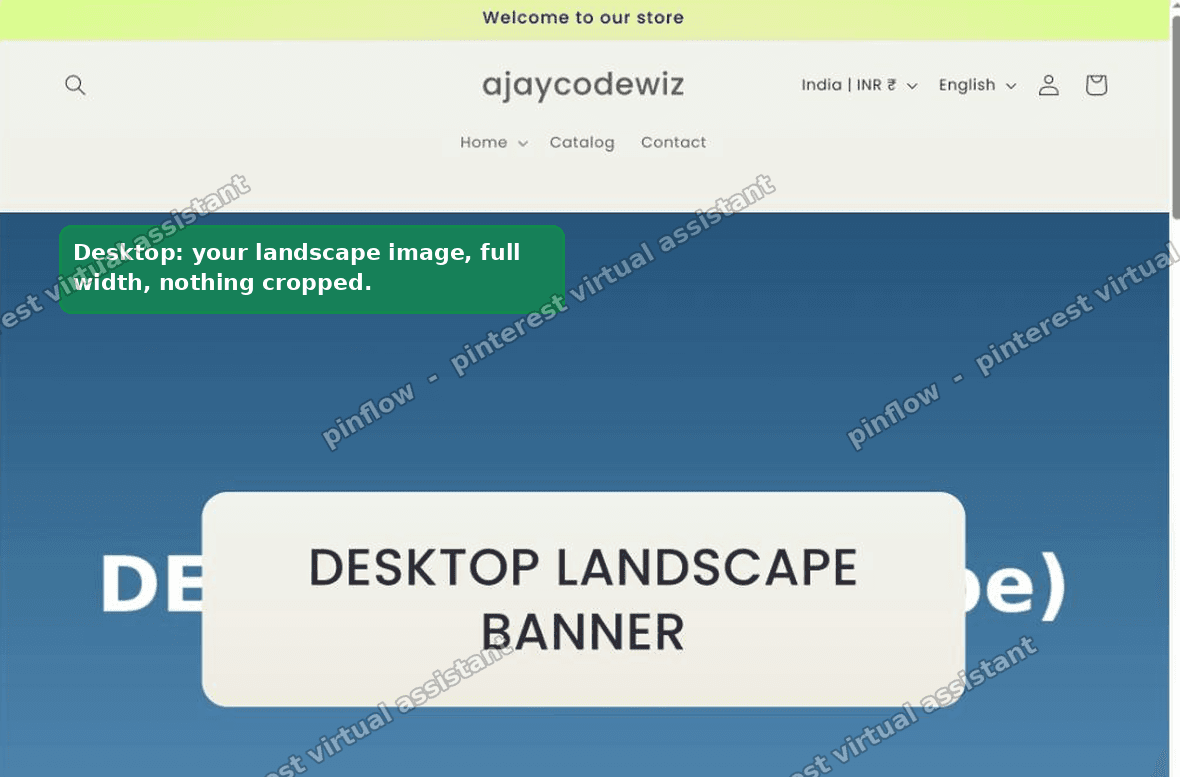 The Sense storefront on desktop showing the landscape banner at full width
On a phone, visitors get the portrait image, nothing cropped.
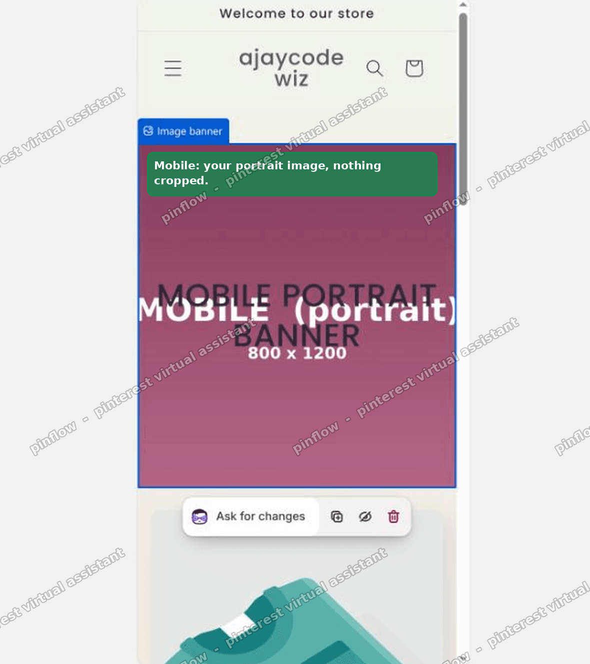 The Sense storefront on mobile showing the tall portrait banner with nothing cut off
I tested this on a Sense store. Desktop loaded the wide image, the phone loaded the tall image, and neither one was cut off. That is the whole goal.
Keep the heading, text and buttons in sync
There is one catch with the two-banner approach. You now have two separate banners, so any text lives in two places.
Set the same heading, the same body text and the same buttons on both banners. Otherwise you will edit the desktop headline, forget the mobile one, and end up with two different messages depending on the device.
Make it a habit. Every time you change the wording, change it on both.
If keeping two copies of the text in sync sounds annoying, the code alternative further down keeps everything in one section. It just needs a small theme edit.
What breakpoint does Sense use, and why 749 and 750
The two numbers in the CSS are not random.
Sense treats 750px wide as the line between phone and desktop. Below that is the mobile layout. At 750px and above is the desktop layout.
So the rules pair up cleanly:
- The desktop banner hides at max-width: 749px, meaning 749px and below.
- The mobile banner hides at min-width: 750px, meaning 750px and above.
There is no gap and no overlap. At any width, exactly one banner is hidden and exactly one shows. If you used the same number on both, say 750 on each, you would get a one-pixel width where both show or both hide. The 749 and 750 split avoids that.
If you ever want the switch to happen at a different width, change both numbers together and keep them one apart. For example 989 and 990 would switch closer to tablet width.
Does this affect my other sections
No. This is the nice part about the Custom CSS box on a section.
The box says it "adds custom styles to this section only." That is literally true. The rule you paste is scoped to that one banner. It cannot reach your header, your footer, your product grid or any other section.
The .banner class in the rule refers to the banner inside that section. Even though other sections might use similar class names, the Custom CSS box wraps your rule so it only applies where you pasted it. So you can hide one banner without any risk to the rest of the page.
That is why I reach for this before editing theme files. The blast radius is one section.
Alternative 1: add a mobile image field to the section
If you are comfortable editing theme code, or you have a developer, you can add a second image field to the Image banner section instead of duplicating the whole section.
The idea:
- Open
sections/image-banner.liquidin the code editor. - Add a second image picker setting in the section schema, something like
mobile_image. - In the section markup, output both images inside a
pictureelement, or output the mobile image with a class that only shows on small screens and hides the desktop image there.
The upside is that the heading, text and buttons stay in one place, so there is nothing to keep in sync. You get a clean "Desktop image" and "Mobile image" pair right in the section settings.
The downside is that it is a theme file edit. Theme updates can overwrite it, and a typo in the schema can break the section. If you go this way, duplicate the theme first so you have a safe copy.
I would only pick this route if you plan to reuse the two-image banner in many places. For a single hero, the no-code two-section method is faster and safer.
Alternative 2: one Custom Liquid section with a picture element
There is a middle path that needs no theme file edit but still keeps everything in one block.
Add a Custom Liquid section and use a picture element. A picture element lets the browser pick the right image by screen width, and the browser only downloads the one it uses.
<picture>
  <source media="(max-width: 749px)" srcset="MOBILE_IMAGE_URL">
  <img src="DESKTOP_IMAGE_URL" alt="Your banner description">
</picture>
You upload both images to Settings, Files, copy their URLs, and drop them in. The browser loads the portrait image on phones and the landscape image on desktop.
The upside over Alternative 1 is that it needs no theme file editing, so a theme update will not wipe it.
The downside is that you lose the built-in banner controls. There is no heading field, no button field, no overlay setting. You would build any text and buttons yourself in the same block. For a plain image hero this is fine. For a hero with a call to action, the two-section method keeps the native controls, which most merchants prefer.
Which method should you use
Pick based on how much you want to touch, and how often you will reuse it.
| Your situation | Use |
|---|---|
| No code, single hero, want native heading and buttons | Two Image banner sections plus the Custom CSS rule |
| No code, plain image hero, no theme edit | Custom Liquid with a picture element |
| Comfortable with code, reusing everywhere | Add a mobile image field to image-banner.liquid |
For the merchant who asked, the two-section method won. It is all in the theme editor, it keeps the banner's heading and buttons, and it survives theme updates because it changes no files.
A quick glossary
These terms come up a lot, so here they are in plain words.
Section. A big building block of a page, like the Image banner, a Featured collection, or a Rich text block. You add and remove sections in the theme editor. Each Sense section has its own Custom CSS box.
Block. A smaller piece inside a section. For example, a heading, a paragraph and a button inside one Image banner are blocks. Blocks live inside sections.
Breakpoint. The screen width where a layout switches from one arrangement to another. In Sense the main breakpoint is 750px. Below it you get the phone layout, at and above it you get the desktop layout. The CSS rules above hook onto that breakpoint.
Media query. The @media screen and (max-width: 749px) part of the CSS. It means "only apply these styles when the screen is 749px wide or smaller." That is how one rule can hide a banner on phones but leave it alone on desktop.
What to check if it did not work
Both banners still show, stacked. The Custom CSS did not save. Reopen each banner's Custom CSS box, confirm the rule is there, and Save again. Nudge Save with Space then Backspace if it is greyed out.
The wrong banner shows on your phone. You pasted the rules into the wrong banners. The max-width: 749px rule goes on the desktop banner. The min-width: 750px rule goes on the mobile banner. Swap them if they are reversed.
Both banners hide at one width. You used the same number in both rules. Use 749 in one and 750 in the other so they never overlap.
It looks right in the editor but wrong on the live site. The theme editor preview is not always a true phone width. Check on a real phone, or resize your browser window until it is narrower than 750px.
Your images still look cropped. That is a separate thing. Each banner still crops its own image to the banner height. Set the banner height to a size that suits your image, and upload an image close to the shape you want. The two-banner trick fixes device switching, not the crop inside a single banner.
Spending too long on manual Shopify busywork?
PinFlow turns your Shopify catalog into Pinterest pins and posts them on a schedule, automatically. Set your banners once, then let the system handle the repetitive marketing part.
Get PinFlow on the Shopify App StoreMore Shopify fixes
More community-sourced Shopify guides, tested on a live store.
Themes & Storefront
Shopify Horizon: Carousel Blank Until You Drag It
A Horizon carousel that shows an empty strip until you drag it, then fills in, is usually the theme skipping the painting of slides it thinks nobody is looking at. Here is how to tell that apart from a genuinely broken carousel, and the one line of CSS that covers it.
Themes & Storefront
Shopify Sold Out Overlay: Grey Out Products and Add a Sold Out Box
Shopify themes mark a sold out product with a small pill in the corner of the card. Here is how to turn that pill into a black Sold Out box across the middle of the photo, and fade the photo behind it, with no theme code and no app.
Themes & Storefront
How to Change the Price Font Size on a Shopify Collection Page
Shopify themes have no setting for the price size on a product card. Here is the one rule that shrinks it on collection pages only, where to paste it so it cannot reach your product pages, and how to keep the crossed out sale price in proportion.