
Make Your Shopify Footer Stick to the Bottom (Sticky Footer CSS)
On short Shopify pages like FAQ and Contact, the footer stops halfway up the screen and leaves empty space below it. Make the footer stick to the bottom with 14 lines of CSS in Theme settings. Tested on Prestige.
By AjayCodeWiz · September 28, 2026 · 9 min read
The problem
A merchant on the Prestige theme asked about this on the Shopify Community. Their FAQ page and their Contact page both had a band of empty space under the footer. The footer ended, and below it the page background carried on to the bottom of the browser window.
It happened on a laptop and on a phone. Longer pages, like the home page and the collection pages, looked fine.
Someone in the thread had already given them some CSS for it. They pasted it into the theme editor, clicked Save, and nothing changed. So I installed Prestige on a test store, built a short FAQ page, and reproduced the empty space. Then I found out why the first fix never worked, and wrote one that does.
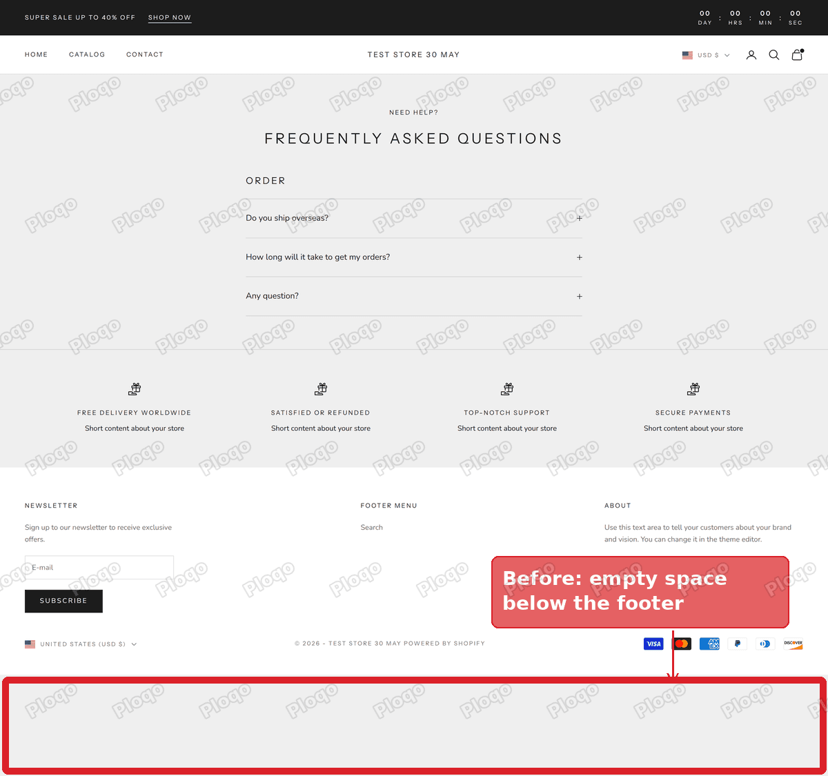 A short Prestige FAQ page with a band of empty background below the footer
Why there is empty space below the footer
A web page is only as tall as the things on it. The header, the page content and the footer are stacked on top of each other, and the page ends where the footer ends.
On a long page that stack is taller than the browser window, so you scroll, and the footer arrives at the bottom as you would expect. On a short page the stack is shorter than the window. The footer ends partway down, and the browser fills the rest of the window with the page background.
On my test store, with a browser window 1,500 pixels tall, the Prestige FAQ page ended at 1,304 pixels. That left 196 pixels of empty background under the footer. On a bigger monitor the band gets taller. On a phone it shows up on any page with only a few lines of text.
Nothing is broken in the theme. It is how every web page behaves unless the theme asks for something different, and Prestige does not.
Why FAQ and Contact pages are the usual ones
These two pages tend to be the shortest pages in a store. An FAQ page with its answers folded away is a heading and a few rows. A Contact page is a heading and a form. Product pages, collection pages and the home page are almost always taller than the screen, so the footer never has room to stop early.
Policy pages, a thank-you page, a search page with no results and the 404 page can show the same band for the same reason.
What a sticky footer is
The fix has a name in web design: a sticky footer. It means the footer sits at the bottom of the window when the page is short, and sits after the content, as normal, when the page is long.
It is different from a footer that stays fixed on screen while you scroll. That kind floats over the page all the time and covers content. A sticky footer does not move with the scroll. It only fills the empty space on short pages, by pushing the footer down to the bottom edge.
The CSS does three things:
- It makes the body of the page at least as tall as the browser window.
- It lets the main area of the page stretch to fill any spare height.
- It moves the spare height to just above the footer, so the footer ends up at the bottom.
CSS here means the code that controls how a page looks: sizes, colours and spacing. You do not need to write any. You paste one block into your theme.
Make the footer stick to the bottom in Prestige
These are the steps I posted in reply to the merchant. The code goes in Theme settings > Custom CSS, a box in the theme editor where you can add your own CSS for the whole store.
- Go to Online Store > Themes.
- Click Edit theme on your current theme, the one at the top of the page.
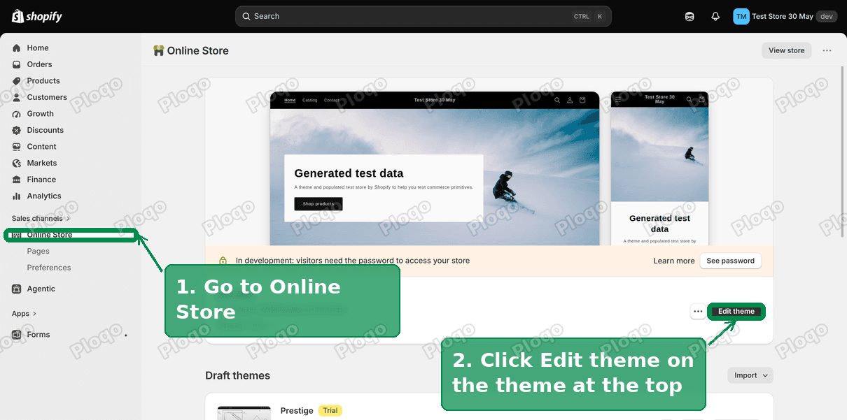 The Shopify Themes page with the current theme's Edit theme button highlighted
- Click the Theme settings icon, the gear, in the bar on the far left.
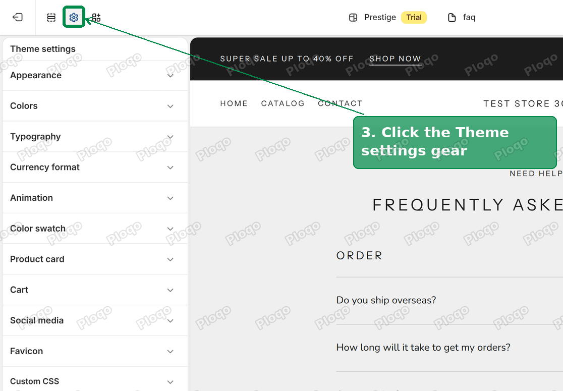 The Prestige theme editor with the Theme settings gear and the settings list highlighted
- Click Custom CSS at the bottom of the list.
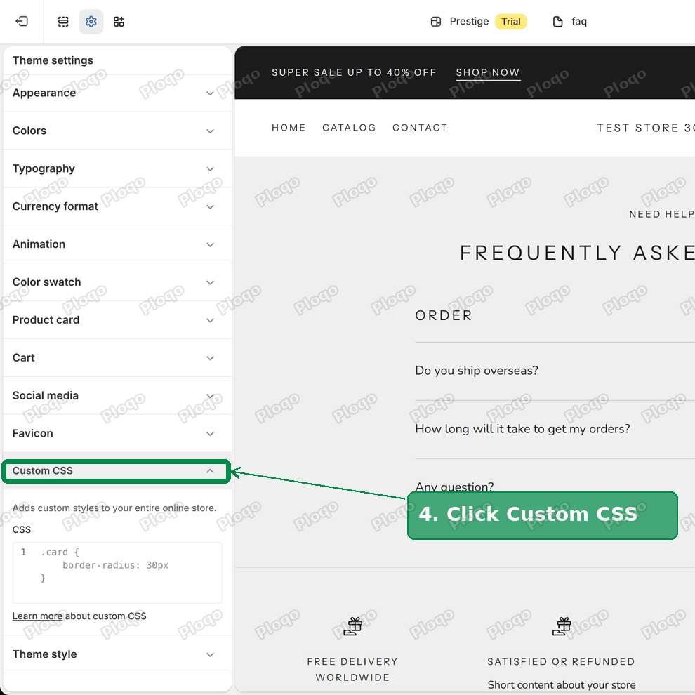 Prestige Theme settings with the Custom CSS panel open
- If you pasted footer code into this box before, delete it. Keep any other code you added.
- Paste this code at the end of the box:
body {
display: flex;
flex-direction: column;
min-height: 100vh;
min-height: 100dvh;
}
#main {
flex-grow: 1;
display: flex;
flex-direction: column;
}
#main > [id*="template--"] + :not([id*="template--"]) {
margin-top: auto;
}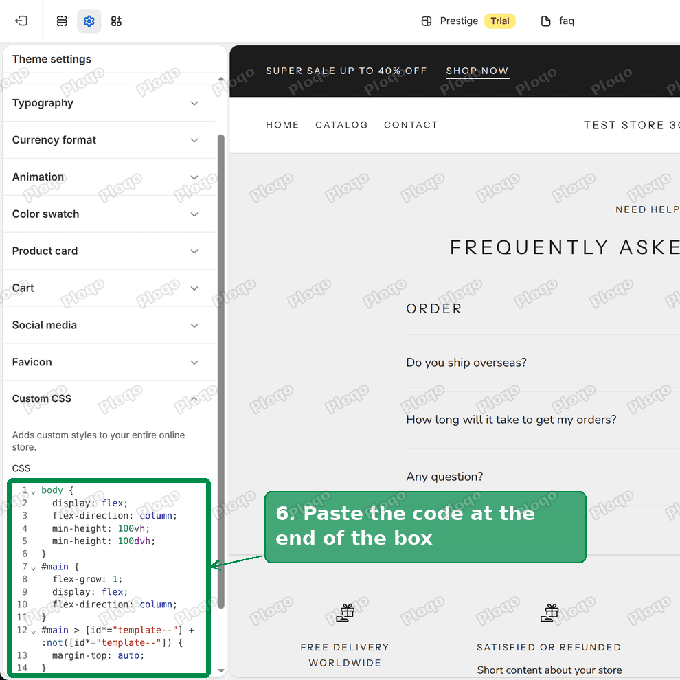 The sticky footer CSS pasted into the Prestige Custom CSS box
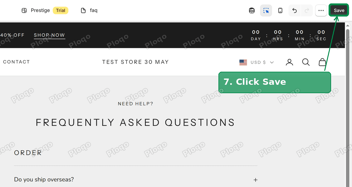
- Click Save.
 The Save button highlighted in the top right of the theme editor
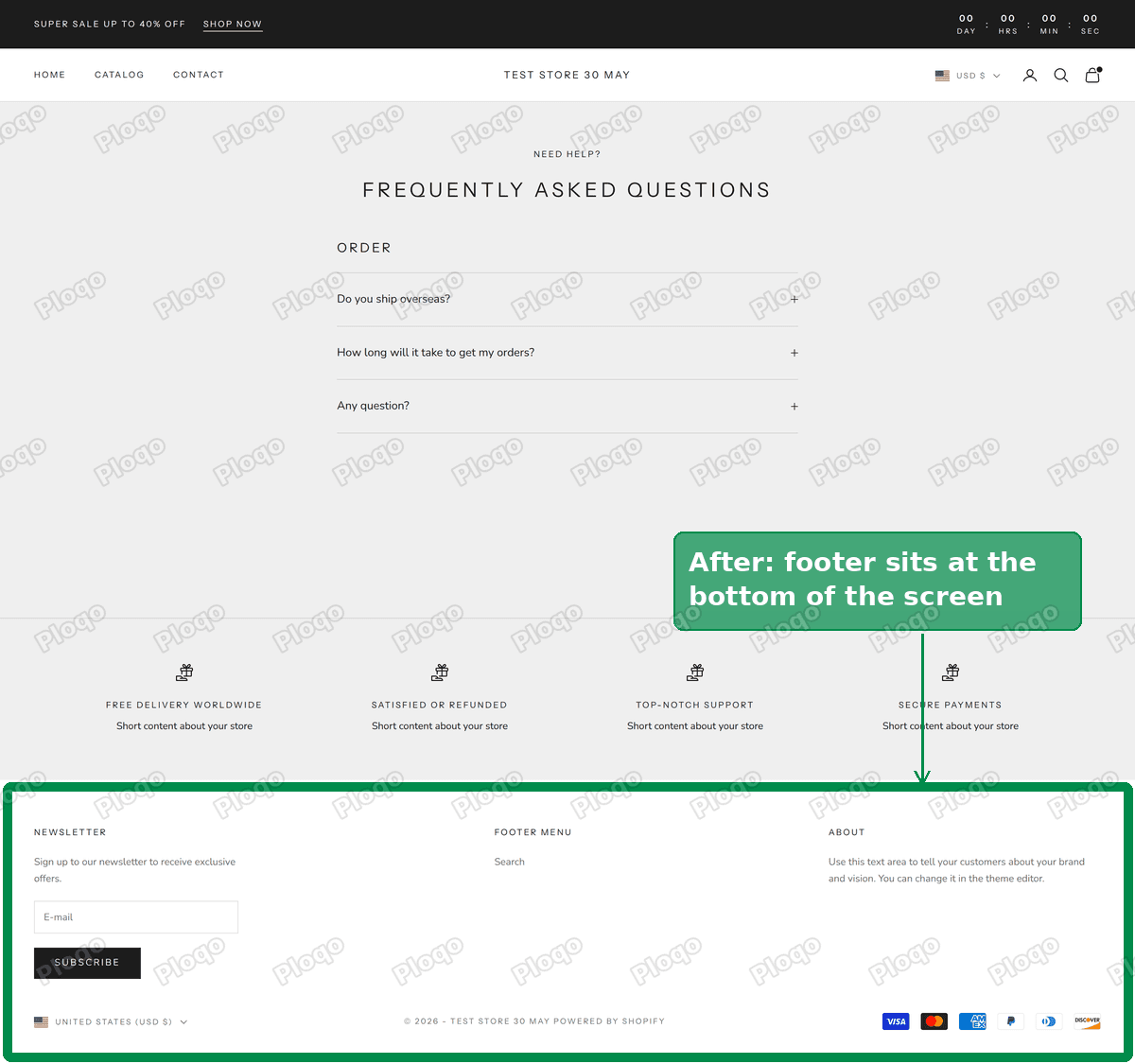
Open your FAQ page in a new tab. On my test store the footer moved from 1,304 pixels down to 1,500 pixels, which is the exact bottom of the window, and the empty band was removed.
 The same Prestige FAQ page with the footer at the bottom of the window
What each part of the code does
You do not need this to use the fix, but it helps if you want to adjust it.
min-height: 100vhmakes the page at least one screen tall. The unitvhmeans a percentage of the window height, so 100 is the full window.min-height: 100dvhdoes the same on phones, where the address bar slides in and out and changes the height of the window. Older browsers ignore this line and use the one above it.flex-grow: 1on the main area lets it take up any spare height that is left after the header.- The last rule points at the first footer section, the one straight after your page content, and gives it
margin-top: auto. That tells the browser to put the spare space above it, which is what pushes the footer down.
The #main part is the name Prestige gives to the area that holds the page content and the footer. Most recent Shopify themes use the same name.
Why the first fix did not save
The code the merchant had been given was close. It had the same first two parts. The third part pointed at the footer using a class name that Shopify adds to every footer section, one that starts with shopify-section-group.
On my test store, the theme editor would not save any Custom CSS rule that used that name. The Save button went grey as if it had worked, and no error appeared. When I reloaded the editor the box had gone back to what it held before, and the storefront had not changed.
I tested it one rule at a time. A rule naming shopify-section-group-footer-group would not save. The same rule for the header group would not save either. Every rule that avoided those names saved normally and showed up on the storefront.
The version above finds the footer another way. Shopify gives the sections of your page template an ID containing template--, and the header and footer sections a different one. The rule picks the first section after the last template section, which is the top of your footer, without naming the blocked class.
If you already pasted the older code, check your Custom CSS box. The older code might still be sitting in the box, or the box might have gone back to an earlier version. Replace it with the code above, save, and reload the editor to confirm it stayed.
Does it change long pages?
No. On a page taller than the window there is no spare height to fill, so the footer stays straight after the content. I checked the home page, a collection page and the Contact page on the test store. On each one the footer ended at the same spot with the code and without it.
It also leaves the spacing between sections alone. Prestige puts a small space between each section on a page, and that space is the same before and after.
What if you have more than one footer section?
Some stores have several sections in the footer area, for example a row of icons or a newsletter sign-up above the footer itself. The code keeps all of them together and moves the whole group to the bottom. The spare space goes between your page content and the first of those sections.
On my test store Prestige had a "Text with icons" section above the footer, and both moved down as one block.
If you built your footer from a Custom Liquid section, a box in the theme editor where you paste your own code, it works the same way. It still counts as a footer section, so it moves down with the rest.
Using a theme other than Prestige
Some themes already keep the footer at the bottom of short pages. I loaded the same short FAQ page in Dawn and in Horizon, two of Shopify's free themes, with a window 1,500 pixels tall. In both, the footer ended at exactly 1,500 pixels without any extra code. If your store runs one of those and still shows a band under the footer, something else is adding it, such as an app or a section below the footer.
Other paid themes vary. The code above relies on two things that change from theme to theme: the main content area being called #main, and the footer sitting inside it. If the code has no effect on your theme, one of those is different.
To check, right-click the empty space on your page and choose Inspect. The panel that opens shows the page's code. Look for the main tag around your content and the ID next to it. If it is something other than main, change #main in both places in the code to match.
Troubleshooting
Nothing changed after saving. Reload the theme editor and open Custom CSS again. If the code is not there, it did not save. Check that the box does not still hold code that names shopify-section-group, since that can block the save.
The code is there but the page looks the same. Make sure you edited your current theme, the one at the top of the Themes page. A copy under Draft themes is not the one shoppers see. The merchant's screenshot in the thread showed a copy of their theme open in the editor, so check the theme name at the top of the editor before you paste.
The footer is at the bottom, but a strip of background still shows under it on a phone. Some phones report the window height with the address bar hidden. The 100dvh line handles this in current browsers. Update the browser on the phone and check again.
A popup or cart drawer looks wrong afterwards. Those float over the page and should not be affected. If one moved, remove the code, save, and let your theme developer know which one.
Your store uses a page builder app. Page builders often draw their own page layout. The code may still work, but if it does not, the builder's own settings for page height are the place to look.
Empty space above the footer instead
If the band sits between your content and the footer, rather than below the footer, it is a different problem. That space usually comes from the section itself: a Padding or Minimum height setting on the last section of the page, or an empty section that is still switched on.
The settings to look at belong to the last section before the footer, in the same theme editor you used above. Its padding and height settings decide how much room it takes, and an empty section left switched on still takes up room.
This article started from a thread on the Shopify Community: <a href="https://community.shopify.com/t/remove-extra-space-below-footer-on-faq-and-contact-pages/688264" rel="nofollow">Remove Extra Space Below Footer on FAQ and Contact Pages</a>.
Spending too long on manual Shopify busywork?
PinFlow turns your Shopify catalog into Pinterest pins and posts them on a schedule, automatically. Set it up once and let it run.
Get PinFlow on the Shopify App StoreMore Shopify fixes
More community-sourced Shopify guides, tested on a live store.
Themes & Storefront
Shopify AI Section: Fix a Price Badge Hidden Behind the Image
You built a section with Shopify's AI section generator, but the price badge on each card sits behind the photo. Here is the Custom Liquid fix that brings it to the front without regenerating anything. Tested on a Dawn store.
Themes & Storefront
Hide Shipping Calculated at Checkout on One Shopify Product
The line under Add to cart that says shipping is calculated at checkout shows on every product, gift cards included. Here is how to hide it on one product only, with the code, screenshots and the Eclipse theme steps.
Themes & Storefront
Shopify Dropdown Menu Behind Page Content (Z-Index Fix)
Your Shopify dropdown or mega menu opens, but the page title and products sit on top of its links and the menu closes before you can click. The fix is one Custom CSS rule in Theme settings. Tested on a Rebel store.