
Shopify Header: Hamburger Menu on Desktop (Horizon)
Horizon shows a full menu bar on desktop and a hamburger icon only on phones. Here is how to show the hamburger menu on desktop too, and how to move the search icon to the right, with screenshots.
By AjayCodeWiz · October 6, 2026 · 8 min read
The problem
A merchant on the Shopify Community asked how to get the hamburger menu on their desktop header. The hamburger is the small icon made of two or three lines that opens a slide-out list of links. Their store, on the Horizon theme version 4.2.0, showed it on phones. On a laptop it showed the full row of links instead: Home, Shop, Contact.
They wanted the phone layout everywhere. Logo in the middle, a clean header, and every link tucked behind the icon.
I rebuilt their setup on a test store running Horizon 4.2.0 and tested the fix on a desktop screen and a phone-sized screen. The two screenshots below show the starting point and the result.
 Horizon 4.2.0 header on desktop showing the full menu links Home, Shop and Contact
 The same header after the change, with a hamburger icon on the left and no menu links
Why Horizon only shows the hamburger on phones
Horizon 4.2.0 has no setting for this. I went through the header settings in the theme editor and none of them switches the menu style.
The theme decides on its own, each time the page loads. It shows the hamburger drawer in two cases:
- The visitor uses a touch screen, such as a phone or tablet.
- The menu links do not fit in the header, so the theme runs out of room and folds them away.
On a normal desktop window neither case is true, so you get the full menu bar.
That is why the usual advice of "shrink the logo" or "add more links until they overflow" is a poor fix. It works by accident and breaks as soon as someone opens the store on a wider monitor.
The reliable fix is to tell the theme to always use the drawer. You do that with a small piece of code, and you do not have to edit any theme file.
What you need
- A store on Horizon 4.2.0. I tested only on that version.
- About ten minutes.
- Access to the theme editor (Online Store, then Themes, then Customize).
Horizon has relatives built on the same code, such as Atelier. I did not test them, so check the result on your own store before you publish anything. Preview the theme from the editor first.
Step 1: Add a Custom Liquid section to the header
Liquid is the code Shopify themes are written in. A Custom Liquid section is a box in the theme editor where you paste your own code. Nothing in the theme's files changes, and you can delete the section later to undo everything.
- Go to Online Store and then Themes.
- Click Customize on your current theme.
- In the Header group on the left, click Add section.
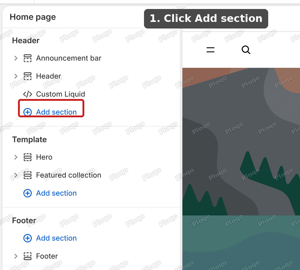 The theme editor with the Header group open and the Add section button highlighted
The Header group is the block at the top of the left sidebar. It holds the announcement bar and the header itself. Put the new section in this group, so that it loads on every page.
- Choose Custom Liquid from the list.
Step 2: Paste the code that forces the hamburger menu
- Click inside the Liquid code box and paste this:
<script>
(function () {
var header = document.querySelector('#header-component');
if (!header) return;
var force = function () {
if (header.dataset.menuStyle !== 'drawer') header.dataset.menuStyle = 'drawer';
};
force();
new MutationObserver(force).observe(header, { attributes: true, attributeFilter: ['data-menu-style'] });
})();
</script>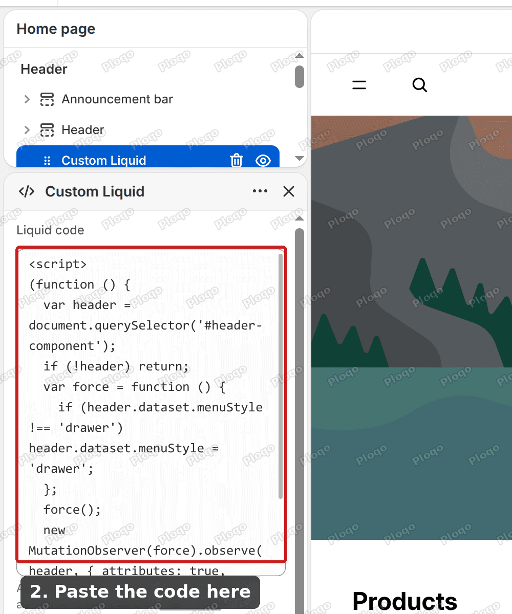 The Custom Liquid box in the theme editor with the code pasted in
- Click Save at the top right of the editor.
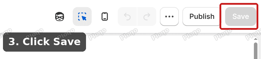 The Save button at the top right of the theme editor
Here is what the code does. The theme stores its menu style on the header as a label, either "menu" or "drawer". The first part of the code sets that label to "drawer". The second part watches the label. If the theme tries to switch it back to "menu" when the window is resized, the code changes it to "drawer" again.
You need the watching part. Without it the full menu comes back whenever the window is resized, and a test on a desktop browser looks fine only until you drag the window edge.
What you get on desktop
After saving, reload the store preview on a desktop screen. The menu links are gone and the hamburger icon sits at the left. Clicking it opens the same slide-out panel that phone visitors already see, with your menu links, the currency picker and a row of products.
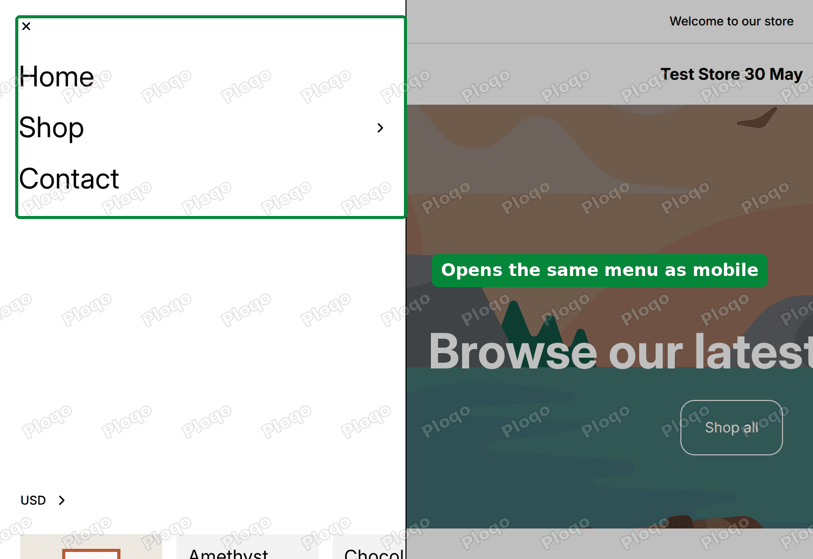 The slide-out menu panel open on a desktop screen after the change
I opened the menu, closed it with the Escape key and scrolled the page. The page scrolled normally afterwards.
Problem two: the search icon moves to the left
The merchant came back with a second request. The hamburger worked, but the search icon now sat on the left, right next to the hamburger. They wanted it on the right with the Account and Cart icons.
This follows from how Horizon lays out its phone header. The phone layout has two slots on the left, one for the hamburger and one for search. It has two slots on the right, which Account and Cart already fill. When you force the phone layout onto desktop, search lands in the second left slot.
Here is the header after the first fix, with search on the left.
 The desktop header after the first fix with the search icon next to the hamburger on the left
The fix is to give the header one more slot on the right and move search into it. I added a short block of style rules to the same Custom Liquid section. The rules go above the script.
Step 3: Replace the code with the updated version
- Go to Online Store, then Themes, then Customize.
- In the Header group on the left, click the Custom Liquid section you added earlier.
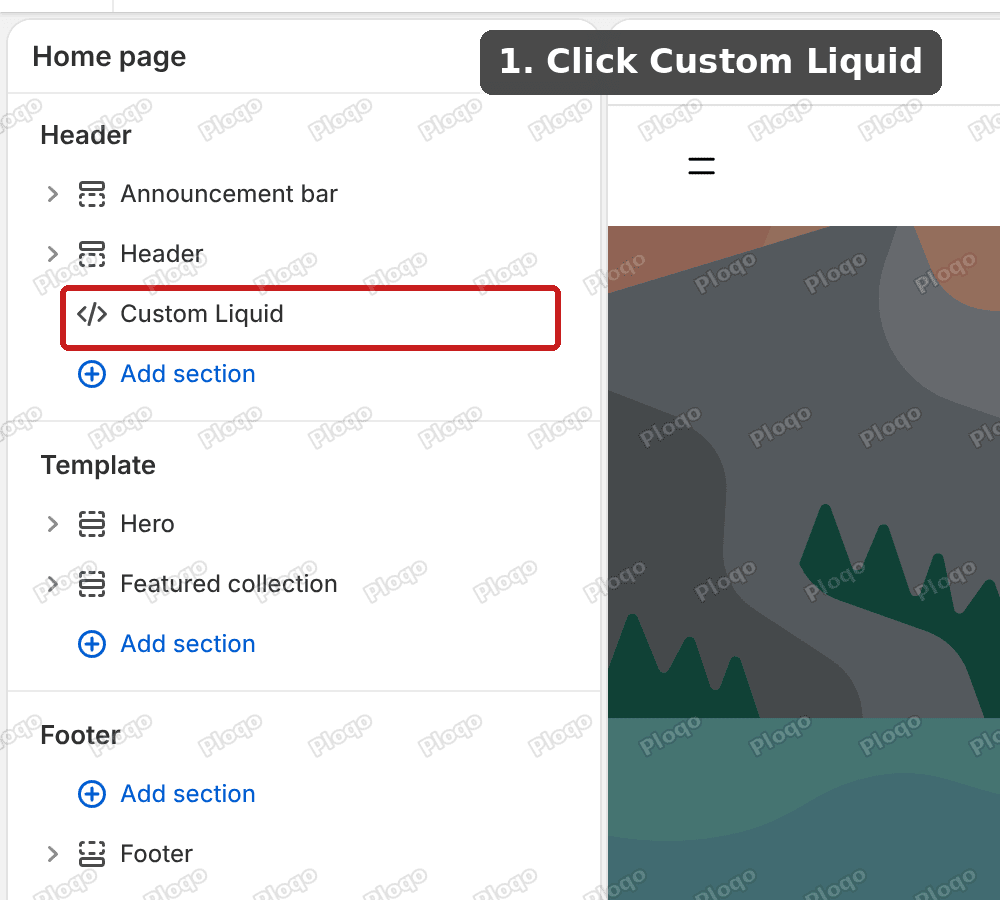 The Header group in the theme editor with the Custom Liquid section highlighted
- Click inside the Liquid code box and delete the old code.
- Paste this updated code instead:
<style>
#header-component[data-menu-style='drawer'] .header__columns {
--header-template-columns: 44px 44px 1fr 44px 44px 44px;
grid-template-areas: 'leftA leftB center rightS rightA rightB';
}
#header-component[data-menu-style='drawer'] .header__columns .search-action {
grid-area: rightS !important;
}
</style>
<script>
(function () {
var header = document.querySelector('#header-component');
if (!header) return;
var force = function () {
if (header.dataset.menuStyle !== 'drawer') header.dataset.menuStyle = 'drawer';
};
force();
new MutationObserver(force).observe(header, { attributes: true, attributeFilter: ['data-menu-style'] });
})();
</script>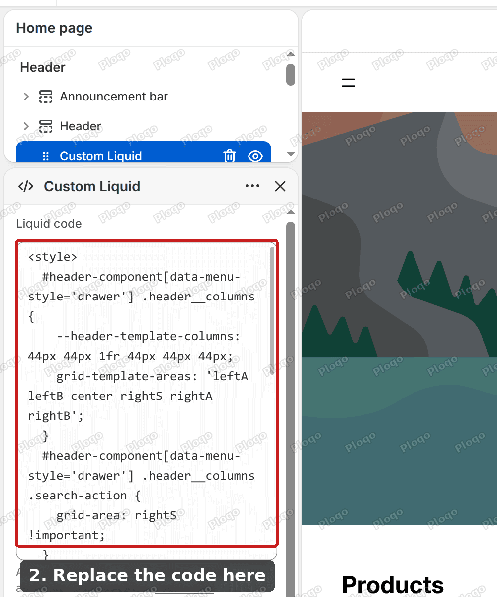 The Custom Liquid box showing the updated code with the style rules at the top
- Click Save.
The style block redraws the header grid in drawer mode. It adds a sixth column and puts the search button in it, next to Account and Cart. The script is the same as before.
Here is the result. Search now sits with Account and Cart on the right, and the hamburger stays on the left.
 The desktop header after the second fix with the search icon on the right next to Account and Cart
Check it on a phone
The new layout also applies on phones, because phones already use the drawer. I loaded the preview at a phone width of 390 pixels. The hamburger sat on the left and search, Account and Cart sat in a row on the right.
My test store's name is long, so it wrapped onto two lines in the middle of the header. If your store name is long too, expect the same wrap, because the center column now has one fewer slot of space. A short name or a logo image fits.
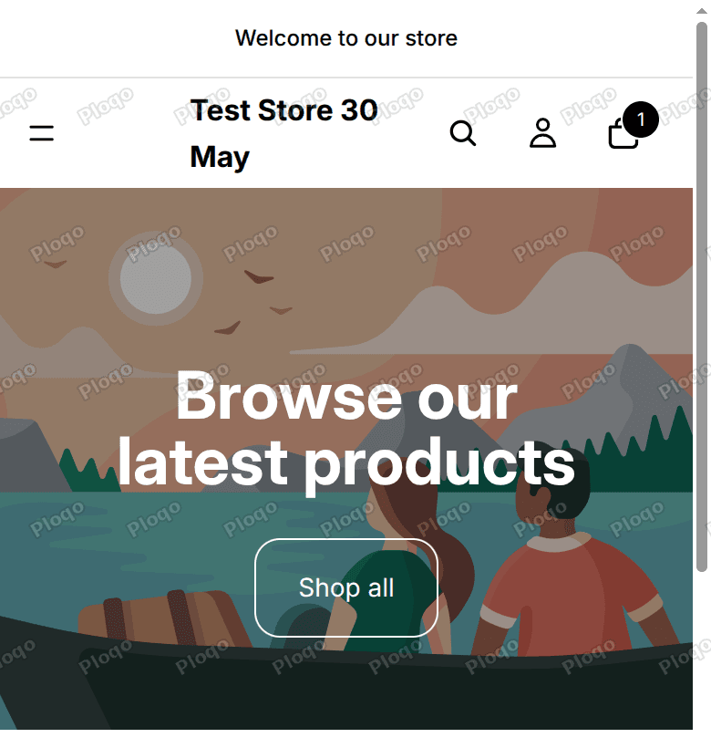 The phone-width header with the hamburger on the left and the search, account and cart icons on the right
If something does not look right
The full menu is still showing on desktop. Check that the Custom Liquid section is inside the Header group, not in the page template below it. Then reload the store with the browser cache cleared. I saw an old copy of the page once on my own test, right after saving, and a reload fixed it.
The search icon is still on the left. Make sure the style block is above the script and that you deleted the old code first. Two copies of the script do no harm, but a half-pasted style block breaks the rules.
The page freezes when you open the menu. The merchant mentioned a freeze early on. I could not reproduce it on Horizon 4.2.0. The page scrolled after I opened and closed the menu, and the merchant later said the menu was working. If your store still freezes, test it in a private window with apps turned off. A pop-up or chat app that locks page scrolling is a common cause.
You want to undo it. Delete the Custom Liquid section from the Header group and save. The theme goes back to its normal behavior, since nothing in the theme files was edited.
Two other ways to get the same result
Edit the theme files. Another answer on the same thread changes one line in the theme's main layout file and one line in its script file, so the theme always picks the drawer. It works too. The drawback is that a theme update overwrites those files, and you have to repeat the edits after every update. The Custom Liquid section is a separate piece of the header group, so it is easier to find and remove.
Use an app. Header and mega menu apps in the Shopify App Store change the menu style without code. They cost a monthly fee, and you now have another app loading on every page. For one layout change I would use the code.
Related questions about the Shopify header
How do I edit the header in Shopify? The Header group at the top of the editor sidebar holds the header and the announcement bar. Click Header to change the logo, menu, colors and icons. On Horizon, the Header section also has the search settings: whether to show search, and where to place it.
How do I add a search bar to the Shopify header? Turn on the search option in the Header section settings. The icon opens a search box when a visitor clicks it. The code in this article only moves the icon. It does not add search to a header that has it switched off.
Can I have different header menus on different pages? Shopify lets you assign a different menu to a single page by using a template, and a community thread covers it. That is a separate change from the menu style.
Words used in this article
Hamburger menu. The icon made of two or three horizontal lines that opens a hidden list of links.
Drawer. The panel that slides in from the side when you click the hamburger.
Header group. The top block of the theme editor sidebar, which holds the announcement bar and the header.
Custom Liquid. A section where you paste your own code, without touching the theme's files.
Summary
- Horizon 4.2.0 has no setting for a desktop hamburger menu. It picks the drawer on touch screens and when the links run out of room.
- A Custom Liquid section in the Header group forces the drawer on every screen size.
- A short style block moves the search icon to the right, next to Account and Cart.
- I tested both changes on Horizon 4.2.0 on a desktop and a 390 pixel wide phone preview, and the menu opened, closed and scrolled normally.
Spending too long on manual Shopify busywork?
PinFlow turns your Shopify catalog into Pinterest pins and posts them on a schedule, automatically. Same idea as the rule above, let the system handle the repetitive part.
Get PinFlow on the Shopify App StoreMore Shopify fixes
More community-sourced Shopify guides, tested on a live store.
Themes & Storefront
Shopify Autoplay Video on Product Page: Skip the Play Button
Your product video shows a play button instead of playing. How to make a Shopify product page video autoplay on desktop and mobile, with the exact code and steps.
Themes & Storefront
Hide the First Image in Your Shopify Product Image Gallery
Hide the first photo in a Shopify product image gallery without deleting it, so the gallery opens on image 2. Tested Custom CSS for the Roam theme, desktop and mobile.
Themes & Storefront
Show a Brand Logo on Shopify Product Pages by Vendor
Show the right brand logo next to the vendor name on every Shopify product page. One logo per brand, no code edits when you add a brand. Tested on the Enterprise theme.