
Shrink or Hide the Image Zoom Button in Shopify
Zoom button too big on your Shopify product photos? Shrink, fade, or hide it with a little Custom CSS while keeping the zoom.
By AjayCodeWiz · August 8, 2026 · 12 min read
The problem
A merchant asked about this on the Shopify Community.
They had a white circle with a magnifying glass inside it, sitting on top of their product photos. It is the image zoom button. Tap or click it and the photo opens larger.
Their complaint was simple. The button was too big. It covered part of the product image. It looked clumsy on the photo.
They did not want to turn zoom off. They liked the feature. They just wanted the button smaller, or the white circle gone, or the whole thing more see-through.
This is a very common ask. The zoom button is helpful. The default size is not.
I reproduced it on a test store on the Eclipse (Fluorescent) theme, the exact theme and version the merchant was running. Here is the button, big and white, sitting over the photo on a phone.
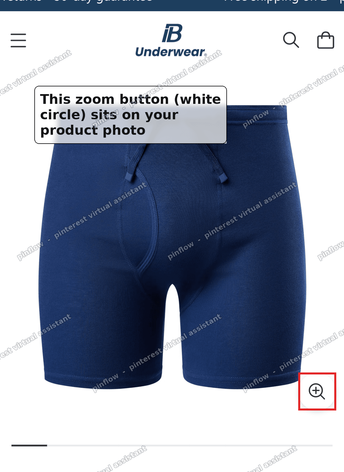 Big white zoom button sitting on the product photo on mobile in the Eclipse theme
The good news is you do not need an app for this. You do not need to edit any theme files. A few lines of Custom CSS shrink the button, fade the circle, or remove it, and the zoom keeps working.
This is the fix for anyone searching for how to shopify hide zoom button, or how to shrink the shopify image zoom button without losing the feature.
Why it happens
The zoom button is built into the theme. It is not something you added.
On Eclipse the button is a round element with a class name of product-media__lightbox-zoom. The white circle you see is not the button itself. It is a pseudo-element, a decorative shape the theme draws behind the icon using CSS. In the code it is the :before part of that button.
The magnifying glass on top is a separate icon. It has its own width and height, set with CSS variables the theme calls --icon-width and --icon-height.
So on screen you are really looking at three things stacked together.
- A round button, sized by a
--sizevariable. - A white circle behind it, drawn by the
:beforepseudo-element. - A magnifier icon on top, sized by the icon variables.
That is the mechanism most forum answers skip. They tell you to make "the button" smaller, but the white circle and the icon are separate pieces. If you only shrink one, the button still looks off. You have to touch all three.
There is one more detail that matters. On Eclipse the button behaves differently by screen size. On phones (anything under 1024px wide) the button is always visible on the photo. On desktop it only appears when you hover over the image. That is why the button feels most intrusive on mobile. It is on screen the whole time.
Before you start
This fix is written for Eclipse (the Fluorescent theme). The class names above are Eclipse's.
If you are on a different theme, the idea is identical but the class name changes. Dawn, Horizon, and other themes name the zoom button something else. Later in this post I show you how to find the correct name for any theme, so the same steps work for you.
To check your theme and version, go to Online Store, then Themes. Your theme name is at the top of the current theme card. Click the three dots, then Edit code, and the version shows in the theme information. I tested on Eclipse 5.3.1.
The fix
Here are the steps. It is all done in one place, the theme's Custom CSS box. No code files, no app.
Step 1. Open your theme editor.
In your Shopify admin, go to Online Store, then Themes. Find your live theme and click Customize, or Edit theme.
 Online Store Themes page with the Edit theme button on the Eclipse theme
Step 2. Open Theme settings and find Custom CSS.
Inside the editor, click the gear icon on the left. That opens Theme settings. Scroll down the list until you see Custom CSS. This is a box where you can add styles that apply to your whole store.
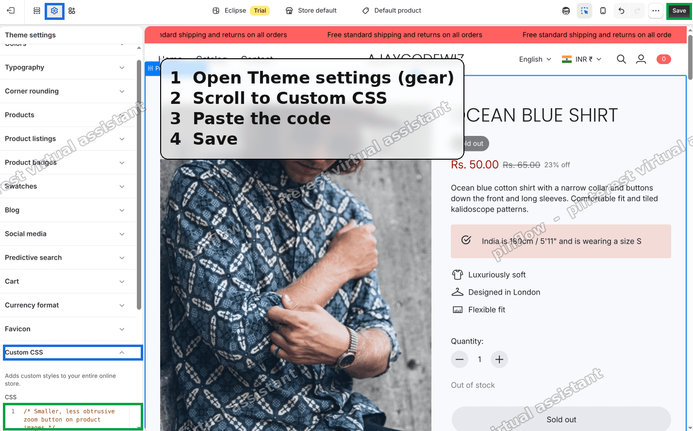 Eclipse theme editor open on Theme settings with Custom CSS highlighted in the sidebar
Step 3. Paste this code, then Save.
Paste the following into the Custom CSS box and click Save in the top right.
.product-media__lightbox-zoom{ --size: 30px; }
.product-media__lightbox-zoom .product-media__zoom-icon{
  --icon-width: 15px !important;
  --icon-height: 15px !important;
}
.product-media__lightbox-zoom:before{ opacity: .5; }
Here is what each line does, in plain words.
- The first line sets the button size to 30px. Eclipse's default is 44px, so this makes it smaller.
- The middle block shrinks the magnifier icon to 15px wide and tall, so the icon matches the smaller button.
- The last line fades the white circle to half visible, so it stops covering the photo so hard.
Save, then look at a product page. The button is smaller and softer, and zoom still works when you tap or click it.
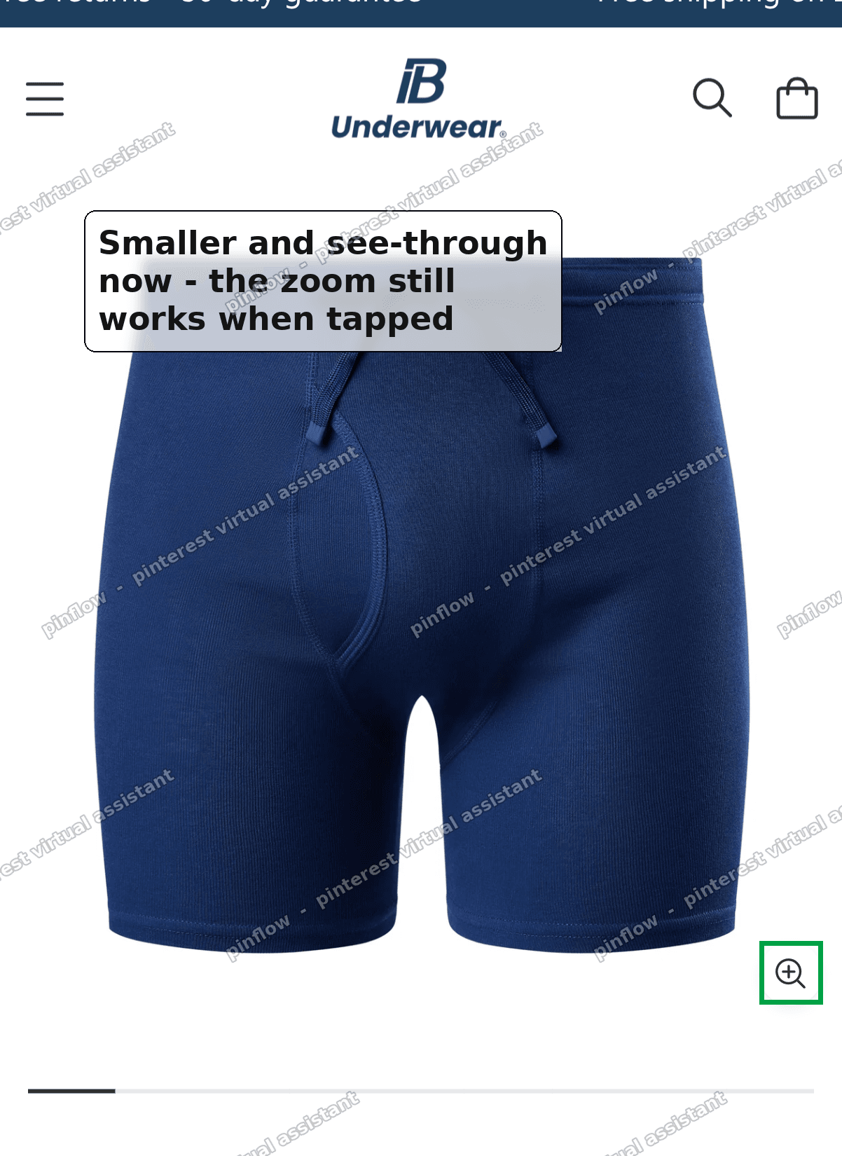 Smaller, see-through zoom button on the product photo after the CSS fix on mobile
Adjust it to taste.
The three values are yours to change.
- Bigger or smaller button: change
--size. Try 26px for tiny, or 40px if 30px feels too small. - More see-through: lower the
opacity. Use.3for very faint,.7for barely faded. - Icon size: change the
--icon-widthand--icon-heightnumbers together so the magnifier stays in proportion.
This is the whole of the shopify image zoom button css most stores need. Small, clean, and the feature stays.
Remove the white circle completely
Some merchants do not want a circle at all. They want just the plain magnifier icon floating on the photo.
To do that, swap the last line of the code for this one.
.product-media__lightbox-zoom:before{ display: none; }That hides the white circle entirely and leaves only the magnifying glass icon. Keep the first two blocks from the main fix if you also want the icon smaller.
This is the answer for the shopify remove zoom icon circle question. You are not removing the icon, you are removing the white disc behind it.
An alternative: turn the zoom off entirely
Maybe you decide you do not want the button at all, not even a faint one.
Eclipse and most modern themes have a built-in setting for this. You do not need CSS for it.
- In the theme editor, open a product page in the preview.
- Click the product media or gallery section in the left sidebar.
- Look for an image zoom or "Enable image zoom" setting.
- Set it to off, or "No zoom", and Save.
That removes the whole button, circle and icon together. The trade-off is you lose the zoom feature. The merchant in the original thread did not want that. They liked zoom. So the CSS route above is the better fit if you want to keep the feature but tame the button. Use the theme setting only if you are happy to drop zoom.
There is a middle option too. Some themes let you choose the zoom style, like open in a lightbox versus hover-to-magnify. Changing the style sometimes changes or removes the on-image button. It is worth a look before you write any CSS.
How do I hide the zoom button in Shopify?
To fully hide the button while keeping the rest of the page, add one rule to Custom CSS.
.product-media__lightbox-zoom{ display: none; }That hides the whole button, circle and icon, using the theme's own class. The image itself is untouched. On Eclipse the zoom still works if the theme allows tap-to-zoom on the image directly, but on most setups hiding the button removes the obvious way to trigger zoom. So hide it only if you truly do not want people zooming, or if you plan to turn zoom off in theme settings anyway.
If your goal is to keep zoom but make the button subtle, use the shrink-and-fade fix higher up instead. Hiding and shrinking are different goals. Pick the one that matches what you want.
What is the CSS class for the Shopify zoom button?
It depends on the theme. There is no single class every Shopify theme uses.
On Eclipse the button is .product-media__lightbox-zoom and the white circle is its :before. Other themes use names like .product__media-icon, .product__media-toggle, or .zoom-button. The name is set by whoever built the theme.
To find yours, open a product page in a desktop browser. Right-click the zoom button and choose Inspect. That opens the browser developer tools. The highlighted element in the code is your button. Read its class value, and that is the selector to use in your Custom CSS.
Then reuse the same fix, just replace .product-media__lightbox-zoom with your theme's class name. The approach carries over to any theme.
If you cannot right-click the button because it only shows on hover, hover the image first, then right-click, or use the developer tools element picker and move your mouse over the button.
Does this fix change the desktop zoom button too?
Yes, it does. The CSS applies everywhere.
One thing tripped up the original merchant, and it is worth flagging. After they saved the code, they thought it only worked on mobile and not on desktop. They came back and corrected themselves. The fix had worked on desktop too. They had been looking at a preview mode that was not applying the saved styles.
So if the change looks like it only worked on phones, do not assume desktop is broken. Open your live store in a normal browser tab, not the theme editor preview, and check again. Custom CSS applies to both screen sizes at once.
Remember the desktop behavior difference from earlier. On desktop the button only appears when you hover the photo, so it feels less intrusive there anyway. The mobile view is where most people notice the button, because it is always on screen.
Will this break the image zoom?
No. Shrinking, fading, or removing the white circle does not touch the zoom function.
The zoom is triggered by clicking or tapping the button, and the button is still there and still clickable. You are only changing how it looks, its size, its opacity, and the circle behind it. The click target still works.
The only version that stops zoom is hiding the whole button with display: none, or switching the theme's zoom setting off. Those remove the way to trigger zoom on purpose. The shrink-and-fade fix keeps everything working.
I tested this on Eclipse 5.3.1, the same version the merchant ran. The smaller, faded button still opened the enlarged photo on both phone and desktop.
If it did not work
A few things to check if the button did not change after you saved.
- You are looking at a cached or preview page. Open your live store in a fresh tab and hard refresh. This is the exact thing that confused the original merchant.
- Wrong class name. If you are not on Eclipse,
.product-media__lightbox-zoomis not your button. Inspect the button and use your theme's real class, as shown above. - Custom CSS box has a character limit. If you already have a lot of CSS in there, some themes cap the length. Remove old unused rules to make room.
- An app added its own gallery. Some product-gallery or image-zoom apps replace the theme's gallery entirely. If yours does, the button belongs to the app, not the theme, and you style it from the app's settings or its own class.
- The rule is being overridden. If another style wins, add
!importantto the size and opacity lines, the same way the icon lines already use it.
Terms people confuse
A few of these words get mixed up, so here is the plain-English version.
Zoom button vs zoom feature. The button is the little control on the photo. The feature is the enlarge-on-click behavior. You can style the button without touching the feature. You can also keep the feature and hide the button, though then people have fewer ways to trigger it.
The circle vs the icon. The white round shape and the magnifying glass are two separate pieces. On Eclipse the circle is the :before pseudo-element and the icon is a small SVG. Removing the circle leaves the icon, and shrinking the icon does not remove the circle.
Custom CSS vs Edit code. Custom CSS is a safe box in Theme settings for adding styles. Edit code opens the raw theme files. For this fix you only need Custom CSS. You never edit a file, so there is nothing to break and it is easy to undo, just delete the lines.
Theme settings vs section settings. Theme settings apply to the whole store, which is where Custom CSS lives. Section settings apply to one part of one page. The zoom toggle, if your theme has one, is usually a section or block setting on the product page, not in theme settings.
That is the full picture. Shrink it, fade it, drop the circle, or hide it completely. The Eclipse selectors are above, and the same steps work on any theme once you find its class name.
Spending too long on manual Shopify busywork?
PinFlow turns your Shopify catalog into Pinterest pins and posts them on a schedule, automatically. Same idea as the rule above, let the system handle the repetitive part.
Get PinFlow on the Shopify App StoreMore Shopify fixes
More community-sourced Shopify guides, tested on a live store.
Themes & Storefront
Shopify AI Section: Fix a Price Badge Hidden Behind the Image
You built a section with Shopify's AI section generator, but the price badge on each card sits behind the photo. Here is the Custom Liquid fix that brings it to the front without regenerating anything. Tested on a Dawn store.
Themes & Storefront
Hide Shipping Calculated at Checkout on One Shopify Product
The line under Add to cart that says shipping is calculated at checkout shows on every product, gift cards included. Here is how to hide it on one product only, with the code, screenshots and the Eclipse theme steps.
Themes & Storefront
Shopify Dropdown Menu Behind Page Content (Z-Index Fix)
Your Shopify dropdown or mega menu opens, but the page title and products sit on top of its links and the menu closes before you can click. The fix is one Custom CSS rule in Theme settings. Tested on a Rebel store.