
Shopify iframe Not Showing Properly? The One-Line Cause
A Shopify iframe that renders as a thin strip, stuck to the left edge, is almost never the embed's fault. Here is the theme rule that collapses it to 150px, and the Custom Liquid block that fixes it.
By AjayCodeWiz · July 26, 2026 · 9 min read
The problem
A merchant asked about this on the Shopify Community and it is one of the better puzzles I have seen.
She had embedded an Excel table from OneDrive on her homepage. Microsoft gives you an iframe, you paste it into a Custom Liquid section, and it should just work.
It did not. Her exact words: "It only shows the top of the table and is not centered."
Her embed code was fine. It had a sensible width and height on it:
<iframe width="621" height="410" frameborder="0" scrolling="no"
  src="https://1drv.ms/x/c/.../..."></iframe>
But on the live page the table rendered as a thin horizontal strip stretched right across the screen. You could see the header row and about two rows of data. Everything below was cut off.
Here is what that looks like. I reproduced it exactly on a test store.
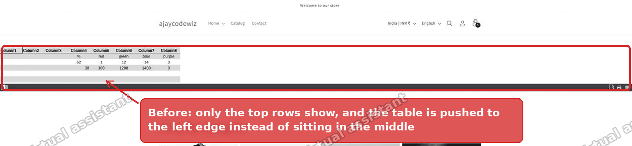 A Shopify iframe collapsed to a thin strip showing only the top rows of an embedded table
Two symptoms, one cause. And the cause is not in the embed code at all.
Why a Shopify iframe collapses to a thin strip
Somewhere in her theme, someone had pasted this line:
<style> iframe {width: 100% !important; max-width: 100% !important; height: auto !important;} </style>That line looks helpful. It reads like "make embeds responsive". It is the single most common piece of advice handed out for iframes that overflow on mobile.
It is also wrong, and here is why.
An iframe is a replaced element. It does not size itself to its contents the way a div does, because the browser cannot see inside a cross-origin frame to measure it. When you tell a replaced element height: auto, the browser cannot compute a real height, so it falls back to the CSS default for the element.
For an iframe, that default is 150 pixels. Always.
So height: auto !important does not mean "fit the content". It means "be 150 pixels tall, and ignore the height attribute the merchant wrote". Her height="410" never had a chance.
The width: 100% !important half explains the second symptom. A Custom Liquid section spans the full page width. Force the iframe to 100% of that, and it stretches edge to edge. There is nothing left to centre.
On my test store I measured it. The iframe rendered at 150px tall with left: 0, filling the full section width. Identical to what she was seeing.
Check this before you change anything
Before you touch the embed, find out whether your theme has this rule. It takes ten seconds.
- Open your storefront page.
- Right-click, then View Page Source.
- Press Ctrl+F and search for
iframe {.
If you find a <style> block with height: auto !important in it, that is your problem. It is usually right at the bottom of the page, just above </body>, because that is where it gets pasted into theme.liquid.
If you do not find it, your problem is something else and the section further down on failure modes is the one to read.
The fix: one Custom Liquid block
The cleanest fix does not require the code editor at all. You replace the contents of the Custom Liquid section you already have, with a version that carries its own styling and wins against the theme rule.
Go to Online Store > Themes > Customize, click the Custom Liquid section that holds your embed, clear the Liquid code box, and paste this in:
<div class="table-embed">
  <iframe class="table-embed__frame" frameborder="0"
    src="YOUR-EMBED-URL-HERE"></iframe>
</div>

<style>
  .table-embed {
    max-width: 100%;
    overflow-x: auto;
    text-align: center;
  }
  .table-embed__frame {
    width: 700px !important;
    max-width: none !important;
    height: 460px !important;
    display: inline-block;
    border: 0;
  }
</style>
Keep your own embed URL between the quotes. Then Save.
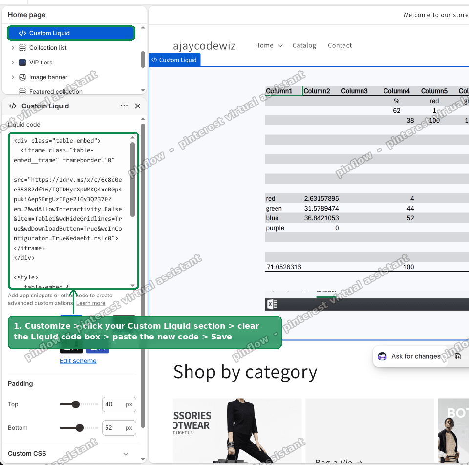 The Custom Liquid section in the Shopify theme editor with the replacement embed code pasted in
That is the whole fix. Here is the same page afterwards.
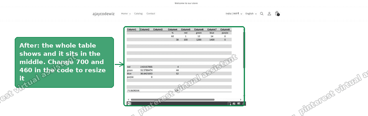 The embedded table rendering at full height and centred on the page
Full table, all eight columns, sitting in the middle of the page.
Why this beats the theme rule
This is worth one paragraph, because it is the part that makes the fix reliable rather than lucky.
Both the theme rule and my rule use !important, so !important alone does not decide the winner. CSS falls back to specificity. The theme rule targets a bare element (iframe), which scores 0-0-1. Mine targets a class (.table-embed__frame), which scores 0-1-0. A class beats an element, so my declarations win no matter where the theme rule sits in the page.
That is also why max-width: none !important is in there. Without it, the theme's max-width: 100% would clamp the frame back to the section width and undo the fixed sizing on narrow screens.
The two numbers you will want to change
700px is the width. 460px is the height. Those are the values that fit the merchant's table with no clipping and no dead space.
Yours will be different. Set the width to roughly the natural width of your embedded content, and raise the height until the vertical scrollbar inside the frame disappears.
The overflow-x: auto on the wrapper handles small screens. On a phone the frame keeps its readable width and the wrapper scrolls sideways, instead of squashing an eight-column table into 360 pixels.
Then delete the line that caused it
The fix above works around the bad rule. It does not remove it, and that rule will do the same thing to the next thing you embed. A YouTube video, a Google Map, a booking widget, a Calendly frame. All of them are iframes. All of them will collapse to 150 pixels.
So clean it up:
- Online Store > Themes > ... > Edit code.
- Open layout > theme.liquid.
- Scroll to the very bottom.
- Just above
</body>you will find a single line starting with<style> iframe {. - Delete that one line and Save.
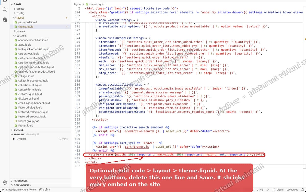 The theme.liquid line that forces every iframe to height auto, just above the closing body tag
Duplicate your theme first if you are nervous. It is one line, but the code editor edits your live theme directly.
How to add an iframe in Shopify
Since a lot of people arrive at this problem while trying to add their first embed, here is the short version of the step before it.
Shopify does not have an "embed" block. The tool you want is the Custom Liquid section, which every free Shopify theme includes.
- Theme editor, open the page you want the embed on.
- Add section, then choose Custom Liquid.
- Paste your iframe into the Liquid code box.
- Save.
That is it. Custom Liquid renders raw HTML, so an <iframe> and a <style> block both work exactly as written. There is no sanitiser stripping them.
If you want the embed inside an existing section rather than as its own section, several themes also offer a Custom Liquid block, which behaves the same way but sits within the section you pick.
Does Shopify allow iframes and script tags in Custom Liquid?
Yes to both. Custom Liquid output is not filtered, so <iframe>, <style> and <script> all render.
The limits that catch people out are elsewhere:
- The Content Security Policy of the site you are embedding. Some services send
X-Frame-Options: DENYor a frame-ancestors policy, which makes the browser refuse to render them in a frame no matter what your code says. You will see a blank frame and a console error. Nothing on the Shopify side can override that. Use the service's official embed URL, not its normal page URL. - The checkout. Custom Liquid does not exist in checkout on any plan below Shopify Plus.
- Blog posts and pages. The rich text editor strips iframes on save. Put the embed in a Custom Liquid section on a template instead of pasting it into a page body.
What to check if it still does not work
If the frame is still wrong after the fix, work down this list. In my experience it is almost always one of the first two.
The frame is 150px tall again. There is a second copy of the rule somewhere. Check theme settings under Custom CSS, check any app embed you have enabled, and search your assets/*.css files for iframe. The theme.liquid line is the common one, but it is not the only place it can live.
The frame is the right size but blank. That is the embedding site refusing to be framed, not a sizing problem. Open the frame URL directly in a new tab. If it loads there but not in the frame, you need the service's share or embed URL rather than the page URL. For a OneDrive spreadsheet, that is the link from Share > Embed, not the one from the address bar.
Everything looks right on desktop and broken on mobile. Check that overflow-x: auto survived the paste. Without it a fixed-width frame will push the whole page sideways and give you a horizontal scrollbar on the body.
The table shows but has its own scrollbars. That is normal for a spreadsheet embed. The frame is a window onto a sheet that extends further than the data. Raise the height until the vertical bar goes, and widen until the horizontal bar goes. If the sheet has thousands of empty rows below your data, the scrollbar will never fully disappear, and that is a spreadsheet problem rather than a Shopify one.
You changed it and nothing happened. Theme editor changes need a Save, and a hard refresh on the storefront. Also confirm you edited the theme you are actually previewing. Editing a draft theme and refreshing the live site is the single most common false alarm.
iframe, embed, and app block: which one you actually want
These three get used interchangeably and they are not the same thing.
An iframe is a browser feature. It puts another website inside a box on your page. You control the box. You do not control what is inside it, and you cannot measure it.
An embed is usually just an iframe with the styling pre-written by the service that gave it to you. YouTube, Google Maps, OneDrive and Calendly all hand you an iframe and call it an embed code.
An app block is Shopify-specific. An installed app registers a block that you place from the theme editor with no code. If an app exists for what you are doing, an app block is easier to maintain than an iframe, because the app owns the responsive behaviour.
For a spreadsheet on a product or landing page, the iframe is the right call. There is no app worth installing for one table, and the Custom Liquid route is about two minutes of work once you know about the 150px default.
The takeaway
If a Shopify iframe renders as a thin strip, do not start rewriting the embed code. Search your theme for height: auto !important on iframe.
That one declaration turns every embed on the store into a 150 pixel band. It is handed out as responsive advice, it looks harmless, and it overrides the height on every frame you will ever add.
I tested all of this on a Dawn store using the merchant's real embed URL. Before the fix: 150 pixels tall, flush against the left edge, top rows only. After: 700 by 460, centred to the pixel, whole table visible.
The embed works. Now get people to the page.
PinFlow turns your Shopify catalog into Pinterest pins and posts them on a schedule, so the pages you spend time perfecting get seen by people who have not found your store yet.
Get PinFlow on the Shopify App StoreMore Shopify fixes
More community-sourced Shopify guides, tested on a live store.
Themes & Storefront
Shopify Horizon: Carousel Blank Until You Drag It
A Horizon carousel that shows an empty strip until you drag it, then fills in, is usually the theme skipping the painting of slides it thinks nobody is looking at. Here is how to tell that apart from a genuinely broken carousel, and the one line of CSS that covers it.
Themes & Storefront
Shopify Sold Out Overlay: Grey Out Products and Add a Sold Out Box
Shopify themes mark a sold out product with a small pill in the corner of the card. Here is how to turn that pill into a black Sold Out box across the middle of the photo, and fade the photo behind it, with no theme code and no app.
Themes & Storefront
How to Change the Price Font Size on a Shopify Collection Page
Shopify themes have no setting for the price size on a product card. Here is the one rule that shrinks it on collection pages only, where to paste it so it cannot reach your product pages, and how to keep the crossed out sale price in proportion.