
Shopify Mega Menu: How to Change the Dropdown Width
Horizon's dropdown spans the whole page because the submenu is absolutely positioned at 100% width. Here is the CSS that pins it under its own menu item, desktop only.
By AjayCodeWiz · July 8, 2026 · 9 min read
The problem: a dropdown with five links spanning the whole screen
Your menu has a Home item with five links under it. On desktop the dropdown opens and stretches edge to edge, leaving a huge empty panel with a thin column of text on the left.
It looks broken. It is not broken, it is doing exactly what the theme's CSS says.
A merchant on the Horizon theme asked how to narrow it and got several rounds of CSS in the thread, none of which changed anything. That is worth paying attention to, because the reason they failed is the interesting part.
I identified the theme from the store's source, installed Horizon on a development store, reproduced the full-width dropdown, and measured the fix. The panel went from 1270px wide to 190px.
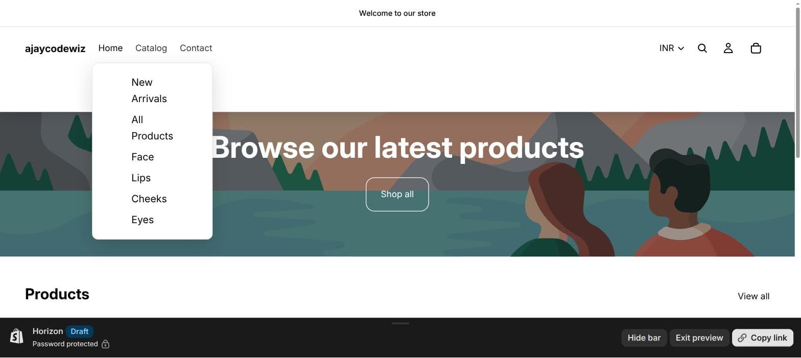 A compact dropdown pinned under its own menu item
Why the dropdown is full width
Horizon styles the submenu panel roughly like this:
.menu-list__submenu {
  position: absolute;
  width: 100%;
  left: 0;
}
Three declarations, and together they guarantee a full-bleed panel.
position: absolute positions the panel against its nearest positioned ancestor. In Horizon that is not the menu item. The <li> has no position set, so the browser walks up until it finds something that does, which is the header or the page itself.
width: 100% then means 100% of that ancestor, so the header's width.
left: 0 pins it to that ancestor's left edge, not the menu item's.
This is deliberate. A mega menu with four columns of category links should span the header. The design assumes a large menu. When your menu has five links, the assumption is wrong and you get a mostly empty panel.
Why the usual CSS advice does not work
The thread tried several fixes that look reasonable and do nothing. Each failure is informative.
Setting max-width on .mega-menu__content. Wrong element. That is inside the panel. Constraining the content leaves the panel itself full width, so you narrow the text and keep the giant empty box.
Setting width on .menu-list__submenu alone. Closer, and it does shrink the panel. But without a positioned ancestor the panel is still anchored to left: 0 of the header, so a narrow panel sits at the far left of the page regardless of which menu item you hovered. Better and still wrong.
transform: translateX(-50%) to centre it. Centres it under the header, not under the menu item, for the same reason.
The missing piece in all three: you have to give the <li> a position first. Until the menu item is itself a positioned element, absolute on the panel cannot reference it. Every width and offset you set is measured against the wrong box.
That single line is what the other answers were missing, which is why more !important did not help.
The fix
Online Store > Themes > ... > Edit code, open assets/base.css, and paste at the very bottom:
/* Compact desktop mega-menu dropdown (Horizon).
   Desktop only - the mobile drawer is untouched. */
@media screen and (min-width: 990px) {
  /* Anchor each dropdown to its own menu item. */
  .menu-list__list-item {
    position: relative;
  }

  /* Shrink the panel from full-width to a dropdown under the item. */
  .menu-list__list-item:not([slot='overflow']) > .menu-list__submenu {
    width: max-content !important;
    max-width: min(90vw, 320px) !important;
    left: 0 !important;
    right: auto !important;
    top: 100% !important;
    padding-inline: 0 !important;
    clip-path: none !important;
  }

  /* Size the content to itself and stack the links vertically. */
  .menu-list__list-item:not([slot='overflow']) > .menu-list__submenu .mega-menu,
  .menu-list__list-item:not([slot='overflow']) > .menu-list__submenu .mega-menu__grid {
    width: 100% !important;
  }

  .menu-list__list-item:not([slot='overflow']) > .menu-list__submenu .mega-menu__grid {
    display: block !important;
  }

  .menu-list__list-item:not([slot='overflow']) > .menu-list__submenu .mega-menu__link {
    display: block !important;
  }

  /* Give it a proper dropdown-card look. */
  .menu-list__list-item:not([slot='overflow']) > .menu-list__submenu .menu-list__submenu-inner {
    transform: none !important;
    padding: 14px 22px !important;
    background: var(--color-background, #fff);
    border: 1px solid rgb(var(--color-foreground-rgb) / 0.08);
    border-radius: 10px;
    box-shadow: 0 10px 30px rgb(var(--color-foreground-rgb) / 0.14);
  }
}
Save. The dropdown now opens directly under its own menu item at the width of its longest link, capped at 320px.
The parts that are doing the work
position: relative on the list item. The line everything else depends on. Now absolute resolves against the menu item.
width: max-content with max-width: min(90vw, 320px). The panel sizes to its longest link rather than to a number you guessed. The cap stops a long category name producing an awkward wide panel, and 90vw keeps it on screen at smaller desktop widths.
top: 100% puts the panel immediately below the item rather than wherever the header had placed it.
clip-path: none. This one is easy to miss and it is why a compact panel can look truncated. Newer Shopify themes animate the reveal with clip-path rather than height, and that clip is sized for a full-width panel. Shrink the panel and the clip can cut off your content. Neutralising it lets the smaller panel show fully.
display: block on the grid and links. The mega menu grid is built for columns. With five links you want one vertical list, so the grid becomes a block and the links stack.
:not([slot='overflow']). Horizon moves menu items that do not fit into an overflow slot with its own positioning. Excluding it leaves that behaviour alone.
Why so many !important
Not laziness. Horizon sets several of these from inline styles and CSS custom properties that the theme's own JavaScript updates on hover. A plain rule at the bottom of base.css loses to an inline style regardless of specificity. !important on the properties the reveal animation touches is what makes the override stick.
Adjusting it
Change the width. Edit 320px in the max-width line. That is the only number you need for a wider or narrower dropdown.
Centre it under the item instead of left-aligning. Replace left: 0 with:
left: 50% !important;
transform: translateX(-50%) !important;
This works here, unlike in the thread, because the item is now positioned.
Right-align items near the end of the menu. A dropdown on the last item can run off screen. Target that item and swap the offsets:
.menu-list__list-item:last-child > .menu-list__submenu {
  left: auto !important;
  right: 0 !important;
}
Keep one menu full width. If a genuine mega menu should still span the header, exclude it by its position:
.menu-list__list-item:nth-child(2) > .menu-list__submenu {
  width: 100% !important;
  max-width: none !important;
}
Why the media query matters
Everything is inside @media screen and (min-width: 990px).
Below that width Horizon does not use dropdowns at all. It uses a slide-in drawer, and the same class names appear in it. Apply these rules unconditionally and you will narrow the mobile drawer into a 320px box floating over the page.
If you test this, test it properly. Resizing your browser window is not the same as a mobile viewport, and browser device emulation is the reliable check. This is a common way to ship a menu that looks right on your laptop and is unusable on a phone.
If the CSS did nothing
This is where the original thread spent most of its time, so it is worth being systematic. Work down this list in order.
You edited the wrong file. Some themes load assets/theme.css, some assets/base.css, and some ship a custom.css that is only included if the theme calls it. Open your site, view source, and check which stylesheet actually loads. Pasting into a file the theme never requests is the single most common cause of "nothing happened."
Use Custom CSS instead and skip the question. Horizon and Dawn both have Theme editor > Theme settings > Custom CSS. Anything there is guaranteed to load and it survives theme updates, unlike edits to base.css. For a change this size it is the better home. The only reason this article says base.css is that it is where the original answer put it.
You are looking at a cached stylesheet. Shopify serves CSS from its CDN with long cache headers. Hard reload, or check in a private window. If the storefront and the theme preview disagree, this is why.
You edited a different theme. Easy to do with two or three copies in the theme list. Confirm the theme you edited is the one that is published, or preview the exact theme you changed.
The class names do not match your theme. These are Horizon's. If you are on Impulse, Prestige, Empire or anything from the Theme Store beyond Dawn and Horizon, inspect your own dropdown and substitute the real class names. The four-step approach at the end of the Dawn section still applies.
A parent has overflow: hidden. If the panel is narrow but clipped rather than full width, something above it is cutting it off. Inspect the ancestors of the submenu and look for overflow on the header or its rows.
The fastest way to tell these apart: open devtools, inspect the submenu panel, and look at the Styles pane. If your rule appears and is struck through, it is a specificity or !important problem. If it does not appear at all, the file is not loading and none of the CSS is the issue.
Doing this on Dawn
The mechanism is the same. The class names differ.
Dawn's dropdown lives in .header__submenu inside details-disclosure, and Dawn's mega menu is .mega-menu__content. Dawn already positions the parent, so you often get away with fewer rules:
@media screen and (min-width: 990px) {
  .header__inline-menu .mega-menu__content {
    width: max-content;
    max-width: min(90vw, 320px);
    left: 0;
    right: auto;
  }
}
Dawn also does not use clip-path for the reveal, so that line is unnecessary there.
The general approach transfers to any theme:
- Inspect the dropdown panel and find which element is actually full width.
- Check whether its parent is positioned. Usually it is not, and that is the bug.
- Set
position: relativeon the parent, then constrain the panel. - Wrap it in a desktop media query.
A note on mega menus generally
If you are here because you want to build one rather than shrink one, the short version for Online Store 2.0 themes:
A Shopify mega menu is driven by your navigation, not by a separate builder. In Content > Menus, a menu item with children renders as a dropdown. A child item that itself has children triggers the multi-column mega menu layout in themes that support it.
So the number of nesting levels in your menu decides which layout you get. One level of children gives a simple dropdown. Two levels gives the full-width mega menu, which is exactly how the full-bleed panel in this article appears in the first place.
Themes vary in how far they take this. Horizon and Dawn both support two levels. Images in menus, promotional blocks and featured products generally need an app or theme code, which is what mega menu apps mostly sell.
If your dropdown is too wide, check your menu depth before writing any CSS. A menu accidentally nested two levels deep will render as a mega menu when you wanted a plain dropdown, and fixing the menu structure is better than overriding the styling of a layout you did not want.
What changed
On the test store, with Horizon and a five-link menu:
- Before: the panel measured 1270px wide, anchored to the header's left edge, with content in a narrow strip.
- After: 190px, pinned under its own menu item, links stacked, with a card border and shadow.
The one thing worth carrying to any theme: an absolutely positioned dropdown that ignores your width is almost always positioned against the wrong ancestor. Fix position on the parent first, and the width rules you already tried will start working.
A tidy menu helps the visitors you already have
PinFlow turns your Shopify catalog into Pinterest pins and posts them on a schedule, so the store you keep polishing keeps reaching people who have not found it yet.
Get PinFlow on the Shopify App StoreMore Shopify fixes
More community-sourced Shopify guides, tested on a live store.
Themes & Storefront
Shopify Payment Icons: Fix a Footer That Shows None
The payment icons in a Shopify footer come from your payment provider, not from the theme. When the provider sends none, the row stays empty. Here is how to add the icons yourself on Refresh, Dawn and similar themes.
Themes & Storefront
Shopify Order Notes: Turn On the Cart Note Box
Let customers leave order notes and special instructions on your Shopify cart page. Turn on the built-in cart note in Theme settings, rename its label, and find each note on the order. Tested on Dawn, no code.
Themes & Storefront
Shopify WhatsApp Integration: Add a Free Chat Button
How to add WhatsApp to Shopify with a floating chat button: shoppers tap it and WhatsApp opens a chat with you, the message already typed and naming the product.