
How to Change the Price Font Size on a Shopify Collection Page
Shopify themes have no setting for the price size on a product card. Here is the one rule that shrinks it on collection pages only, where to paste it so it cannot reach your product pages, and how to keep the crossed out sale price in proportion.
By AjayCodeWiz · September 14, 2026 · 7 min read
The problem
You look at your collection page and the prices are shouting. On a grid of four products the number is as heavy as the product name above it, sometimes heavier, and the whole row reads as a wall of digits rather than a set of products.
There is no theme setting for this. You can change your heading font, your body font, and the overall type scale, and none of those move the price on a product card independently of everything else. Turn the body scale down to shrink the price and you shrink your paragraphs and your buttons with it.
 A Shopify collection page where the price on each product card is set at 16 pixels with wide letter spacing
The fix is one line of CSS, pasted into a box Shopify already gives you. This guide shows where it goes, and more importantly how to scope it so your product pages are left alone.
Why the obvious rule causes a second problem
Search for this and the answer you will find most often is:
.price { font-size: 12px; }That does shrink the price on your collection page. It also shrinks the price on your product page, in your cart drawer, in your related products row, in search results, and anywhere else your theme prints a price. .price is a shared class, meaning the same label is used on every price in the theme, so a rule written against it on its own reaches all of them.
Usually that is not what anyone wants. The price on a product page is supposed to be prominent. It is the number a shopper is deciding on. The one on a card in a grid of twelve is doing a different job and can be much smaller.
So the rule needs a second part that says which prices you mean.
The class that scopes it
On a Shopify product card, the title and price sit together inside an element labelled .card-information. A class is just a label on an element that CSS can point at, and this one exists on every product card and nowhere else.
Write the rule as .card-information .price and it reads as "a price that is inside a product card". Prices on product pages are not inside a card, so they never match.
That is the whole trick, and it is worth understanding because the same pattern solves most "it changed in the wrong place too" CSS problems on a Shopify store.
Step by step
1. Open the theme editor
From your Shopify admin go to Online Store > Themes, then click Customize on the theme you are using.
2. Switch the preview to a collection page
The editor opens on your home page. Use the page dropdown in the top bar and pick Collections, then any collection. The preview reloads showing your product grid.
You need to be on a collection page because the box you are about to use belongs to a section, and the product grid section only exists here.
3. Click Product grid
In the left sidebar, under Template, click Product grid.
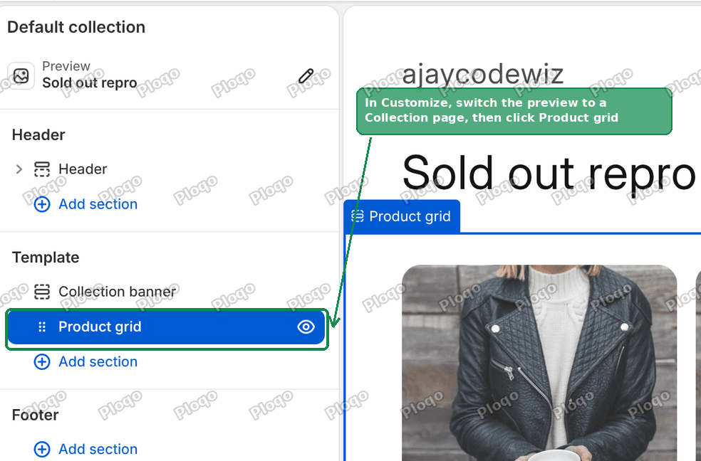 The Shopify theme editor with Product grid selected in the left sidebar
4. Open the Custom CSS box
The right hand panel now shows the settings for that section. Scroll it to the very bottom, past Filtering and sorting and past Padding, and click the row labelled Custom CSS.
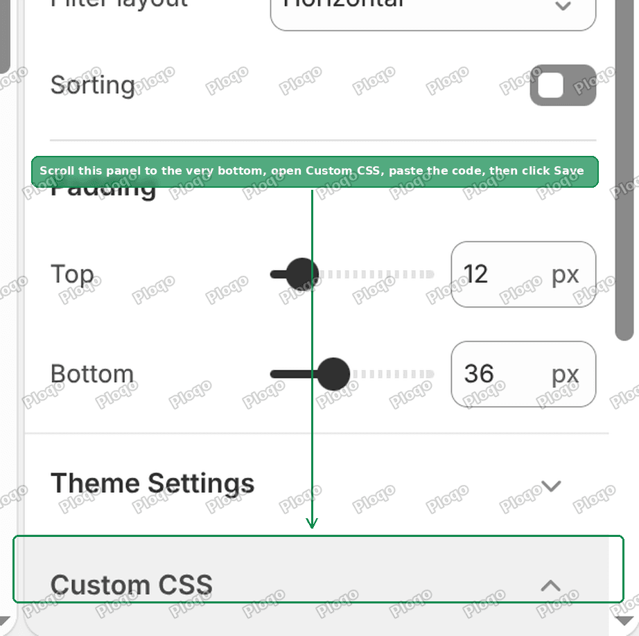 The Custom CSS box at the bottom of the Product grid section settings
Every section and block in the theme editor has one of these. Anything you paste in is automatically limited to that section, which gives you a second layer of safety on top of the .card-information scoping.
5. Paste the CSS
.card-information .price{font-size:1.2rem;letter-spacing:.04rem}
.card-information .price .price-item{font-size:inherit}
Then click Save in the top right.
6. Check it
 The same collection page with the card prices reduced to 12 pixels
The prices are smaller, the product titles have not moved, and if you open a product page the price there is exactly as it was.
Reading the numbers
1.2rem is 12 pixels. This catches people out constantly. In Dawn and the themes built from it, one rem works out to ten pixels rather than the usual sixteen, so every size in a Shopify stylesheet looks about ten times larger than the pixel value. The theme ships the card price at 1.6rem, which is 16 pixels.
Some useful values:
1.6remis 16px, the theme default1.4remis 14px, a gentle reduction1.3remis 13px1.2remis 12px, what the screenshots use1.1remis 11px, about as small as stays comfortable to read
You can write font-size:12px instead if you prefer. It works identically. The rem version is only there to match the way the rest of the theme is written.
.04rem is the letter spacing, the space between individual characters. The theme ships .1rem, which is generous and part of why the price reads as wide even before you consider its size. Dropping it tightens the number up. Set it to 0 to remove the extra spacing entirely.
What the second line is for
.card-information .price .price-item{font-size:inherit}If a product is on sale, the card shows two numbers: the old price crossed out, and the new one. Themes set the crossed out one at its own size, which is smaller than the main price but fixed. Shrink only the main price and the two end up nearly the same size, which looks wrong in the other direction.
font-size: inherit tells both numbers to take whatever size the line above set. They stay in proportion at any value you choose.
If you would rather leave the crossed out price at the size your theme picked, delete that second line.
Two limits to know about the Custom CSS box
It holds 500 characters. The two rules above use about ninety, so there is plenty of room, but the limit applies to the whole box rather than per rule. If you build this up over time and Save suddenly stops working, that is why.
It rejects the content property. Not relevant here, but worth knowing if you try to extend this later. Any rule containing content is refused with "Invalid property value: content", which rules out adding text through ::before or ::after in this box.
Making it apply everywhere else
The Custom CSS box covers one section, so the rule reaches collection pages and nothing else. That is usually exactly right. If you want it in more places:
- A Featured collection row on your home page is its own section. Open the home page in the editor, click that section, and paste the same two lines into its Custom CSS box.
- Related products on your product pages is a separate section again, usually called Related products or You may also like.
- Everywhere at once, use the theme wide Custom CSS box instead. Click the Theme settings icon in the top left of the editor, scroll to the bottom, and paste there. The trade off is that it is not scoped to a section, so it depends entirely on
.card-informationto stay out of your product pages. That is reliable, but you have less of a safety net if you later broaden the selector.
If nothing changes
- Check which section is selected. Pasting into Collection banner instead of Product grid is the most common cause, and the two sit next to each other in the sidebar.
- Check your theme's class names. Themes bought outside the Shopify Theme Store often use their own. Right click a price on your collection page, choose Inspect, and look at the classes on the element and its parents. If you do not see
priceandcard-information, substitute whatever is there. - Try adding
!important. Write it asfont-size:1.2rem !important. Some themes set the price size with a more specific rule that wins by default. Reach for this only when a correct selector does nothing, not as a habit. - Hard refresh. Your browser may still be holding the old stylesheet.
Changing the product title instead
While you are in the same box, the title on a card is .card__heading, so the matching rule is:
.card-information .card__heading{font-size:1.5rem}Between those two you can set the relationship between the name and the number however you want it, which is usually the real goal rather than the price size on its own.
What you end up with
One rule, in a box Shopify provides, scoped twice over, with no theme file edited and nothing that a theme update can overwrite. Delete the contents of the box and the price goes straight back to the size your theme shipped.
Spending too long on manual Shopify busywork?
PinFlow turns your Shopify catalog into Pinterest pins and posts them on a schedule, automatically. Same idea as the rule above, let the system handle the repetitive part.
Get PinFlow on the Shopify App StoreMore Shopify fixes
More community-sourced Shopify guides, tested on a live store.
Themes & Storefront
Shopify Horizon: Carousel Blank Until You Drag It
A Horizon carousel that shows an empty strip until you drag it, then fills in, is usually the theme skipping the painting of slides it thinks nobody is looking at. Here is how to tell that apart from a genuinely broken carousel, and the one line of CSS that covers it.
Themes & Storefront
Shopify Sold Out Overlay: Grey Out Products and Add a Sold Out Box
Shopify themes mark a sold out product with a small pill in the corner of the card. Here is how to turn that pill into a black Sold Out box across the middle of the photo, and fade the photo behind it, with no theme code and no app.
Themes & Storefront
Show a Discount on the Shopify Product Page
An automatic discount is invisible on the product page until the cart. Here is a tag-driven badge that shows the discounted price on the page itself, and matches checkout exactly.