
Shopify Product Image Size: Make It Smaller on the Page
Your product photo takes two thirds of the page and the text is squeezed beside it. That is the theme's column split, not your image file. The setting to try first, then the CSS.
By AjayCodeWiz · September 3, 2026 · 10 min read
The problem, in the words a merchant would use
A merchant asked about this on the Shopify Community. On their product page the photo filled most of the screen. The title, price, buttons and description were crammed into a thin column on the right. They wanted the image smaller so more of the text showed, because they planned to put more information in the description.
Their store runs the Horizon theme. Horizon is Shopify's newer free theme, and it lays the product page out differently from Dawn, so the older Dawn advice people paste into forums often does nothing here.
Here is the same thing reproduced on a Horizon test store.
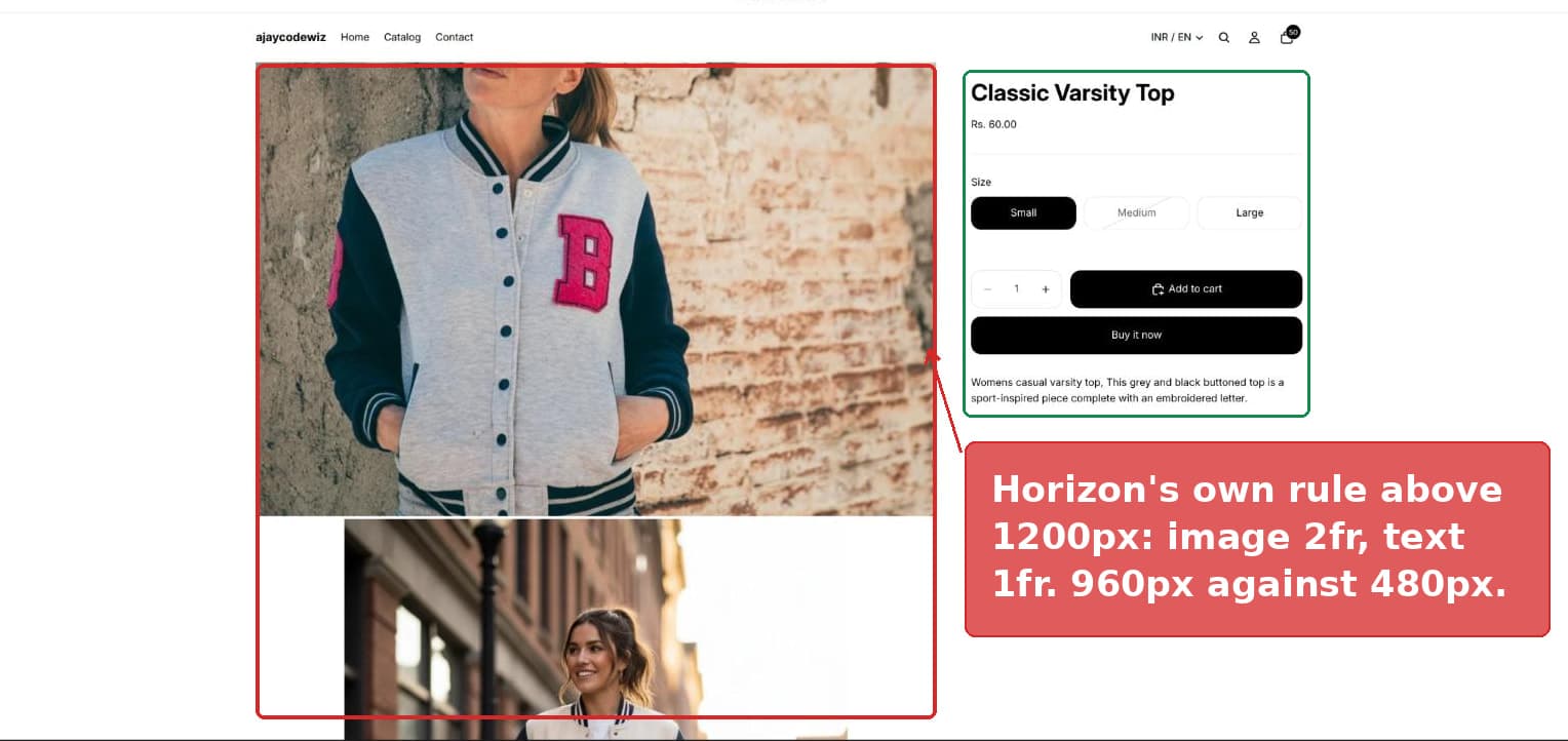 Horizon product page with the image column twice the width of the text column
The image column is 960 pixels wide. The text column is 480. Exactly twice as wide.
If you searched for "shopify product image size", "resize product image shopify", or "shopify make product image smaller" and landed here, read the next section first. It is the thing that trips most people up.
There are two different things called "product image size"
This is why so many merchants go round in circles on this problem.
One is the image file you upload. That is a real file with real dimensions, for example 2048 by 2048 pixels. Shopify's own guidance is to upload square images of about 2048 by 2048, and to keep every product photo the same shape so your collection pages line up.
Two is the amount of space your theme gives that image on the product page. This is the column width. It has nothing to do with the file.
If your product image looks too big on the page, it is almost always the second one. Uploading a smaller file will not help. The theme will just stretch the smaller file to fill the same column, and now it looks blurry as well as too big.
So the question to ask is not "what size should my product image be". It is "how much of the row does my theme give the image".
Why Horizon makes the image so wide
Horizon has no slider for this. There is no "image width" setting in the theme.
Instead the split is written into the theme's own stylesheet. On screens wider than 1200 pixels Horizon applies this rule:
.product-information__grid:not(.product-information__grid--half,.product-information--media-none).product-information--media-left {
  grid-template-columns: 2fr 1fr;
}
grid-template-columns: 2fr 1fr means the row is cut into three shares. The image gets two of them. The text gets one. That is the 960 against 480 in the screenshot.
On a narrower desktop, between 750 and 1200 pixels, Horizon uses a slightly different rule and the image is a bit less dominant. Below 750 pixels the two columns stop sitting side by side and stack instead, so on phones the image is full width and the text sits underneath it. Nothing on this page changes what phones see.
That last point matters. Most fixes for this problem should be desktop only, because on a phone there is no second column to take space from.
Fix 1: the built-in setting, no code
Try this first. It takes about ten seconds and it survives theme updates, which custom code does not.
Go to Online Store, then Themes, then Customize. In the left hand list, under Template, click Product information.
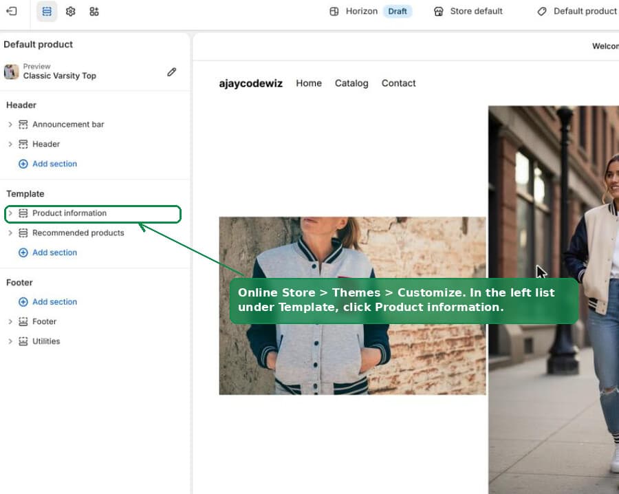 Theme editor left list with the Product information section selected
In the settings panel on the right, turn on Equal columns.
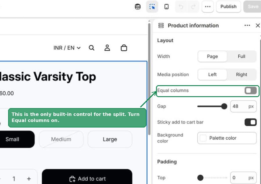 The Equal columns toggle in Horizon's Product information settings
That takes you from two-to-one straight to fifty-fifty. The image is now half the row instead of two thirds, and the text column doubles in width.
For a lot of stores that is enough, and you can stop here.
The toggle underneath it that undoes your work
When you turn Equal columns on, a second toggle appears below it called Limit product details width. Leave it off.
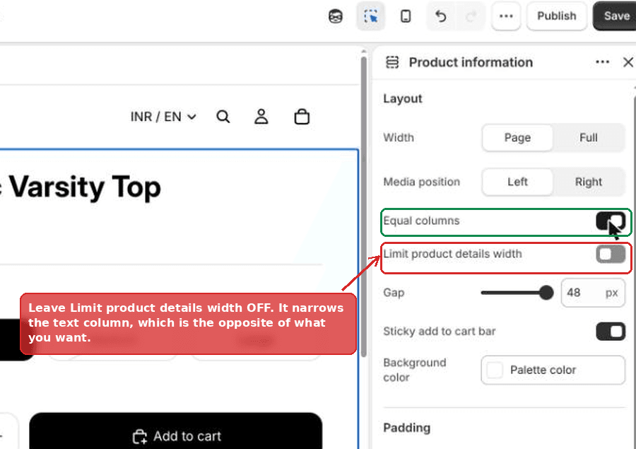 Limit product details width left switched off
That setting caps how wide the text column is allowed to get. If your goal is more room for text, switching it on works against you. It is there for stores that want a narrow, centred block of product details on a very wide screen, which is the opposite situation.
This toggle only exists while Equal columns is on. That is why it seems to appear from nowhere, and why some merchants report that the layout "went back to normal" after they touched it.
Fix 2: the CSS, for anything smaller than half
Equal columns cannot go below fifty-fifty. If you want the image at 40 percent, or 30, you need one small CSS rule.
Put it in Theme settings, then Custom CSS. That is the gear icon in the theme editor, and Custom CSS is near the bottom of the list. Use this box rather than the Custom CSS box inside the Product information section.
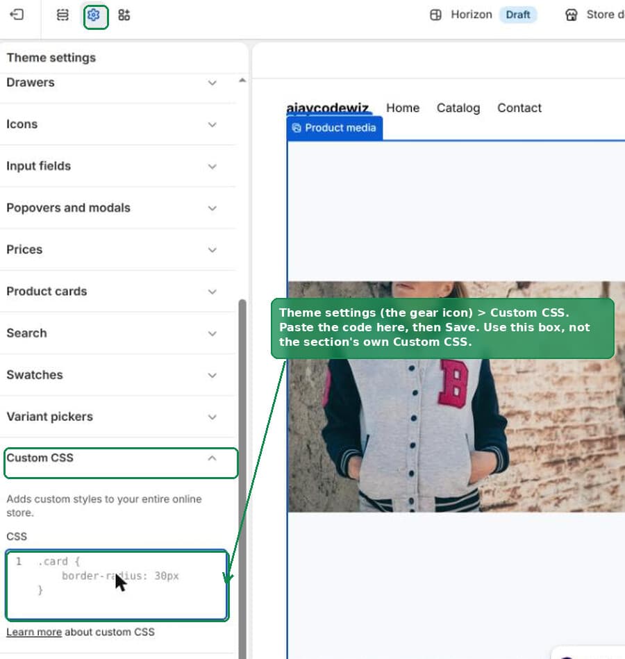 The Custom CSS box in Shopify theme settings
@media screen and (min-width: 990px) {
  .product-information__grid.product-information--media-left {
    grid-template-columns: 40% 1fr !important;
  }
}
Save, then look at your product page.
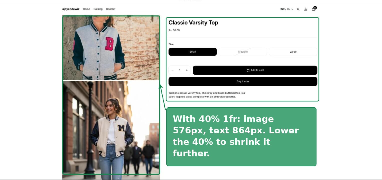 Product page after the custom CSS, with a much smaller image
On the test store the image column went from 960 pixels down to 576, and the text column from 480 up to 864.
Things worth knowing about that rule:
40%is the image width. Lower the number for a smaller image, raise it for a bigger one. Try 45, then 35, until it looks right.- Turn Equal columns back off first. The setting and the CSS both target the same row and they will fight each other.
- It is desktop only. The
@media screen and (min-width: 990px)wrapper means the rule is ignored on phones, where the columns stack anyway. - If your media sits on the right, change
--media-leftto--media-rightin the selector. Horizon uses a different class name for each side, and the Media position setting in the Product information section is what switches it.
Why the CSS people post for this so often does nothing
This is worth its own section, because it is the single most common reason a merchant tries the fix, sees no change, and gives up.
CSS decides between two competing rules using specificity. Roughly, the rule that names more classes wins. When two rules are equally specific, the one that loads later wins.
Horizon's own rule names three classes:
.product-information__grid:not(.product-information__grid--half,.product-information--media-none).product-information--media-leftThe :not(...) part counts. A :not() takes the weight of the most specific thing inside it, so that whole selector counts as three classes.
Now look at a shortened version that gets passed around a lot:
.product-information__grid.product-information--media-leftTwo classes. That is less specific than Horizon's rule, so on any screen wider than 1200 pixels the theme wins and your rule is ignored with no error. No error, no warning, nothing in the editor to tell you. It just does not apply.
I tested every version of this on a live Horizon product page. The two-class selector with no !important left the columns at 960 and 480, completely unchanged. Adding !important took them to 432 and 1008. The same rule with :not(...) kept in also worked.
So if a snippet is not doing anything, the fix is almost always to add !important before the semicolon, exactly as in the code block above.
The other reasons a CSS snippet fails with no error
Two more, both easy to miss.
The double hyphens turn into one long dash. product-information--media-left contains two plain hyphens. Copying from a forum post into a text field on a Mac can convert -- into a single long dash, because of the text substitution feature in macOS. The rule then matches nothing at all and looks identical at a glance. If a snippet will not work after pasting, delete those two characters and type them again by hand.
Deleting the @media line breaks the braces. @media is not a line you can remove on its own. It is a wrapper, so it opens a { at the top and closes a } at the bottom. Remove just the first line and you leave one extra } behind, and Shopify rejects the whole block as invalid CSS.
For the record, @media is allowed in both Custom CSS boxes. So are @supports, @container and @layer. Only @import, @charset and @namespace are blocked.
Your image may be too tall rather than too wide
Making the column narrower fixes width. It does not fix height, and on a lot of stores height is the bigger problem, especially when the theme stacks every product photo down the page.
These three settings live on the Product media block, which sits under Product information in the theme editor.
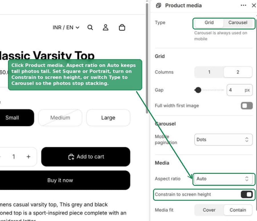 Product media block settings including Aspect ratio and Constrain to screen height
- Aspect ratio. It ships on Auto, which means each photo keeps its own shape. Upload one tall portrait photo and it stays tall, and it drags the page down with it. Set this to Square or Portrait and every photo is cropped to the same shape.
- Constrain to screen height. Turn this on and no single image is allowed to be taller than the visitor's screen. It is the quickest way to stop one oversized photo dominating the page.
- Type: Grid or Carousel. On Grid, your photos stack down the page one after another. On Carousel they share a single frame and the visitor swipes or clicks through them. Switching to Carousel can cut the length of a product page by more than half.
None of those three need code, and together they usually change the feel of the page more than the width fix does.
Fixing the column width in other themes
The mechanism is the same everywhere. The class name is not.
Every theme puts the product media and the product details in a two-column row on desktop, and sets the split in its own stylesheet. Your job is to find the class name for that row and override it.
To find it, right click the gap between the image and the title in your browser, choose Inspect, and look for the element that wraps both columns. Its class is what goes in your rule.
- Dawn uses
.product__media-wrapperand.product__info-wrapper, each with a width in percent rather than a grid. You change the two widths so they still add up to 100. - Horizon, Fabric, Studio and other newer Shopify themes use
.product-information__gridwithgrid-template-columns, which is the case covered above. - Paid themes vary. Many of them do offer a real width setting in the theme editor, so check the product section settings before you write any CSS.
Whatever the theme, wrap the rule in a @media screen and (min-width: 990px) block so phones are left alone, and be ready to add !important if nothing happens.
What size should you actually upload, then
Since this is the other meaning of the question, here is the short version.
Upload square images at 2048 by 2048 pixels. That is large enough for the zoom feature to look sharp and small enough not to slow the page down. Shopify accepts images up to 4472 by 4472 and up to 20MB, but you gain nothing from going that big.
Keep every photo the same shape. Mixed shapes are the usual reason collection pages look ragged, with cards of different heights.
Shopify resizes and serves your images automatically, so you do not need to make separate versions for phones. Upload once at the large size and let the platform handle the rest.
And to say it once more, because it is the thing that sends people down the wrong path: uploading a smaller file does not make the image smaller on the product page. The theme decides that, and the settings and CSS above are how you change it.
What to check if it still has not worked
- You are on a narrow window. Below 990 pixels wide the rule is switched off on purpose. Widen the browser window to test it.
- Equal columns is still on. It uses a different set of classes and will override the percentage. Switch it off.
- The rule went in the section's Custom CSS box instead of Theme settings. Both work, but the section box is limited to 500 characters and is scoped to that one section, which makes it easier to get wrong. Theme settings allows 1500 characters and applies everywhere.
- The dashes are wrong. Retype the two hyphens in
--media-left. - You missed the
!important. Add it before the semicolon. - Your media position is Right. Then the class is
--media-right, not--media-left.
A note on theme updates
Custom CSS is not covered by theme updates. If Shopify renames product-information__grid in a future Horizon release, your rule stops working, in exactly the way described above, with no error to warn you.
That is the real argument for trying Equal columns first. A setting is part of the theme and gets carried forward. A CSS rule is your own maintenance from the day you add it.
Keep a note of any custom CSS you add and what it was for. After a theme update, that note is the difference between a two minute fix and an afternoon of guessing.
Spending too long on manual Shopify busywork?
PinFlow turns your Shopify catalog into Pinterest pins and posts them on a schedule, automatically. Set your storefront up once, then let the system handle the repetitive part.
Get PinFlow on the Shopify App StoreMore Shopify fixes
More community-sourced Shopify guides, tested on a live store.
Themes & Storefront
Shopify Payment Icons: Fix a Footer That Shows None
The payment icons in a Shopify footer come from your payment provider, not from the theme. When the provider sends none, the row stays empty. Here is how to add the icons yourself on Refresh, Dawn and similar themes.
Themes & Storefront
Shopify Order Notes: Turn On the Cart Note Box
Let customers leave order notes and special instructions on your Shopify cart page. Turn on the built-in cart note in Theme settings, rename its label, and find each note on the order. Tested on Dawn, no code.
Themes & Storefront
Shopify WhatsApp Integration: Add a Free Chat Button
How to add WhatsApp to Shopify with a floating chat button: shoppers tap it and WhatsApp opens a chat with you, the message already typed and naming the product.