
Remove the Horizontal Scrollbar on a Shopify Page (CSS Fix)
A Shopify page that scrolls sideways has one element wider than the screen. Remove the horizontal scrollbar on one page with a Custom Liquid section and six lines of CSS. Tested on Horizon.
By AjayCodeWiz · September 28, 2026 · 10 min read
The problem
A merchant on the Horizon theme asked about this on the Shopify Community. One page on their store, a landing page for custom bags, had a horizontal scrollbar along the bottom of the browser window. The rest of the store was fine.
The page also moved sideways. Drag the scrollbar, or swipe left on a trackpad, and the whole layout slid off to one side with empty space behind it. On a landing page built to win wholesale enquiries, that looks broken.
They had already tried one fix from the thread and it had not worked. So I rebuilt the same page on a Horizon test store, reproduced the scrollbar, and found a fix that removes it on that one page without touching the rest of the theme.
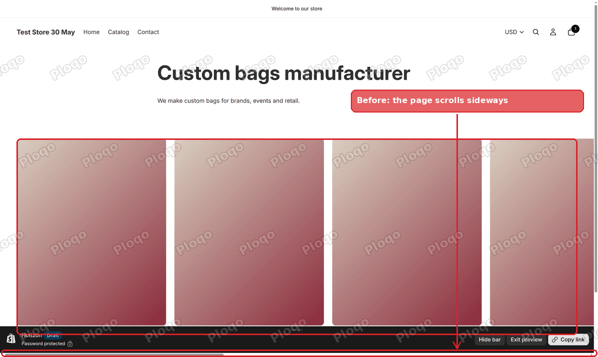 A Horizon page with a carousel running off the right edge and a horizontal scrollbar at the bottom of the window
Why a Shopify page scrolls sideways
A browser only shows a horizontal scrollbar when something on the page is wider than the window. It is never the page as a whole. It is one element that sticks out past the right edge, and the browser makes room for it.
On the merchant's page, that element was a carousel. It showed a row of product photos, and the row was much longer than the screen. The carousel was meant to hide the photos that did not fit. It did not, so the full row stretched the page to several times the width of the window.
On my test store the page measured 3,820 pixels wide inside a window that was 1,430 pixels wide. That is why the scrollbar thumb, the grey handle you drag, was so short on the merchant's screenshot. A short thumb means the page is far wider than the screen.
The usual causes on Shopify are:
- A carousel or slider row that is not clipped at the edge of its box. Sections made with Shopify's section generator in the theme editor often build their own carousels, and this is where the merchant's came from.
- A "full width" section that uses the width of the whole browser window. That width includes the vertical scrollbar, so the section ends up about 15 pixels too wide and adds a small sideways scroll.
- A fixed width in pixels, such as an image, table or video set to 1,600 pixels wide, which is fine on a big monitor and too wide on a laptop.
- An embed from another site, such as a map, a booking widget or a social feed, that sets its own width.
Why you might not see it on your own computer
Macs hide scrollbars until you scroll, when a trackpad is the only pointer. A merchant working on a MacBook can look at the page all day and never see the bar. Their customers on Windows, or on a Mac with a mouse plugged in, see it at once.
On a phone there is no bar at all. The page wobbles instead: a thumb swipe moves it sideways a little, and the edge of the screen shows a strip of empty space. It is the same problem with the same cause.
Find the template your page uses
Horizon, like every recent Shopify theme, builds each page from a template. A template is a saved layout that decides which sections show up on a page, and in what order. Most pages use the "Default page" template. A page with its own design, like a landing page, usually has a template of its own.
This matters because the fix goes on the template, so it only affects pages that use that template. If you add it to the wrong one, nothing changes on the page you care about.
To check which one your page uses, go to Online Store > Pages in your Shopify admin and open the page. The Theme template box on the right of the page editor shows its name. Write it down before you start.
Remove the horizontal scrollbar on one page
These are the same steps I posted in reply to the merchant. You add a Custom Liquid section to the page's template. A Custom Liquid section is a box in the theme editor where you can paste your own code, and it only appears on the template you add it to.
- Go to Online Store > Themes.
- Click Edit theme on your current theme.
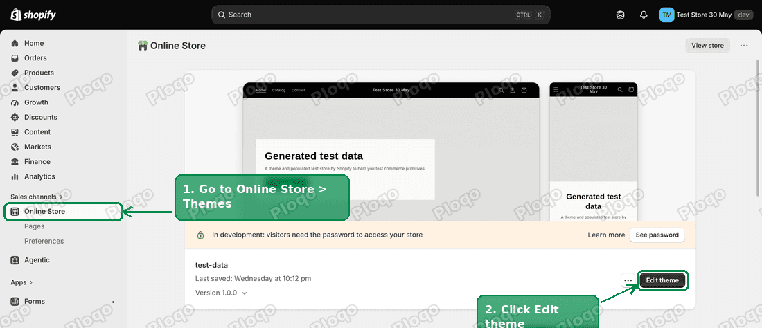 The Shopify Themes page with the Edit theme button highlighted
- Click Home page in the bar at the top of the editor. This opens the list of page types.
- Click Pages.
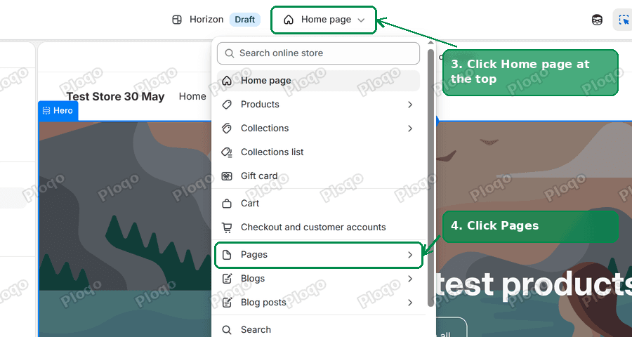 The theme editor page picker open, with Home page and Pages highlighted
- Click the template your page uses, the one you wrote down earlier. The editor preview switches to a page that uses it.
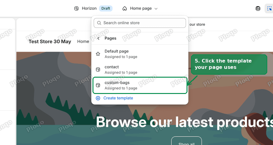 The list of page templates in the Horizon theme editor, with the custom template highlighted
- Click Add section in the left sidebar, under Template.
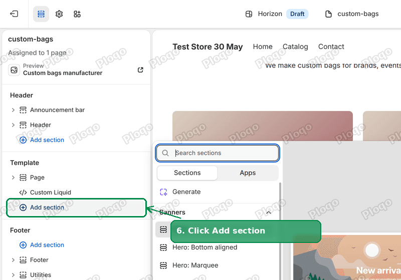 The Horizon theme editor sidebar with Add section highlighted
- Click Custom Liquid. You can type "Custom Liquid" in the search box to find it faster.
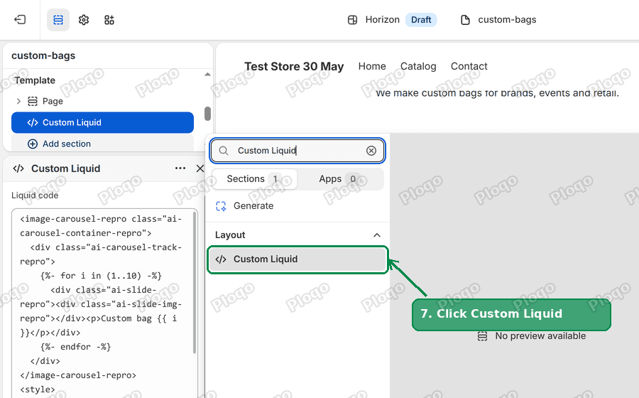 The Add section panel with the Custom Liquid section highlighted
- Paste this code into the Liquid box of the new section:
<style>
[class*="ai-carousel-container"] {
display: block;
max-width: 100%;
overflow: hidden;
}
html, body {
overflow-x: clip;
}
</style>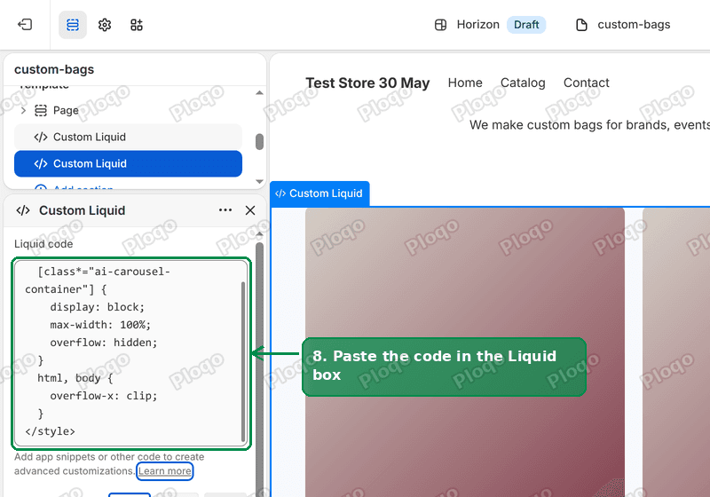 The Custom Liquid section settings with the CSS pasted into the Liquid box
- Click Save in the top right corner.
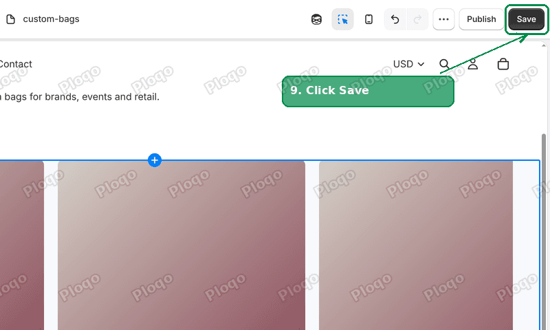 The theme editor Save button highlighted
Open the page on your store and reload it. On my test store the page went from 3,820 pixels wide back to 1,430, the exact width of the window, and the scrollbar at the bottom was gone. Scrolling sideways did nothing.
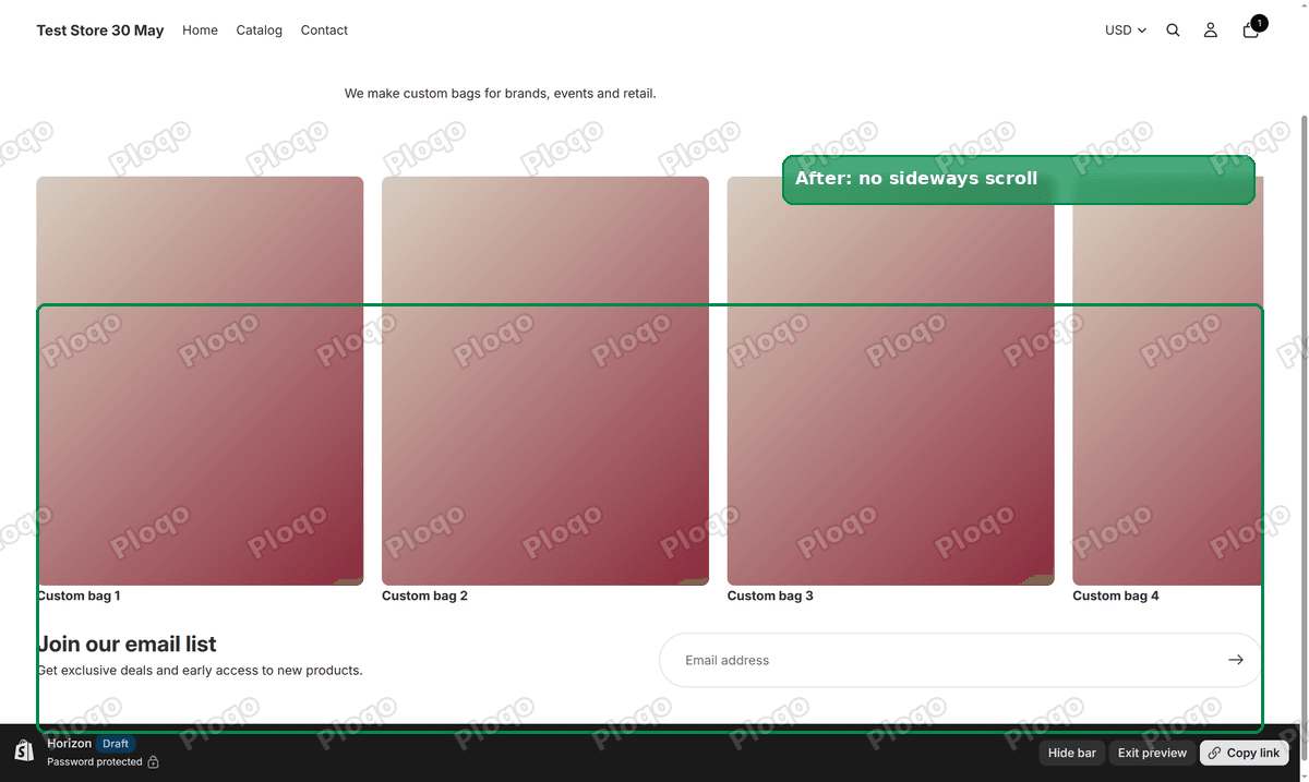 The same Horizon page with the carousel contained and no horizontal scrollbar
The Custom Liquid section is empty on the page itself. It adds no text or spacing, so it does not matter where it sits in the section list.
What the CSS does
The code has two parts, and each one does a separate job. CSS is the code that controls how things on a web page look and where they sit.
The first rule targets the carousel. The part in square brackets is a selector, the bit of code that points at one element on the page. This one matches any element whose name contains "ai-carousel-container", which is the name the theme editor's section generator gave the merchant's carousel. The rule tells that box to stay inside the page width and to hide anything that spills out of it. The photos that do not fit are still there. They sit out of view, the way the carousel intended.
The second rule is a safety net for the whole page. It tells the browser to cut off anything that runs past the right edge of the page, whatever it is, rather than make room for it with a scrollbar. If your wide element is not a generated carousel, this line is the one that removes the scrollbar.
The first rule matters for another reason: it fixes the carousel itself rather than only hiding the damage. The second rule on its own removes the scrollbar, but the carousel would still be drawn past the edge of the screen.
Why "overflow-x: clip" and not "overflow-x: hidden"
Most tutorials for removing a horizontal scrollbar with CSS use overflow-x: hidden. It is the older rule, and it works on the scrollbar. On a Shopify theme it has a side effect.
Horizon, like most current themes, has a sticky header, a header that stays pinned to the top of the screen as you scroll down. I tested both rules in Chrome on a page with a sticky header. With overflow-x: hidden on both parts of the page, the header stopped sticking and scrolled away with the page, 600 pixels up and out of view. With overflow-x: clip the scrollbar went away and the header stayed pinned at the top.
So use clip. It removes the scrollbar and leaves the sticky header alone.
Remove the horizontal scrollbar on every page instead
If the scrollbar shows up on several pages, the cause is usually a section you reused on each of them, such as the same carousel or a full width banner.
You can add the same Custom Liquid section to each template that has the problem. Repeat the steps above and pick a different template in step 5. Product pages, collection pages and the home page each have their own templates in that same list.
If the scrollbar is on every page of the store, look at the parts that appear on every page: the header, the announcement bar and the footer. A wide menu, a long line of text in the announcement bar, or an embed in the footer is the likely cause.
Find the element that is too wide
The fix above removes the scrollbar without needing to know what caused it. If you want to know which element is sticking out, your browser can list it for you. This works in Chrome, Edge and Firefox on a computer.
- Open the page on your store.
- Right click anywhere on the page and click Inspect. A panel of developer tools opens.
- Click the Console tab in that panel. The console is a box where you can type short commands for the browser to run on the page.
- Paste this line and press Enter:
[...document.querySelectorAll('body *')].filter(el => el.getBoundingClientRect().right > document.documentElement.clientWidth + 1).map(el => el.tagName + '.' + [...el.classList].join('.'))The browser lists every element whose right edge is past the edge of the window. On my test page, the list started with the carousel's slides. The first few names in the list are the ones to look at. They tell you which section is causing it, even when the names look technical.
Chrome may ask you to type "allow pasting" before it accepts pasted code in the console. That is a safety check for a line you copied from somewhere else, and it is fine to allow for this one.
If the scrollbar is still there
The code is on the wrong template. This is the most likely reason. The merchant in the thread had first tried a similar fix and saw no change. The editor opens on the home page, and picking Pages alone does not take you to a custom page's template. Check the page's Theme template under Online Store > Pages, then check the editor shows that same template in step 5.
The section was not saved. After pasting, click an empty part of the sidebar and then Save. If the Save button stays grey, the editor has not registered the change yet. Click into the Liquid box again, add a space and delete it, and Save should turn dark.
You are looking at a cached page. Reload the page with Ctrl+Shift+R on Windows or Cmd+Shift+R on a Mac, or open it in a private window.
The browser is old. overflow-x: clip works in every current browser. Safari only added it in version 16, in 2022, so an older iPhone that has not been updated will ignore that line. The first rule in the code still clips a generated carousel on those phones.
You are editing a different theme. The Themes page lists your live theme at the top and drafts below it. Click Edit theme on the one marked as your current theme.
A carousel's own scrollbar is a different thing
Some sections are meant to scroll sideways. A row of product cards on mobile, a "shop the look" strip, or a collection slider often has its own small scrollbar or swipe area under the row. That scroll belongs to the section, and the rest of the page stays still.
The problem in this article is the scrollbar at the very bottom of the browser window, which moves the whole page. You can tell them apart with one test: scroll sideways and watch the header. If the header and logo move, the page is too wide. If only the row of cards moves, the section is working as designed, and you can leave it alone.
Sections made with the theme editor's generator
The merchant's carousel came from Shopify's section generator in the theme editor, where you describe a section and Shopify writes it for you. These sections are fast to make and often look right on the screen they were made on. The merchant usually has not read the code they produce, so a missing line, like the one that clips a carousel at its edge, only shows up later on a different screen.
It is worth opening any generated section on a phone and on a laptop with a mouse before you publish it. If it adds a sideways scroll, the fix in this article works for it. If your carousel has a different name from the merchant's, the second rule in the code still removes the scrollbar.
Spending too long on manual Shopify busywork?
PinFlow turns your Shopify catalog into Pinterest pins and posts them on a schedule, automatically. Set it up once and let it run.
Get PinFlow on the Shopify App StoreMore Shopify fixes
More community-sourced Shopify guides, tested on a live store.
Themes & Storefront
Shopify AI Section: Fix a Price Badge Hidden Behind the Image
You built a section with Shopify's AI section generator, but the price badge on each card sits behind the photo. Here is the Custom Liquid fix that brings it to the front without regenerating anything. Tested on a Dawn store.
Themes & Storefront
Hide Shipping Calculated at Checkout on One Shopify Product
The line under Add to cart that says shipping is calculated at checkout shows on every product, gift cards included. Here is how to hide it on one product only, with the code, screenshots and the Eclipse theme steps.
Themes & Storefront
Shopify Dropdown Menu Behind Page Content (Z-Index Fix)
Your Shopify dropdown or mega menu opens, but the page title and products sit on top of its links and the menu closes before you can click. The fix is one Custom CSS rule in Theme settings. Tested on a Rebel store.