
Shopify Sold Out Overlay: Grey Out Products and Add a Sold Out Box
Shopify themes mark a sold out product with a small pill in the corner of the card. Here is how to turn that pill into a black Sold Out box across the middle of the photo, and fade the photo behind it, with no theme code and no app.
By AjayCodeWiz · September 14, 2026 · 9 min read
The problem
Your collection page has a mix of products. Some are in stock, some sold out. A shopper scrolling the grid should be able to tell them apart in a glance, without reading anything.
Most Shopify themes do mark sold out products. The mark is just small: a pill in the bottom left corner of the card, in the same colour as every other badge, at about twelve pixels tall. On a phone, in a grid of four products, most people scroll straight past it.
The look that streetwear and drop based stores use instead is much louder. The product photo fades back, and a solid black square sits in the middle of it with SOLD OUT in white capitals. There is no mistaking it.
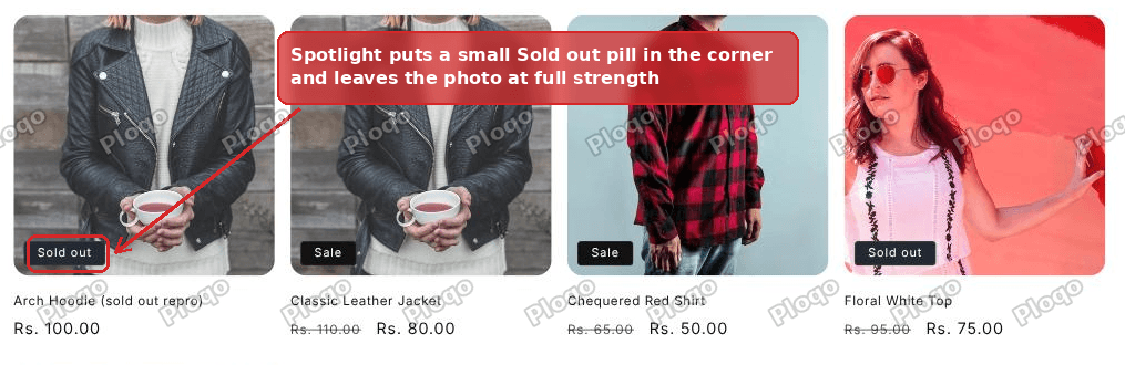 A Shopify collection page where the sold out product only has a small pill in the corner of the card
This guide builds that, using two rules of custom CSS, no app, and no edits to any theme file. The screenshots are from the Spotlight theme, and the same approach works on Dawn and every theme built from it, which covers Craft, Taste, Studio, Ritual, Trade, Crave, Refresh and Sense.
The part most tutorials get wrong
Search this and you will find answers that tell you to add a new element to the card: open card-product.liquid, find the image block, and paste in a <div> that says Sold Out, wrapped in a check for whether the product is available.
That works, and it is more work than the job needs. It means editing a theme file, which a theme update can overwrite, and it means understanding Liquid, Shopify's templating language, well enough to put the check in the right place.
There is a shortcut, and it comes from something your theme already does.
Your theme is already printing the words "Sold out" on that card. That is what the small pill is. The text exists, the check for whether the product is available has already run, and the element is already sitting inside the product photo's container.
So you do not need a new element. You need to restyle the one that is already there.
What the theme gives you to work with
Two class names do all the work here. A class is a label on an element that CSS can point at.
.price--sold-out goes on the price block of any card whose product is unavailable. Your theme adds it automatically. This is the marker that tells CSS "this whole card is a sold out product", and it is more reliable than looking at the badge, because the sold out badge and the sale badge share the same class name as each other.
.card__badge is the little box holding that pill, and .badge is the pill itself.
Between them you can say: on any card that contains a sold out price, take the badge, and turn it into something much bigger.
The connecting piece is a CSS feature called :has(). It lets a rule select a parent based on what is inside it. .card-wrapper:has(.price--sold-out) means "a product card that contains a sold out price". Every browser released since early 2023 supports it, so it is safe to use on a live store now.
Step by step
1. Open the theme editor
From your Shopify admin, go to Online Store > Themes, then click Customize on the theme you are using.
2. Switch the preview to a collection page
The editor opens on your home page. Use the page dropdown in the top bar, the one that says Home page, and pick Collections, then any collection. The preview will reload showing your product grid.
This matters, because the box you are about to use belongs to whichever section you have selected, and the product grid section only exists on collection pages.
3. Click Product grid
In the left sidebar you will see the sections that make up the collection page. Click Product grid.
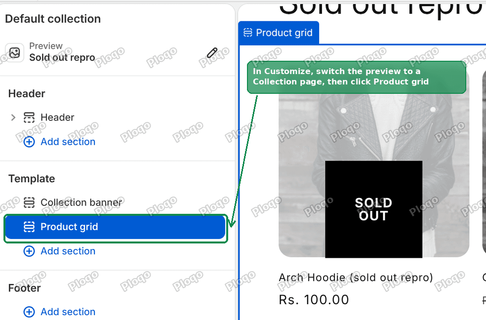 The Shopify theme editor with the Product grid section selected in the left sidebar
4. Open the Custom CSS box
The right hand panel now shows every setting for that section. Scroll it all the way to the bottom, past Filtering and sorting and past Padding, and you will find a collapsed row called Custom CSS. Click it to open.
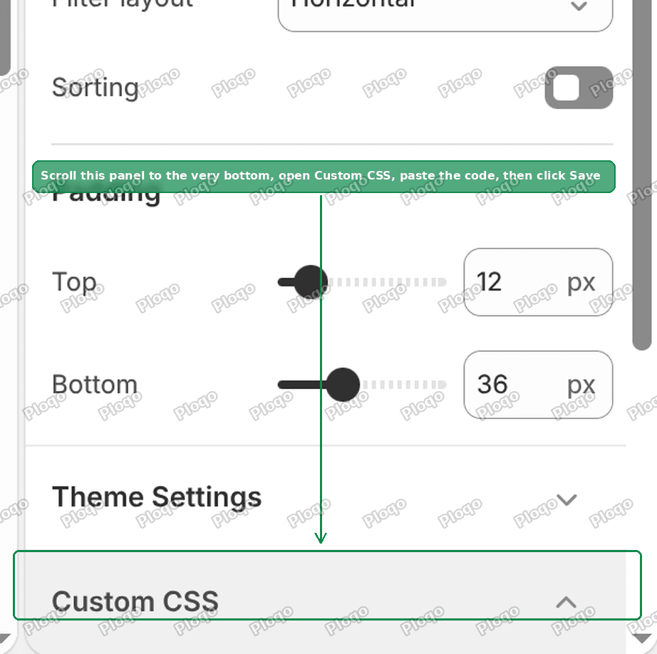 The Custom CSS box at the bottom of the Product grid section settings
Shopify puts one of these boxes on every section and every block. Whatever you type into it is automatically limited to that section, so a rule pasted here cannot leak onto your product pages or your home page even if the selector is broad. That scoping is the reason this box is safer than editing a stylesheet.
5. Paste the CSS
.card-wrapper:has(.price--sold-out) img{opacity:.35}
.card-wrapper:has(.price--sold-out) .card__badge{position:absolute;top:50%;left:50%;transform:translate(-50%,-50%);margin:0;z-index:2}
.card-wrapper:has(.price--sold-out) .badge{display:grid;place-items:center;width:120px;height:120px;background:#000;color:#fff;border:0;border-radius:0;padding:0;font-size:1.6rem;font-weight:700;text-transform:uppercase;word-spacing:120px;text-align:center}
Then click Save in the top right.
6. Check it
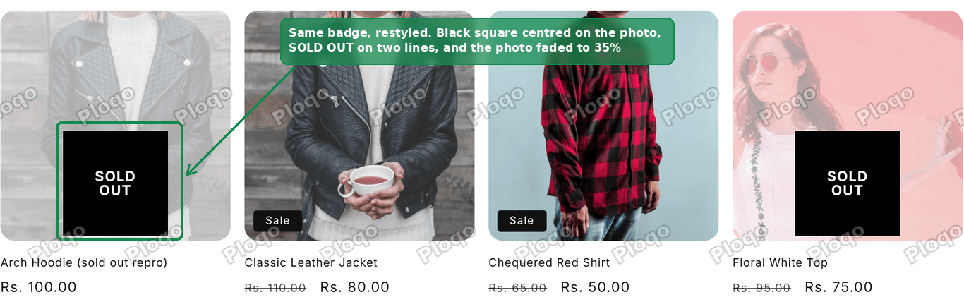 The same collection page with the sold out products faded behind a black Sold Out box
The sold out cards now have a faded photo and a black square in the middle. The in stock cards, including any with a Sale badge, are exactly as they were.
What each line does
Line one fades the photo. opacity: .35 means the image renders at thirty five percent strength, so it washes out towards the page background without going grey. Lower numbers fade it further. At .2 the product is barely readable, at .6 the effect is subtle.
Line two moves the badge. By default it sits in a corner. position: absolute with top: 50%, left: 50% and a translate(-50%, -50%) pins it to the exact centre of the photo. That translate is the standard way to centre something, because top: 50% alone puts the element's top edge at the middle rather than its centre.
Line three turns the pill into the box. It sets a fixed 120 by 120 square, a black background, white text, removes the theme's rounded corners and border, and makes the text bold and uppercase.
The odd one in that list is word-spacing: 120px. That is what stacks SOLD and OUT onto two lines. The words are separated by more space than the box is wide, so the browser has no choice but to break between them. Delete it and the text sits on one line.
Changing the look
Everything you are likely to want to adjust is a number or a colour in that block.
- Box size. Change both
120pxvalues in line three. They should stay equal to each other to keep the box square. - Box and text colour.
background:#000andcolor:#fff. A white box with black text reads well on dark product photography. - Rounded corners. Replace
border-radius:0with something likeborder-radius:8px. - How faded the photo gets. The
.35in line one. - One line instead of two. Delete
word-spacing:120px;. - Text size.
font-size:1.6remis 16 pixels. Note that rem values in Shopify themes work out to ten times smaller than you might expect, so 1.6rem is 16px, not 25px.
Two limits worth knowing before you edit it
The box holds 500 characters. The CSS above uses 445. If you add to it and Save stops working, that is why. Shopify counts the whole box, not each rule, and refuses to save anything longer. Shorten a selector or drop a property rather than adding a fourth rule.
The box will not accept the content property. This is the one that catches people out, because the obvious way to write a Sold Out overlay is to invent a new element with ::after and give it content: "SOLD OUT". Shopify's validator rejects any rule containing content, and the save fails with "Invalid property value: content". Restyling the badge your theme already prints sidesteps this entirely, which is the second reason to prefer that approach over inventing an element.
Making it work everywhere else
The Custom CSS box belongs to one section. That is a feature, not a limitation, but it does mean the rule only covers the section you pasted it into.
If you also show products on your home page, in a Featured collection row, that row is a different section with its own Custom CSS box. Open the home page in the editor, click that section, scroll to its Custom CSS box, and paste the same three lines.
The same goes for a related products row on your product pages, and for a collection list on any custom page you have built.
If you want it everywhere at once, there is a theme wide version of the same box. In the theme editor, click the Theme settings icon in the top left, scroll to the bottom, and you will find a Custom CSS box there too. Rules pasted there apply to every page of the theme. The trade off is that they are not scoped, so a broad selector really can affect something you did not intend, and you have to be more careful about what you put in.
If nothing changes after you save
Run through these in order.
- You pasted it into the wrong section. The most common cause. Check that the sidebar had Product grid highlighted, not Collection banner, when you opened the Custom CSS box.
- Nothing in the grid is actually sold out. Set one product's inventory to zero, with its inventory policy set to stop selling when out of stock, and reload. A product that is allowed to oversell never gets a sold out badge and never gets
.price--sold-out. - Your theme hides badges. Some themes have a setting to turn product card badges off. If the small pill was never showing in the first place, there is nothing to restyle. Turn the badge back on in the section or theme settings first.
- Your theme is not from the Dawn family. Themes bought from third party marketplaces often use their own class names. Right click a sold out card, choose Inspect, and look for the class on the price element. If it is not
price--sold-out, substitute whatever your theme uses in all three rules. - You are looking at a cached page. Reload with a hard refresh, or open the store in a private window.
A note on stock, not styling
This changes how a sold out product looks. It does not change what a shopper can do with it, and it does not hide it.
That is usually right. Keeping sold out products visible preserves their search rankings and the links pointing at them, and it shows returning shoppers that the item existed. If you would rather they disappeared from the grid entirely, that is a sorting setting on the collection rather than CSS, and it is a decision worth making deliberately.
If you want shoppers to be able to ask for the product when it returns, a back in stock app adds a notify button to the product page, and the black box above sits happily alongside it.
What you end up with
Three lines of CSS, in a box Shopify gives you, scoped to one section, with no theme file edited and nothing to uninstall. The words on screen come from your theme's own translation file, so they follow the shopper's language, and if you ever delete the CSS the badge goes straight back to being a small pill in the corner.
Spending too long on manual Shopify busywork?
PinFlow turns your Shopify catalog into Pinterest pins and posts them on a schedule, automatically. Same idea as the rule above, let the system handle the repetitive part.
Get PinFlow on the Shopify App StoreMore Shopify fixes
More community-sourced Shopify guides, tested on a live store.
Themes & Storefront
Shopify Horizon: Carousel Blank Until You Drag It
A Horizon carousel that shows an empty strip until you drag it, then fills in, is usually the theme skipping the painting of slides it thinks nobody is looking at. Here is how to tell that apart from a genuinely broken carousel, and the one line of CSS that covers it.
Themes & Storefront
How to Change the Price Font Size on a Shopify Collection Page
Shopify themes have no setting for the price size on a product card. Here is the one rule that shrinks it on collection pages only, where to paste it so it cannot reach your product pages, and how to keep the crossed out sale price in proportion.
Themes & Storefront
Show a Discount on the Shopify Product Page
An automatic discount is invisible on the product page until the cart. Here is a tag-driven badge that shows the discounted price on the page itself, and matches checkout exactly.