
Add a Sticky Bottom Navigation Bar in Shopify
Give mobile shoppers a fixed bottom navigation bar in Shopify with a free Liquid snippet - no app required.
By AjayCodeWiz · August 5, 2026 · 13 min read
The problem
A merchant asked about this on the Shopify Community. They wanted a free, mobile-friendly bottom navigation bar for their store.
Their goal was simple. A bar that stays pinned to the bottom of the screen on phones, with quick buttons like Home, Shop, Search, Cart and Account. Always visible, so a shopper never has to scroll back up to move around the store.
This is the same pattern that most shopping apps use. A row of icons fixed to the bottom edge of the phone. On the web, Shopify does not ship one by default.
I reproduced the request on a test store on a Dawn theme. Dawn is Shopify's free reference theme, so if it works there it works on almost every free theme. Here is the result on a real phone. The bar sits at the bottom, and the Cart button carries a live count.
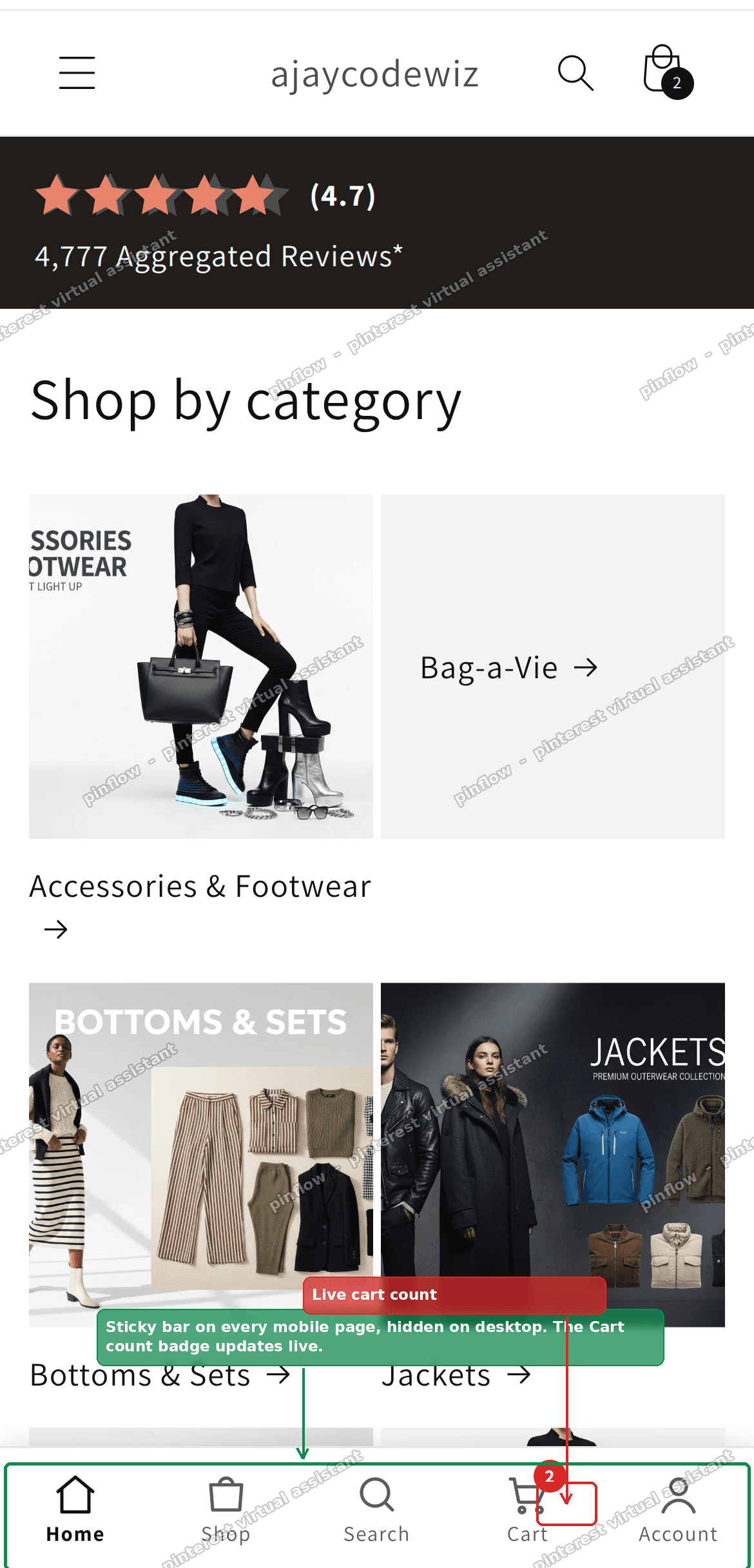 Result on a phone: a sticky bottom navigation bar with Home, Shop, Search, Cart and Account, plus a live cart count badge
That is a Shopify sticky bottom navigation bar, built with free Liquid code and nothing else. No app, no monthly fee. Below is exactly how to add it.
Why Shopify has no built-in bottom bar
This is the part most forum answers skip, and it explains why you have to add code at all.
Shopify themes are built for one navigation menu at the top. The header holds your main menu, the logo, search and the cart icon. That layout came from desktop, where a top bar is the norm.
A sticky bottom navigation bar is a mobile-app idea. It puts the main actions within thumb reach at the bottom of the screen. Shopify's free themes were never given a setting for it, so there is no toggle to switch on.
You have two honest ways to add one. Pay for an app that injects a bar. Or paste a small piece of free Liquid code that draws the bar itself. This guide does the second, because it costs nothing and you control every button.
The word "sticky" here means the bar uses CSS position: fixed. Fixed means the element stays glued to one spot on the screen while the page scrolls behind it. That is the mechanism behind every sticky footer menu you have seen.
Before you start: check your theme type
This fix works on any free Online Store 2.0 theme. That includes Dawn, Craft, Sense, Refresh, Ride, Taste and Spotlight.
Online Store 2.0 is Shopify's current theme system. The quick way to tell you have it: open the theme editor and look for an Add section button in the left panel. If it is there, you are on a 2.0 theme and this code will work.
Older "vintage" themes, like the original Debut, work differently and are not covered here. If you are unsure, you almost certainly have a 2.0 theme, because every new Shopify store ships with one.
You do not need coding skills. You paste the code once, then set the buttons from the theme editor with normal clicks.
The fix: a free sticky bottom navigation bar
The code below is a self-contained theme section. A section is a block of a Shopify page that you can add and configure from the theme editor. Because it is one section, everything lives in a single file: the bar, its styles, its icons and its settings.
Once it is in, you never touch the code again. Labels, links, icons and colours are all set with clicks.
Step 1. Add the code
Go to Online Store, then Themes. On your theme, open the ... menu and choose Edit code.
In the file tree, find the Sections folder. Click Add a new section, name it mobile-bottom-nav, delete the starter code the editor drops in, paste the full code from the block below, then Save.
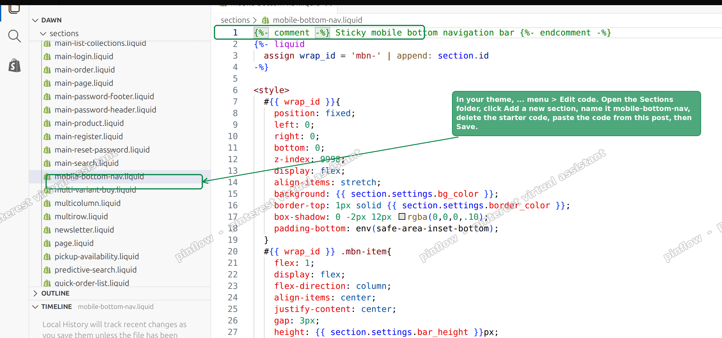 Step 1: create a new section named mobile-bottom-nav in the Edit code screen
Here is the complete code. Paste all of it.
{%- comment -%} Sticky mobile bottom navigation bar {%- endcomment -%}
{%- liquid
  assign wrap_id = 'mbn-' | append: section.id
-%}

<style>
  #{{ wrap_id }}{
    position: fixed;
    left: 0;
    right: 0;
    bottom: 0;
    z-index: 9998;
    display: flex;
    align-items: stretch;
    background: {{ section.settings.bg_color }};
    border-top: 1px solid {{ section.settings.border_color }};
    box-shadow: 0 -2px 12px rgba(0,0,0,.10);
    padding-bottom: env(safe-area-inset-bottom);
  }
  #{{ wrap_id }} .mbn-item{
    flex: 1;
    display: flex;
    flex-direction: column;
    align-items: center;
    justify-content: center;
    gap: 3px;
    height: {{ section.settings.bar_height }}px;
    text-decoration: none;
    color: {{ section.settings.icon_color }};
    font-size: 11px;
    line-height: 1;
    position: relative;
  }
  #{{ wrap_id }} .mbn-item svg{ width: 24px; height: 24px; }
  #{{ wrap_id }} .mbn-item.is-active{ color: {{ section.settings.active_color }}; font-weight: 600; }
  #{{ wrap_id }} .mbn-badge{
    position: absolute;
    top: 6px;
    left: 54%;
    min-width: 17px;
    height: 17px;
    padding: 0 4px;
    border-radius: 9px;
    background: {{ section.settings.badge_color }};
    color: #fff;
    font-size: 10px;
    font-weight: 700;
    line-height: 17px;
    text-align: center;
  }
  #{{ wrap_id }} .mbn-badge[hidden]{ display: none; }
  @media (min-width: {{ section.settings.hide_above }}px){
    #{{ wrap_id }}{ display: none; }
  }
  @media (max-width: {{ section.settings.hide_above | minus: 1 }}px){
    body{ padding-bottom: calc({{ section.settings.bar_height }}px + env(safe-area-inset-bottom)); }
  }
</style>

<nav id="{{ wrap_id }}" role="navigation" aria-label="Bottom navigation">
  {%- for block in section.blocks -%}
    {%- liquid
      assign is_active = false
      if block.settings.link == routes.root_url and request.page_type == 'index'
        assign is_active = true
      elsif block.settings.link contains '/cart' and request.page_type == 'cart'
        assign is_active = true
      elsif block.settings.link contains '/collections' and request.page_type == 'collection'
        assign is_active = true
      elsif block.settings.link contains '/account' and request.page_type contains 'customers'
        assign is_active = true
      endif
    -%}
    <a href="{{ block.settings.link | default: '#' }}"
       class="mbn-item{% if is_active %} is-active{% endif %}"
       {{ block.shopify_attributes }}>
      {%- case block.settings.icon -%}
        {%- when 'home' -%}
          <svg viewBox="0 0 24 24" fill="none" stroke="currentColor" stroke-width="1.7" stroke-linecap="round" stroke-linejoin="round"><path d="M3 10.5 12 3l9 7.5"/><path d="M5 9.5V21h14V9.5"/></svg>
        {%- when 'shop' -%}
          <svg viewBox="0 0 24 24" fill="none" stroke="currentColor" stroke-width="1.7" stroke-linecap="round" stroke-linejoin="round"><path d="M4 7h16l-1 13H5L4 7Z"/><path d="M8.5 7a3.5 3.5 0 0 1 7 0"/></svg>
        {%- when 'search' -%}
          <svg viewBox="0 0 24 24" fill="none" stroke="currentColor" stroke-width="1.7" stroke-linecap="round" stroke-linejoin="round"><circle cx="11" cy="11" r="7"/><path d="m20 20-3.2-3.2"/></svg>
        {%- when 'cart' -%}
          <svg viewBox="0 0 24 24" fill="none" stroke="currentColor" stroke-width="1.7" stroke-linecap="round" stroke-linejoin="round"><circle cx="9" cy="20" r="1.4"/><circle cx="18" cy="20" r="1.4"/><path d="M3 4h2l2.2 11.2a1 1 0 0 0 1 .8h8.6a1 1 0 0 0 1-.8L21 8H6"/></svg>
        {%- when 'account' -%}
          <svg viewBox="0 0 24 24" fill="none" stroke="currentColor" stroke-width="1.7" stroke-linecap="round" stroke-linejoin="round"><circle cx="12" cy="8" r="4"/><path d="M4 21c1.5-4 5-6 8-6s6.5 2 8 6"/></svg>
        {%- when 'heart' -%}
          <svg viewBox="0 0 24 24" fill="none" stroke="currentColor" stroke-width="1.7" stroke-linecap="round" stroke-linejoin="round"><path d="M12 20s-7-4.4-9.2-8.6C1.3 8.5 2.8 5 6 5c2 0 3.2 1.2 4 2.4C10.8 6.2 12 5 14 5c3.2 0 4.7 3.5 3.2 6.4C19 15.6 12 20 12 20Z"/></svg>
        {%- when 'menu' -%}
          <svg viewBox="0 0 24 24" fill="none" stroke="currentColor" stroke-width="1.7" stroke-linecap="round" stroke-linejoin="round"><path d="M4 7h16M4 12h16M4 17h16"/></svg>
        {%- when 'phone' -%}
          <svg viewBox="0 0 24 24" fill="none" stroke="currentColor" stroke-width="1.7" stroke-linecap="round" stroke-linejoin="round"><path d="M6 3h3l1.5 5-2 1.5a12 12 0 0 0 6 6l1.5-2 5 1.5v3a2 2 0 0 1-2 2A17 17 0 0 1 4 5a2 2 0 0 1 2-2Z"/></svg>
      {%- endcase -%}
      {%- if block.settings.show_cart_count -%}
        <span class="mbn-badge" data-mbn-count {% if cart.item_count == 0 %}hidden{% endif %}>{{ cart.item_count }}</span>
      {%- endif -%}
      <span>{{ block.settings.label }}</span>
    </a>
  {%- endfor -%}
</nav>

<script>
  (function(){
    var badges = document.querySelectorAll('#{{ wrap_id }} [data-mbn-count]');
    if(!badges.length) return;
    function paint(n){
      badges.forEach(function(b){ b.textContent = n; b.hidden = (n <= 0); });
    }
    function refresh(){
      fetch('{{ routes.cart_url }}.js', {headers:{'Accept':'application/json'}})
        .then(function(r){ return r.json(); })
        .then(function(c){ paint(c.item_count); })
        .catch(function(){});
    }
    var _fetch = window.fetch;
    window.fetch = function(){
      var url = arguments[0] && (arguments[0].url || arguments[0]);
      var p = _fetch.apply(this, arguments);
      if(typeof url === 'string' && /\/cart\/(add|change|update|clear)/.test(url)){
        p.then(function(){ setTimeout(refresh, 60); });
      }
      return p;
    };
    document.addEventListener('visibilitychange', function(){ if(!document.hidden) refresh(); });
  })();
</script>
The section also ships with a schema block that gives you the settings and the five default buttons. It is part of the same file. You can see the full schema in our forum reply, linked at the foot of this page.
Step 2. Turn it on for every page
Go back to your theme and click Customize to open the theme editor.
In the left panel, find the Footer group. Click Add section, type "mobile", and choose Mobile bottom nav. Save.
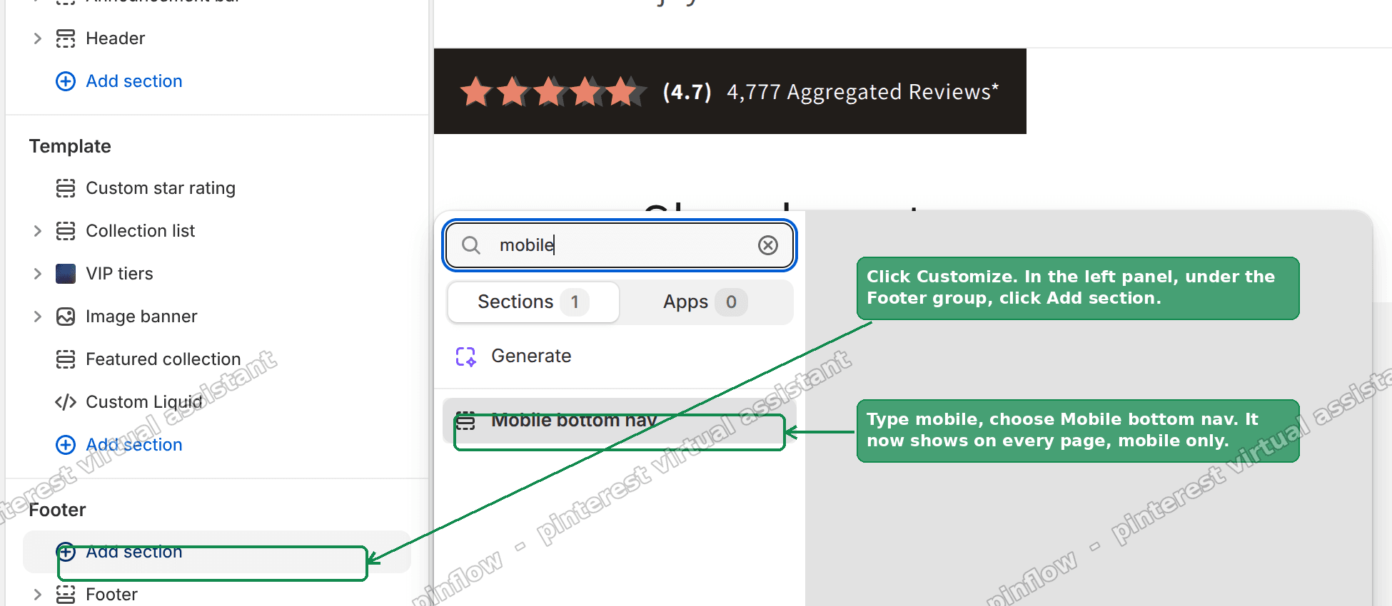 Step 2: add the Mobile bottom nav section under the Footer group in the theme editor
Adding it to the Footer group is what makes the bar show on every page of the store, not just the home page. Because the code is fixed to the bottom, it floats above the footer rather than sitting inside it.
Step 3. Set your links
Click the section in the editor. Each Nav item is one button in the bar.
For each one, set the Label (the text under the icon), the Link (where it goes), and pick an Icon from the dropdown. Icons include home, shop, search, cart, account, wishlist, menu and contact.
On your Cart button, turn on Show cart item count. That is what draws the live badge.
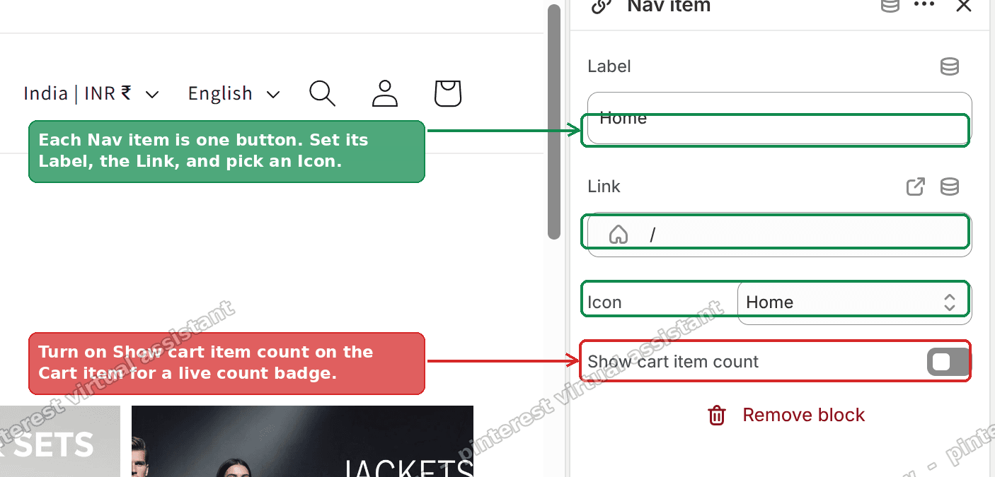 Step 3: set each Nav item label, link and icon, and turn on Show cart item count
That is the whole setup. You now have a Shopify mobile bottom menu that you edit with clicks.
An alternative: a no-code app
If you would rather not touch code at all, there are apps in the Shopify App Store that add a mobile bottom menu for you. Search "mobile bottom bar" or "sticky bottom navigation".
The trade-off is real. Most charge a monthly fee, they add their own script to every page, and you are tied to their layout and their support. For a bar this simple, that is a lot of overhead.
The free section above does the same job, loads no third-party script, and keeps every setting inside your own theme. I would only reach for an app if you want extras like a slide-up menu drawer or per-device scheduling.
How do I make a Shopify menu stick to the bottom on mobile?
You give the element position: fixed and pin it with bottom: 0. Those two CSS rules are what turn a normal row of links into a sticky footer menu.
The code above already does this. The bar is fixed to the bottom, spans the full width with left: 0 and right: 0, and sits above the page with a high z-index so nothing covers it.
You cannot get this from the standard theme menu settings alone. The header menu is built to sit at the top. To stick a menu to the bottom you either add the code here or use an app.
Can I add a bottom nav bar without an app?
Yes. The section in this guide is a complete Shopify bottom nav bar with no app involved.
It is free, it lives in your theme, and it survives theme updates as long as you keep the section file. Because it is Liquid, it can read live store data like the cart count, which a pure image or link block cannot.
The only "cost" is pasting the code once. After that, everything is point and click.
How do I add a live cart count to the bottom bar?
Turn on Show cart item count on the Cart button, as in Step 3.
The badge starts from Shopify's own cart.item_count. A small script then listens for add-to-cart and cart-update requests and refreshes the number without a page reload. So when a shopper adds an item, the badge ticks up right away.
If the count ever looks stale, a page refresh always corrects it, because the number is re-read from the cart on every load.
How do I hide the sticky footer menu on desktop?
The code hides itself on wide screens automatically. That is handled by a media query tied to the Hide on screens wider than setting.
The default is 750px. Screens wider than that (tablets in landscape and desktops) do not see the bar. Phones do. You can raise or lower that number in the section settings if your breakpoint is different.
This matters because a fixed bottom bar on desktop looks out of place and wastes screen space. Keeping it mobile only is the correct default.
If it did not work
A few things trip people up. Check these in order.
The bar does not appear at all. Make sure you added the section under the Footer group in the theme editor and saved. Pasting the code in Edit code alone is not enough. The section has to be added to a page.
It shows on desktop too. Your Hide on screens wider than value may be set very high. Lower it back toward 750px. Also confirm you are testing at a real phone width, not just a narrow browser window.
The bar covers the footer or last row of content. The code already adds bottom padding to the page to leave room. If your theme fights it, raise the Bar height setting slightly, which increases that padding.
The cart badge stays hidden. The badge only shows when the cart has items, and only on the button where you turned on Show cart item count. An empty cart shows no badge by design.
Nothing saved in Edit code. Confirm the file is named as a section and that you deleted the starter code before pasting. A leftover {% schema %} from the starter will clash with the one in this code.
Terms people confuse
Sticky vs fixed. People say "sticky" for both, but they are different CSS values. position: sticky scrolls with the page until it hits an edge, then holds. position: fixed is pinned the whole time. A bottom navigation bar uses fixed, so it never moves.
Header menu vs bottom bar. Your theme's navigation menu is the list of links you build under Navigation in the admin. This bottom bar is separate. It has its own buttons, set inside the section. Editing your header menu does not change the bottom bar, and vice versa.
Section vs snippet. This code is a section, which can be added and configured in the theme editor. A snippet is a reusable code fragment with no editor settings. Using a section is why you get click-to-edit labels, links and colours instead of hard-coded values.
Bottom bar vs footer. The footer is the block of links and info at the very end of the page. It scrolls away. The Shopify fixed bottom menu for mobile floats on top and is always visible. They can coexist, and this bar sits above the footer.
That covers it. A free, editable, mobile-only sticky bottom navigation bar, tested on a Dawn store, with a live cart count and no app or monthly fee.
Spending too long on manual Shopify busywork?
PinFlow turns your Shopify catalog into Pinterest pins and posts them on a schedule, automatically. Same idea as the rule above, let the system handle the repetitive part.
Get PinFlow on the Shopify App StoreMore Shopify fixes
More community-sourced Shopify guides, tested on a live store.
Themes & Storefront
Shopify AI Section: Fix a Price Badge Hidden Behind the Image
You built a section with Shopify's AI section generator, but the price badge on each card sits behind the photo. Here is the Custom Liquid fix that brings it to the front without regenerating anything. Tested on a Dawn store.
Themes & Storefront
Hide Shipping Calculated at Checkout on One Shopify Product
The line under Add to cart that says shipping is calculated at checkout shows on every product, gift cards included. Here is how to hide it on one product only, with the code, screenshots and the Eclipse theme steps.
Themes & Storefront
Shopify Dropdown Menu Behind Page Content (Z-Index Fix)
Your Shopify dropdown or mega menu opens, but the page title and products sit on top of its links and the menu closes before you can click. The fix is one Custom CSS rule in Theme settings. Tested on a Rebel store.