
Shopify Transparent Header Overlapping the Slideshow
Your Shopify header menu prints on top of the first slide. That is the transparent header setting. How to turn it off on Prestige, and why the menu text stays white until you change the header colour scheme, not CSS. Tested on a Prestige store.
By AjayCodeWiz · July 28, 2026 · 8 min read
The problem: your header menu sits on top of the slideshow
You open your Shopify homepage and the menu is printed straight over the first slide.
The links, the logo and the cart icon float on top of the image. On a busy photo they are almost impossible to read. White text vanishes into a light background. Dark text disappears into a dark one.
You want the menu to sit in its own bar, above the slideshow, not on it.
A merchant asked exactly this on the Shopify Community. They were on the Prestige theme. I reproduced it on a Prestige store and worked through the fix, plus the follow-up problem that trips most people up.
Why it happens: the transparent header
This is a setting, not a bug.
Most premium themes ship a feature called a transparent header. When the first section on a page is a full-width image, slideshow or video, the header drops its background and floats over that image. The menu becomes see-through so the hero photo runs edge to edge behind it.
It looks great on the demo store, where the hero is a dark, evenly lit photo picked to make white menu text pop.
It looks bad the moment you swap in your own image. Your photo has light areas where the menu was meant to be white. Now the menu is unreadable.
So the header is not broken. It is doing exactly what the transparent-header setting tells it to. You just want that setting off.
The fix on Prestige: turn off Allow transparent header
The setting lives on the first section of the page, not on the header.
That surprises people. They open the Header section looking for it, do not find it, and give up. It is attached to whatever section sits first, because that is the section the header floats over.
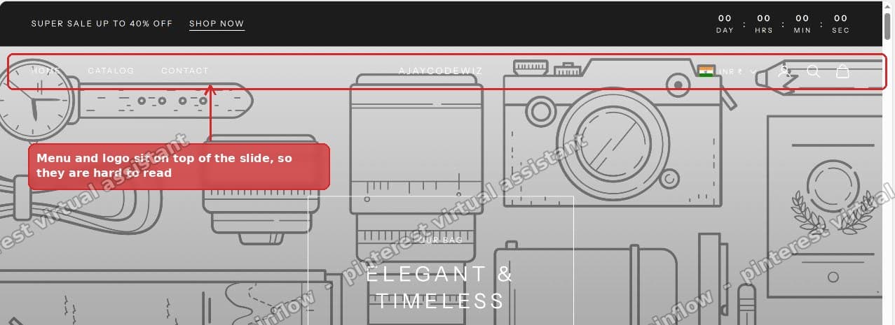 The menu and logo print straight onto the first slide, so they are hard to read
Here are the steps.
Step 1. Go to Online Store > Themes and click Customize.
Step 2. In the left panel, click the first section under Template. On most stores that is the Slideshow or Image banner. Do not click the Header section.
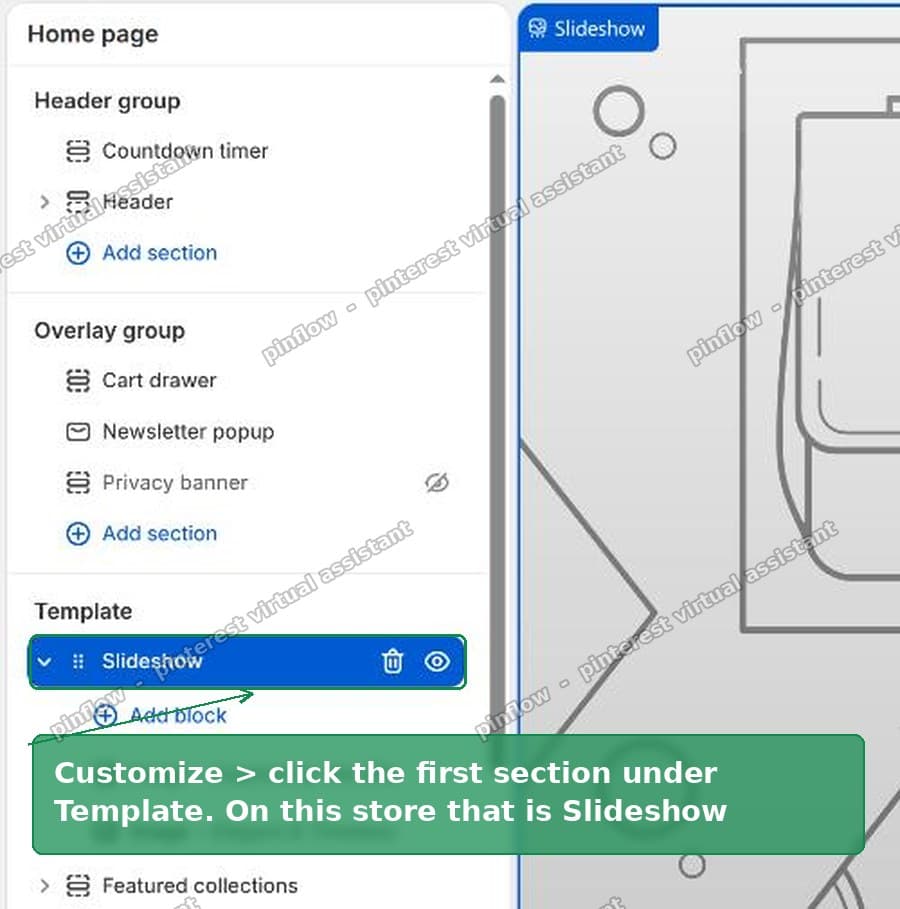 Click the first section under Template, which is the Slideshow
Step 3. In the section settings, turn off Allow transparent header. Then click Save at the top right.
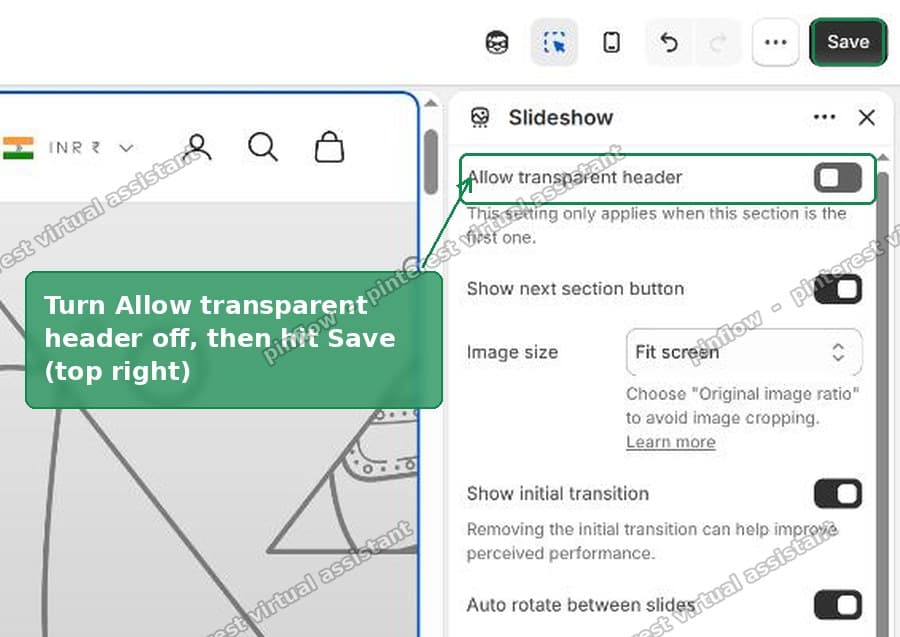 Turn off Allow transparent header, then Save
That is it. The menu now sits in its own solid bar above the slide.
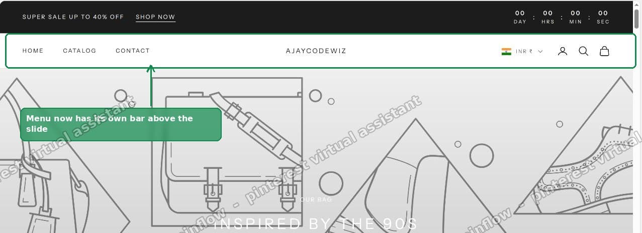 The menu now has its own bar above the slideshow
Two things that fix themselves, so do not touch them
People often start changing other settings after this. You do not need to.
Your logo swaps back on its own. Premium themes let you upload two logos: a normal one and a transparent-header version, usually a white one. The theme only uses the white logo while the header is see-through. Turn transparency off and it switches back to your normal logo automatically. There is no separate setting to flip.
The slideshow does not get shorter. A common worry is that adding a solid header bar will push the hero down or shrink it. It will not. These themes size the first section as full height minus the header height. Turn transparency off and the maths still works out. Your hero still fills exactly one screen.
The follow-up catch: the menu text stays white
This is the part that sends people back to the forum.
You turn transparency off, the bar appears, and the menu text is still white on a white bar. You cannot read it. So you reach for CSS, or you dig through the general theme colour settings, and nothing moves.
Here is why. On Prestige, and on most premium themes, the menu colour does not come from CSS or from a single colour picker. It comes from the colour scheme assigned to the header section.
A colour scheme is a set: background, text, buttons and icons, all bundled together. The theme ships several. The header is pointing at one of them, and that scheme's text colour is white because it was built to sit on a dark hero.
CSS loses this fight because the theme sets the colour with high specificity from the scheme. Your rule gets overridden, or it changes the text but not the icons, and you end up with a half-fixed header.
The fix: change the header's colour scheme
Step 1. In the theme editor, click the Header section.
Step 2. At the top of the panel is Color scheme, shown as a row of small swatches. Each swatch is a full scheme. The one with the outline is the one currently in use.
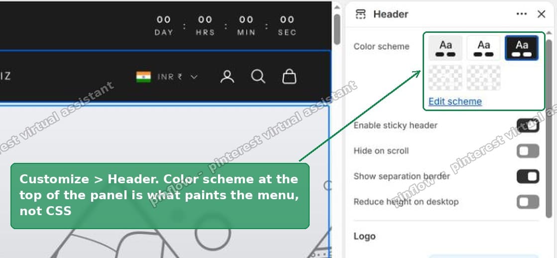 The Header section Color scheme is what paints the menu, not CSS
Step 3. Click a different swatch, the one whose background matches your header (white) and whose text is the colour you want (dark). On a default Prestige that is normally the first, light, scheme. The menu, the icons and the logo all follow it.
Step 4. If none of the swatches fits, click Edit scheme and change Body text to your colour. Be careful here. A scheme is shared across the store, so every other section using it changes too. Picking a different swatch is the safer move than editing one.
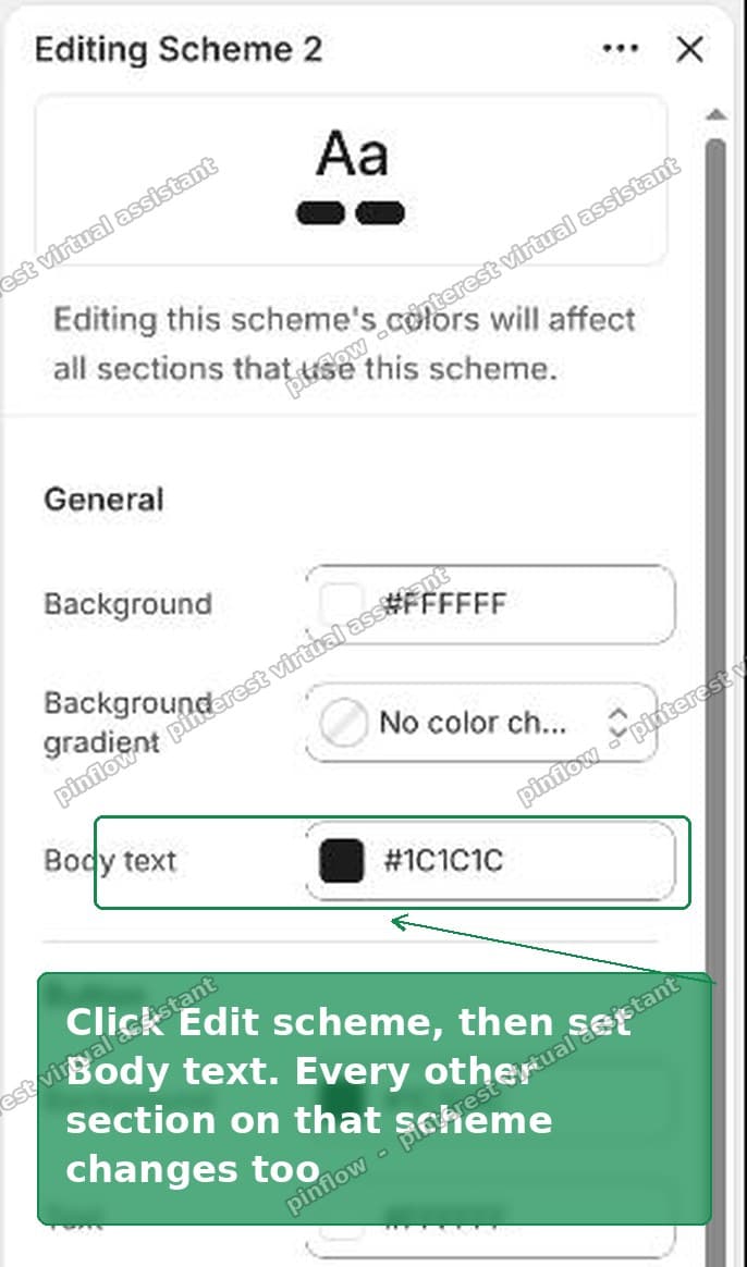 Edit scheme lets you set the exact Body text colour, but it is shared across sections
One more place to check: the announcement bar above the header has its own colour scheme. If yours has a bar, set that separately or its text can go white too.
Doing the same thing on other themes
The wording changes by theme, but the idea is identical: a per-section transparency toggle, and a colour scheme on the header.
- Prestige, Impulse, Warehouse, Athens and most premium themes call it Allow transparent header or Transparent header, on the first section.
- Dawn and the free themes mostly do not float the header at all, so if your menu overlaps an image on a free theme, look at the section itself rather than a transparency setting.
- Debut and other legacy themes put a Transparent header checkbox in the header settings instead of the section.
If you cannot find the toggle, the reliable tell is this: it lives wherever the theme decided the header should float. That is either the first section or the header. Check both.
What to check if the menu is still hard to read
- You changed the wrong section. The transparency toggle is on the very first section on the page. If you have an announcement bar, a countdown timer or anything above the slideshow, the "first section" is still the first content section, but confirm you clicked the slideshow and not the header.
- The preview looks unchanged. The theme editor caches the preview. Save, then reload the editor, or open the storefront in a new tab. The change is usually already applied and just not repainted.
- Only the text changed, not the icons. You edited CSS instead of the scheme. Undo the CSS and change the header's colour scheme instead.
- It is fine on the homepage but broken on another page. Transparency is set per page, on that page's first section. Fix each page that shows the overlap. Collection, product and blog pages usually do not use a transparent header, so this is normally a one-page change.
What if you actually want to keep the transparent header?
Some stores want the see-through look. It suits a dark, full-bleed hero.
If that is you, do not turn the setting off. Fix the readability instead.
- Leave Allow transparent header on.
- Change the header colour scheme so its text reads against your hero. On a dark photo, pick the scheme with white text. On a light photo, pick the dark one.
- Upload a transparent-header logo in a colour that shows on your image. The theme has a separate slot for it, right next to the normal logo.
- If the text sits over a busy part of the photo, add a subtle dark overlay to the slide. Most slideshow sections have an overlay opacity setting for exactly this.
That keeps the floating header and makes it legible, which is the look the feature was built for.
How to turn the transparent header on, if you want it
The reverse question comes up just as often: the header is solid and someone wants it to float over the hero.
It is the same toggle. Open the first section on the page, find Allow transparent header, and turn it on. The header drops its background over that section. Then set the header colour scheme so the menu reads against the image, exactly as above.
If the toggle is missing, your first section is not a full-width media section. Transparency only applies over an image banner, slideshow or video. A rich-text or collection section first on the page will not offer it.
Transparent header vs sticky header: not the same thing
These two settings get confused constantly, because both live near the top of the theme.
- A transparent header is about colour. It makes the header background see-through so a hero image shows behind it. This is the setting causing the overlap.
- A sticky header is about position. It keeps the header pinned to the top as you scroll. It has nothing to do with the overlap.
Turning off sticky will not fix an overlapping menu. Turning off transparency will. If you turned off the wrong one and saw no change, that is why.
The short version
- The overlap is the transparent header feature. Turn off Allow transparent header on the first section, then Save.
- Your white logo and your slide height both correct themselves. Leave them alone.
- If the menu text stays white, change the colour scheme on the Header section, not CSS.
- The announcement bar has its own scheme. Set it separately.
I tested every step of this on a Prestige store before writing it.
Spending too long on manual Shopify busywork?
PinFlow turns your Shopify catalog into Pinterest pins and posts them on a schedule, automatically. Set your storefront up once, then let the system handle the repetitive part.
Get PinFlow on the Shopify App StoreMore Shopify fixes
More community-sourced Shopify guides, tested on a live store.
Themes & Storefront
Shopify Horizon: Carousel Blank Until You Drag It
A Horizon carousel that shows an empty strip until you drag it, then fills in, is usually the theme skipping the painting of slides it thinks nobody is looking at. Here is how to tell that apart from a genuinely broken carousel, and the one line of CSS that covers it.
Themes & Storefront
Shopify Sold Out Overlay: Grey Out Products and Add a Sold Out Box
Shopify themes mark a sold out product with a small pill in the corner of the card. Here is how to turn that pill into a black Sold Out box across the middle of the photo, and fade the photo behind it, with no theme code and no app.
Themes & Storefront
How to Change the Price Font Size on a Shopify Collection Page
Shopify themes have no setting for the price size on a product card. Here is the one rule that shrinks it on collection pages only, where to paste it so it cannot reach your product pages, and how to keep the crossed out sale price in proportion.