
How to Build a 3-Column Product Page in Dawn
Dawn gives you media on one side and everything else on the other. Here is how to split the info column in two so the buy box sits on the right, tested on a Dawn store.
By AjayCodeWiz · July 13, 2026 · 10 min read
The problem: Dawn only gives you two columns
Dawn's product page is media on one side, everything else on the other. Title, price, description, variant picker, quantity, buy buttons and accordions all stack in a single column.
On a long product page that column gets tall. The description pushes the Add to cart button down, and on a wide monitor you end up with a lot of empty space beside a narrow strip of text.
What plenty of stores want instead is three columns: product information on the left, media in the middle, and the buy box on the right. Title and description on one side, the thing the customer came to click on the other, images between them.
There is no setting for this. Dawn's media position options are left and right, and that is the extent of it.
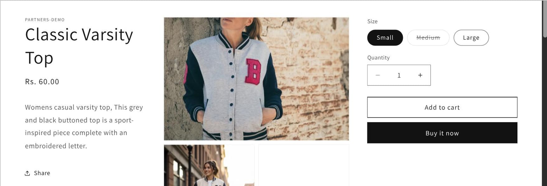 The finished three-column product page: information, media, then the buy box
I built it on a Dawn test store. It needs a Liquid change and a CSS change, and the Liquid change is more interesting than it first looks.
Why you cannot do this with CSS alone
The tempting approach is to leave the markup alone and rearrange with flexbox order. It does not work, and the reason is structural.
Dawn renders one <section class="product__info-container"> and loops every block into it:
{%- for block in section.blocks -%}
  {%- case block.type -%}
    {# ... every block type rendered here ... #}
  {%- endcase -%}
{%- endfor -%}
All the blocks are siblings inside one container. CSS order can rearrange siblings within a flex container, but it cannot take half of them and move them into a different column on the other side of the media. They are in the same box, and the media is not in that box at all.
So the markup has to change. You need two info containers, with the blocks split between them.
That means duplicating the entire case statement, once per column, unless you factor it out first. Factoring it out is the better move and it is where this starts.
Step 1: extract the block renderer into a snippet
Duplicate your theme before touching anything. Online Store > Themes > ... > Duplicate.
Create a new file, snippets/product-info-block.liquid.
Cut the entire {%- case block.type -%} ... {%- endcase -%} body out of sections/main-product.liquid, the part starting right after {%- for block in section.blocks -%}, and paste it in, wrapped like this:
{% comment %}
  Renders a single main-product info block by type.
  Accepts:
  - block: {Object}
  - product: {Object}
  - product_form_id: {String}
{% endcomment %}
{%- case block.type -%}
  {# ...paste the original case/when block here, unchanged... #}
{%- endcase -%}
Do not modify the case body. Move it verbatim. It is several hundred lines handling every block type Dawn supports, and the goal here is purely to make it callable from two places.
The {% comment %} header documenting what the snippet accepts is Dawn's own convention. Worth keeping, because in six months the three variables this snippet depends on will not be obvious.
One thing to know: {% render %} gives the snippet an isolated scope. It cannot see variables from the parent template unless you pass them in explicitly. That is why block, product and product_form_id are all passed on every call. Miss one and that block type renders empty rather than erroring rather than erroring, which is a confusing failure to debug.
Step 2: split the loop into two columns
In sections/main-product.liquid, replace the markup between <div class="product product--..."> and its closing </div> with this:
<div class="product product--{{ section.settings.media_size }} product--{{ section.settings.media_position }} product--{{ section.settings.gallery_layout }} product--mobile-{{ section.settings.mobile_thumbnails }} product--3col-desktop grid grid--1-col {% if product.media.size > 0 %}grid--2-col-tablet{% else %}product--no-media{% endif %}">
  {%- assign product_form_id = 'product-form-' | append: section.id -%}
  {%- assign right_col_block_types = 'variant_picker,quantity_selector,buy_buttons' | split: ',' -%}

  <div class="product__info-wrapper product__info-wrapper--left grid__item{% if settings.page_width > 1400 and section.settings.media_size == "small" %} product__info-wrapper--extra-padding{% endif %}{% if settings.animations_reveal_on_scroll %} scroll-trigger animate--slide-in{% endif %}">
    <section class="product__info-container">
      {%- for block in section.blocks -%}
        {%- unless right_col_block_types contains block.type -%}
          {%- render 'product-info-block', block: block, product: product, product_form_id: product_form_id -%}
        {%- endunless -%}
      {%- endfor -%}
    </section>
  </div>

  <div class="grid__item product__media-wrapper">
    {% render 'product-media-gallery', variant_images: variant_images %}
  </div>

  <div class="product__info-wrapper product__info-wrapper--right grid__item{% if settings.page_width > 1400 and section.settings.media_size == "small" %} product__info-wrapper--extra-padding{% endif %}{% if settings.animations_reveal_on_scroll %} scroll-trigger animate--slide-in{% endif %}">
    <section
      id="ProductInfo-{{ section.id }}"
      class="product__info-container{% if section.settings.enable_sticky_info %} product__column-sticky{% endif %}"
    >
      {%- for block in section.blocks -%}
        {%- if right_col_block_types contains block.type -%}
          {%- render 'product-info-block', block: block, product: product, product_form_id: product_form_id -%}
        {%- endif -%}
      {%- endfor -%}
      <a href="{{ product.url }}" class="link product__view-details animate-arrow">
        {{ 'products.product.view_full_details' | t }}
        {{- 'icon-arrow.svg' | inline_asset_content -}}
      </a>
    </section>
  </div>
</div>
Everything else in the file, the media modal, popups and structured data, stays as it is.
What is going on here
right_col_block_types is the whole configuration. One line decides which blocks form the buy box:
{%- assign right_col_block_types = 'variant_picker,quantity_selector,buy_buttons' | split: ',' -%}Want the price on the right too? Add price. Want the description on the right? Add description. The two loops read from this list, so changing it is the only edit needed to move a block between columns.
Two loops over the same blocks, one with unless ... contains, one with if ... contains. Every block lands in exactly one column, and any block type you have not thought about defaults to the left, which is the safe direction.
ProductInfo-{{ section.id }} stays on the right column. Dawn's JavaScript uses that id to find the variant picker and update the form. Put it on the wrong column and variant switching stops working with no error.
product--3col-desktop is a new class added purely as a CSS hook, so the stylesheet can target this layout without affecting anything else.
Step 3: the CSS
Append to assets/section-main-product.css:
/* 3-column desktop product layout: info | media | buy box */
/* Selectors go 4 class-selectors deep so they reliably beat Dawn's own
   .product--large:not(.product--no-media) rules (3 class-selectors, since
   :not() counts its argument toward specificity). */
@media screen and (max-width: 989px) {
  .product--3col-desktop.product .product__media-wrapper,
  .product--3col-desktop.product .product__info-wrapper.product__info-wrapper--left,
  .product--3col-desktop.product .product__info-wrapper.product__info-wrapper--right {
    max-width: 100%;
    width: 100%;
  }
}

@media screen and (min-width: 990px) {
  .product--3col-desktop.product .product__media-wrapper,
  .product--3col-desktop.product .product__info-wrapper.product__info-wrapper--left,
  .product--3col-desktop.product .product__info-wrapper.product__info-wrapper--right {
    max-width: none;
  }

  .product--3col-desktop.product .product__info-wrapper.product__info-wrapper--left {
    width: calc(28% - var(--grid-desktop-horizontal-spacing) / 2);
    order: 1;
    padding: 0 4rem 0 0;
  }

  .product--3col-desktop.product .product__media-wrapper {
    width: calc(38% - var(--grid-desktop-horizontal-spacing));
    order: 2;
  }

  .product--3col-desktop.product .product__info-wrapper.product__info-wrapper--right {
    width: calc(34% - var(--grid-desktop-horizontal-spacing) / 2);
    order: 3;
    padding: 0 0 0 4rem;
  }
}
Change 28% / 38% / 34% to adjust the column widths. They should total 100%.
The specificity note is the important part
Those selectors are deliberately four class-selectors deep, and the comment in the code explains why.
Dawn styles its product columns with rules like .product--large:not(.product--no-media) .product__media-wrapper. That is three class-selectors, because :not() contributes its argument's specificity. A rule written with two or three of your own classes ties or loses, and CSS breaks ties by source order, which depends on stylesheet load order rather than anything you control.
Writing the override one level deeper than the rule you are beating removes the ambiguity. It is more robust than !important, which wins now and makes every future change harder.
The --grid-desktop-horizontal-spacing variable is Dawn's own gutter. Subtracting it from each width keeps the columns aligned with the rest of the grid instead of overflowing by the gap amount.
Making the buy box sticky
A three-column layout creates an obvious opportunity. The buy box is now a narrow column of its own, so it can follow the customer down a long page instead of scrolling away.
Dawn already has the machinery. The right column picks up product__column-sticky when Enable sticky info is ticked in the section settings, and that class does the work.
Tick it in the theme editor, on the Product information section. No code needed, because the markup above already carries the class through.
Two things to watch. A sticky column that is taller than the viewport will not stick usefully, since there is nothing left to scroll past, so keep the buy box to the essentials. And a sticky element that overlaps a sticky header is a common annoyance; if that happens, Dawn's sticky offset is driven by the header height, so check your header is not set to a mode the calculation does not account for.
Using it on only some products
The layout above applies to every product using that template, because it is baked into main-product.liquid.
If you want it on a subset, duplicate the template instead of editing the shared one. In the theme editor, use Create template from the product template dropdown, name it something like product.three-column, then assign it per product from the product page in the admin under Theme template.
That gives you two templates using the same snippet, which is another reason extracting product-info-block.liquid in step 1 pays off. Both templates render blocks through the same file, so a fix to a block type applies to both.
The alternative, wrapping the whole layout in a Liquid condition on a product tag, works but leaves you maintaining two layouts in one file. Templates are the cleaner separation.
Testing it before you publish
Work through this on the preview URL rather than the live theme.
Switch variants. The single most likely thing to break, because the JavaScript depends on ProductInfo-{{ section.id }} being present. Change size or colour and confirm the price, availability and image all update.
Add to cart. Confirm the item lands in the cart with the right variant, not just the default.
A product with no media. The product--no-media class path still needs to render sensibly. An empty middle column is a real possibility here.
A product with one image versus twenty. Gallery layout changes with count on Dawn.
A sold-out variant. The buy button state is rendered by a block that now lives in a different column.
Reorder blocks in the theme editor. Blocks are still draggable, and dragging one between the categories in right_col_block_types should move it between columns. If it does not, the list and the block types have drifted apart.
A long description and a one-line description. The column heights differ wildly, and that is where an unbalanced layout shows up.
What happens on mobile
Below 990px all three wrappers go full width and stack, so you get a single column again, which is what you want on a phone.
There is one consequence worth stating plainly: on mobile and tablet the buy box blocks render after the description and accordions, because they are later in the source order.
For a short description that is fine. For a long one, the Add to cart button ends up a long scroll down, which is worse than stock Dawn on the device where most of your traffic probably is.
If that matters, add an order to the mobile block as well to lift the right column above the left, or keep descriptions in a collapsible accordion so they do not push the buy box down. Test on an actual phone before shipping, not just a narrow browser window.
What I confirmed on the test store
- Dawn renders one info container, which is why CSS
orderalone cannot produce this layout. - Extracting the case body into
snippets/product-info-block.liquidlet both loops render the same block types without duplicating several hundred lines. - Keeping
ProductInfo-{{ section.id }}on the buy box column kept variant switching working. - Four-class-deep selectors beat Dawn's
:not()rules without!important. - Below 990px the layout stacks to one column, with the buy box after the description.
The takeaway: the hard part is not the CSS, it is that Dawn's blocks live in one loop. Once you extract the renderer into a snippet, you can call it from as many columns as you like, and the layout becomes a one-line list of which blocks go where.
A better product page works on the traffic you already have
PinFlow turns your Shopify catalog into Pinterest pins and posts them on a schedule, so the page you just rebuilt gets seen by people outside your store.
Get PinFlow on the Shopify App StoreMore Shopify fixes
More community-sourced Shopify guides, tested on a live store.
Themes & Storefront
Shopify Payment Icons: Fix a Footer That Shows None
The payment icons in a Shopify footer come from your payment provider, not from the theme. When the provider sends none, the row stays empty. Here is how to add the icons yourself on Refresh, Dawn and similar themes.
Themes & Storefront
Shopify Order Notes: Turn On the Cart Note Box
Let customers leave order notes and special instructions on your Shopify cart page. Turn on the built-in cart note in Theme settings, rename its label, and find each note on the order. Tested on Dawn, no code.
Themes & Storefront
Shopify WhatsApp Integration: Add a Free Chat Button
How to add WhatsApp to Shopify with a floating chat button: shoppers tap it and WhatsApp opens a chat with you, the message already typed and naming the product.