
Shopify Header Covering the Announcement Bar on Mobile
On a phone, your Shopify header sits on top of the announcement bar and hides half of it. The fix is a few lines of Custom CSS in Theme settings. Tested on a Nordic store, with the exact numbers.
By AjayCodeWiz · September 25, 2026 · 8 min read
The problem
A merchant on the Nordic theme asked about this on the Shopify Community. They added an announcement bar above their header. On a computer it looked fine. On a phone, the header and the announcement bar ran into each other, and the layout looked cluttered.
I reproduced it on a test store running Nordic 1.5.1, the same version the merchant runs. I added an announcement bar with the text "Free shipping on all orders above Rs. 999" and a View More button. I also turned on Header overlay and set Sticky header to Always, which matches the merchant's setup.
On a 390px wide phone screen, the announcement bar is 70px tall. The header starts 40px from the top of the page. So the header covers the bottom 30px of the bar, which is where the View More button sits.
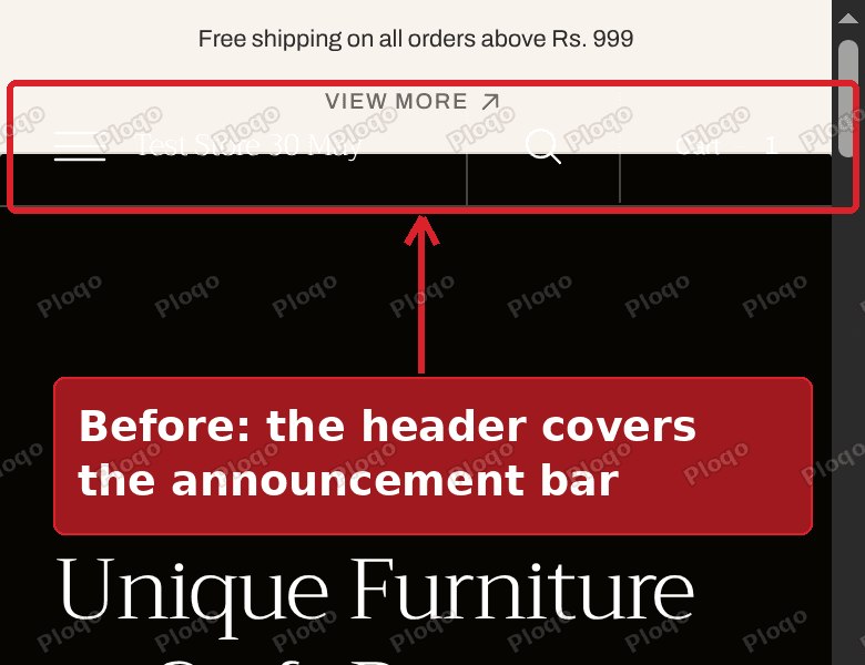 Before: on a phone, the Nordic header covers the bottom of the announcement bar
Why the header lands on the announcement bar
Two Nordic settings work together here.
Header overlay is a setting on the Header section. It makes the header float over the first section of your home page instead of pushing it down. The theme editor notes that it only works when the first section is a slideshow. It is the setting that gives you a see-through header over a big hero image.
When the header floats like that, the theme has to know how tall the announcement bar is, so it can place the header just below it. Nordic takes that number from the announcement bar's Height setting. The default is 40.
The theme editor shows a small note under that Height setting: "Only on desktop devices." On a computer, the bar is held at that height, so the number and the real bar agree.
On a phone, the bar is not held at 40. It grows to fit its content. A line of text plus a button does not fit across a narrow screen, so the button drops to a second line and the bar grows to 70px. The header is still placed 40px from the top, so it lands 30px inside the bar.
That is why the problem shows up "especially on mobile," as the merchant put it. The longer your announcement, the worse it gets.
The fix: tell Nordic how tall the bar really is on a phone
The fix changes the number Nordic uses for phone screens only. Once the theme uses the bar's real height, the header sits right below it. You paste the code into Custom CSS, a box in the theme editor where you can add your own styling code without editing any theme files.
These are the exact steps from my reply on the forum.
Step 1 and 2: open the theme editor
In your Shopify admin, go to Online Store. Then click Edit theme on your Nordic theme.
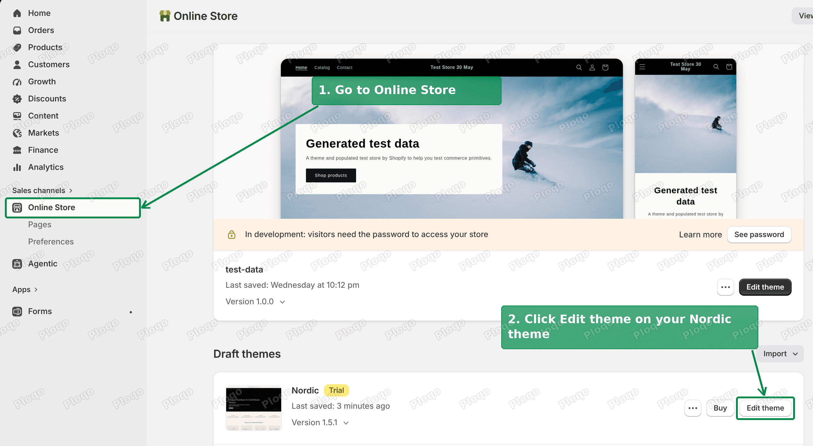 Go to Online Store, then click Edit theme on your Nordic theme
Step 3: open Theme settings
Click the Theme settings icon at the top of the left panel. It sits next to the icon that shows your page sections.
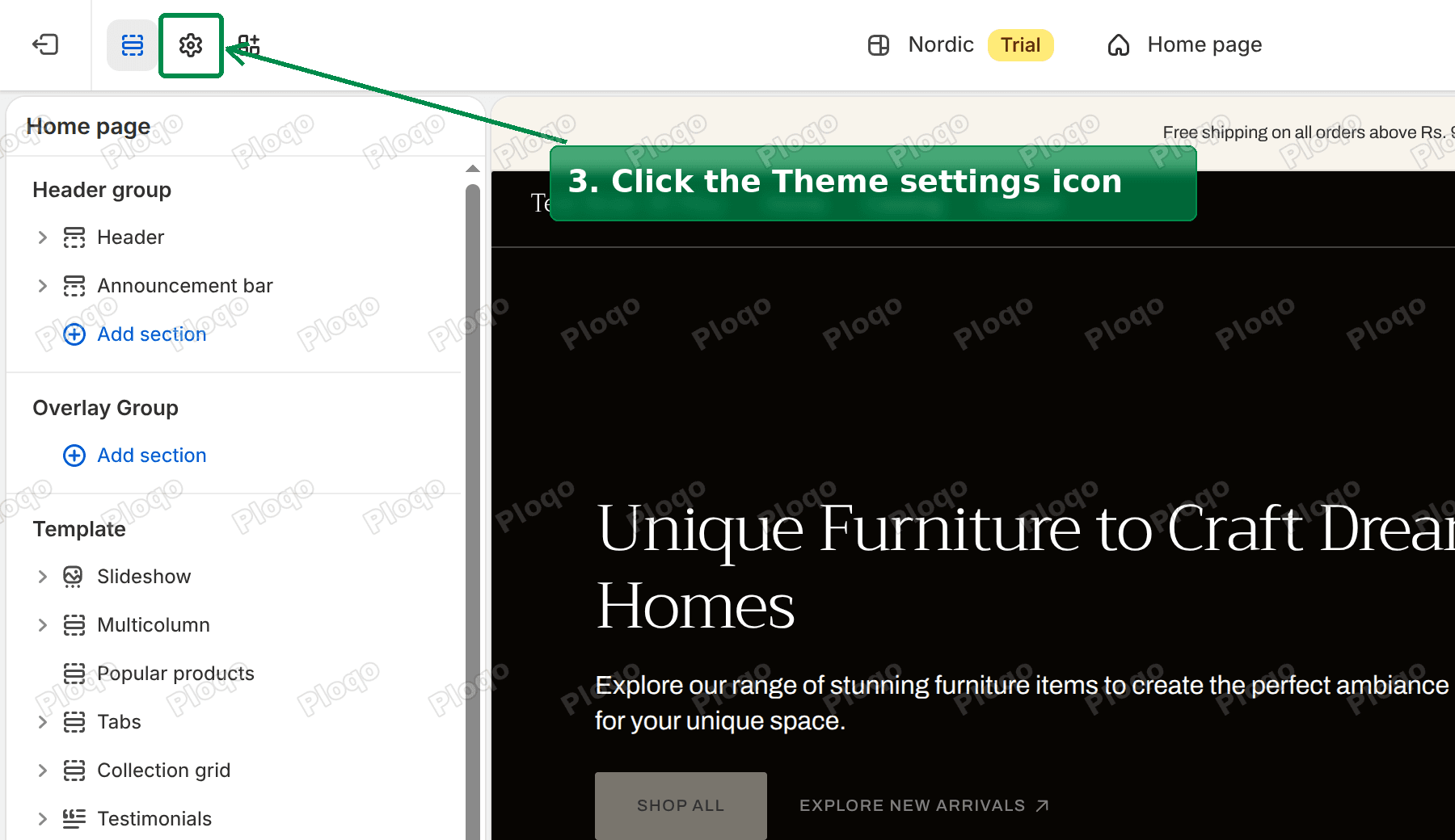 Click the Theme settings icon at the top of the left panel
Step 4: open Custom CSS
Theme settings shows a list of groups: Colors, Typography, Cart and more. Click Custom CSS near the bottom of the list.
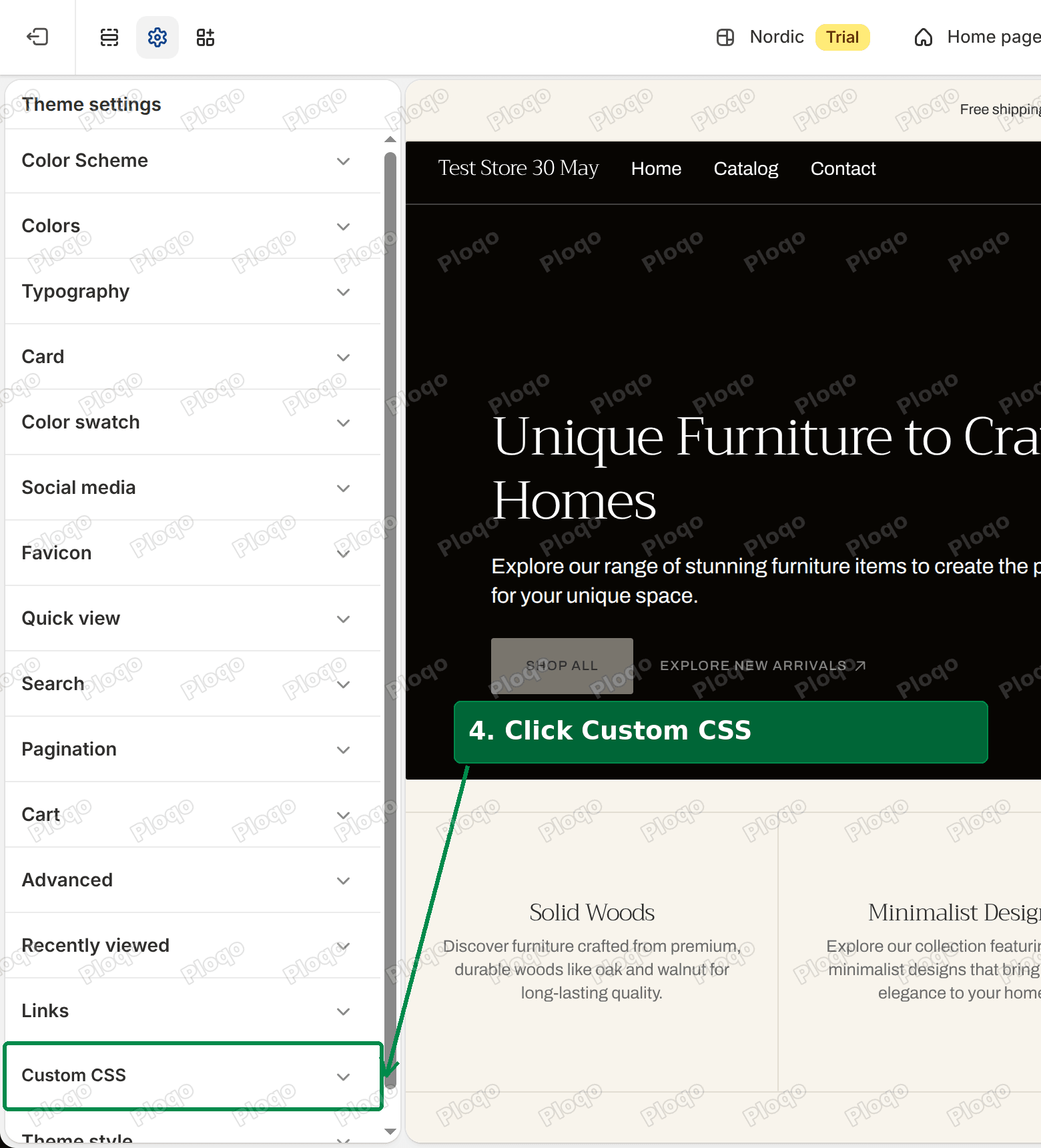 Click Custom CSS in the Theme settings list
Step 5: paste the code
Paste this code at the end of the box. If there is already code in the box, leave it there and add this below it.
@media screen and (max-width: 749px) {
html {
--announcement-height: 70px !important;
}
.announcement-bar {
min-height: var(--announcement-height);
}
}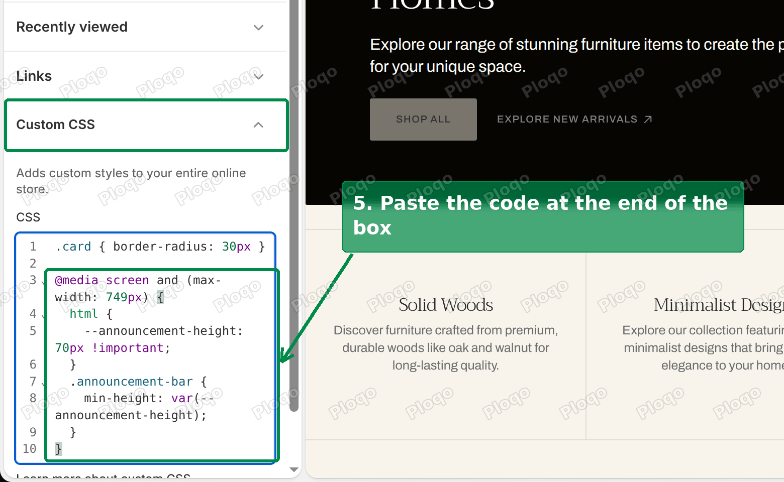 Paste the code at the end of the Custom CSS box
The first line limits the code to screens narrower than 750px, which is where Nordic switches to its phone layout. The part inside sets the announcement bar's height for phones to 70px. The theme uses that number to place the header, and the bar is kept at least that tall, so the two can never disagree.
Step 6: save
Click Save in the top right corner.
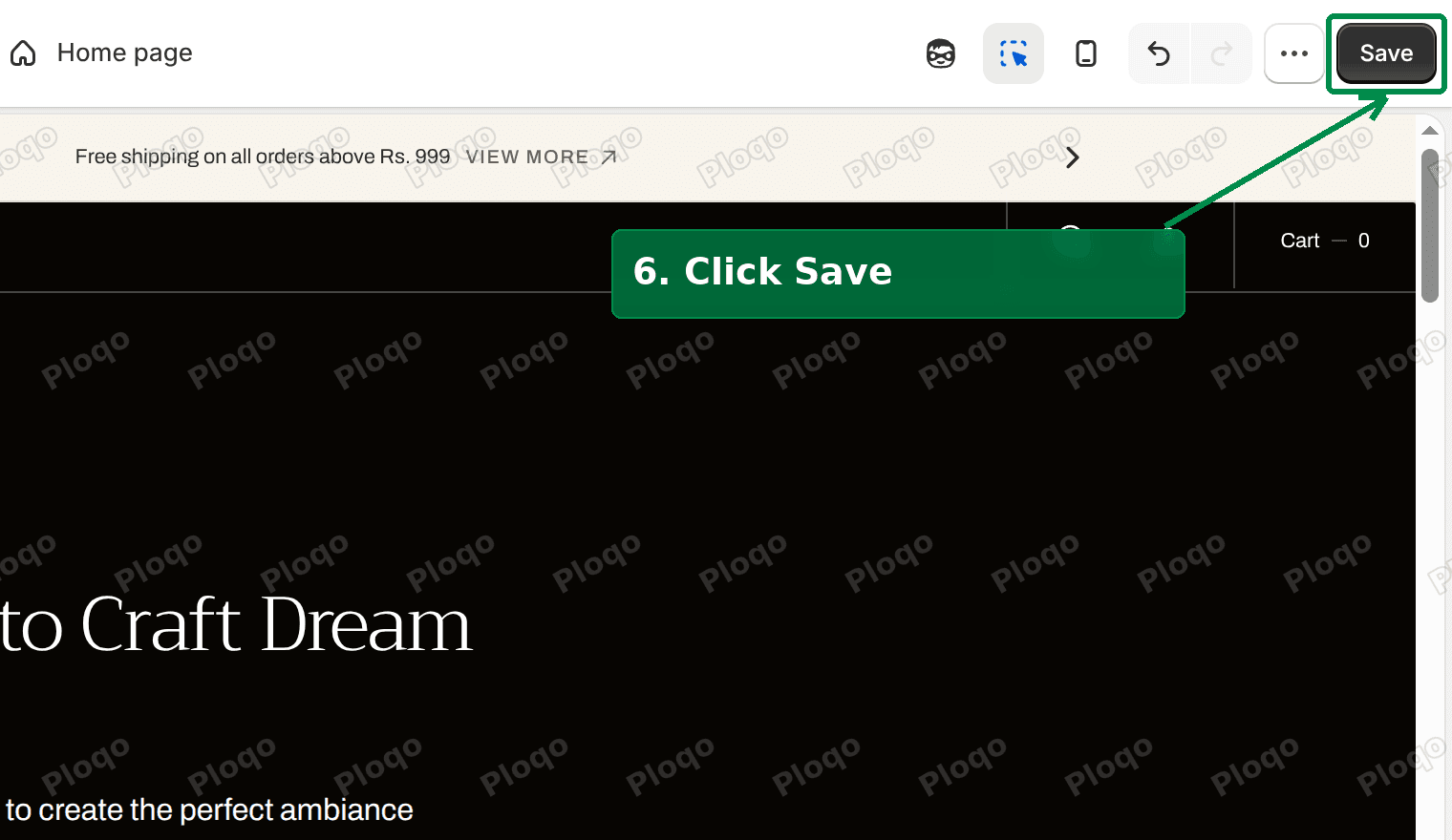 Click Save in the top right of the theme editor
The result
After saving, I reloaded the store on the same 390px phone screen. The announcement bar runs from the top of the page down to 70px. The header now starts at 70px, directly below it, instead of at 40px. The View More button is fully visible.
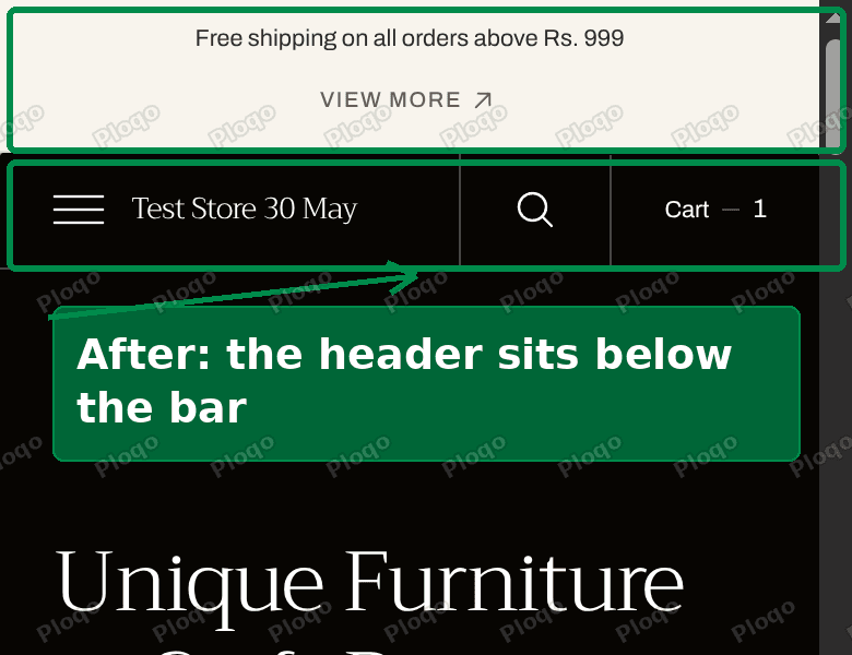 After: the header sits below the announcement bar on a phone
I also scrolled down the page and back to the top. The header came back to 70px, right under the bar.
On a computer, nothing changes. The code only applies to phone-sized screens, and the header stays exactly where it was on desktop.
If your announcement is longer
70px fits one line of text plus the button on a second line. If your announcement is longer, the bar grows again on a phone.
I tested a longer message on the same store: "Free shipping on all orders above Rs. 999 and easy 7 day returns across India." The bar grew to 85px. For a message like that, change 70px to 90px in the code.
To find the right number for your store, open your store on your phone after saving. If the header still covers part of the bar, raise the number by 10 or 20 and save again. A slightly larger number only adds a little space above the header, so it is safer to go over than under.
Why not just move the header down?
Another reply in the thread suggested adding top: 70px !important; to the header itself. That places the header correctly when the page first loads.
That fixes the header's position, but it adds a second number to keep in sync. The bar's height and the header's position then live in two places, and if you change your announcement you have to update both.
The code above changes the one number Nordic already uses for both. It also holds the bar at least that tall on a phone, so the bar and the header always agree.
Another option: keep the announcement on one line
If you would rather not add code, keep the announcement short enough to fit on one line on a phone. Another reply in the thread suggested hiding the View More button on phones for the same reason.
That works when your announcement is short. It does not work when the text itself wraps. A button that links to a sale or a collection is also worth keeping, so the Custom CSS fix is the one I recommend.
Header terms that are easy to mix up
Announcement bar. The thin strip at the very top of the page, used for shipping offers, sales and short notices. In Nordic it is its own section in the Header group of the theme editor, with its own Height setting and slides.
Header. The row with your logo, menu, search, account and cart icons.
Header overlay. A Nordic Header setting that floats the header over the first section of the home page. This is the see-through header look, and it is the setting that makes this overlap possible.
Sticky header. A Nordic Header setting with three options: None, On scroll up and Always. It decides whether the header stays on screen while a shopper scrolls. It changes how the header moves, not where it starts.
If your header covers your slideshow rather than your announcement bar, that is a different problem, caused by the transparent header setting itself. The Shopify transparent header guide covers that one.
If it did not work
Is the code in the right box? Paste it in Theme settings > Custom CSS. The Announcement bar section and the Header section each have their own Custom CSS box too, but this code belongs in the Theme settings one.
Did you check on a phone? The code only applies to screens narrower than 750px. On a computer you will see no change, which is expected. To check from a computer, make your browser window narrow, or open your store on your phone.
Does the header still cover part of the bar? Your announcement is taller than 70px on a phone. Raise the number in the code, for example to 90px, and save.
Is there empty space between the bar and the header now? The number is larger than your bar needs. Lower it by 10 and save again.
Did Shopify change your code after saving? Shopify tidies the Custom CSS box when you save. On my test store it spread a one-line rule over three lines and removed a blank line. That is only formatting, and the code works the same.
What to do
- Follow steps 1 to 4 above to reach the Custom CSS box.
- Paste the code at the end of the box and save.
- If your announcement is long, change
70pxto90px. - Your desktop layout does not change.
I tested every step of this on a Nordic store before writing it.
Spending too long on manual Shopify busywork?
PinFlow turns your Shopify catalog into Pinterest pins and posts them on a schedule, automatically. Set it up once and let it run.
Get PinFlow on the Shopify App StoreMore Shopify fixes
More community-sourced Shopify guides, tested on a live store.
Themes & Storefront
Shopify AI Section: Fix a Price Badge Hidden Behind the Image
You built a section with Shopify's AI section generator, but the price badge on each card sits behind the photo. Here is the Custom Liquid fix that brings it to the front without regenerating anything. Tested on a Dawn store.
Themes & Storefront
Hide Shipping Calculated at Checkout on One Shopify Product
The line under Add to cart that says shipping is calculated at checkout shows on every product, gift cards included. Here is how to hide it on one product only, with the code, screenshots and the Eclipse theme steps.
Themes & Storefront
Shopify Dropdown Menu Behind Page Content (Z-Index Fix)
Your Shopify dropdown or mega menu opens, but the page title and products sit on top of its links and the menu closes before you can click. The fix is one Custom CSS rule in Theme settings. Tested on a Rebel store.