
Shopify Table Not Fitting on Mobile? Make It Responsive
A table pasted from Excel looks fine on a laptop and runs off the edge of a phone. Here is the Custom CSS that makes every column fit on mobile, with no hidden data and no changes to your page template.
By AjayCodeWiz · September 30, 2026 · 8 min read
The problem
You build a chart in Excel or Google Sheets, copy it, and paste it into a Shopify page. On your laptop it looks right. On a phone the last two columns are missing, and the visitor has to drag the table sideways to read them.
A merchant on the Shopify Community hit exactly this with a shift stick thread sizing chart. It had five columns: Make, Model, Year, Trans and Shifter Compatible Adapter Size. On her phone only the first four showed.
She had three rules for the fix. Keep every column visible. Make the text a little smaller if needed. Do not touch the page template in the theme editor, because other pages use it.
What "responsive" means for a table
A responsive page is one that rearranges itself to fit the screen it is on. Shopify themes do this for their own sections: a row of three products becomes one column on a phone.
A table you paste in is different. It is your content, not a theme section, so the theme cannot rearrange it. The table keeps the column widths it arrived with, and a phone screen is about 390 pixels wide, which is less than most five column charts want.
Themes handle this by putting a scroll box around the table. The page stays the right width and the table scrolls sideways inside it. That is why the merchant could see some columns and had to drag to reach the rest. It is also why wrapping the table in your own scrolling container does nothing: the theme already added one.
Why a pasted Excel table is wider than it needs to be
Excel does not paste only your words. It also pastes a fixed width for each column, written into the table's code. Those widths were chosen for a spreadsheet on a desktop screen.
I reproduced this on a test store running the Ritual theme. I built a five column chart with Excel style widths, opened it at a phone width of 390 pixels, and measured it:
- The table was 399 pixels wide.
- The scroll box around it was 348 pixels wide.
- The extra 51 pixels were enough to push the last column out of view.
So the table is only a little too big. It does not need a new layout. It needs to stop holding on to the widths it was pasted with, and to use a smaller type size and tighter cell padding, which is the space inside each cell.
The theme makes it slightly worse in two ways. It adds padding around every cell. On newer Shopify themes it also sets header rows in capital letters, and capitals are wider than lower case. A long header like "Shifter Compatible Adapter Size" takes a lot of room.
Before and after
On the test store, the last column ("Shifter Compatible Adapter Size") was cut off at the right edge of the phone screen:
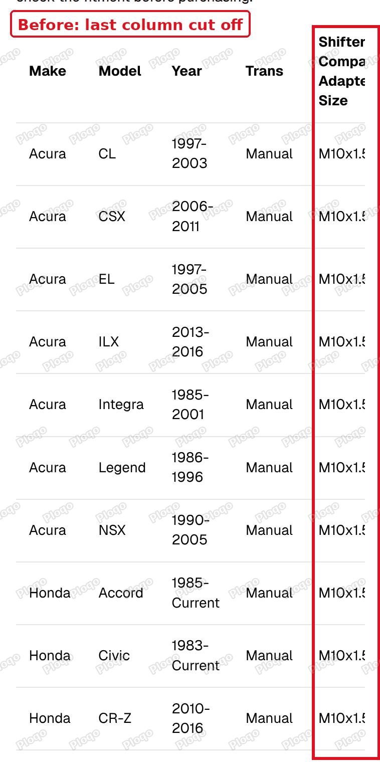 A five column table on a phone with the last column cut off at the right edge
After adding the CSS below, all five columns fit on the same phone screen and no sideways scrolling is needed:
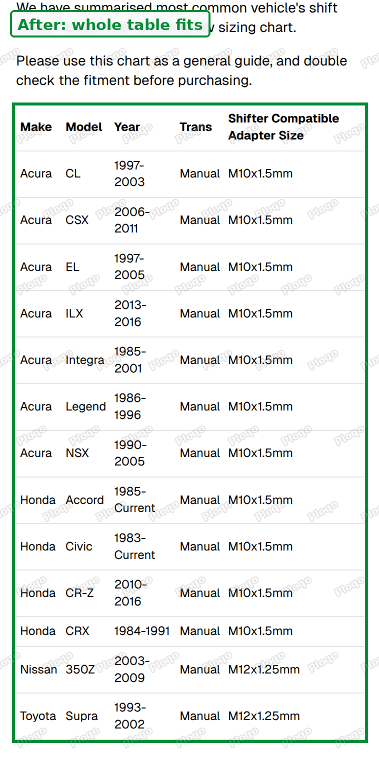 The same table on a phone with all five columns visible
I measured it again to be sure. The table and its scroll box were both 348 pixels wide, so nothing was left over to scroll. The five columns came out at 46, 49, 65, 48 and 140 pixels.
The fix
You paste a small block of Custom CSS. Custom CSS is a box in your theme settings where you add your own styling rules. It applies to the whole store, so the rules below are written to act only on phones, and only on tables inside page content.
Step 1: Open your theme editor
Go to Online Store, then click Edit theme next to your current theme.
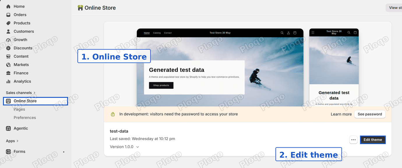 The Shopify admin Themes page with Online Store and the Edit theme button highlighted
Step 2: Open Theme settings
Click the gear icon on the left of the editor. It is labelled Theme settings.
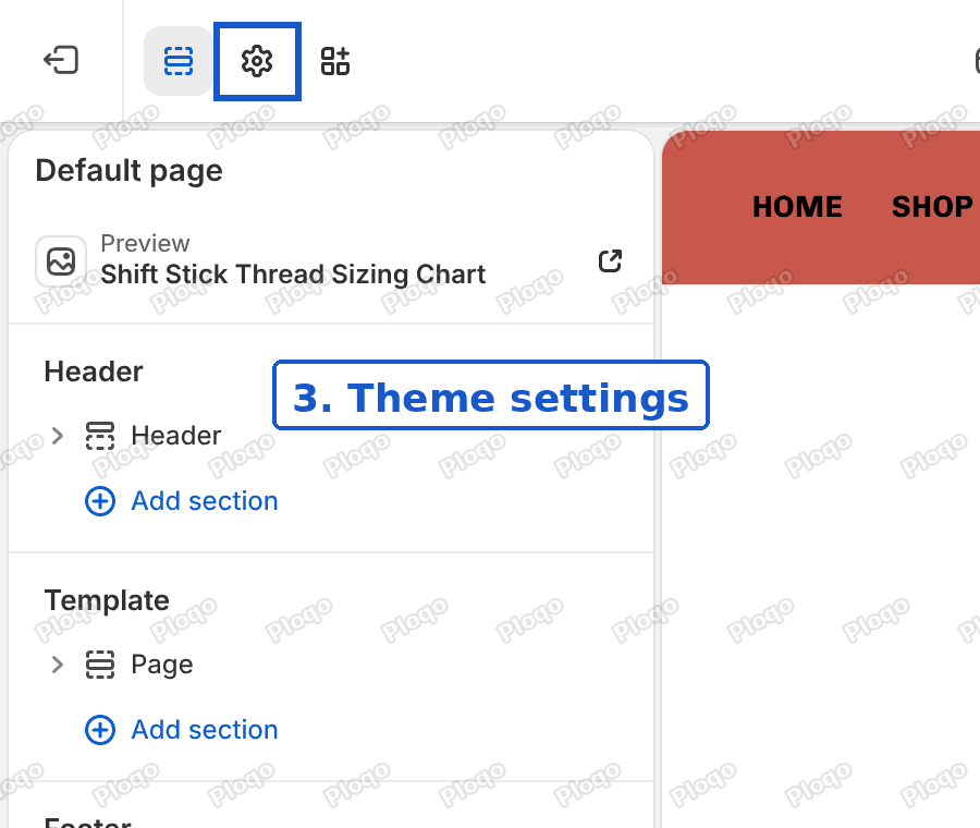 The theme editor with the Theme settings gear icon highlighted
Step 3: Open Custom CSS
Scroll to the bottom of the list and click Custom CSS.
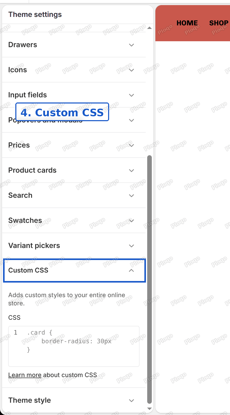 The Theme settings list scrolled down to the Custom CSS section
Step 4: Paste the code
Click inside the box and paste this:
@media screen and (max-width: 749px) {
.rte table {
table-layout: auto !important;
width: 100% !important;
}
.rte table col {
width: auto !important;
}
.rte table th,
.rte table td {
width: auto !important;
font-size: 12px !important;
padding: 6px 4px !important;
}
}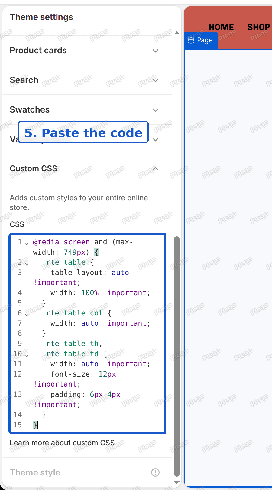 The Custom CSS box with the table code pasted in
If the box already has rules in it, click at the end, press Enter and paste below them. Do not select everything and paste over it, or you will delete your existing styling.
Step 5: Save
Click Save at the top right, then open your page on a phone.
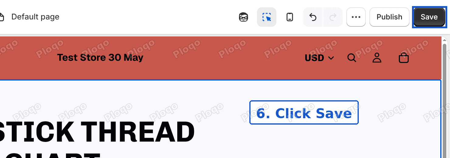 The Save button in the theme editor highlighted
What each part of the code does
You do not need to understand the code to use it, but it helps to know what you are changing if you want to adjust it later.
@media screen and (max-width: 749px)means "only apply the rules inside when the screen is 749 pixels wide or less". Desktop and most tablets are wider, so they are not affected..rte tablepoints at tables inside page content.rtestands for rich text, which is the editor you type page content into.table-layout: autolets each column be as wide as its content needs, instead of the width it was pasted with.width: autoon the columns and cells removes the fixed widths that Excel added.font-size: 12pxmakes the text smaller. Your normal text is probably 16 pixels.padding: 6px 4pxcuts the space inside each cell to 6 pixels above and below and 4 pixels left and right.!importanttells the browser to use these values even where the pasted table has its own. The pasted widths are written directly into the table, and without this the rules lose.
If the table still does not fit
Try these in order. Each is a small change.
Make the text one size smaller. Change 12px to 11px. With five columns on a narrow phone, 12 pixels is about as large as the text can be and still fit. Do not go below 11, or it becomes hard to read.
Shorten the longest header. A header like "Shifter Compatible Adapter Size" cannot be narrower than its longest word. Changing it to "Adapter Size" frees up a lot of room.
Check the table has more than about six columns. Past that, even small text will not fit on a phone. Two options work better than shrinking further. Leave the table scrolling sideways and tell visitors to swipe, or split it into two tables.
Cannot see any change at all? Your theme may not use the rte label around page content. Different themes name it differently. Right-click the table on a computer, choose Inspect, and look at the label on the box around the table. Replace .rte in the code with that label.
Clear the cache. Open the page in a private window, or on a phone, so you are not looking at a stored copy.
Alternative: fix the table instead of the theme
The CSS above works without opening the page. If you would rather clean the table itself, you can remove the widths Excel added.
In the page editor, click the <> button to switch to the code view. Look for width= and style="width: in the table, in the <col> tags and in each <td> cell. Delete those. Save the page.
This is slower, and every time you paste a new Excel table the widths come back. The CSS fix covers every table you paste later.
You can also paste the spreadsheet as plain text first, then build the table with the editor's own table button. The table button sits in the editor toolbar next to the video button. A table made that way starts without the Excel widths.
Will this change my other pages?
The rules apply to every table in page content on a phone, not only the one you were fixing. On those tables the text becomes 12 pixels and the cell padding gets tighter. Desktop is untouched, and so is your page template.
If you have another table that already looks right on phones, check it after saving. The most likely change is slightly smaller text.
Frequently asked questions
Why does my Shopify table scroll sideways on mobile? Shopify themes wrap page tables in a scroll box so the page itself does not become wider than the screen. The table scrolls inside that box when it is wider than the phone.
Can I make a table scroll instead of shrinking? Yes, and on most themes it already does. If the table is only a little too wide, shrinking it is a better experience, because visitors see everything at once.
Do I need an app for this? No. Custom CSS is built into the theme editor and the fix is one paste.
Does this work for a size chart? Yes. A size chart is a table, and the same rules apply. If your size chart is a popup or an image rather than a pasted table, see how to add a size chart to Shopify.
Summary
A table pasted from Excel carries fixed column widths that a phone cannot fit. The theme adds a scroll box around it, which hides the overflow instead of fixing it. A mobile only block of Custom CSS removes the fixed widths, shrinks the text to 12 pixels and tightens the padding, and every column fits on the screen. On my test store the table went from 399 pixels wide to 348, the same width as its box.
Spending too long on manual Shopify busywork?
PinFlow turns your Shopify catalog into Pinterest pins and posts them on a schedule, automatically. Same idea as the rule above, let the system handle the repetitive part.
Get PinFlow on the Shopify App StoreMore Shopify fixes
More community-sourced Shopify guides, tested on a live store.
Themes & Storefront
Shopify AI Section: Fix a Price Badge Hidden Behind the Image
You built a section with Shopify's AI section generator, but the price badge on each card sits behind the photo. Here is the Custom Liquid fix that brings it to the front without regenerating anything. Tested on a Dawn store.
Themes & Storefront
Hide Shipping Calculated at Checkout on One Shopify Product
The line under Add to cart that says shipping is calculated at checkout shows on every product, gift cards included. Here is how to hide it on one product only, with the code, screenshots and the Eclipse theme steps.
Themes & Storefront
Shopify Dropdown Menu Behind Page Content (Z-Index Fix)
Your Shopify dropdown or mega menu opens, but the page title and products sit on top of its links and the menu closes before you can click. The fix is one Custom CSS rule in Theme settings. Tested on a Rebel store.