
Shopify Too Many Variants? Fix the Tall Product Page
In Horizon, a product with 20 colours stacks into a tall variant block that pushes the image and Add to cart off-screen. Here is the compact, scrollable fix, tested on Horizon.
By AjayCodeWiz · August 2, 2026 · 8 min read
The problem
A merchant raised this on the Shopify Community. They sell a product with a lot of values on one option, like 20 colours on a water bottle. On the Horizon theme, those 20 colours do not sit in a neat row. They stack into a tall, multi-row block.
That block is the problem. It is so tall that it pushes the product image and the Add to cart button far down the page.
Then it gets worse. When the shopper picks a colour, the product image at the top updates to match. But the page does not scroll for them. They are still parked down next to the colour buttons, looking at nothing, and they have to scroll back up to see the colour they just chose.
In their words, the swatches "consume significant page height" and there is "no scroll compensation," so the customer "must scroll up manually to confirm and view their selection."
It is worst on desktop, where the tall block can push the whole gallery out of view. On mobile it is milder, because the screen is narrower and the rows behave a little differently, but it is still not great.
I reproduced this on a Horizon test store with 20 colours and fixed it. The fix turns that tall block into a short, scrollable box. The image and the Add to cart button stay in view, so picking a colour no longer sends the shopper off-screen.
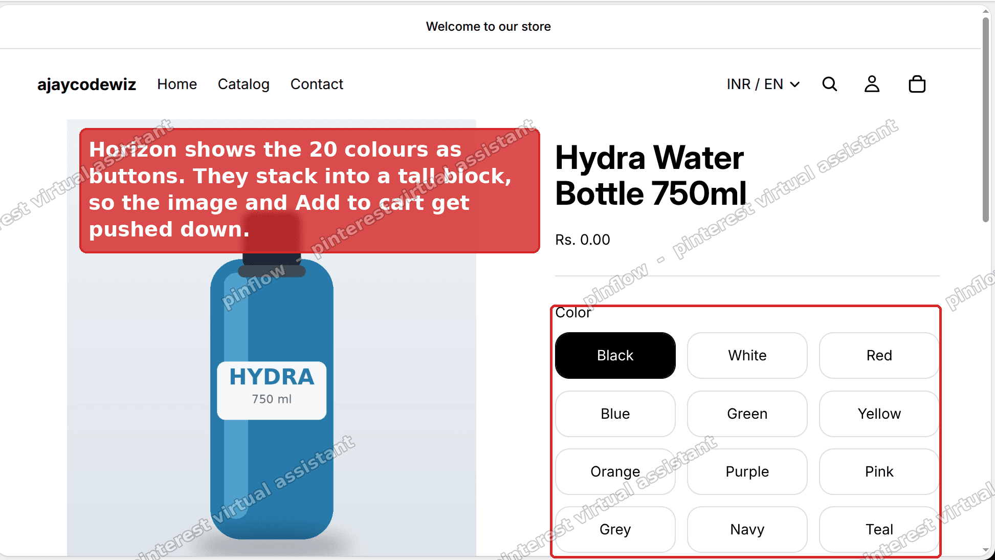 Horizon product page - 20 colours stack into a tall block
Why it happens
Horizon is Shopify's newer free theme. On the product page it draws each option value as its own control, a swatch for a colour or a text button otherwise, and it shows them all at once.
For a Size option with three values that is fine. Three controls sit in one short row.
For a Colour option with 20 values it is not. Twenty controls cannot fit in one row, so they wrap onto the next line, and the next, and the next. You end up with a tall block that is several rows deep. The more values you have, the taller it gets.
Horizon has no built-in setting to cap that height or make the block scroll. It just lets the controls keep wrapping downward and shove everything below them further down the page.
There is also no auto-scroll. Picking a value swaps the main image, but the theme does not move the shopper back up to see it. That is why the experience feels broken with a long list, even though nothing is technically failing.
(This guide is about a long list that renders as a tall block. If your colour swatches are not showing at all and appear as plain text instead, that is a different fix, see how to add color swatches without an app.)
The fix: make the colours a compact, scrollable box
The fix is a few lines of CSS. You do not edit any theme file. You paste it into a Custom Liquid block in the theme editor, so it is easy to add and just as easy to remove later.
Here is what it does. It caps the height of the variant block and lets it scroll on its own. The option label, like "Color", stays pinned at the top of the box while you scroll through the values. The image and the Add to cart button stay where they are.
First, open the theme editor:
- From your Shopify admin, go to Online Store > Themes.
- On Horizon, click Customize.
- Open a product template from the page dropdown at the top.
Now add the block. In the left sidebar, open Product information, then Details. Click Add block and choose Custom Liquid.
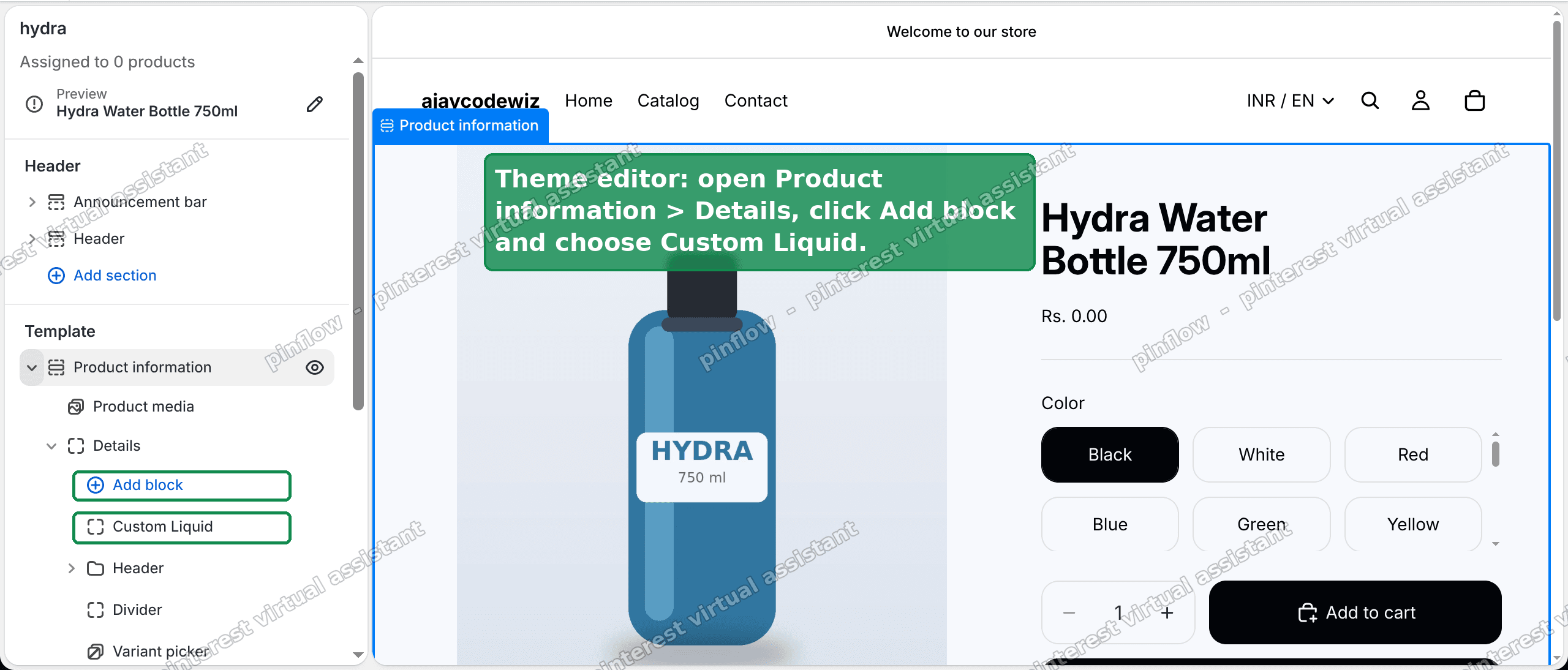 Theme editor - add a Custom Liquid block under Product information, Details
Paste this into the Liquid code box, then click Save:
<style>
.variant-picker .variant-option--buttons{
max-height:8.25rem;overflow-y:auto;align-content:flex-start;
padding-inline-end:6px;scrollbar-width:thin;
}
.variant-picker .variant-option--buttons legend{
position:sticky;top:0;width:100%;z-index:1;
background:var(--color-background);
}
</style>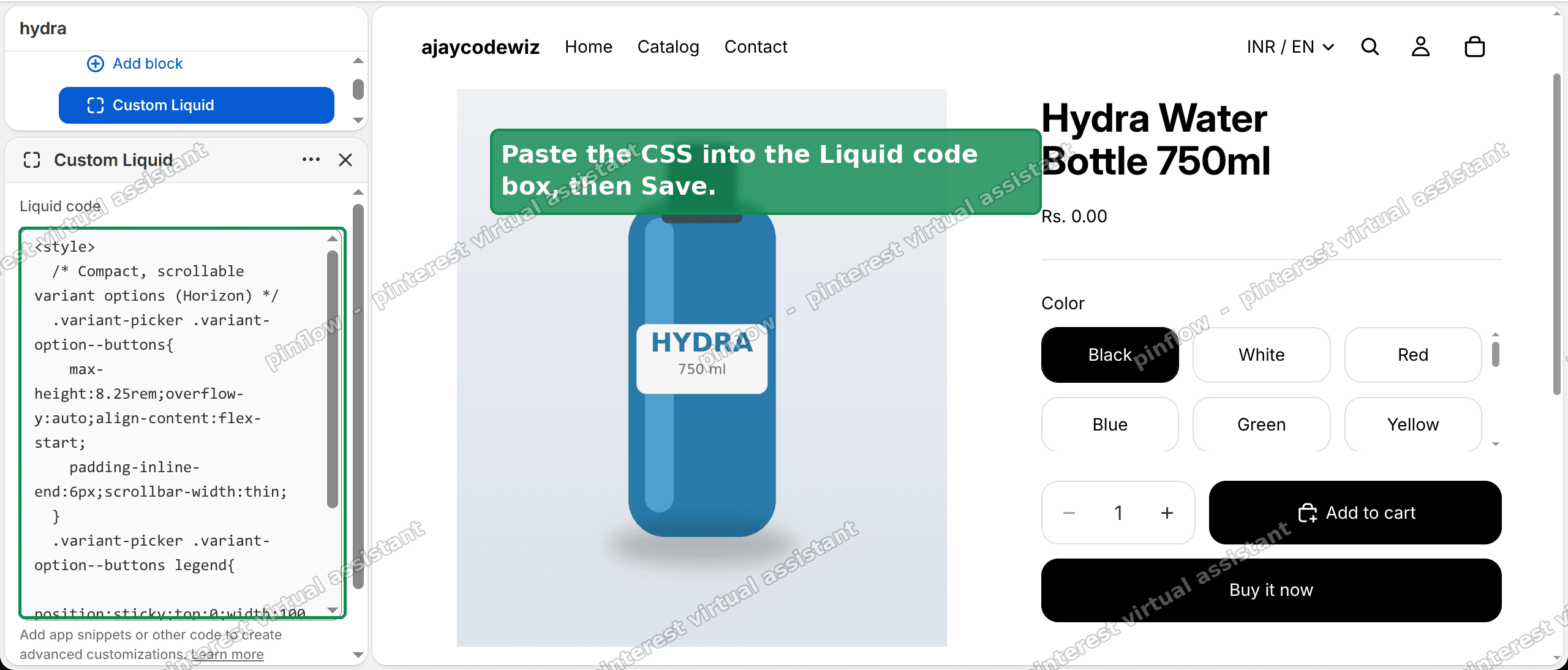 Paste the CSS into the Liquid code box, then Save
That is the whole fix. Refresh the product page and the colour block will be short and scrollable.
Here is the result on my test store. The 20 colours now sit in a fixed-height box that scrolls on its own. The "Color" label stays pinned at the top of that box. The image and Add to cart stay in view, so picking a colour no longer sends you off-screen.
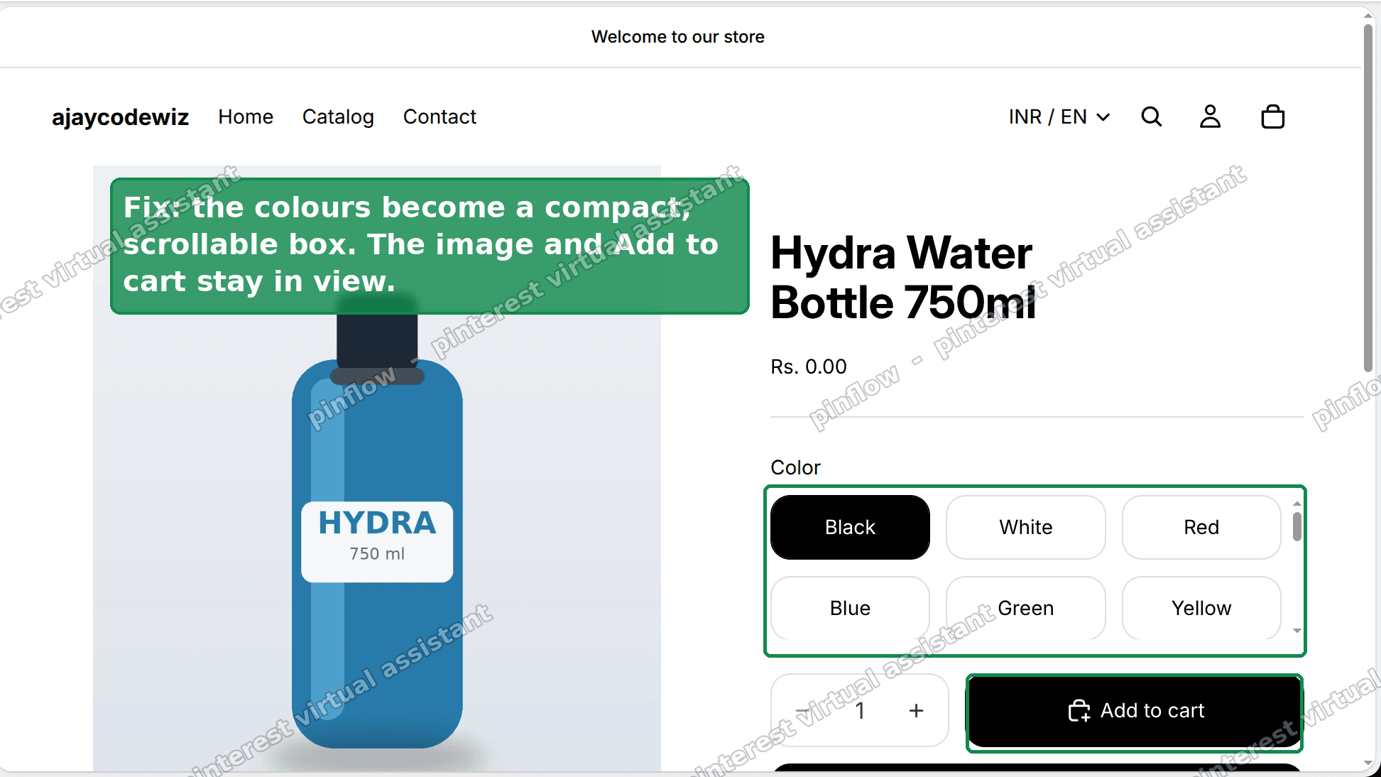 After - compact scrollable colour box, image and Add to cart stay in view
This works whether your colours show as round swatches or square buttons. The same block holds both, so the same rule caps the height.
The one number you can change
max-height: 8.25rem is the knob. It controls how tall the box is before it starts to scroll.
At 8.25rem you see about two rows of colours at once, then scroll for the rest. That is a good default for a long list, because it keeps the box small.
Want more colours visible before it scrolls? Raise the number. Try 12rem for roughly three rows, or 16rem for about four. Want it even tighter? Lower it. Change one value, save, and refresh to see the new height.
Does this slow down my product page?
No. It is a small amount of CSS. It does not load an app, it does not add scripts, and it does not change your images. It only changes how tall one block is allowed to be. There is no measurable effect on page speed.
Will it work on mobile too?
Yes. The rule caps the height on every screen size, so the box stays compact on phones as well as on desktop. Mobile was the milder case to begin with, and the fix keeps it tidy there too.
If you want a different height on mobile than on desktop, that is possible with a media query, but most stores do not need it. The single value works well across screen sizes.
Will a theme update remove it?
Because the fix lives in a Custom Liquid block, not in a theme file, a normal theme update will not touch it. The block stays where you put it.
If you ever want to remove the fix, open the same Custom Liquid block in the theme editor and delete it, or clear the code and save. Nothing else on the page depends on it.
The no-code alternative: switch to Dropdowns
If you would rather not touch any code, Horizon gives you a second option.
In the theme editor, open the Variant picker block and find its Style setting. Change it from Buttons or Swatches to Dropdowns.
Now your 20 colours collapse into a single dropdown menu. One short line, no tall block, no scrolling issue at all.
The trade-off is that the colours are no longer all visible at once. The shopper has to open the dropdown to see them. For a long list that is often a fair trade, since a wall of 20 buttons was not easy to scan anyway. For a short list of two or three colours, buttons are usually nicer, so only switch the products that actually have a long list.
You can mix the two ideas. Use the scrollable box for products where you want the swatches visible, and dropdowns for the ones with the longest lists.
Doing this on Dawn or a paid theme
The idea carries to other themes, only the class names change. Horizon uses variant-option--buttons. Dawn and its relatives use different names, often something like variant-input-wrap, and paid themes like Prestige have their own markup.
The reliable way to find the right selector on any theme is to inspect the element. On the product page, right-click a colour control and choose Inspect. Read the class on the block that holds all the values, then apply the same max-height and overflow-y: auto rule to it. The method does not change: cap the block that holds the values, then let it scroll.
Variant, option, value: the words people mix up
These three words get used loosely, and it makes fixes harder to follow. Here is the plain version.
- An option is a choosing category, like Color or Size.
- A value is one choice inside an option, like Red, or Large.
- A variant is a full combination the customer actually buys, like "Red / Large".
The tall block in this problem is a long list of values on one option. Twenty colour values. It is not about the total variant count, and it is not the 3-option limit. It is purely how one long list of values is drawn on the page.
Swatch, button, dropdown: which one do you have?
Horizon can show an option in a few styles, and the right fix depends on which you use.
- Swatches are small colour circles or image chips, shown all at once.
- Buttons are tappable boxes with the value name inside, also shown all at once.
- Dropdowns are a single closed menu with a downward arrow that opens the list.
Swatches and buttons are the styles that stack into a tall block, because every value is drawn at the same time. The scrollable-box fix is for those. Dropdowns already collapse the list, so they never have this problem.
To check which you have, open the Variant picker block in the theme editor and read its Style setting. Or just look at the product page: a closed menu with an arrow is a dropdown, and a grid of boxes or circles is buttons or swatches.
The short version
On Horizon, a product with many values on one option, like 20 colours, stacks into a tall block that pushes the image and Add to cart down the page, and picking a colour leaves the shopper scrolled away from it.
Add a Custom Liquid block under Product information > Details and paste the CSS above. It caps the block into a short, scrollable box with the label pinned, so the image and Add to cart stay in view. max-height is the knob, and the fix works for swatches too.
If you would rather not use code, set the Variant picker Style to Dropdowns and the long list collapses into one menu.
Spending too long on manual Shopify busywork?
PinFlow turns your Shopify catalog into Pinterest pins and posts them on a schedule, automatically. Set your product pages up once, then let the system handle the repetitive marketing part.
Get PinFlow on the Shopify App StorePart of a complete guide
Shopify Variants: The Complete Guide
Variants are one product sold in several forms. How they work, the 2,048 and 3-option limits, and where each variant fix lives - images, swatches, sorting, hiding and the theme-specific bugs.
More Shopify fixes
More community-sourced Shopify guides, tested on a live store.
Themes & Storefront
Hide Unavailable Variants in a Shopify Dropdown
Green has no 3XL, so Shopify prints "3XL - Unavailable" in the size dropdown anyway. How to remove combinations that do not exist, without the bug that kills the variant picker. Tested on Studio.
Shopify Admin
How to Hide a Variant in Shopify Without Deleting It
A colour is temporarily unavailable and you want it off every product page without deleting it and rebuilding it later. Shopify can now unpublish a single variant. The fast way to do it, tested on a live store.
Themes & Storefront
Shopify Craft Theme: Sync Thumbnails to the Variant Picker
In the Craft theme, clicking a product thumbnail changes the photo but leaves the variant selector behind. Here is why the sync only runs one way, and the Custom Liquid block that fixes it.