
Square Size Buttons on Shopify Dawn (Custom CSS)
Dawn draws size options as round pills. Here is the Custom CSS that turns them into square boxes matching the Add to cart button, tested on Dawn 16.0.0.
By AjayCodeWiz · October 6, 2026 · 7 min read
The problem
Dawn shows product sizes as round pills by default. They are oval buttons with a thin grey outline and a pale fill when selected.
Many stores want a sharper, more premium look. A merchant on the Shopify Community asked for exactly that. They wanted the size pills to be square, with a thin border and the size text in the middle. The look they described was "the same as the Add to cart button".
Their store runs Dawn 16.0.0. I rebuilt their product page on a test store with the same theme version and the same sizes, XS to XXL. Then I changed the pills until they matched the Add to cart button.
Here is the starting point. This is how Dawn draws the sizes before any change.
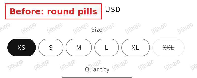 Dawn size pills before the change, drawn as round ovals
And this is the result after the fix.
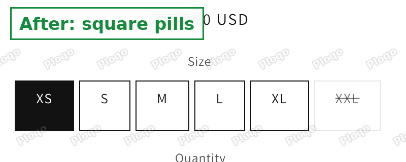 Dawn size pills after the change, drawn as square boxes with a thin border
The selected size stays filled in black. A sold out size keeps its strike through line.
What you can change without code
Dawn has a settings panel for the pills. Open Theme settings in the theme editor and look for Variant pills. Variant is Shopify's word for one version of a product, such as the medium size.
The panel has three sliders in its Border group.
| Setting | Dawn's default | What it does |
|---|---|---|
| Thickness | 1px | How thick the outline is |
| Opacity | 55% | How strong the outline colour is. 100% is solid |
| Corner radius | 40px | How round the corners are. 0 is square |
Set Corner radius to 0 and Opacity to 100%. The pills turn into boxes with a solid outline. That already looks close to the Add to cart button.
There is one thing the sliders cannot do. They cannot give every box the same height and a minimum width. Each pill is as wide as its text plus padding, so a short size like S looks narrower than XL. If you want an even row of boxes, add a small block of CSS.
CSS is the code that controls how a page looks. Dawn gives you a box for it, so you do not need to edit any theme files.
Make the sizes equal squares with Custom CSS
Dawn has one place for your own style rules. It is called Custom CSS and sits at the bottom of Theme settings. Rules you put there apply to the whole store.
Here is the code I used. It sets a thin solid border, removes the rounding, and gives each box the same height and a minimum width of 5rem. A rem is a size unit tied to the text size. On Dawn, 5rem is 50 pixels.
.product-form__input.product-form__input--pill input[type="radio"] + label {
  border: 1px solid rgb(var(--color-foreground));
  border-radius: 0;
  min-width: 5rem;
  height: 5rem;
  padding: 0 1rem;
  display: inline-flex;
  align-items: center;
  justify-content: center;
}
.product-form__input.product-form__input--pill input[type="radio"] + label::before {
  border-radius: 0;
}
The first rule styles the box. The second removes a hidden layer Dawn adds behind each pill for its optional shadow, so no round edge shows through.
On my test store the boxes came out 50 pixels tall. They were 50 to 58 pixels wide for S to XL, and about 66 pixels for XXL, which has the most letters.
Step by step
Every step below is the screen you will see in your own admin.
1. Open the theme editor
Go to Online Store > Themes. Click Edit theme on the theme you want to change.
Work on a copy first if the store is live. Click the three dots next to your theme and choose Duplicate. Test there, then repeat the steps on the live theme.
 The Edit theme button on the Themes page
2. Open Custom CSS
Click the Theme settings icon. It is the gear in the left toolbar. Scroll down the list and click Custom CSS.
3. Paste the code
Click inside the box. Press the End key, press Enter to start a new line, then paste the code from above.
Do not delete what is already in the box. Other rules there belong to your theme or to a past change. Put the new code under them.
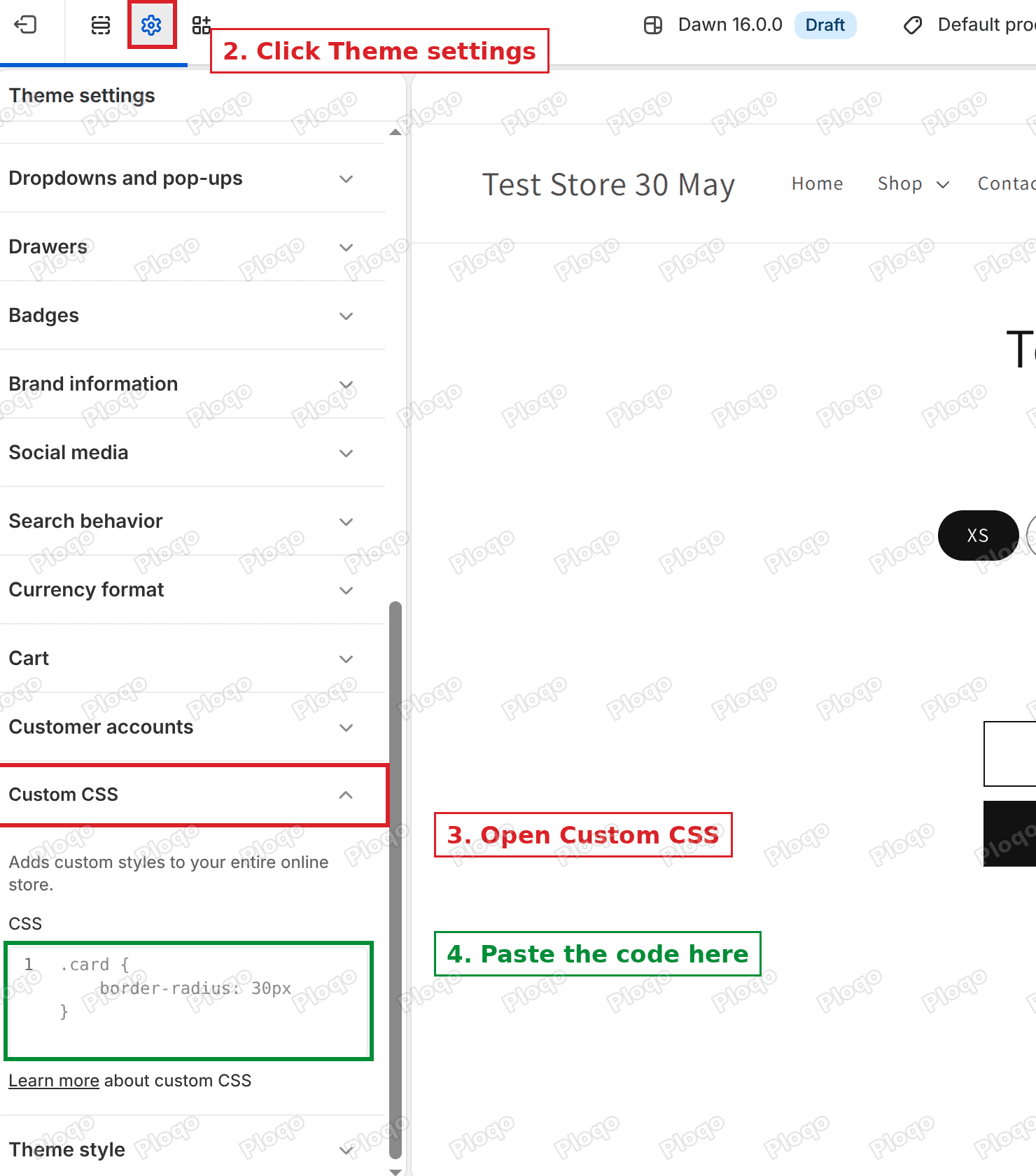 Theme settings with the Custom CSS box open
4. Save
Click Save in the top right corner. A black message says Changes saved. The preview on the right shows the new boxes straight away.
 The Save button in the theme editor toolbar
This is what the editor looked like on my test store after I pasted and saved. The code is in the box and the preview shows square boxes.
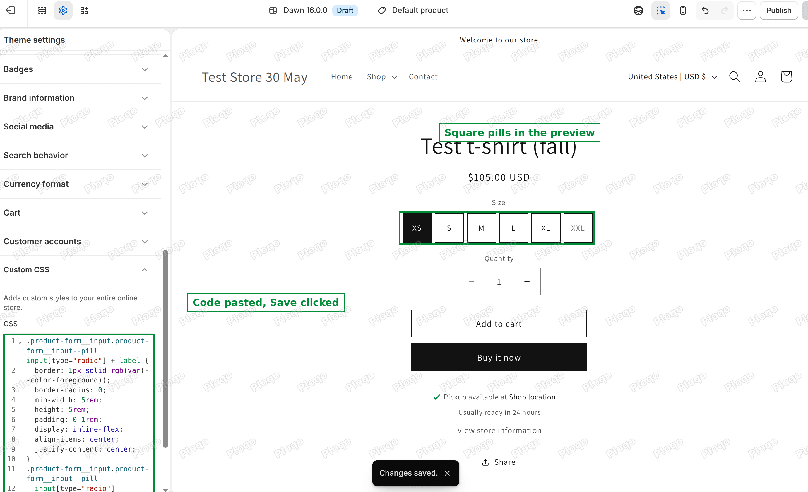 Dawn theme editor with the pasted CSS saved and square size boxes in the preview
What each line of the code does
You do not need to understand the code to use it. If you want to tweak it, this is what each line controls.
- border: 1px solid ... draws a thin solid outline in your main text colour.
- border-radius: 0 removes the rounded corners.
- min-width: 5rem stops a box from being narrower than 50 pixels.
- height: 5rem gives every box the same height.
- padding: 0 1rem adds space left and right of the letters, and none above or below.
- display, align-items and justify-content put the size text in the middle of the box, both across and up and down.
Do the boxes fit on a phone?
My before and after screenshots were taken at a phone width of 430 pixels. All six boxes, XS to XXL, fit on one row there with the 5rem setting.
If you have more sizes, or longer names, the boxes wrap onto a second row. That is fine and happens by itself. If you would rather keep them in one row, lower the 5rem to 4rem.
Change the size of the boxes
Change 5rem in the code to make the boxes bigger or smaller. Both numbers should match if you want a square. Try 4rem for a compact look and 6rem for a chunky one.
If your sizes are long words like "Extra Large", the box needs to grow wider. Remove height and use padding instead, for example padding: 1.2rem 1.6rem;.
Change the border colour
The code uses your theme's main text colour for the border. That is black on a standard Dawn store, which matches the Add to cart button.
To use another colour, replace rgb(var(--color-foreground)) with a colour code, such as #999999 for grey.
Why the border and the corners come from two places
You may notice that the settings panel and the CSS both change the same things. The settings panel is the clean way to do it when the sliders are enough. The CSS wins when the two disagree, because Dawn reads the Custom CSS box after its own stylesheets. I checked this in the page source of the test store. The Custom CSS block comes after the file that styles the size pills.
That is also why the code starts with two class names instead of one. Two class names make the rule stronger, so it still applies if your theme or an app adds its own pill style later.
What if it did not work?
Nothing changed in the preview. Check that you pasted the code into Custom CSS under Theme settings. The same box exists inside individual sections, and rules there only apply to that section.
The pills are still round on one page. The code targets the size pills on the product page. Other places that show sizes, such as a quick add popup, may use their own styling.
You use dropdowns, not pills. Dawn can show options as a dropdown instead. These steps change pills only. In the theme editor, open your product page and click the variant picker block. Switch its type to pills.
The sold out size looks different. That is intended. Dawn gives a sold out size a paler border and a strike through line so shoppers can tell it is unavailable. If you want to hide unavailable sizes instead, see how to hide unavailable variants.
You use Horizon, not Dawn. Horizon builds its variant buttons differently, and the class names above do not exist there. The post on turning Horizon variant buttons into a dropdown has the Horizon version of sharp corners.
Related changes you might want
Once the boxes match your Add to cart button, a few neighbouring changes usually follow.
- Make the option name bold: bold the variant option name.
- Fix a variant list that grows too tall: too many variants layout.
- Learn where the Custom CSS box lives and what it can do: how to add custom CSS in Shopify.
Summary
- In the editor, scroll the settings list to the box labelled Custom CSS.
- Paste the code under anything already in the box and click Save.
- Change 5rem to adjust the box size.
- Use the Variant pills sliders if you only want sharp corners and a solid border.
Tested on Dawn 16.0.0 with a six size product, XS to XXL, with XS selected and XXL sold out.
Spending too long on manual Shopify busywork?
PinFlow turns your Shopify catalog into Pinterest pins and posts them on a schedule, automatically. Same idea as the rule above, let the system handle the repetitive part.
Get PinFlow on the Shopify App StorePart of a complete guide
Shopify Variants: The Complete Guide
Variants are one product sold in several forms. How they work, the 2,048 and 3-option limits, and where each variant fix lives - images, swatches, sorting, hiding and the theme-specific bugs.
More Shopify fixes
More community-sourced Shopify guides, tested on a live store.
Themes & Storefront
Remove the Variant ID From Your Shopify Product URL
Your product link keeps turning into /products/name?variant=43176780890281, before the customer has touched anything. One theme setting stops it, a second switch covers Dawn, and a short snippet cleans the links that already carry the ID.
Themes & Storefront
Hide Unavailable Variants in a Shopify Dropdown
Green has no 3XL, so Shopify prints "3XL - Unavailable" in the size dropdown anyway. How to remove combinations that do not exist, without the bug that kills the variant picker. Tested on Studio.
Shopify Admin
How to Hide a Variant in Shopify Without Deleting It
A colour is temporarily unavailable and you want it off every product page without deleting it and rebuilding it later. Shopify can now unpublish a single variant. The fast way to do it, tested on a live store.