
Shopify Mobile Banner Size (And Why Yours Gets Cropped)
Your 1920x700 banner looks great on desktop and loses its text on phones. Here are the real slot sizes Shopify themes give a banner, the mobile banner size that actually fits, and how to serve a separate image to phones.
By AjayCodeWiz · September 6, 2026 · 10 min read
The problem
A merchant asked about this on the Shopify Community. They had built a slideshow on the Horizon theme. The image was 1920x700, the size every guide recommends.
On desktop it looked right. On a phone the sides were gone. Their headline read "AUTUM" and then nothing.
They asked a fair question. Can desktop and mobile have their own slideshow settings?
I reproduced the whole thing on a test store, measured what the theme actually does, and fixed it. Everything below is what really happened.
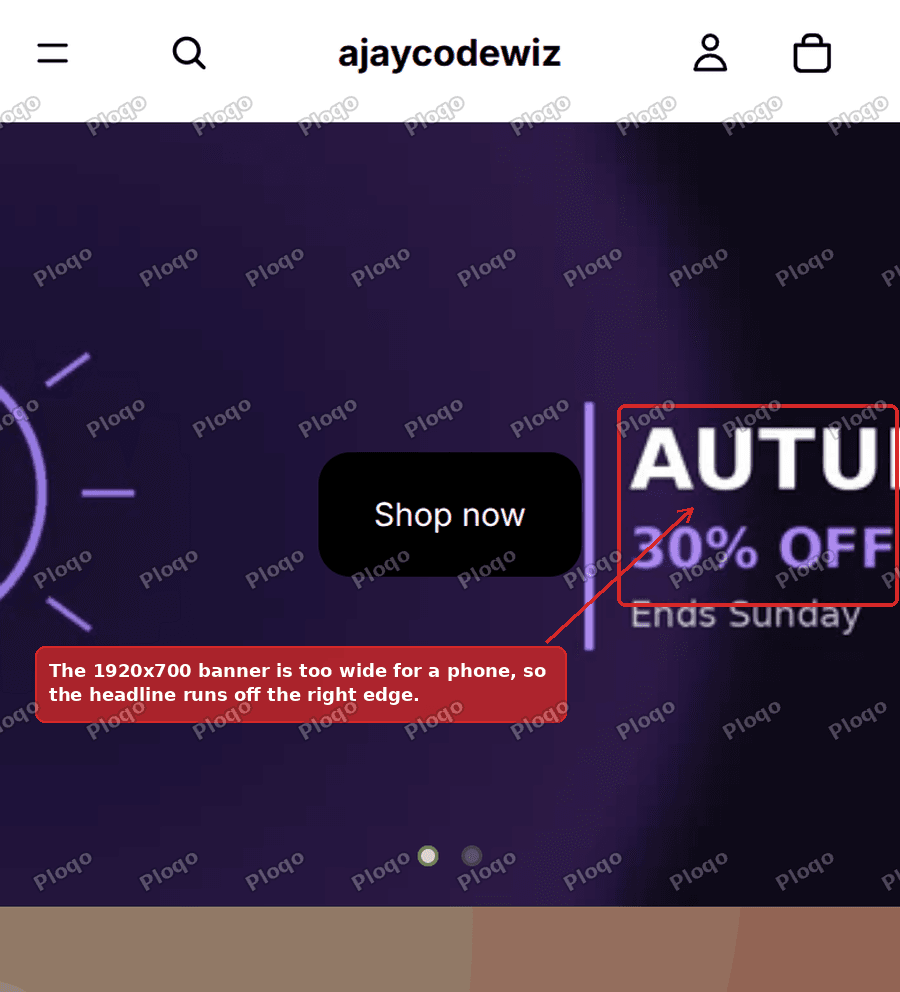 A 1920x700 banner on a phone, with the headline cut off at the right edge
Why your banner gets cropped
This is the part no size guide explains, and it is the whole answer.
A banner slot has a fixed height. Your image is stretched until it covers that slot, and whatever hangs over the edge is cut off. The CSS behind it is object-fit: cover.
So what matters is not the size of your image. It is the shape of your image against the shape of the slot.
Here is the arithmetic for the merchant above.
- Their image was 1920x700. Divide 1920 by 700 and you get 2.74. It is 2.74 times wider than it is tall.
- On a 1440px wide desktop, the slot was 1440x560. That is 2.57. Close to 2.74, so almost nothing was lost.
- On a 390px wide phone, the slot was 390x340. That is 1.15. Nowhere near 2.74.
To cover a slot that is 1.15 wide with an image that is 2.74 wide, the browser has to blow the image up until its height fits, then throw away the sides. It kept about 42% of the width and binned the rest. The headline lived in the part it binned.
That is the entire bug. Your banner is not too big. It is the wrong shape for a phone.
The real slot sizes on a Shopify theme
Most size guides give you one number and move on. The useful number is the slot, and it changes with the height setting you picked in the theme editor.
I read these straight out of Horizon's theme code. Horizon is Shopify's newest free theme, and Dawn and its relatives behave the same way.
| Media height | Phone slot | Desktop slot |
|---|---|---|
| Small | width x 280px | width x 420px |
| Medium (default) | width x 340px | width x 560px |
| Large | width x 400px | width x 720px |
Now put a real phone against that. A common phone is 390px wide.
| Media height | Phone slot | Shape |
|---|---|---|
| Small | 390 x 280 | 1.39, slightly landscape |
| Medium | 390 x 340 | 1.15, nearly square |
| Large | 390 x 400 | 0.98, square |
That is the answer to the question behind the question. The banner slot on a phone is roughly square. It is not a wide strip. It never was.
What size should a Shopify mobile banner be
Match the shape of the slot, and keep your text away from the edges.
- Best all-round mobile banner size: 1080 x 1080. Square. It fits the Medium and Large slots with only a few percent trimmed off the top and bottom.
- If you use the Small height: 1200 x 900. Slightly landscape, closer to 1.39.
- Avoid 1080 x 1350 unless you have raised the height. That is the Instagram portrait shape. It is taller than any phone banner slot, so you lose the top and the bottom. I tried it first and it clipped the last line of my text.
Two rules that matter more than the exact numbers:
- Keep important text in the middle 80%. Every slot on every device crops a little. Text near an edge is text you will eventually lose.
- Do not bake your headline into the image at all if you can avoid it. Use the theme's own heading and button blocks over a plain photo. Then nothing can crop your words, because they are real text sitting on top.
The second one is free, helps SEO, and stays sharp on every screen. It is the fix I would reach for first.
Desktop and homepage banner size
For the desktop half of the same banner, 1920 x 700 is still fine. That is 2.74, and desktop slots sit between 2.4 and 2.9 depending on the height you chose.
If you only want to remember one pair:
- Desktop banner: 1920 x 700
- Mobile banner: 1080 x 1080
Keep both under about 300KB. A hero banner is usually the largest thing on your homepage, and it is the image Google measures for your loading score. There is more on that in making your Shopify hero image load faster.
How to actually serve a different image on phones
Knowing the right size is only half of it. You still need the theme to send the square one to phones and the wide one to desktops.
There are three ways, in order of effort.
Option 1: use a Hero section instead of a Slideshow (no code)
If you only need one banner and not a rotating set, Horizon already does this for you. The Hero section has a setting called Show different media on mobile. Turn it on and you get a second image picker for phones.
Add a Hero section, switch that on, upload your square image, done. No code at all.
Most people asking this question do not know that setting exists, because it is on Hero and not on Slideshow.
Option 2: two sections, one hidden per screen (no code)
Build the banner twice. Show one on desktop, the other on phones, using a few lines in the section's Custom CSS box. It works on any theme and any section type.
I wrote that method up in full, on the Sense theme, in showing a different image on mobile and desktop.
The trade off is maintenance. Every change has to be made twice, and it gets annoying fast with a slideshow that has several slides.
Option 3: add a Mobile image setting to your slides (one file)
This is the one the merchant needed, because they had a real slideshow with multiple slides.
Horizon's Slideshow has one image per slide and no mobile option. But its Hero section already has the pattern. You can copy that pattern onto the slide, and then every slide gets its own Mobile image picker in the theme editor, permanently.
Step 1. Go to Online Store > Themes. Click the three dots on your theme, then Edit code.
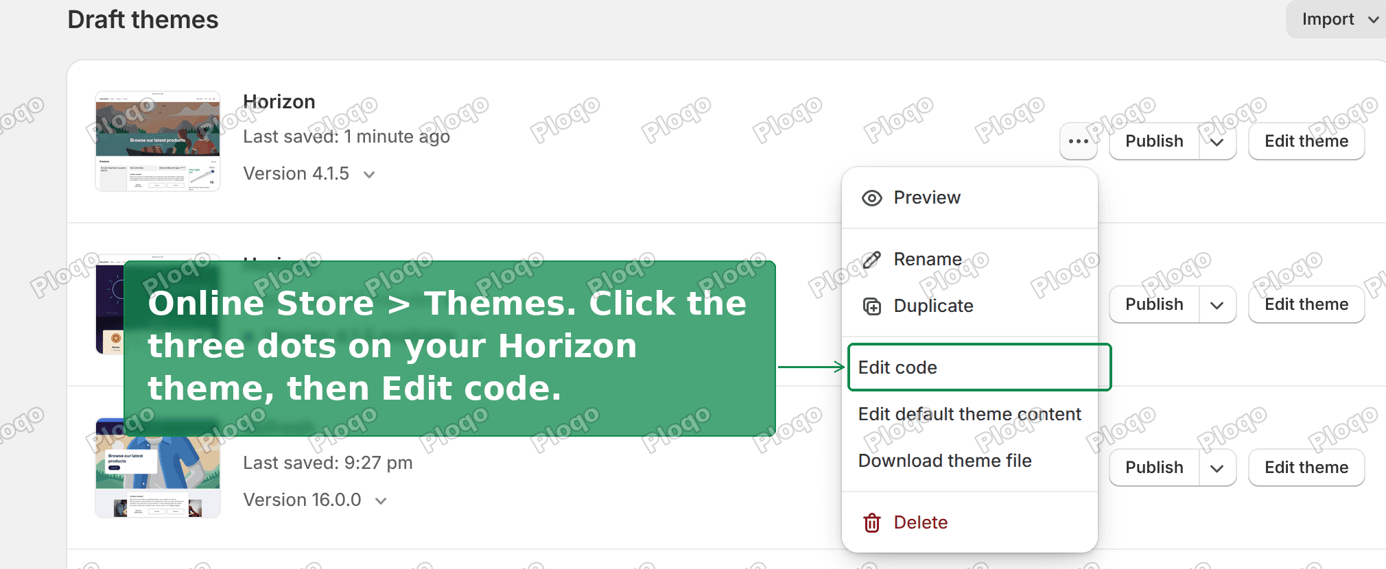 The theme actions menu in Shopify admin, with Edit code highlighted
Step 2. Open blocks/_slide.liquid.
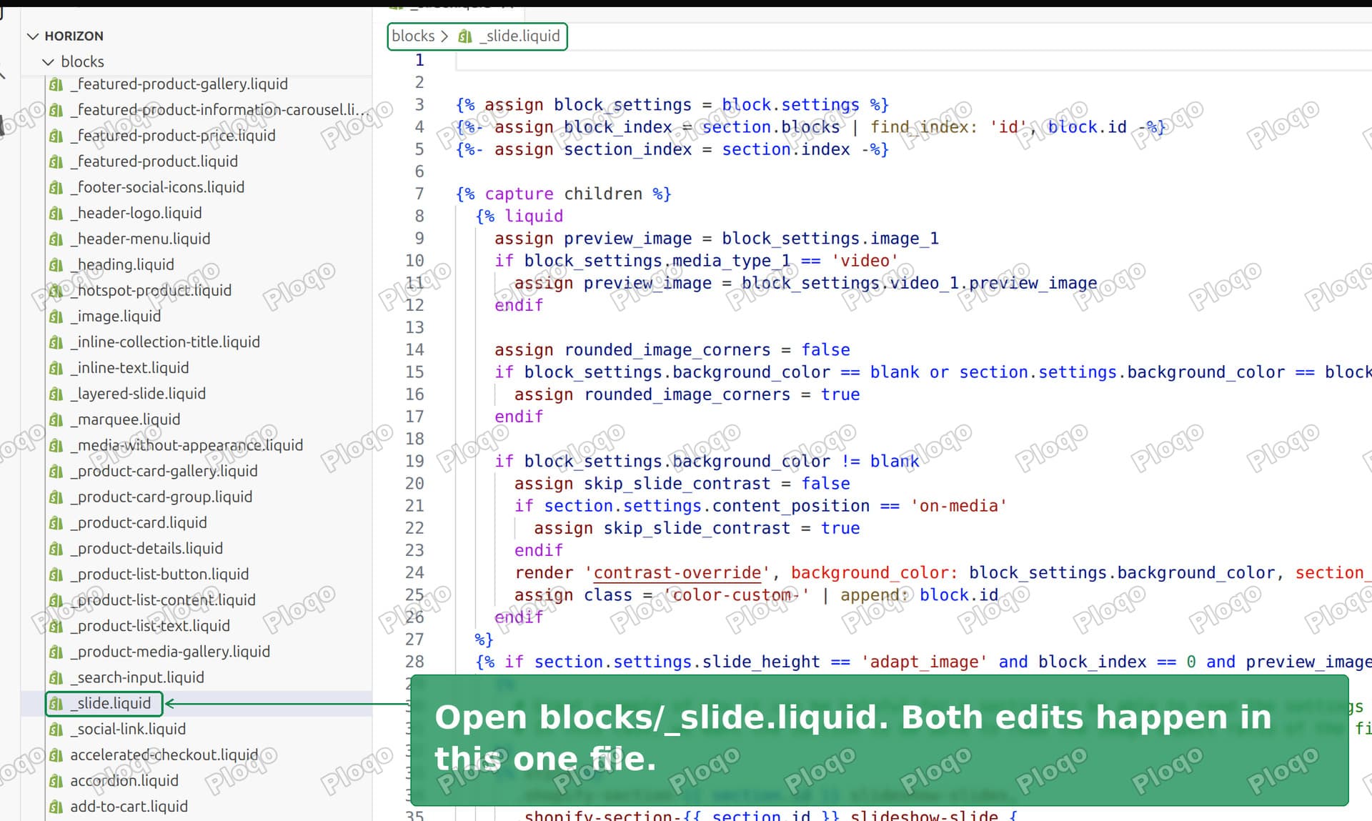 The Shopify code editor with blocks/_slide.liquid open
Step 3. Find these six lines.
      {%- if block_settings.media_type_1 == 'image' -%}
        {{
          block_settings.image_1
          | image_url: width: 3840
          | image_tag: height: height, sizes: sizes, widths: widths, class: 'slide__image', loading: loading, fetchpriority: fetchpriority
        }}
Replace them with this.
      {%- capture desktop_image -%}
        {{
          block_settings.image_1
          | image_url: width: 3840
          | image_tag: height: height, sizes: sizes, widths: widths, class: 'slide__image', loading: loading, fetchpriority: fetchpriority
        }}
      {%- endcapture -%}

      {%- if block_settings.media_type_1 == 'image' -%}
        {%- if block_settings.custom_mobile_media and block_settings.image_1_mobile != blank -%}
          {% style %}
            .slide__image-container > .slide__picture {
              display: contents;
            }
            .slide__picture > .slide__image {
              position: relative;
              width: 100%;
              height: 100%;
              object-fit: cover;
              object-position: center center;
            }
          {% endstyle %}
          <picture class="slide__picture">
            <source
              media="(max-width: 749px)"
              sizes="100vw"
              srcset="
                {{ block_settings.image_1_mobile | image_url: width: 500 }} 500w,
                {{ block_settings.image_1_mobile | image_url: width: 750 }} 750w,
                {{ block_settings.image_1_mobile | image_url: width: 1100 }} 1100w,
                {{ block_settings.image_1_mobile | image_url: width: 1500 }} 1500w
              "
              width="{{ block_settings.image_1_mobile.width }}"
              height="{{ block_settings.image_1_mobile.height }}"
            >
            {{ desktop_image }}
          </picture>
        {%- else -%}
          {{ desktop_image }}
        {%- endif -%}
Step 4. Lower down the same file, inside {% schema %}, find the image_1 setting and add these two straight after it.
    {
      "type": "checkbox",
      "id": "custom_mobile_media",
      "label": "Use a different image on mobile",
      "default": false,
      "visible_if": "{{ block.settings.media_type_1 == 'image' }}"
    },
    {
      "type": "image_picker",
      "id": "image_1_mobile",
      "label": "Mobile image",
      "visible_if": "{{ block.settings.media_type_1 == 'image' and block.settings.custom_mobile_media }}"
    },
Save.
Step 5. Go back to Customize and click a slide. The two new settings are there.
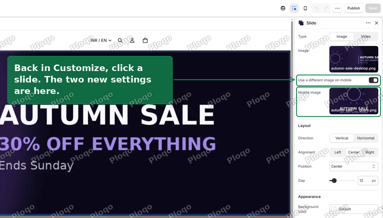 The slide settings panel showing Use a different image on mobile and a Mobile image picker
Tick the box, pick your square image, and the banner is fixed.
 The same banner on a phone after the fix, with all the text visible
Does this slow the page down?
No, and this is worth understanding because it is the usual objection.
The code above uses a picture element. The browser reads the rules first, decides which image it needs, and downloads only that one. A phone never downloads your 1920px desktop banner. A desktop never downloads the square one.
That is the difference between doing it this way and hiding a second section with CSS. A hidden section is still on the page. Depending on the theme, the browser may well fetch that image before it finds out it is invisible.
So the code route is the faster route, not the slower one. If page speed is your reason for asking, this is the option to pick.
What breakpoint counts as mobile?
749px and below. That is the number in the code, and it is the same one Dawn, Horizon and most Shopify themes use internally.
The reason 749 looks odd is that the desktop rule starts at 750. Themes are written mobile first, so the phone styles apply up to 749px, and everything from 750px up is treated as desktop.
Tablets in portrait are usually 768px or 810px wide, so they get the desktop image. That is normally what you want. If it is not, change 749 to 1023 in the code above.
What to check if it did not work
- The setting does not appear. The JSON in step 4 almost certainly has a missing or extra comma. Shopify will refuse to save a schema it cannot parse, so check the error message at the top of the code editor.
- Nothing changed on your phone. Check you actually ticked the box and picked an image. The code deliberately falls back to the desktop image when either is missing, so a half-finished setting looks like nothing happened.
- You resized your browser and it did not switch. Reload the page. Browsers pick the image once and do not always re-pick when a window is dragged.
- It works on your phone but not a colleague's. You are probably looking at a cached copy. Hard refresh.
- It disappeared after a theme update. Expected. A theme update replaces theme files, and that includes this one. Keep a copy of your two edits somewhere. This is the real cost of the code route.
A quick glossary
- Aspect ratio. Width divided by height. 1920x700 is 2.74. A square is 1.
- Slot. The fixed box your banner has to fill. Set by the theme's height setting, not by your image.
object-fit: cover. The rule that fills the slot and crops the overflow, instead of squashing your image.- Breakpoint. The screen width where the layout switches. 750px on most Shopify themes.
srcset. A list of sizes of the same picture. The browser picks the smallest one that still looks sharp.
The short version
- Your banner is cropped because it is the wrong shape for the slot, not because it is the wrong size.
- The banner slot on a phone is roughly square, about width x 340px on the default height.
- Use 1920 x 700 for desktop and 1080 x 1080 for mobile.
- Keep text in the middle 80%, or better, use the theme's own text blocks over a plain photo.
- To serve both, use a Hero section if one banner is enough. Add a Mobile image setting to the slide if you need a real slideshow.
Tested on Horizon 4.1.5 with a 1920x700 desktop banner and a 1080x1080 mobile one. At 390px wide the phone loads the square image. Desktop still loads the wide one.
Spending too long on manual Shopify busywork?
PinFlow turns your Shopify catalog into Pinterest pins and posts them on a schedule, automatically. One less thing to remember to switch on.
Get PinFlow on the Shopify App StoreMore Shopify fixes
More community-sourced Shopify guides, tested on a live store.
Themes & Storefront
Shopify Horizon: Carousel Blank Until You Drag It
A Horizon carousel that shows an empty strip until you drag it, then fills in, is usually the theme skipping the painting of slides it thinks nobody is looking at. Here is how to tell that apart from a genuinely broken carousel, and the one line of CSS that covers it.
Themes & Storefront
Shopify Sold Out Overlay: Grey Out Products and Add a Sold Out Box
Shopify themes mark a sold out product with a small pill in the corner of the card. Here is how to turn that pill into a black Sold Out box across the middle of the photo, and fade the photo behind it, with no theme code and no app.
Themes & Storefront
How to Change the Price Font Size on a Shopify Collection Page
Shopify themes have no setting for the price size on a product card. Here is the one rule that shrinks it on collection pages only, where to paste it so it cannot reach your product pages, and how to keep the crossed out sale price in proportion.