
How to Change Font Size on Shopify for Mobile Only
Your heading looks fine on a laptop and enormous on a phone. Here is the Custom CSS that shrinks it on mobile alone, and why the rule most people copy does nothing on Shopify's newer themes.
By AjayCodeWiz · September 17, 2026 · 9 min read
The problem
Your store looks right on a laptop. You open it on your phone and one heading takes up most of the screen. A three line sentence becomes six lines, the button under it drops below the fold, and the page reads as one giant sentence instead of a shop.
Shopify has no setting for this. Theme settings let you pick a heading size, but that size applies at every screen width. Turn it down far enough to look right on a phone and your desktop headings go weedy.
So people reach for Custom CSS, which is the box Shopify gives you for pasting your own styling rules. Then they hit the second problem: the rule most tutorials print does nothing.
The rule that does nothing
A merchant on the Shopify Community was running the Dwell theme and pasted this:
@media only screen and (max-width: 768px) {
  .h2 {
    font-size: 22px !important;
  }
}
Saved it. Reloaded. The heading did not move by a pixel.
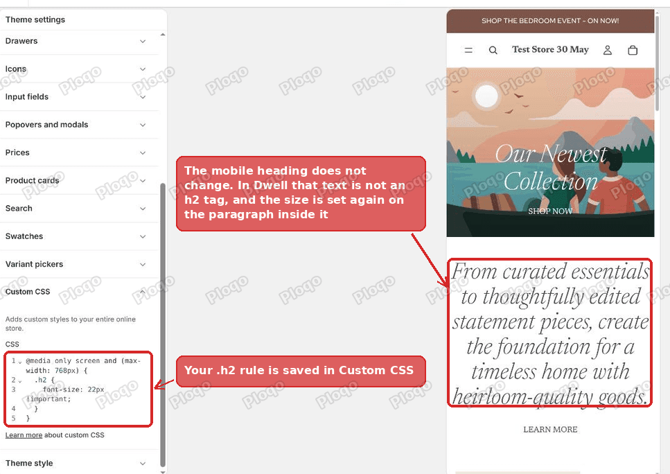 The h2 rule is saved in the Shopify Custom CSS box and the heading on mobile is still full size
The usual answer on forums is that the dot is wrong. .h2 with a dot points at a class, which is a label attached to an element, while h2 without a dot points at the HTML tag. Drop the dot and it will work.
On older themes that advice is right. On Shopify's newer themes it is wrong twice over, and following it wastes an afternoon.
Why newer Shopify themes break the usual advice
Shopify's newest themes, the Horizon family, separate how a heading looks from what it is in the page code. Dwell, Horizon, Fabric, Studio and the rest of that family all work this way. So does anything built on Shopify's 2024 and later theme structure.
When you add a Heading block and set its style to H2, the theme does not output an <h2> tag. It outputs something closer to this:
<div class="text-block h2">
  <p>Where quality craftsmanship meets timeless design</p>
</div>
Two things follow from that, and both of them matter.
There is no h2 tag to target. A rule written as h2 { font-size: 22px } finds nothing on that part of the page, so dropping the dot changes nothing.
The size is set twice. The theme's own stylesheet carries this:
h2,
.h2.h2,
.text-block.h2 > * {
  font-size: var(--font-h2--size);
}
Read the third line. .text-block.h2 > * means "every direct child of a text block styled H2". That is the <p> holding your words.
So when you write .h2 { font-size: 22px !important }, the size does change on the outer <div>. The paragraph inside then sets its own size from the theme's rule, and a child's own font size always beats the one it would have inherited from its parent. Your rule lands one level too high, and the text you can actually see never reads it.
That is why nothing happens, and why !important does not rescue it. !important wins arguments between rules pointing at the same element. It does nothing about a different element further down.
The fix
Add the children to the rule. Two selectors, one extra character of typing:
@media screen and (max-width: 749px) {
  .h2,
  .h2 * {
    font-size: 22px !important;
  }
}
.h2 * means "anything inside an element labelled h2". That catches the paragraph, and it catches a real heading tag if your text happens to contain one.
On a test store running Dwell 4.1.5 this took the pull quote heading from 40px down to 22px on mobile and left the desktop layout exactly as it was.
Where to paste it
There are two Custom CSS boxes in the Shopify theme editor and they do different jobs. Picking the wrong one is the other reason this fix appears not to work.
1. Open the theme editor
In your Shopify admin go to Online Store > Themes and click Customize on your current theme.
2. Click the gear icon
The narrow strip down the top left of the editor has three icons. The middle one, the gear, opens Theme settings. These settings apply to your whole store rather than to one section of one page.
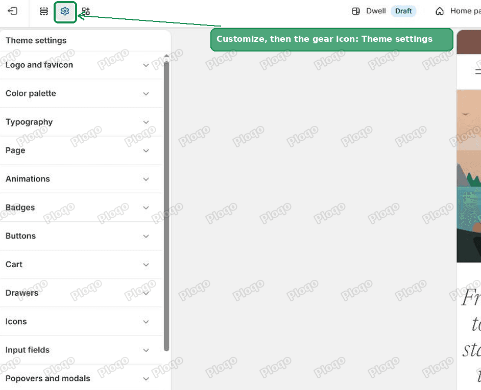 The gear icon in the Shopify theme editor opens Theme settings
3. Scroll to the bottom and open Custom CSS
Theme settings is a long list: Logo and favicon, Color palette, Typography, and so on. Custom CSS is near the very bottom, under Variant pickers. Click it and a small code box opens.
The wording under the heading tells you which box you are in. Under Theme settings it reads "Adds custom styles to your entire online store." The box inside an individual section reads "Adds custom styles to this section only", and that one will not touch headings anywhere else on your store.
4. Paste the rule
Paste the code into the box. The preview on the right updates as you type, so you can see the heading shrink before you commit to anything.
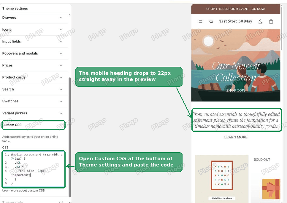 The Custom CSS box in Shopify Theme settings with the mobile font size rule pasted in
5. Save
Click Save at the top right. The change is live on that theme immediately.
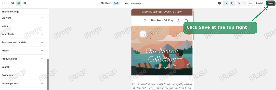 Click Save at the top right of the Shopify theme editor
6. Check desktop
Switch the preview back to desktop with the monitor icon in the top bar. Your headings should be exactly as they were. The rule sits inside @media screen and (max-width: 749px), so it only runs on screens narrower than that.
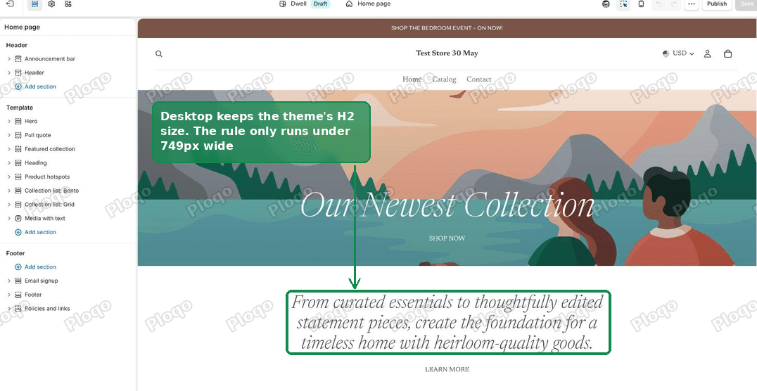 The desktop preview shows the Shopify heading still at the theme's full H2 size
Picking the right breakpoint
A breakpoint is the screen width where a rule switches on. The number inside max-width is yours to choose, but matching your theme's own number keeps everything consistent.
- 749px is what the Horizon family uses, Dwell included. Below it the theme treats the screen as a phone.
- 768px is the common generic choice, and it is what most tutorials print. It works, it just includes small tablets held upright.
- 989px catches tablets in landscape too. Use it if your headings also look heavy on an iPad.
If you are not sure, start with 749px. Resize your browser window slowly and watch where your theme's own layout flips from a phone layout to a desktop one. That is your number.
Changing a different heading level
The same pattern works for every heading size in the theme. Swap the number in the class:
@media screen and (max-width: 749px) {
  .h1, .h1 * { font-size: 30px !important; }
  .h2, .h2 * { font-size: 22px !important; }
  .h3, .h3 * { font-size: 18px !important; }
}
Only add the lines you actually need. A store where every heading level has been overridden is harder to adjust later than one with a single rule in it.
Changing heading size everywhere, without code
If your headings are too big on desktop as well, you do not need CSS at all.
Go to Theme settings > Typography. Each heading level has its own size control there. Turn Heading 2 down from 40px to, say, 32px and it changes at every screen width, with no code and nothing to maintain.
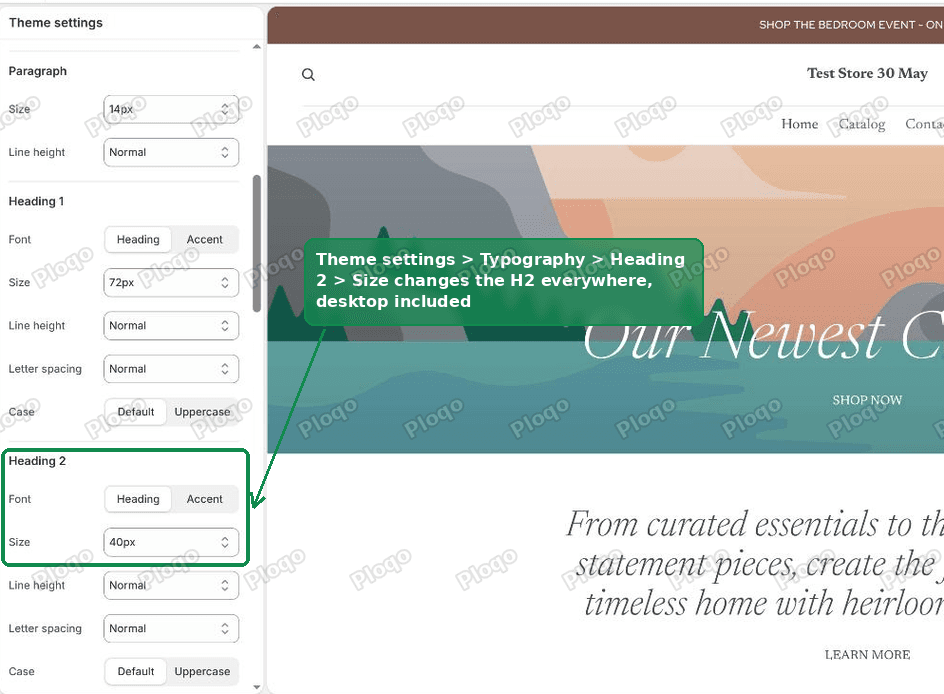 Theme settings Typography panel in Shopify showing Heading 2 size set to 40px
This is worth checking first. On Dwell, Heading 2 is set to 40px and the theme prints that same 40px on a phone. Heading 1 is set to 72px but the theme shrinks it as the screen narrows. That difference is why H2 is the level that looks wrong on mobile while H1 looks fine.
Use Typography when the size is wrong everywhere. Use the Custom CSS rule when desktop is right and only mobile is wrong.
Does this work on Dawn and older themes?
Yes, and on older themes you have more targets to choose from, not fewer.
Dawn, Debut, Craft, Spotlight, Refresh and the rest of the Online Store 2.0 generation output real <h2> tags for most headings. Dawn also carries .h2 as a utility class for things that should look like a heading without being one.
So on Dawn this covers both:
@media screen and (max-width: 749px) {
  h2,
  .h2,
  .h2 * {
    font-size: 22px !important;
  }
}
Adding h2 costs nothing on a Horizon-family theme, since there are few loose h2 tags for it to find. Leaving it out on Dawn misses most of your headings. If you do not know which generation your theme is, use the three-selector version.
One caution on newer themes. Because the tag and the visual style are decoupled, a block styled H1 can still contain an <h2> tag inside it. A bare h2 { } rule will shrink that too, which is usually not what you wanted. That is the other reason to prefer the class.
If it still has not changed
Work down this list in order. In practice it is almost always the first or second item.
You pasted into a section's Custom CSS box, not Theme settings. The section box only styles that one section on that one page. Read the line of help text above the box; it tells you which one you have.
You are editing a different theme. The theme editor opens on whichever theme you clicked Customize on. If you have a draft copy and a live one, check the theme name in the top bar of the editor.
You are looking at a cached page. Shopify and your phone both cache stylesheets. Load the page in a private window, or add ?x=1 to the end of the address to force a fresh copy.
Your browser window is wider than the breakpoint. Shrinking a desktop browser window does trigger the rule, but only once it is narrower than 749px. Watch the heading as you drag the window edge in.
An app is drawing the heading. Review widgets, page builders and popup apps render their own markup and their own classes, and .h2 will not be in it. Right click the heading, choose Inspect, and look at the class names on the element. Whatever you see there is what the rule needs to name.
The text is inside a Rich text block, not a Heading block. Rich text output is wrapped in .rte rather than a heading class. Target .rte h2, .rte p instead.
Related fixes on this blog
- How to add custom CSS in Shopify walks through both Custom CSS boxes from scratch, with a worked example.
- Change your Shopify menu font size covers navigation text, including app-built mega menus.
- Change the price font size on a collection page does the same job for product card prices.
What to do
- On Dwell, Horizon and the rest of Shopify's newest themes, a heading styled H2 is a
<div class="h2">with a<p>inside, not an<h2>tag. - The theme sets the size on that inner
<p>as well, so a rule aimed at.h2alone is overridden. - Use
.h2, .h2 *inside amax-widthmedia query, in Theme settings > Custom CSS. - Use 749px for the Horizon family, 768px as a generic phone breakpoint.
- If desktop is wrong too, change Theme settings > Typography instead and skip the code.
Spending too long on manual Shopify busywork?
PinFlow turns your Shopify catalog into Pinterest pins and posts them on a schedule, automatically. Same idea as the rule above, let the system handle the repetitive part.
Get PinFlow on the Shopify App StoreMore Shopify fixes
More community-sourced Shopify guides, tested on a live store.
Themes & Storefront
Shopify Search and Discovery App: Fix Unrelated Search Results
Synonyms are gone from the Shopify Search and Discovery app and store search now pads results with unrelated products. Here is a paste-in fix for Dawn that makes search strict again, and how to rebuild synonyms with tags.
Themes & Storefront
Shopify Coming Soon Page: Add a Get Early Access Button
Turn the Shopify coming soon page into an early access sign-up with a real Get early access button, then email the list your store password before launch. Tested on the Flow theme, with a no-code option.
Themes & Storefront
Remove the Variant ID From Your Shopify Product URL
Your product link keeps turning into /products/name?variant=43176780890281, before the customer has touched anything. One theme setting stops it, a second switch covers Dawn, and a short snippet cleans the links that already carry the ID.