
Shopify Dropdown Menu Behind Page Content (Z-Index Fix)
Your Shopify dropdown or mega menu opens, but the page title and products sit on top of its links and the menu closes before you can click. The fix is one Custom CSS rule in Theme settings. Tested on a Rebel store.
By AjayCodeWiz · October 3, 2026 · 9 min read
The problem
A merchant running the Rebel theme asked about this on the Shopify Community. Their store has a mega menu under the header, with tabs for Living, Dining, Office, Bar, Lighting and Decor. A mega menu is a wide dropdown that shows many links in columns when you point at a tab.
On the home page it worked. On the other pages the menu opened, but part of the page was drawn on top of it. The merchant also said the menu "snaps shut" before a visitor can click a link.
I opened the merchant's store and checked the Sofas collection page. I pointed at Living and the menu opened. The big page heading "Sofas" was printed right across the first row of links. When I moved the pointer down toward Sofas, Recliners or Sectionals, it left the menu and the menu closed.
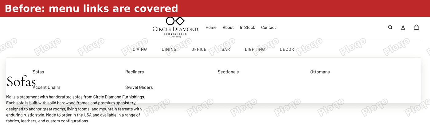 Before: the Sofas page heading sits on top of the Living menu links
I measured it as well. For every link in the menu, I asked the browser which element sits at the center of that link. On the Sofas page, a block of page content answered for all 16 links across the six tabs, not the menu. A click on those links would have hit the page, not the link.
Why the menu ends up behind the page
Every item on a web page sits on a layer. When two items overlap, the one on the higher layer is drawn on top. The number that sets the layer is called z-index. A bigger number is higher, and an item with no number gets the default layer.
When two items ask for the same layer, the one that comes later in the page's code is drawn on top.
That is what happens here. Rebel is built on Shopify's Horizon theme, and Horizon gives its sections a content wrapper on layer 1. The merchant's mega menu is a section under the header, so its wrapper is on layer 1. The first section of the page below it, such as the collection title and description, has a wrapper on layer 1 as well.
Both are on layer 1, so the page content wins because it comes later. The menu panel opens downward, straight into that content.
This also explains why the menu closes. A hover menu stays open only while the pointer is over the menu or its panel. When the page content is drawn on top, the pointer is over the page, not the panel. The browser treats that as leaving the menu and the panel hides.
It also explains why the home page worked. I tested the menu on six pages, with the page-level code the merchant had already added switched off. The menu was covered on the Sofas page, the All products page, a product page and the Contact page. It was not covered on the home page or the About page, because the first section on those pages does not sit on layer 1 over the menu.
The fix: put the menu section on a higher layer
The fix gives the menu's section a layer higher than the page content. The section keeps its place on the page, so the layout does not change. You paste the rule into Custom CSS, a box in the theme editor where you can add your own styling code without editing any theme files.
These are the exact steps from my reply on the forum.
Step 1 and 2: open the theme editor
In your Shopify admin, go to Online Store. Then click Edit theme on your current theme.
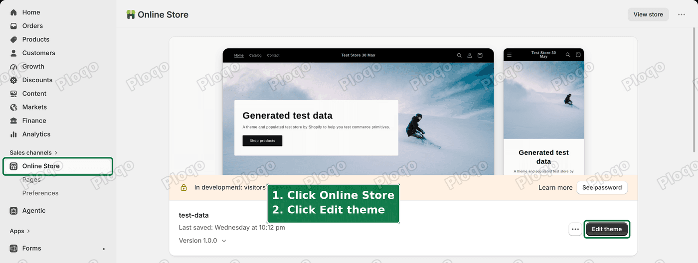 Go to Online Store, then click Edit theme on your current theme
Step 3: open Theme settings
Click the Theme settings icon at the top of the left panel. It is the gear, next to the icon that shows your page sections.
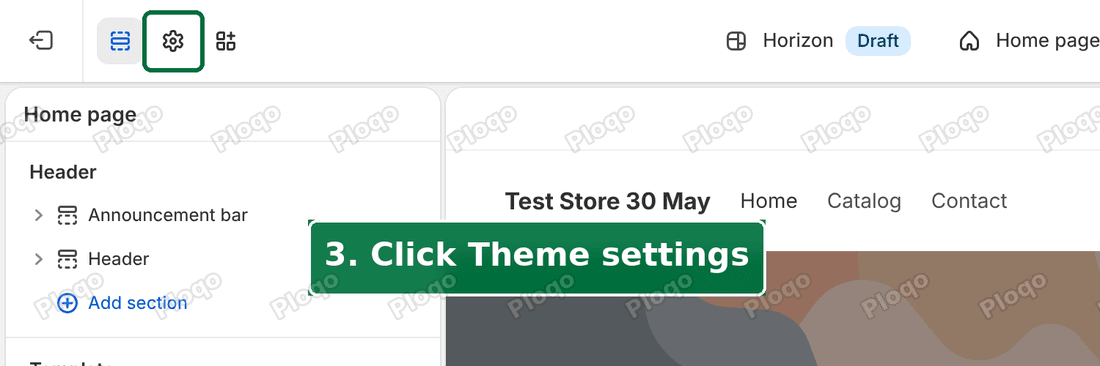 Click the Theme settings gear at the top of the left panel
Step 4: open Custom CSS
Theme settings shows a list of groups such as Prices, Product cards and Swatches. Scroll down and click Custom CSS.
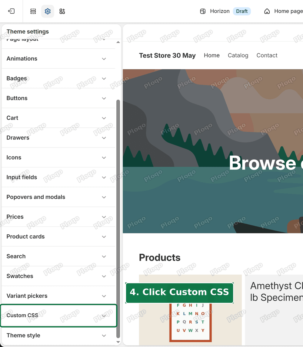 Scroll down and click Custom CSS in the Theme settings list
Step 5: paste the code
Click at the end of the box, press Enter and paste this code. If the box already holds code, leave it there and add this below it.
.shopify-section-group-header-group:not(.header-section) {
position: relative;
z-index: 10;
}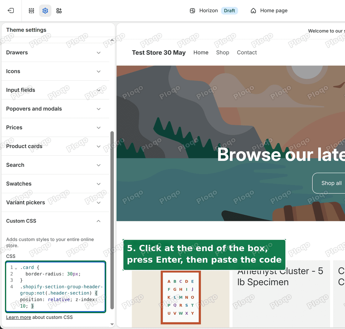 Paste the code at the end of the Custom CSS box
The first line points at the sections that sit in your header area, except the header itself. In the merchant's store that is the mega menu section. The second line lets the section take a layer. The third puts it on layer 10, above the page content on layer 1.
The header is left out on purpose. Horizon keeps the header in place while you scroll, and changing how it is positioned could break that.
Step 6: save
Click Save in the top right corner.
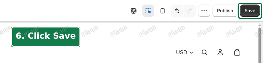 Click Save in the top right of the theme editor
The result
I tried the rule on the merchant's live store, in my own browser only. Nothing was saved to their store. The Living panel now opens above the Sofas heading, and the page text no longer shows through the links.
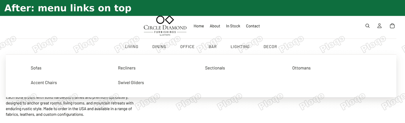 After: the Living menu links sit on top of the page and can be clicked
I ran the same check as before on seven pages: the home page, About, Contact, a product page, the Sofas collection, the All products collection and the cart. The menu answered for 16 of 16 links on every page. Before the rule, the page answered for all 16 on the Sofas page.
Only the layer changed. The menu looks the same, and nothing else on the page moved.
Other fixes from the same thread
Two other replies in the thread tried to fix this, and both are reasonable.
Lower the page content to layer 0. One reply added main#MainContent { z-index: 0; } to the bottom of the theme's main layout file. main#MainContent is the box that holds everything under the header. Putting it on layer 0 puts the whole page below the menu's layer 1. When I loaded the merchant's store, that rule was in place and all 16 links were reachable.
The tradeoff is that it changes the layer of the entire page body, not only the menu. If you later add a sticky bar or a popup inside the page, it now sits below the menu, which may not be what you want. It also means editing the theme's code file, where a Custom CSS box is easier to undo.
Target the menu section by its ID. Another reply used the section's own ID in the selector. That also worked when I tried it at desktop width. The ID belongs to one section, so if you delete the menu section and add it back, the ID changes and the rule stops matching. The rule in this guide points at the header area as a whole, so it keeps working.
All three methods do the same job, which is to give the menu a higher layer than the page. Pick the one you find easiest to maintain.
How to check your own store
You do not need any developer tools to see whether your menu is covered.
- Open one collection page, one product page and your home page on a computer.
- Point at a menu tab so the dropdown opens.
- Move the pointer slowly down onto the first link in the dropdown.
- Watch for the menu closing, or page text showing through the links.
If the menu works on the home page but not on inner pages, you have the layer clash described above. Different pages start with different first sections, so one page can behave differently from another.
Test on a computer. This menu switches to a tap-to-open layout on a phone, so the hover problem does not show there.
Z-index terms that are easy to mix up
Z-index. A number that sets which of two overlapping items is drawn on top. A higher number is on top. It only has an effect on items that are positioned, which is why the rule above also sets position: relative.
Layer. A plain word for a z-index level. Items with the same layer are drawn in page order, so the later one is on top.
Hover menu. A menu that opens when the pointer rests on a tab and closes when the pointer leaves it. If anything else is drawn over the opened panel, the pointer counts as having left.
Mega menu. A wide dropdown that shows many links in columns, often with images. Themes such as Horizon ship a basic dropdown, and merchants add mega menus with an app or a custom block. If you want to change how wide the panel is, the Shopify mega menu width guide covers it.
Sticky header. A header that stays at the top while a visitor scrolls. It has its own layer, and it is the reason the rule above leaves the header alone.
If your menu is not covered by page content but by a chat button, that is the same type of problem with a different cause. The chat widget covering your menu guide explains it. If a header is sitting on your announcement bar on a phone, see the header covering the announcement bar guide. For menus with several levels, the Shopify nested dropdown menu guide covers how to build them.
If it did not work
Did you test the right theme? If you pasted the code into a duplicate of your theme, preview that duplicate. The live store will not change until you publish the duplicate.
Is the code in the right box? Paste it in Theme settings > Custom CSS. The individual sections have their own Custom CSS boxes, and the code does not apply to the whole header area from there.
Did you click Save? The Save button is greyed out until you change something. After pasting, it turns dark. Click it, then reload your store.
Is your menu inside the header itself? The rule leaves the header section alone. If your menu is a setting of the Header section, the menu is not the problem described here. Look for what is drawn on top of it.
Does the menu still close before you reach the links? Look for empty space between the tab and the panel. If there is some, the pointer leaves the menu while crossing it. That is a spacing problem and a separate fix.
Do other things now sit under the menu? The rule gives the menu section layer 10. If a popup or a drawer is now hidden behind the menu, give that item a layer above 10.
Did Shopify change your code after saving? Shopify tidies the Custom CSS box when you save. It may spread the rule over more lines. That is formatting only, and the code works the same.
What to do
- Go back to Custom CSS using steps 1 to 4 above.
- Paste the rule at the end of the box and save.
- Hover over a menu tab on a collection page and move down to the links.
- If the links are still covered, check the questions above.
I tried this on the merchant's live store with seven pages and 16 menu links, and the menu was reachable on all of them.
Spending too long on manual Shopify busywork?
PinFlow turns your Shopify catalog into Pinterest pins and posts them on a schedule, automatically. Set it up once and let it run.
Get PinFlow on the Shopify App StoreMore Shopify fixes
More community-sourced Shopify guides, tested on a live store.
Themes & Storefront
Shopify AI Section: Fix a Price Badge Hidden Behind the Image
You built a section with Shopify's AI section generator, but the price badge on each card sits behind the photo. Here is the Custom Liquid fix that brings it to the front without regenerating anything. Tested on a Dawn store.
Themes & Storefront
Hide Shipping Calculated at Checkout on One Shopify Product
The line under Add to cart that says shipping is calculated at checkout shows on every product, gift cards included. Here is how to hide it on one product only, with the code, screenshots and the Eclipse theme steps.
Themes & Storefront
Shopify Sales Counter: Show "X Sold" on Product Pages
Shopify has no built-in sales counter. Here is how to show a sold count on your product page and collection pages in the Dawn theme, using one product field and three lines of theme code.