
Shopify Product Page Design: Price Next to the Title
Move the price to the right of the product title on a Shopify Dawn product page and make both the same size, with one block of CSS and no app. Tested on Dawn, desktop and phone.
By AjayCodeWiz · October 6, 2026 · 8 min read
The problem
On a default Dawn product page, the product title sits on one line and the price sits on the next line below it. Both are centred or left aligned, one above the other.
A merchant on the Shopify Community wanted a different product page design. They wanted the price on the right side, level with the title, and they wanted the title the same size as the price.
I rebuilt their page on a test store running Dawn and made the change with a short block of CSS. CSS is the code that controls how a page looks. Dawn has a box in the theme editor where you can paste it, so you do not need to edit any theme files.
Here is the page before the change. The price sits under the title.
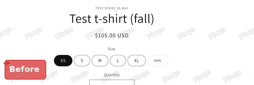 Dawn product page before the change, with the price on its own line under the title
And here is the page after the change. The title is on the left, the price is on the right, and both are the same size.
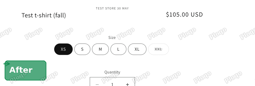 Dawn product page after the change, with the title on the left and the price on the right at the same size
Why there is no setting for this
Dawn lets you reorder the blocks on a product page. A block is one piece of the page, such as the title, the price or the size picker. You can drag the price above the title, but every block gets its own full row. There is no option to put two blocks side by side.
The same goes for the text size. Dawn sets the title size in its own code, and the product page settings have no slider for it. That is why this change needs a small amount of CSS.
What you need before you start
- A store running the Dawn theme, or a theme built on Dawn.
- A product page you want to change.
- About five minutes.
The steps below were tested on Dawn 15.5.0. If you run a newer version, the same class names are still in use on the product page.
The steps
1. Open the theme editor
Go to Online Store in your Shopify admin, then click Edit theme next to your current theme.
 Online Store page in the Shopify admin with the Edit theme button highlighted
2. Switch to a product page
The editor opens on your home page. Click the page list at the top and choose Products. Pick any product. All products share the same product page layout, so the one you choose does not matter.
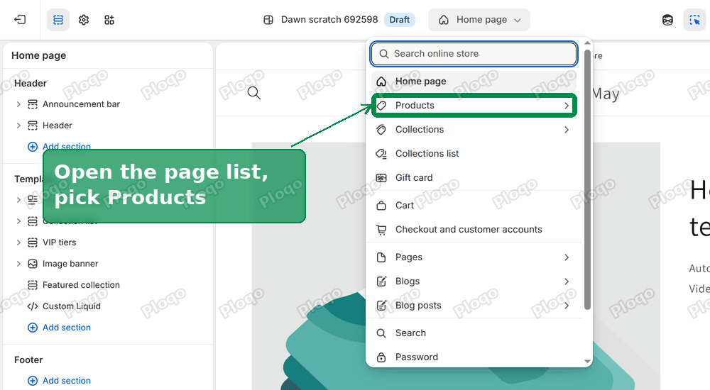 The page list in the Dawn theme editor open, with Products highlighted
3. Add a Custom Liquid block
Click Product information in the left panel. Then click Add block.
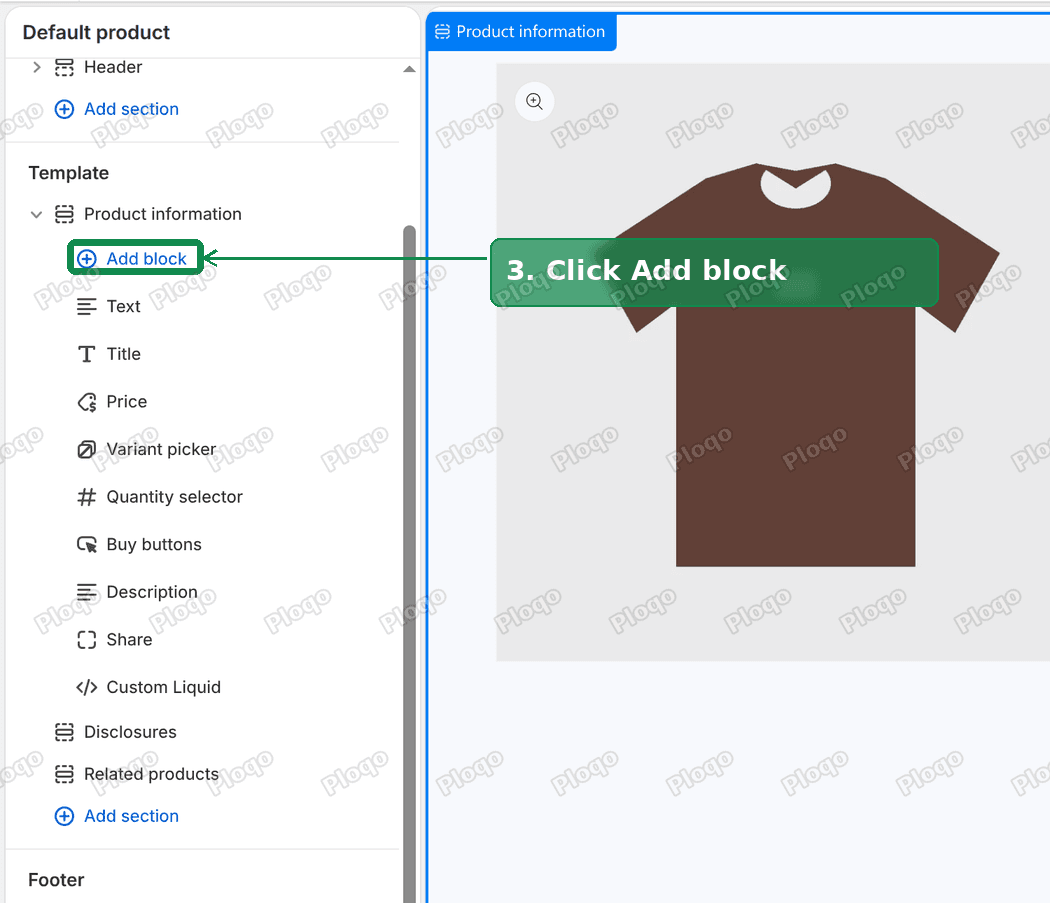 The Product information section expanded in the editor with the Add block button highlighted
Choose Custom Liquid from the list. A Custom Liquid block is a box where you can paste code. Dawn puts it on the page without changing anything else.
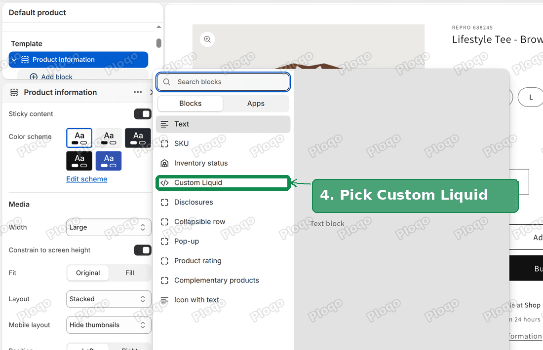 The block picker in the Dawn theme editor with Custom Liquid highlighted
4. Paste the code
Paste this into the Liquid code box. Keep the <style> lines at the top and bottom, because they tell the page that the text between them is CSS.
<style>
.product__info-container {
display: grid !important;
grid-template-columns: 1fr auto;
column-gap: 2rem;
align-items: center;
}
.product__info-container > * {
grid-column: 1 / -1;
}
.product__info-container > .product__title {
grid-area: 2 / 1;
text-align: left;
margin: 0;
}
.product__info-container > div[id^="price-"] {
grid-area: 2 / 2;
text-align: right;
margin: 0;
}
.product__title h1,
.product__title h2,
.product__info-container .price,
.product__info-container .price-item {
font-size: 2rem;
line-height: 1.3;
}
</style>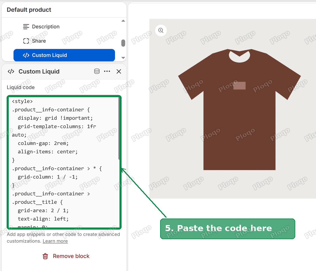 The Custom Liquid box in the editor with the CSS pasted in
5. Save
Click Save at the top right. Open the product page in a new tab to check it.
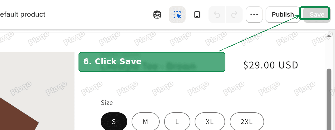 The Save button at the top right of the theme editor
How the code works
You do not need this to use the code, but it helps if you want to adjust it.
The product information area is split into two columns. The left column takes all the spare width. The right column is only as wide as its content.
The title goes in the left column of row two. The price goes in the right column of the same row. Every other part of the product info, such as the size picker and the Add to cart button, still spans both columns, so it keeps its normal full width position.
The last rule sets the text size of the title and the price. Both are 2rem. A rem is a size unit based on your store's base text size. Dawn sets one rem to 10 pixels, so 2rem is 20 pixels. I measured both the title and the price at 20 pixels on my test store.
Change the size of the title and price
Edit 2rem in the last rule. A bigger number gives bigger text. Because the title and the price share one rule, they always stay the same size as each other.
If you want the price a little smaller than the title, split the last rule in two. Give the title its own font-size and the price its own.
Does it work on a phone?
Yes. I checked the same page at a phone width of 390 pixels. The title stays on the left and the price stays on the right of the same row.
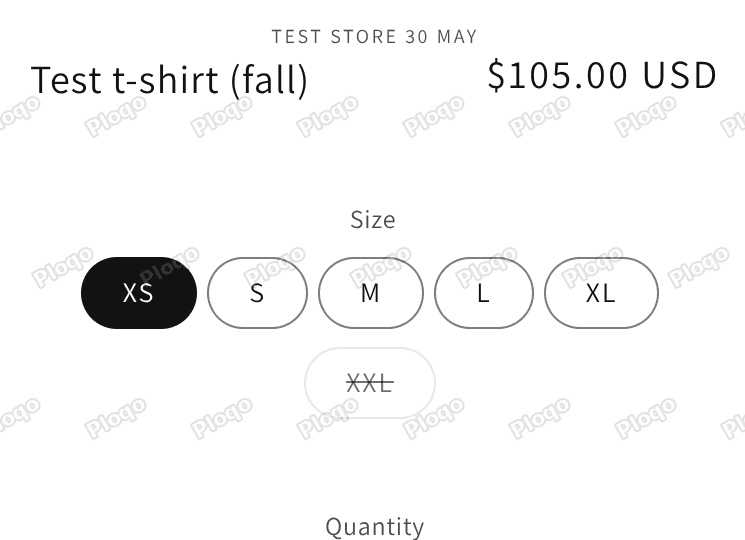 Phone view of the product page with the title on the left and the price on the right
What happens with a long product title?
A long title is the main thing to watch. I changed the title on my test store to a long one, "Oversized Heavyweight Cotton Autumn Collection Crewneck T-shirt (fall edition)", and looked at it on a phone.
The title wraps onto four lines on the left. The price stays on the right, centred beside those lines. Nothing overflows the screen.
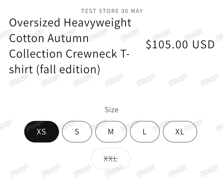 Phone view with a long product title wrapping onto four lines beside the price
If you think this looks crowded, make the size smaller. A value of 1.6rem gives a long title more room.
Which block moved, and which did not
The vendor line, which is the small grey brand name above the title, stays above the row on its own line. The size picker, quantity box and buy buttons stay below it, one under the other.
Is this a good layout for your store?
Another merchant replied to the same thread with a fair warning. They pointed out that a title and a price on one row leave less room for each. Products with long titles, a sale price with a crossed out old price, or a sales badge can all crowd that row, and phones have even less width.
The long title test above is the one case I checked on a phone. The title wrapped neatly and the price stayed beside it. I did not test a product with a sale price and a badge, so look at your own sale products on a phone before you keep this design.
A few things help it work well.
- Keep product titles short. Two or three words suit this layout best.
- Keep the price on one line. A single price on the right is easier to scan than two prices.
- If your sale products look crowded, lower the 2rem value or remove the price rule and keep only the title change.
The same merchant also suggested giving the Add to cart button a solid background colour so it stands out more. That is a separate change in your theme colour settings, and it is worth a look once the title row is finished.
What if it did not work?
Nothing changed on the page. Check that the Custom Liquid block sits inside Product information, not inside another section. Then save and reload the product page.
The title is on the left but the price is still below it. Your price block may use a different structure. Open the product page, right click the price, choose Inspect and check that its wrapper has an id that starts with the word price. If it does not, your theme is not built on Dawn.
The title is very narrow. The price column has taken too much space. This happens when the price is long, such as a price range. Make the price smaller using the last rule.
You use Horizon or another newer theme. The class names in this code are Dawn's. Horizon builds its product page differently, so the code does nothing there.
You want it on collection pages too. This code only changes the product page. For the price on collection cards see how to change the price font size on a collection page.
Related changes you might want
- Change the size of the description text: Shopify product description font size.
- Move the whole info column up on desktop: customize the Shopify product page layout with CSS.
- Put the product images and info in two columns: Shopify two column product page.
- Learn where the Custom CSS box lives: how to add custom CSS in Shopify.
Summary
- Switch the editor to a product page.
- Add a Custom Liquid block to Product information.
- Paste the code and click Save.
- Change 2rem to make the title and price larger or smaller.
- Check a product with a long title on your phone before you finish.
Tested on Dawn 15.5.0 with a six size product. The phone checks were done at a width of 390 pixels.
Spending too long on manual Shopify busywork?
PinFlow turns your Shopify catalog into Pinterest pins and posts them on a schedule, automatically. Same idea as the rule above, let the system handle the repetitive part.
Get PinFlow on the Shopify App StoreMore Shopify fixes
More community-sourced Shopify guides, tested on a live store.
Themes & Storefront
Shopify Autoplay Video on Product Page: Skip the Play Button
Your product video shows a play button instead of playing. How to make a Shopify product page video autoplay on desktop and mobile, with the exact code and steps.
Themes & Storefront
Hide the First Image in Your Shopify Product Image Gallery
Hide the first photo in a Shopify product image gallery without deleting it, so the gallery opens on image 2. Tested Custom CSS for the Roam theme, desktop and mobile.
Themes & Storefront
Show a Brand Logo on Shopify Product Pages by Vendor
Show the right brand logo next to the vendor name on every Shopify product page. One logo per brand, no code edits when you add a brand. Tested on the Enterprise theme.